 flowmance
Dusk Design System


Dusk is a dark, all-caps studio site. Everything is uppercase Satoshi on a soft charcoal #111111, framed by a thin fixed rail on the left. The big titles run at 10vw in Satoshi Bold, and most of them swap a single word for a hand-written Story Script word at 50% white (OUR work, PREMIUM services, Launch Fast.); the hero title is all Satoshi. Colour only comes from floating 3D renders and warm studio portraits.
Four signatures make it recognisable:
- Bold sans plus one script word. Most big headings (not the hero) mix Satoshi with one Story Script word set at half opacity, often on its own line: PROVIDING AN ARRAY OF / premium SERVICES.
- The left rail. A fixed 90px column, full height, with a 1px white-20% right border and a 3-line vertical hamburger in the middle. A 1px white line grows down its edge while the page loads.
- Uppercase everything. The body is set text-transform: uppercase, so paragraphs, links, emails (INFO@DUSK.COM) and buttons are all caps.
- Floating work. Project cards (15px corners) are scattered across a 5-column grid and slide past a sticky OUR work title, some renders breaking out of their frames.
Dusk is a dark-only design.
Colors
Surfaces
#111111Page, rail and menu background (--black-3)
#000000The 130px "View Project" cursor circle
#222222Service cards, the CTA band, contact inputs (--black-2)
#444444The text panel of the featured blog row (--dark-slate-grey)
#222222Contact inputs (4px radius)
Ink
#111111Text on primary
#FFFFFFTitles, buttons on hover, project names
#FFFFFF · 80%Header and hero meta text (DIGITAL EXPERIENCE DESIGN AGENCY, ©2024)
#FFFFFF · 60%Paragraphs (p is #FFFFFF99), service text, footer links
#FFFFFF · 70%Project categories, social links
#FFFFFF · 50%The Story Script word in the big titles (opacity 0.5)
#FFFFFFAction
#FFFFFFThe white button
#111111Button hover: it turns charcoal with white text
Lines & effects
#FFFFFF · 20%Rail border, menu divider, newsletter underline, blog dividers
#FFFFFF · 40%The 1px divider inside blog content (value not in the extracted data)
Typography
Satoshi · display-hero
The quick brown fox jumpsDIGITAL CREATIVE STDUIO, OUR (.title-1.vw). 144px · 700 · 1.1
Story Script · headline-script
The quick brown fox jumpspremium, performance inside 60px titles. 74px · 400 · 0.8
Satoshi · title-lg
The quick brown fox jumpsSection leads (GREAT COMPANIES USE DUSK TO POWER THEIR BUSINESS FORWARD.). 28px · 700 · 1.3
Satoshi · body-lg
The quick brown fox jumpsParagraphs (60%), footer links. 18px · 500 · 1.44
Satoshi · label
The quick brown fox jumpsButtons, default text. 14px · 700 · 1.43
Spacing & shape
| Purpose | Value |
|---|---|
| Container | max 1200px, centred |
| Breakpoints | 991px, 767px and 479px, plus a 1440px+ tweak |
Spacing scale
| Token | Value | Preview |
|---|---|---|
xs | 15px | |
sm | 20px | |
md | 30px | |
lg | 40px | |
xl | 80px | |
2xl | 100px |
Layout spacing
| Token | Value | Preview |
|---|---|---|
column-gap | 20px | |
rail | 90px | |
section | 120px | |
block | 150px |
Border radius
Surfaces
How the surfaces stack, from the page background up. Hex codes and roles are in Colors above.
Motion
| Page loader | A 1px white line grows height 0 → 100% along the rail, 500ms; the loader fades out in 300ms |
| Scroll reveal | opacity 0 → 1 and a move to x 0, y 0, 1000ms outQuart, from an offset (about y 100px, x ±100px or scale 0.75) |
| Project hover | Cursor circle scales in from 0 (about 1000ms); title and category rise y 10px → 0 and the shade fades in, 300ms ease |
| Image parallax | Portraits and photos drift vertically (about ±40–100px) while scrolling through view |
| Menu open | Panel fades in 300ms; links slide x 10% → 0% and fade in, 300ms ease; the menu icon animates (about 600ms) |
| Link underline | Width 0 → 100%, 500ms; back to 0 in about 300ms |
| Rotating mark | A small badge rotates slowly on a loop (about 8s) |
| Button and links | Colour change 200–300ms |
Do’s and don’ts
- Set all text uppercase in Satoshi, 500 for paragraphs and 700 for titles and buttons.
- Give big section titles one Story Script word at 50% opacity (#FFFFFF80); keep the hero all Satoshi.
- Keep the page on #111111 with #222222 cards (10px radius) and a fixed 90px left rail with a 1px #FFFFFF33 border.
- Use the white button (#FFFFFF, #111111 text, 3px radius, padding 15px 20px) that turns #111111 on hover.
- Set paragraphs at 60% white and meta text at 80% white.
- Let 3D renders float over titles and break out of their frames in the work area.
- Add an accent colour; the reds and blues in the Webflow variables are not part of this page.
- Use pure #000000 for backgrounds or add drop shadows.
- Put Story Script in paragraphs, labels or buttons, or use more than one script word per title.
- Use the 50% ink-faint tone below 60px.
- Round buttons into pills; they stay at 3px.
- Use lowercase body text; the system depends on all caps.
Example prompt
Any page in the Dusk style
More design systems like this
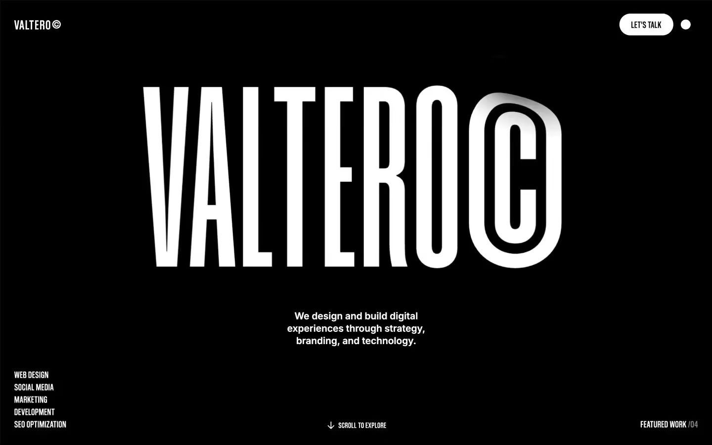
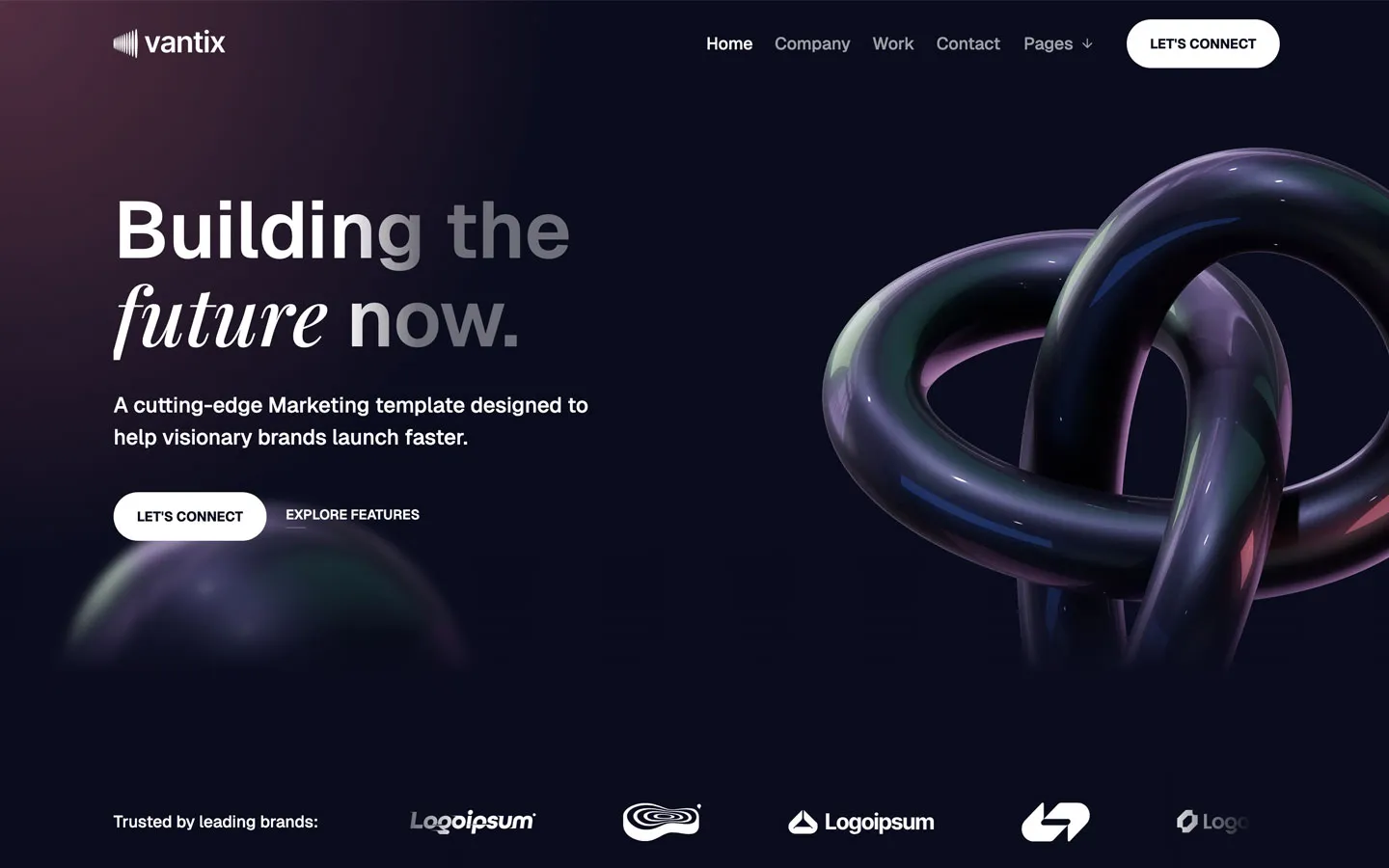
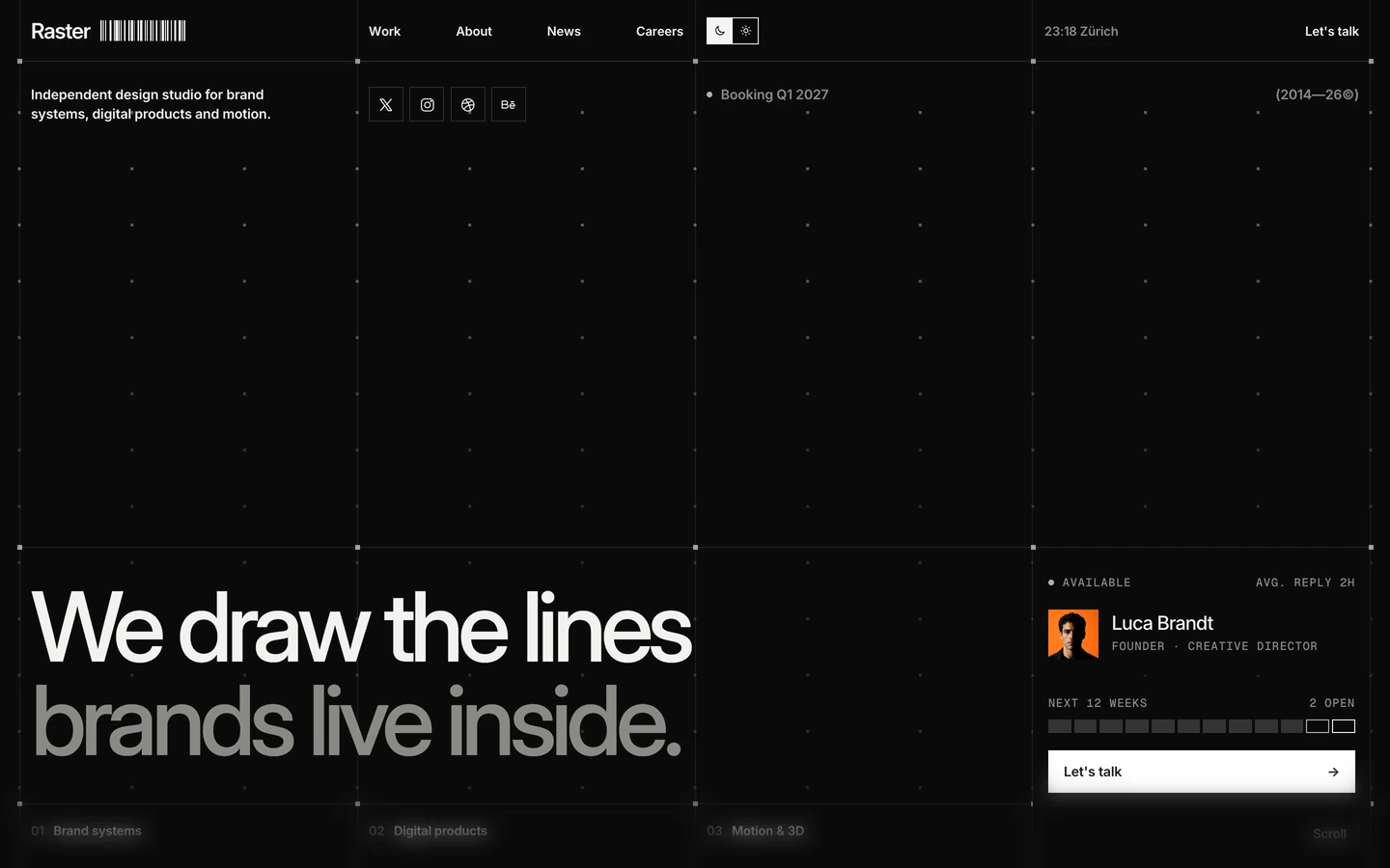
Agency design systems, the same colors first.

Bring any of them to your AI tool
All Access unlocks all 398 design systems, ready for Claude, ChatGPT, Gemini, Cursor, v0 and Lovable, plus 400+ templates on all 5 platforms.
Get All AccessUpgrade to All AccessHow to use the Dusk design system
Pick a file to see what it’s for and where it goes.
What it is
The whole design system in one markdown file, written for AI: every color, type style, spacing value, component and motion rule, plus do's, don'ts and a ready prompt.
Best for
Claude, ChatGPT, Gemini, Cursor and v0, or any other AI tool that builds pages or code.
How to use it
- Put
DESIGN.mdin your project and mention it in your request, or save it as.cursor/rules/dusk.mdc - For the rule file, start it with a front-matter block that sets
alwaysApply: true, so every chat uses it - Ask: “Build a pricing page using DESIGN.md.” Cursor follows the colors, fonts, spacing and rules
- Put
DESIGN.mdin the project root - Add one line to
CLAUDE.md: “Follow DESIGN.md for all UI.” - Ask for any page or component; Claude reads the file first
- Attach
DESIGN.mdto the chat (or paste it in) - Ask: “Build a landing page in this design system.”
- Keep the file in the chat or project knowledge, so follow-up pages stay on style
What it is
Every token as data, in the W3C Design Tokens format: colors with their roles, type styles, radius, spacing, and component tokens that point at them.
Best for
Figma (Tokens Studio), Style Dictionary and other design-token tools, and build scripts.
How to use it
- In Figma, open Tokens Studio, choose Import, and pick
tokens.json - Or point Style Dictionary’s
sourceat it to generate tokens for any platform - In code, import it like any JSON file
What it is
A Tailwind CSS v4 theme: every color, font, type style, radius and spacing value becomes a Tailwind utility, like bg-canvas, text-headline-lg or rounded-md.
Best for
Tailwind v4 projects, and AI builders that write Tailwind (v0, Lovable, Bolt).
How to use it
- Save
theme.cssnext to your main CSS file - Import it after Tailwind:
@import "tailwindcss"; @import "./theme.css"; - Use the classes:
bg-canvas text-ink rounded-md p-lg
What it is
The same tokens as plain CSS variables on :root. Component values point at the color variables, so changing one color updates everything that uses it.
Best for
Any website: plain CSS, Webflow custom code, Framer, WordPress.
How to use it
- Add it to your stylesheet, or in Webflow paste it into Site settings → Custom code inside a
<style>tag - Use the variables anywhere:
color: var(--color-ink) - Change a token once and every place that uses it follows