 flowmance
Concept Design System


Concept is a black, cinematic agency site that is driven by scrolling. White Inter Tight 600 headlines grow to viewport width, a giant Work word zooms past the camera, projects slide sideways in a pinned horizontal track, and service names glide across the screen in 100px lines. All colour comes from soft pastel 3D renders (pink, coral, lavender, chrome) shown with square corners; the interface stays black, white and translucent grey.
Four signatures make it recognisable:
- The Imagine / Design / Solve. hero. A 120px three-word stack on the left over a magenta-blue fluid swirl that fades into black, with a hand-drawn white underline under Design, a green lightning scribble and a paper-plane doodle.
- Scroll scenes. Work at 10vw scales from 1.5× to 5.5× inside a 300vh pinned track, then a 400vh track moves the project cards 450% to the left.
- Square pastel renders. Project images have no radius and sit edge to edge, each a single soft 3D object on a pink, lavender or white ground.
- Service lines with slashes. Digital Design / Marketing / Illustration / Art Direction / Branding in 100px weight 500, separated by thin skewed slashes, sliding left and right as you scroll, with soft black fades at the edges.
Colors
Surfaces
#000000Page and section background (the Webflow variable is named --white but holds black)
#090909The cart drawer (with a 1px white-20% border); the only raised panel
Ink
#FFFFFFButton labels
#FFFFFFHeadlines, nav, buttons, links (--black holds white)
#FFFFFF · 70%Paragraphs (p has opacity 0.7) and the second lead in the hero
#999999Skill names and percentages; blog category tags use #979797
#FFFFFFAction
#C7C7C7 · 50%Button fill and the social icon circles that appear on hover: a translucent grey that reads as #646464 on black
#C7C7C7 · 50%Lines & effects
#FFFFFF · 22%The skewed 3px slash dividers between service words (value not in the extracted data; the slashes read as a faint grey in the screenshots)
#FFFFFF1px award rows and column rules, 2px link underlines, footer tag borders
#AAAAAA2px border on blog category tags
#000000 · 80%The 150px "view project" cursor circle (hover only; value not in the extracted data)
Typography
Inter Tight · display-work
The quick brown fox jumpsWork, scaled up on scroll (.title-6). 144px · 600 · 1.1
Inter Tight · headline-rotator
The quick brown fox jumpsProject names scrolling over each image. 64px · 600 · 1.2 · 1px
Inter Tight · title-lg
The quick brown fox jumpsLeads (.subhead), often in two tones. 28px · 600 · 1.4
Inter Tight · label
The quick brown fox jumpsButton labels. 19px · 700 · 1.05
Inter Tight · body
The quick brown fox jumpsParagraphs at 70%, stat labels, skills. 17px · 600 · 1.35
Inter Tight · eyebrow
The quick brown fox jumpsFooter tags STAY IN TOUCH, VIST US. 14px · 700 · 1.1 · 1px
Spacing & shape
| Purpose | Value |
|---|---|
| Container | max 1200px, centred; sections add 5% side padding |
| Section rhythm | 130px top and bottom (80px at ≤991, 50px at ≤767 and ≤479) |
| Breakpoints | 991px, 767px and 479px, plus a 1440px+ tweak |
Spacing scale
| Token | Value | Preview |
|---|---|---|
xs | 8px | |
sm | 15px | |
md | 30px | |
lg | 50px | |
xl | 60px | |
2xl | 100px |
Layout spacing
| Token | Value | Preview |
|---|---|---|
column-gap | 30px | |
section-cta | 120px | |
section | 130px | |
hero-bottom | 160px | |
hero-top | 180px |
Border radius
Surfaces
How the surfaces stack, from the page background up. Hex codes and roles are in Colors above.
Motion
| Fade-up on scroll | opacity 0 → 1, 1000–1250ms outQuart; y → 0, 1000ms outQuart |
| `Work` zoom | Scale up (about 1.5 → 5.5) scrubbed through a 300vh pinned track; a black cover then shrinks in width (about 800ms) |
| Horizontal projects | Cards move left (about x 0 → −450%) scrubbed through a 400vh pinned track |
| Service marquee | Rows move sideways (about ±30–50px) with page scroll |
| Project name loop | Scrolls x 0 → −100% on a slow linear loop (about 40s); fades in on hover in 300ms ease |
| View-project cursor | Follows the mouse; scales 0 → 1 on enter and back to 0 on leave (about 600ms in, 400ms out) |
| Button hover | Label slides up out, arrow slides up in, about 500ms |
| Menu | Panel slides down, about 500ms; links rise y 200% → 0 with skewY 7° → 0°, 1100ms outQuint |
| Social icons | Circle scales in on hover; the icon scales to 0.8, 300ms outQuad |
| Skill bars | Width 0 → n%, 500ms ease |
Do’s and don’ts
- Keep the page on #000000 with white #FFFFFF Inter Tight 600 headlines.
- Set paragraphs and second halves of leads at 70% white.
- Use the translucent grey pill (#C7C7C7 at 50%, 30px radius, white 19px / 700) for every filled button.
- Show images with square corners and a single pastel 3D object.
- Use vw sizes for the biggest words so they fill the width (Work 10vw, stats 9vw, CTA 7vw).
- Separate inline service words with thin skewed slashes at 22% white.
- Round images or add borders to them.
- Add an accent colour to buttons, links or icons; colour belongs to the renders.
- Add drop shadows or light surfaces; the only grey is the translucent pill and icon circles.
- Put the grey pill on a light image or light surface: white text passes (about 5.9:1) only because the 50% grey sits on black. Keep its labels 19px / 700.
- Use the #999999 skill grey for paragraphs; it is for small labels next to white values.
- Trust the Webflow variable names: --white is black and --black is white.
- Run long scroll scenes on tablet and phone; below 991px turn the pinned tracks into normal lists (suggested).
Example prompt
Any page in the Concept style
More design systems like this
Agency design systems, the same colors first.
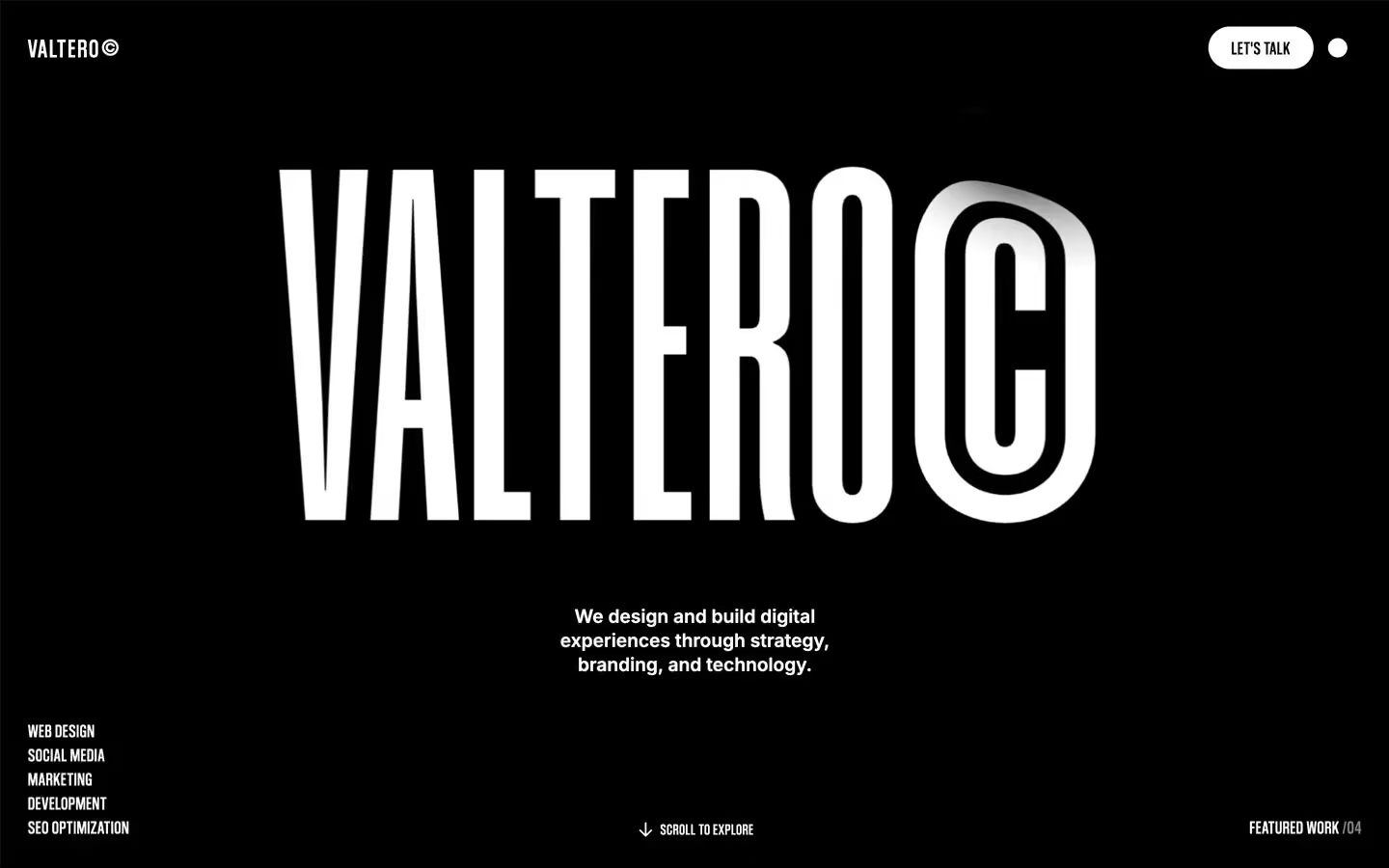
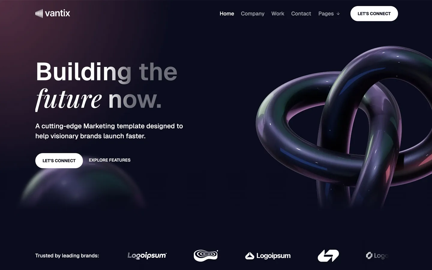
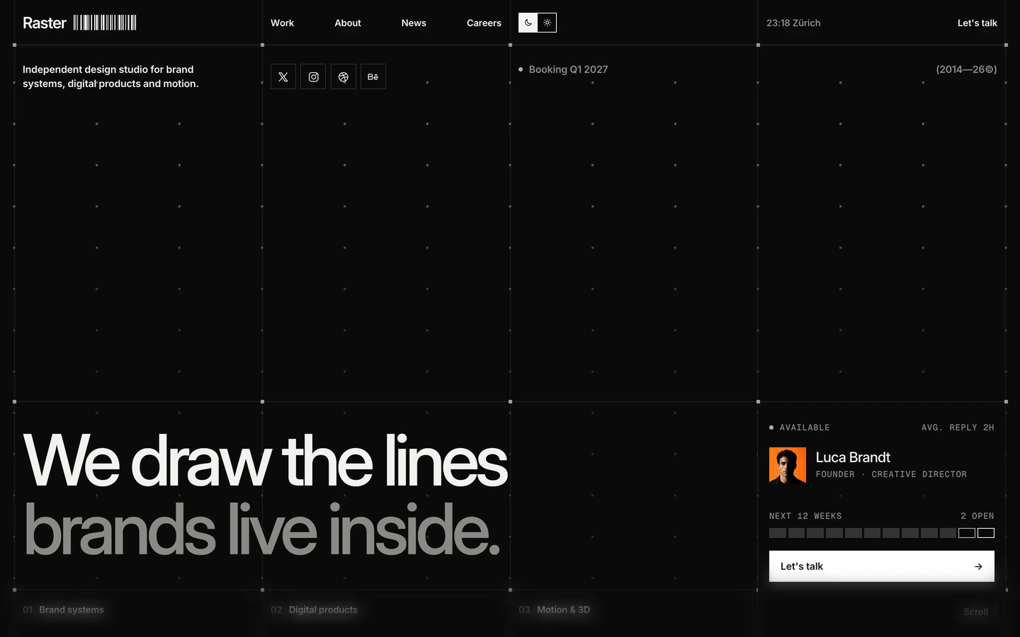

Bring any of them to your AI tool
All Access unlocks all 398 design systems, ready for Claude, ChatGPT, Gemini, Cursor, v0 and Lovable, plus 400+ templates on all 5 platforms.
Get All AccessUpgrade to All AccessHow to use the Concept design system
Pick a file to see what it’s for and where it goes.
What it is
The whole design system in one markdown file, written for AI: every color, type style, spacing value, component and motion rule, plus do's, don'ts and a ready prompt.
Best for
Claude, ChatGPT, Gemini, Cursor and v0, or any other AI tool that builds pages or code.
How to use it
- Put
DESIGN.mdin your project and mention it in your request, or save it as.cursor/rules/concept.mdc - For the rule file, start it with a front-matter block that sets
alwaysApply: true, so every chat uses it - Ask: “Build a pricing page using DESIGN.md.” Cursor follows the colors, fonts, spacing and rules
- Put
DESIGN.mdin the project root - Add one line to
CLAUDE.md: “Follow DESIGN.md for all UI.” - Ask for any page or component; Claude reads the file first
- Attach
DESIGN.mdto the chat (or paste it in) - Ask: “Build a landing page in this design system.”
- Keep the file in the chat or project knowledge, so follow-up pages stay on style
What it is
Every token as data, in the W3C Design Tokens format: colors with their roles, type styles, radius, spacing, and component tokens that point at them.
Best for
Figma (Tokens Studio), Style Dictionary and other design-token tools, and build scripts.
How to use it
- In Figma, open Tokens Studio, choose Import, and pick
tokens.json - Or point Style Dictionary’s
sourceat it to generate tokens for any platform - In code, import it like any JSON file
What it is
A Tailwind CSS v4 theme: every color, font, type style, radius and spacing value becomes a Tailwind utility, like bg-canvas, text-headline-lg or rounded-md.
Best for
Tailwind v4 projects, and AI builders that write Tailwind (v0, Lovable, Bolt).
How to use it
- Save
theme.cssnext to your main CSS file - Import it after Tailwind:
@import "tailwindcss"; @import "./theme.css"; - Use the classes:
bg-canvas text-ink rounded-md p-lg
What it is
The same tokens as plain CSS variables on :root. Component values point at the color variables, so changing one color updates everything that uses it.
Best for
Any website: plain CSS, Webflow custom code, Framer, WordPress.
How to use it
- Add it to your stylesheet, or in Webflow paste it into Site settings → Custom code inside a
<style>tag - Use the variables anywhere:
color: var(--color-ink) - Change a token once and every place that uses it follows