 flowmance
BOLDZ Design System


BOLDZ is a loud, poster-like agency site. Almost everything big is set in Coolvetica Condensed, uppercase and enormous (17vw in the hero, 288px in the marquee), on a soft #121212 black. Between the shouting there is calm: Instrument Sans statements, square full-colour photos with no rounding, and plain #222222 blocks for buttons. Photography brings the colour: neon portraits, electric blue, saturated red, a flat yellow tile.
Four signatures make it recognisable:
- Three-line hero with an outlined middle. BOLDZ™ / DIGTIAL / AGENCY © stacked at 17vw, line height 0.9. The middle line is drawn as a white outline (fill #121212), the other two are solid white. Two tilted photos (a black-and-white VR portrait left, a neon-glasses portrait on blue right) hang off the edges.
- The pill ©. In Coolvetica the © reads as a tall rounded capsule with a C inside. It sits after AGENCY, before DESIGN in the marquee, and on its own as a section title word.
- Scrolling word marquees. Rows of 288px uppercase words (BRANDING, ©DESIGN) run across the page, broken by a white rounded square with a black play triangle.
- Dot navigation. Each nav link has a small white dot before it (a 30px white circle when it opens up on hover), with the logo mark centred and Cart | 0 on the far right.
BOLDZ is dark-only. It is a Webflow Ecommerce build (plans, package products, checkout).
Colors
Surfaces
#121212Page, sections, testimonial slide, footer (--main-color)
#222222The CONTACT US button face and .button
#191919Contact inputs
#FFFFFFNav dots, the white project label chips, the form submit, the play tile
Ink
#FFFFFF#FFFFFF#FFFFFFHeadlines, nav, outline strokes
#FFFFFF · 70%Paragraphs (p { opacity: .7 })
#FFFFFF · 55%Dates, roles, meta (.data-text)
#FFFFFF · 50%The grey phrase inside the testimonial quote (.gray-text)
#FFFFFF · 33%01 02 03 indexes in the services list
#FFFFFF#121212Text on inverse-canvas
Action
#222222The CONTACT US button face and .button
#222222.button and its hover
#444444With secondary: .button and its hover
Lines & effects
#111111The end colour of marquee edge fades
#FFFFFF · 15%Cart and slider dividers
#FFFFFF · 12%Input borders
#E7EEEE1px top rule on each services row (renders as a dim hairline in the screenshots)
#000000 · 30%Overlays on work and blog images
Typography
Coolvetica Condensed · display-marquee · shown in Oswald (fallback)
The quick brown fox jumpsMarquee words (15 instances). 288px · 400 · 1.2 · 2px
Instrument Sans · headline-lg
The quick brown fox jumpsThe statement High caliber brands need advanced capabilities. 50px · 600 · 1.3
Coolvetica Condensed · title-name · shown in Oswald (fallback)
The quick brown fox jumpsTestimonial names and roles. 22px · 400 · 0.9 · 1px
Instrument Sans · body
The quick brown fox jumpsParagraphs at 70%. 21px · 500 · 1.3
Instrument Sans · label
The quick brown fox jumpsNav links. 17px · 500 · 1.18
Instrument Sans · caption
The quick brown fox jumpsDates and meta at 55%. 14px · 600 · 1.3
Spacing & shape
| Purpose | Value |
|---|---|
| Container | max 1440px, so content runs nearly edge to edge; side padding 3% (43px at 1440) |
| Section rhythm | 150px top and bottom (.section, 100px at ≤479px, side padding stays 3%); the work section 200px with 35px sides (100px top and bottom at ≤991px, 3% sides at ≤479px); one section starts at only 50px to follow the marquee |
| Breakpoints | 991, 767 and 479px (Webflow defaults), plus ≥1280px |
Spacing scale
| Token | Value | Preview |
|---|---|---|
xs | 9px | |
sm | 16px | |
md | 20px | |
lg | 25px | |
xl | 40px | |
2xl | 70px | |
3xl | 120px |
Layout spacing
| Token | Value | Preview |
|---|---|---|
column-gap | 16px | |
section-gutter | 43px | |
section | 150px | |
section-work | 200px |
Border radius
Surfaces
How the surfaces stack, from the page background up. Hex codes and roles are in Colors above.
Motion
| Headline word reveal | Skew y 15° → 0°, 1000ms outExpo; words rise y 120% → 0%, 1000–1400ms outExpo |
| Hero photo tilt | Rotate, 600ms outExpo on load; mouse-move parallax |
| Drop-in | y −100% → 0, 800ms swingFrom (a slight overshoot) |
| Fade-up | opacity 0 → 1 with move to 0, 0, 1000ms outQuart |
| Slide-in | x −30px → 0, 500ms outQuart; x 30px → 0, 800ms outExpo |
| Nav dot / colour change | Size, 500ms; background colour, 500ms inOutQuart |
| Accordion | 0.8s cubic-bezier(0.215, 0.61, 0.355, 1) |
| Button press | transform .2s |
| Marquee | Scroll-linked horizontal move of the word rows |
Do’s and don’ts
- Set every big word in Coolvetica Condensed, uppercase, with +2–3px tracking and line height 0.9–1.2.
- Outline one line of a stacked display title (white stroke, #121212 fill) and keep the others solid.
- Keep the page #121212 and use #222222 only for button faces.
- Keep photos square with 0px corners and one strong hue each.
- Use Instrument Sans for statements, quotes and paragraphs, with paragraphs at 70% white.
- Use the pill © and ™ as part of the brand voice.
- Use Coolvetica in lowercase or for paragraphs, or Instrument Sans in all caps above the 12px tags.
- Round images, cards or buttons.
- Add an accent colour to the interface; the photos supply colour.
- Put ink-faint (33%) on anything smaller than the 34px indexes; it is below 3:1 on #121212.
- Add drop shadows.
- Ship the DIGTIAL typo.
Example prompt
Any page in the BOLDZ style
More design systems like this
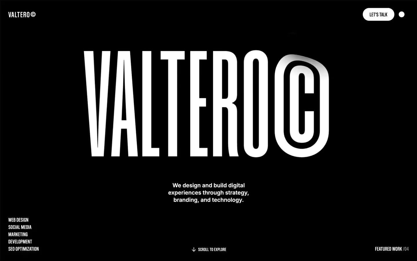
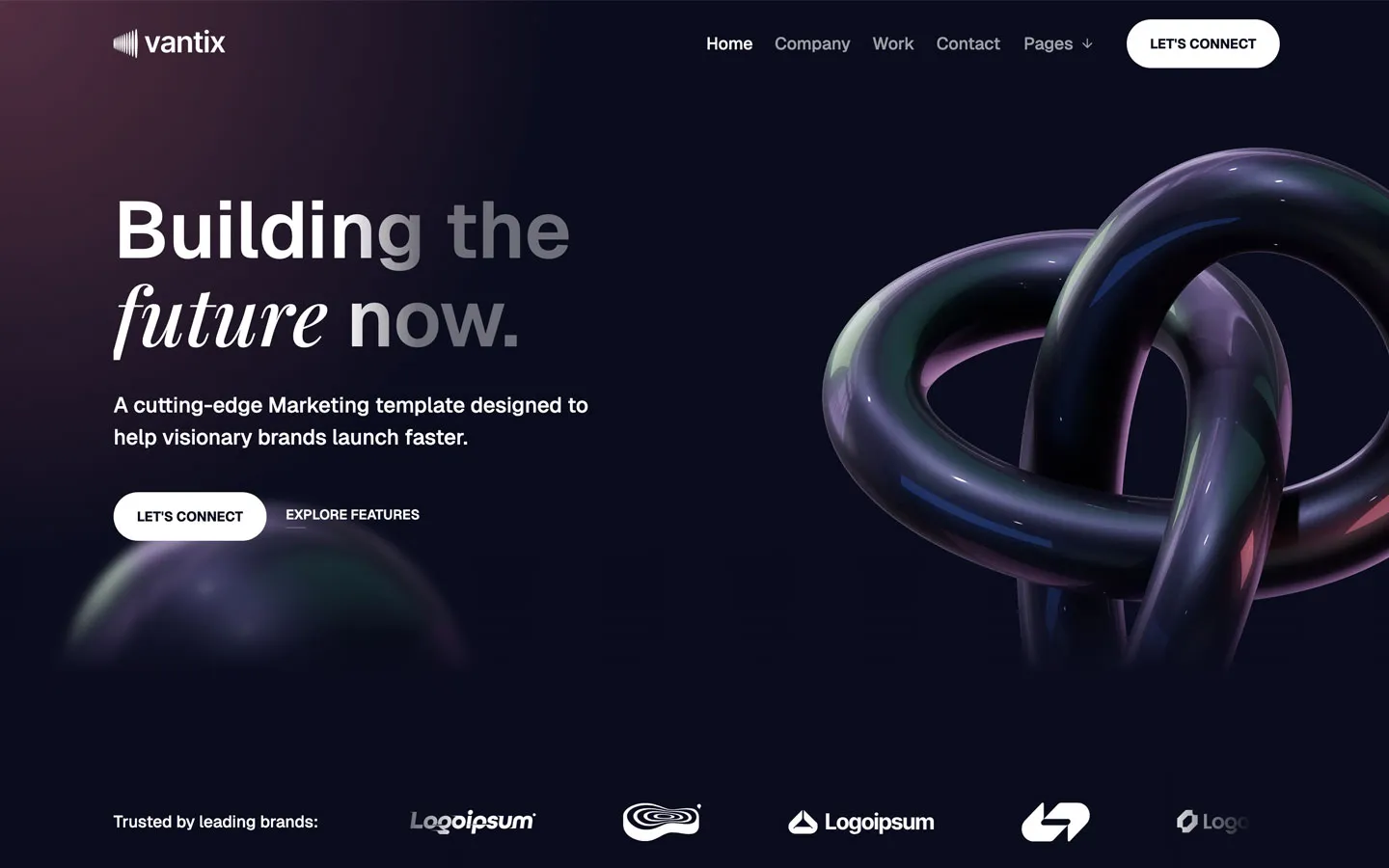
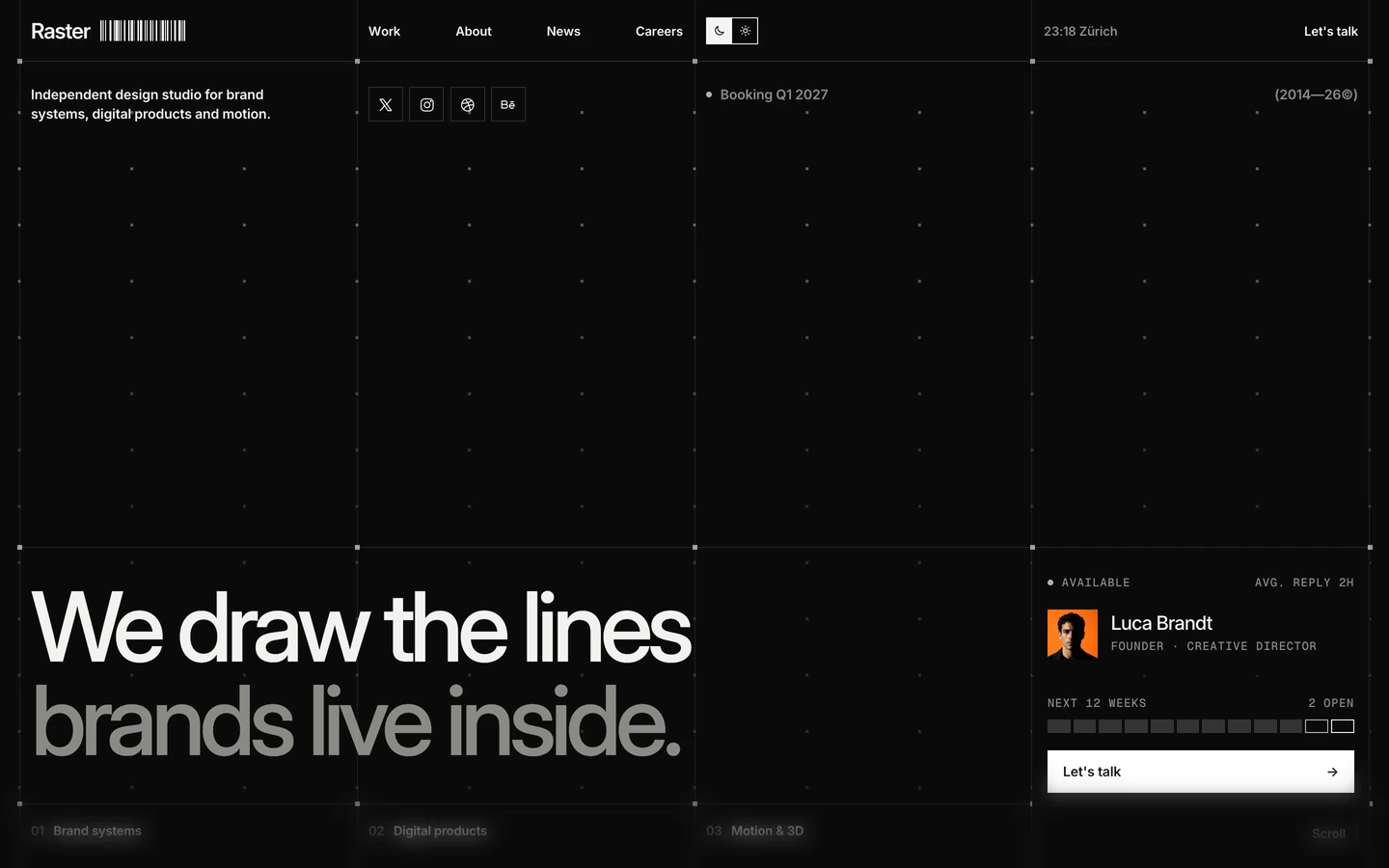
Agency design systems, the same colors first.

Bring any of them to your AI tool
All Access unlocks all 398 design systems, ready for Claude, ChatGPT, Gemini, Cursor, v0 and Lovable, plus 400+ templates on all 5 platforms.
Get All AccessUpgrade to All AccessHow to use the BOLDZ design system
Pick a file to see what it’s for and where it goes.
What it is
The whole design system in one markdown file, written for AI: every color, type style, spacing value, component and motion rule, plus do's, don'ts and a ready prompt.
Best for
Claude, ChatGPT, Gemini, Cursor and v0, or any other AI tool that builds pages or code.
How to use it
- Put
DESIGN.mdin your project and mention it in your request, or save it as.cursor/rules/boldz.mdc - For the rule file, start it with a front-matter block that sets
alwaysApply: true, so every chat uses it - Ask: “Build a pricing page using DESIGN.md.” Cursor follows the colors, fonts, spacing and rules
- Put
DESIGN.mdin the project root - Add one line to
CLAUDE.md: “Follow DESIGN.md for all UI.” - Ask for any page or component; Claude reads the file first
- Attach
DESIGN.mdto the chat (or paste it in) - Ask: “Build a landing page in this design system.”
- Keep the file in the chat or project knowledge, so follow-up pages stay on style
What it is
Every token as data, in the W3C Design Tokens format: colors with their roles, type styles, radius, spacing, and component tokens that point at them.
Best for
Figma (Tokens Studio), Style Dictionary and other design-token tools, and build scripts.
How to use it
- In Figma, open Tokens Studio, choose Import, and pick
tokens.json - Or point Style Dictionary’s
sourceat it to generate tokens for any platform - In code, import it like any JSON file
What it is
A Tailwind CSS v4 theme: every color, font, type style, radius and spacing value becomes a Tailwind utility, like bg-canvas, text-headline-lg or rounded-md.
Best for
Tailwind v4 projects, and AI builders that write Tailwind (v0, Lovable, Bolt).
How to use it
- Save
theme.cssnext to your main CSS file - Import it after Tailwind:
@import "tailwindcss"; @import "./theme.css"; - Use the classes:
bg-canvas text-ink rounded-md p-lg
What it is
The same tokens as plain CSS variables on :root. Component values point at the color variables, so changing one color updates everything that uses it.
Best for
Any website: plain CSS, Webflow custom code, Framer, WordPress.
How to use it
- Add it to your stylesheet, or in Webflow paste it into Site settings → Custom code inside a
<style>tag - Use the variables anywhere:
color: var(--color-ink) - Change a token once and every place that uses it follows