 flowmance
Bangkok Design System


Bangkok is a loud, graphic agency and portfolio site built from black and white only. It feels like a printed gig poster: wide Unbounded capitals that fill the screen edge to edge, a nav drawn as boxes of heavy 2px black lines, and a black work band where a giant title slides past before the colourful 3D renders appear. Every colour on the page comes from the images.
Four signatures make it recognisable:
- Boxed line nav. The header is a row of cells drawn with 2px black lines: the Bangkøk logo in a left cell with a bottom rule, a centre cell with side and bottom rules holding HOME ABOUT NEWS CONTACT in 18px Unbounded caps, and an empty right cell with a bottom rule. Each cell is 130px tall, inset 10px from the window.
- Billboard Unbounded. The hero title DIGITAL / STUDIO is 150px weight 500 caps, and the work band title RECENT WORK runs at 20vw (288px at 1440) weight 600, wider than the screen, sliding sideways as you scroll.
- Outlined pills. The call to action is LET'S TALK: a 2px black outline pill (50px radius, 48px tall) with 13px Unbounded caps that fills black on hover.
- Fixed black footer. The footer is a full-height black panel fixed behind the page, uncovered as the last section scrolls away.
Colors
Surfaces
#FFFFFFPage background
#F5F5F5The lightest grey step: the Send Message button fill
#000000The work band and the fixed footer
#777777Form placeholders
Ink
#000000Text on primary
#000000Text on secondary
#000000Headlines, nav, button outlines
#222222Blockquotes and the text of the white .button (--black-second)
#888A8BParagraphs and the faded half of the hero lead (--grey)
#FFFFFFText on inverse-canvas
#FFFFFF · 50%Small meta text in the footer
#FFFFFFAction
#FFFFFFThe outlined pill: white (transparent) inside, black text and 2px black border
#000000The pill fills black on hover (.button-rounded:hover), text turns white
#F5F5F5The contact form's Send Message button (same value as surface-1)
#FF0E0ERound remove button in the cart
Lines & effects
#EEEEEECircles of about 40px behind the social icons (no text sits on it)
#0000002px rules in the nav and above the hero footer row
#222222Shop cart panel and its dividers
#333333Shop cart panel and its dividers
Typography
Unbounded · display-section
The quick brown fox jumpsRECENT WORK (.title-4, font-size: 20vw). 288px · 600 · 1.1
Unbounded · headline-marquee
The quick brown fox jumpsProject names running across the bottom of each image (NIGHT DESERT). 60px · 600 · 1.2 · 1px
Inter Tight · body-xl
The quick brown fox jumpsHero lead and the footer line I'm always here and ready to communicate. 26px · 600 · 1.5
Unbounded · title-md
The quick brown fox jumpsPrices. 24px · 600 · 1.88
Unbounded · label-nav
The quick brown fox jumpsNav links. 18px · 600 · 1.78
Unbounded · micro
The quick brown fox jumpsPage default. 14px · 700 · 1.43
Spacing & shape
| Purpose | Value |
|---|---|
| Container | max 1200px, centred, a flex column |
| Breakpoints | 991px, 767px and 479px, plus a min-width: 768px step |
Spacing scale
| Token | Value | Preview |
|---|---|---|
hair | 10px | |
sm | 15px | |
md | 20px | |
lg | 30px | |
xl | 40px |
Layout spacing
| Token | Value | Preview |
|---|---|---|
nav-cell | 130px | |
section | 130px | |
hero-bottom | 150px | |
hero-top | 190px |
Border radius
Surfaces
How the surfaces stack, from the page background up. Hex codes and roles are in Colors above.
Motion
| Page-load intro | Elements fade and rise on page load: opacity 0 → 1, y 30px → 0, 300–500ms ease |
| Fade-up on scroll | opacity 0 → 1, y 30px → 0, 500ms |
| Text roll (nav, pills) | Label y 0% → −100% with a copy rolling in, 300ms ease, inside a 33px mask |
| Pill fill | transition: all 0.2s to a black fill |
| Nav cell bar | .button-line-first height grows, 200–500ms ease / 400ms outCubic |
| Mouse drift | Elements shift x/y ±5px, ±10px and ±30px with the cursor, 500ms |
| Sliding title | RECENT WORK moves horizontally while the band is in view |
| Project marquee | Names scroll continuously along each image |
| Image filter | A filter change on hover, 300ms ease |
| Scale pop | scale → 0, 500ms, then back → 1, 300ms ease |
Do’s and don’ts
- Keep the interface to ink #000000 and canvas #FFFFFF, with #888A8B only for paragraph text.
- Set every display word, nav link and button in Unbounded caps; keep paragraphs in Inter Tight.
- Draw structure with 2px black lines (nav cells, the hero's bottom rule) instead of cards.
- Use the outline pill (2px black, 50px radius, 48px tall) for calls to action and fill it black on hover.
- Put work on a black inverse-canvas band with square-cornered 4:3 renders and 30px gaps.
- Let one display word exceed the screen width, as RECENT WORK does at 20vw.
- Use the orange and green Webflow variables; they are not part of the visible design.
- Round images or add shadows.
- Set #888A8B (ink-muted) below 18px: it is only about 3.5:1 on white. Keep it for 18px+ paragraphs and the 26px lead.
- Mix lowercase into Unbounded or capitals into Inter Tight.
- Use 1px lines; every rule and outline on the page is 2px (only the shop cart panel has a 1px #333333 border).
- Run the marquee or sliding title when reduced motion is on.
Example prompt
Any page in the Bangkok style
More design systems like this
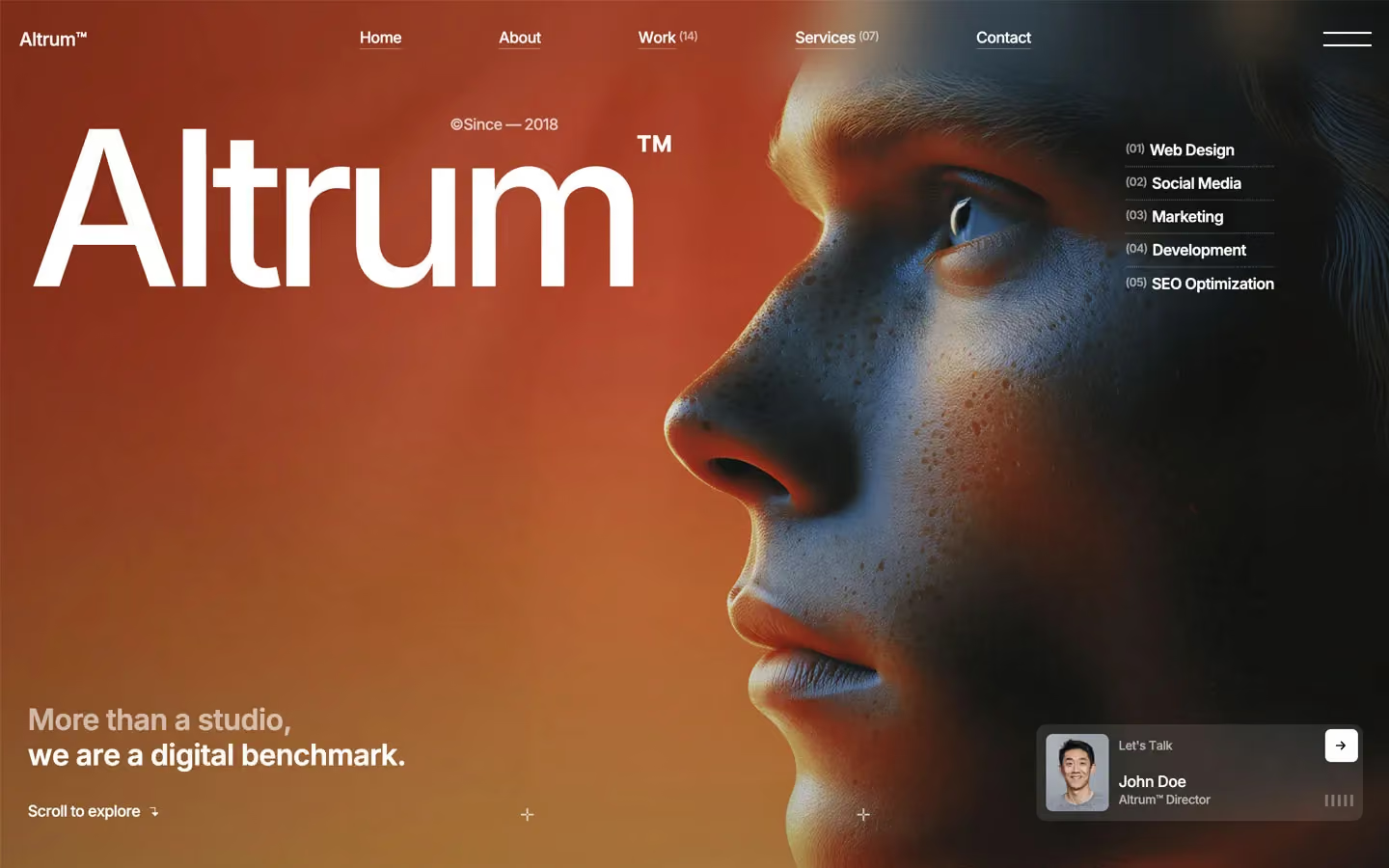
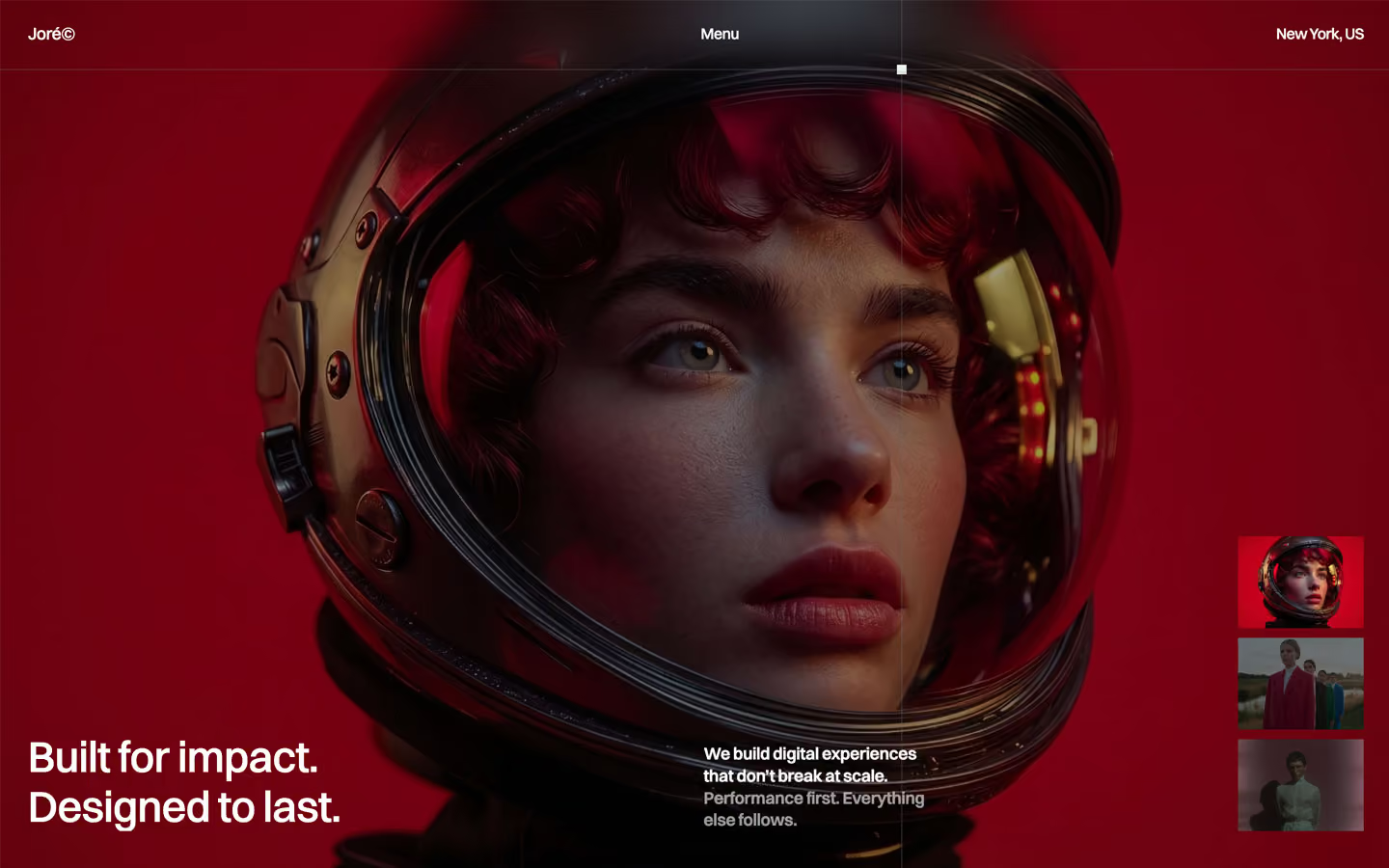
Agency design systems, the same colors first.


Bring any of them to your AI tool
All Access unlocks all 398 design systems, ready for Claude, ChatGPT, Gemini, Cursor, v0 and Lovable, plus 400+ templates on all 5 platforms.
Get All AccessUpgrade to All AccessHow to use the Bangkok design system
Pick a file to see what it’s for and where it goes.
What it is
The whole design system in one markdown file, written for AI: every color, type style, spacing value, component and motion rule, plus do's, don'ts and a ready prompt.
Best for
Claude, ChatGPT, Gemini, Cursor and v0, or any other AI tool that builds pages or code.
How to use it
- Put
DESIGN.mdin your project and mention it in your request, or save it as.cursor/rules/bangkok.mdc - For the rule file, start it with a front-matter block that sets
alwaysApply: true, so every chat uses it - Ask: “Build a pricing page using DESIGN.md.” Cursor follows the colors, fonts, spacing and rules
- Put
DESIGN.mdin the project root - Add one line to
CLAUDE.md: “Follow DESIGN.md for all UI.” - Ask for any page or component; Claude reads the file first
- Attach
DESIGN.mdto the chat (or paste it in) - Ask: “Build a landing page in this design system.”
- Keep the file in the chat or project knowledge, so follow-up pages stay on style
What it is
Every token as data, in the W3C Design Tokens format: colors with their roles, type styles, radius, spacing, and component tokens that point at them.
Best for
Figma (Tokens Studio), Style Dictionary and other design-token tools, and build scripts.
How to use it
- In Figma, open Tokens Studio, choose Import, and pick
tokens.json - Or point Style Dictionary’s
sourceat it to generate tokens for any platform - In code, import it like any JSON file
What it is
A Tailwind CSS v4 theme: every color, font, type style, radius and spacing value becomes a Tailwind utility, like bg-canvas, text-headline-lg or rounded-md.
Best for
Tailwind v4 projects, and AI builders that write Tailwind (v0, Lovable, Bolt).
How to use it
- Save
theme.cssnext to your main CSS file - Import it after Tailwind:
@import "tailwindcss"; @import "./theme.css"; - Use the classes:
bg-canvas text-ink rounded-md p-lg
What it is
The same tokens as plain CSS variables on :root. Component values point at the color variables, so changing one color updates everything that uses it.
Best for
Any website: plain CSS, Webflow custom code, Framer, WordPress.
How to use it
- Add it to your stylesheet, or in Webflow paste it into Site settings → Custom code inside a
<style>tag - Use the variables anywhere:
color: var(--color-ink) - Change a token once and every place that uses it follows