A practical client workflow for adapting a Webflow template: discovery, content, CMS, components, accessibility, responsive QA, forms, SEO, and handoff.
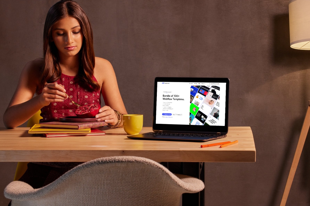
A professional client website does not need to start from zero. A good Webflow template can remove a lot of setup work, but only if the team treats it as a framework rather than a finished design.
The difference is in the process. Here is the workflow we would use when adapting a template for a real client.
Understand the client's offer, audience, priorities, existing content, competitors, and what the site needs to achieve. Decide which pages matter and which actions visitors should take.
This prevents the project from becoming “how do we fill the sections in this template?” The template should support the strategy, not dictate it.
Take the required pages and compare them with the template. Some pages can be adapted directly. Others may need to be combined, rebuilt, or removed.
Do this before spending time on polish. It is much easier to change the structure while the project is still rough.
Real copy changes the design. Service names are longer. Testimonials are messier. Project titles wrap. Team bios vary in length.
Bring those constraints into the project early so spacing, type, cards, and responsive behavior are designed around the actual site rather than placeholder content.
Update typography, colors, image direction, spacing, buttons, and recurring interface patterns together. Avoid fixing each page independently.
Webflow variables and components can help keep those decisions centralized. When the type scale or button treatment changes, the whole site should not require a manual cleanup.
Use CMS Collections for content the client will repeat or maintain: projects, articles, jobs, team members, locations, properties, or other structured items.
Do not make the CMS more complicated than the client needs. Good field names and a small number of useful fields make handoff much smoother.
Check text contrast, heading order, button labels, keyboard focus, form labels, image alt text, and interactive states before the final QA week.
Accessibility problems are much easier to solve when they are part of the design process rather than a last-minute patch.
A template may include motion that was designed for a completely different personality. Keep what helps. Remove what feels decorative or slows the experience.
It is often better to have a few well-chosen interactions than preserve every animation from the demo.
A form is not finished when the success message appears. Confirm where submissions go, who receives them, whether any automation works, and whether the client can manage the process after handoff.
The same applies to scheduling tools, newsletter forms, analytics, CRM integrations, and embeds.
Changing typography, content length, imagery, and section order changes the assumptions behind the original responsive design. Test the finished version again from scratch.
Check large desktop, normal laptop, tablet, and mobile, plus the widths in between. A 13-inch laptop often exposes problems that a wide design canvas hides.
Professional delivery is often about details visitors barely notice when they are correct:
Before launch, make the site understandable to the client. Clean up class names, remove unused demo content, organize CMS fields, and show the client the parts they will actually edit.
A site is not easier to maintain just because it was built visually. The structure still needs to make sense.
If the project still feels like the demo with a new logo, the customization stopped too early. If the useful structure remains but the hierarchy, content, image direction, typography, and interactions feel specific to the client, the template has saved time without becoming the identity.
For current starting points, browse Flowmance Webflow templates.


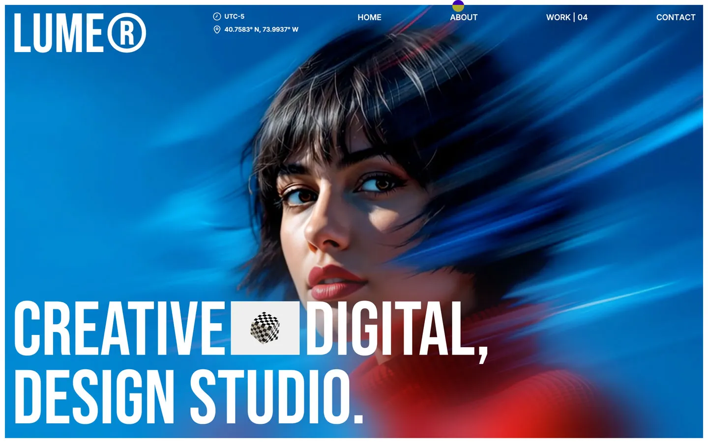
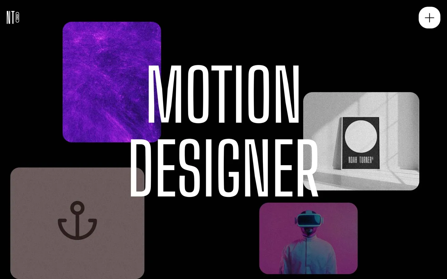
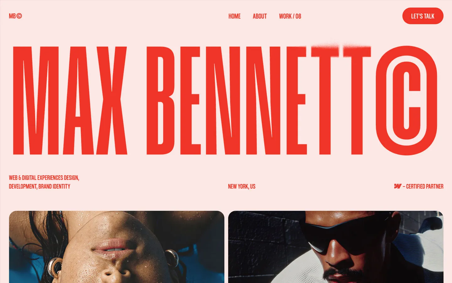


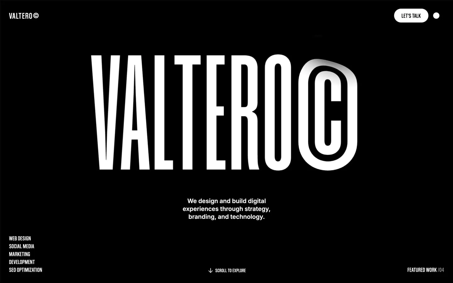
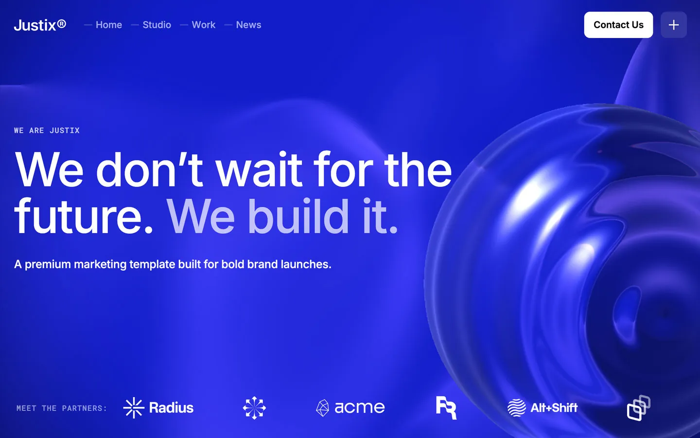


Don’t miss out on our superb, customizable templates designed to enhance your web design experience. We constantly add new templates and components.

Explore stunning Webflow, Framer, HTML5, Next.js and Figma templates designed to spark your next big idea.


*Rest assured that your data is safe with us, and you'll only hear from us 1 time per month.