 flowmance
Vellmar Design System
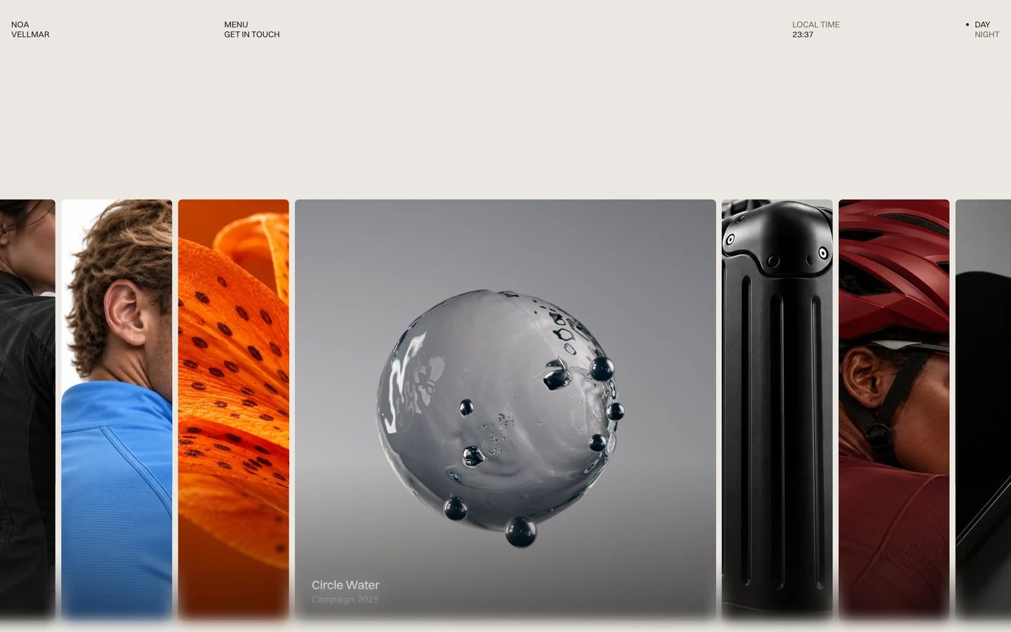
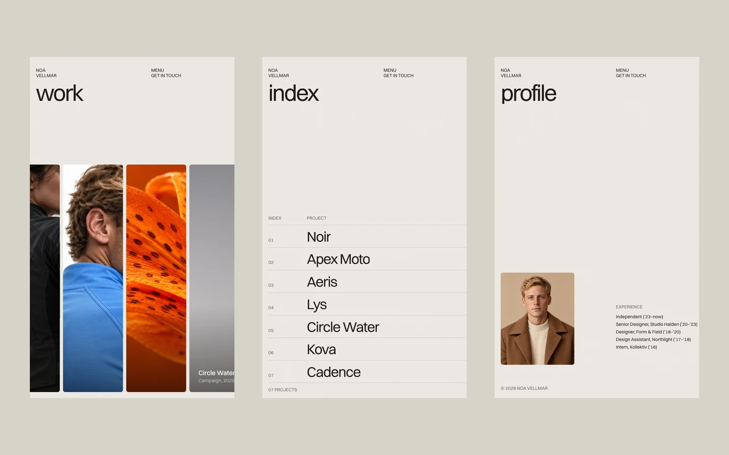
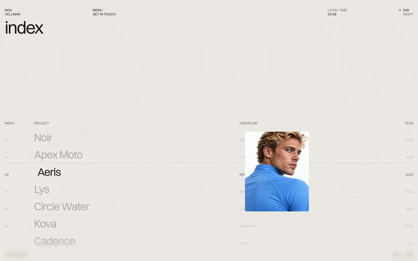
Vellmar is a one-screen portfolio for an independent designer. The home view does not scroll: a warm stone canvas, four tiny label pairs across the top, and one row of tall media strips filling the lower two thirds of the screen. One strip is open as a large square tile with a white title and year; the others stay narrow, edge to edge with 8px gaps, and bleed off both sides of the viewport. Almost all of the visual weight is the work itself.
Three signatures make it recognisable:
- The strip slider. A 14-column row of media strips, 8px apart, with 6px corners. One opens to about 600×600px while the rest are about 158px wide, and opening another one slides the row in 0.6s.
- Stacked label pairs. The header is four pairs of 12px uppercase words, one under the other: NOA / VELLMAR, MENU / GET IN TOUCH, LOCAL TIME / 01:27, • DAY / NIGHT. There is no logo mark and no bar.
- Lowercase page titles. The other views (work, index, profile) open as tiles from the menu with a 60px lowercase title at −3.3px tracking.
The four screenshots are the same 900px view, which does not scroll, but the row moves on by itself between them: the open tile cycles through Circle Water (Campaign, 2025), Apex Moto (Campaign, 2026) and Noir (Digital product, 2026), and the narrow strips shift order around it. The clock also ticks, with its colon blinking off (02 41).
Colors
Surfaces
#EBE8E1Page background
#DFDBD2Tile backgrounds behind media (shows while media loads)
#D6D2C8Menu overlay
#1D1C19The small dot beside the active theme option
Ink
#1D1C19Text on primary
#1D1C19All header labels, titles, bio text
#1D1C19Same as ink: body text is full ink, there is no separate body grey
#6B665CLOCAL TIME, the inactive NIGHT, secondary labels
#FFFFFFTile titles and meta set on images
Action
#EBE8E1Set to the canvas: there are no filled buttons
#EBE8E1Lines & effects
#1D1C19 · 14%1px rules in lists (index and profile views)
#0A0805 · 55%Darkening layer over media behind white captions
Typography
Switzer · display-page
The quick brown fox jumpsPage titles work, index, profile (3 uses, in the menu views). 60px · 400 · 1.0 · -3.3px
Switzer · headline
The quick brown fox jumpsLarge lines in the index and profile views (7 uses). 37px · 400 · 1.0 · -1.68px
Switzer · body-xl
The quick brown fox jumpsProfile bio: Noa Vellmar is an independent digital designer based in Lisbon… (47 uses). 23px · 400 · 1.2 · -0.35px
Switzer · title
The quick brown fox jumpsTile titles: Circle Water, Kova, Cadence. 17px · 500 · 1.0 · -0.17px
Switzer · caption
The quick brown fox jumpsTile meta: Campaign, 2025. 13px · 400 · 1.0
Switzer · label
The quick brown fox jumpsHeader labels, menu links (87 uses). 12px · 400 · 1.0
Spacing & shape
| Purpose | Value |
|---|---|
| Breakpoints | Webflow defaults (991, 767, 479) |
Spacing scale
| Token | Value | Preview |
|---|
Layout spacing
| Token | Value | Preview |
|---|---|---|
gap | 8px | |
gutter | 16px |
Border radius
Surfaces
How the surfaces stack, from the page background up. Hex codes and roles are in Colors above.
Motion
| Strip open/close | transform 0.6s cubic-bezier(0.22, 1, 0.36, 1), neighbours delayed 0.05s |
| Label roll | top 0.6s cubic-bezier(0.22, 1, 0.36, 1) on the duplicated label |
| Caption in | opacity, filter (blur) and transform, 0.35s |
| View reveal | opacity 0.6s and filter 0.6s after 0.2s, transform 0.8s cubic-bezier(0.22, 1, 0.36, 1) after 0.2s |
| Fades | opacity 0.4s; color 0.4s on labels |
| Clock colon | opacity → 0.3, 1s sine.inOut, repeating |
| Cursor follow | x / y quickTo, 0.7s power3 |
| Auto-advance | The row moves on by itself about every 10s |
Do’s and don’ts
- Keep the home view to one screen: header labels on top, one strip row at the bottom.
- Use #EBE8E1 for the canvas and #1D1C19 for all text; #6B665C only for secondary labels.
- Set header text in Switzer 12px/400 uppercase, stacked in two-word pairs.
- Give every media tile a 6px radius and an 8px gap to its neighbours.
- Animate opens and rolls with cubic-bezier(0.22, 1, 0.36, 1) at 0.6s.
- Put white captions only over the #0A08058C scrim.
- Add buttons, boxes, borders or icons to the header.
- Use bold text, or weight 500 outside tile titles.
- Add shadows, gradients or blur to the UI.
- Put #6B665C text on #DFDBD2 tiles (4.1:1) or the #D6D2C8 menu (3.8:1); keep ink-subtle on the canvas, at 12px+ uppercase meta only, and use #1D1C19 on the darker surfaces.
- Use an accent colour; colour belongs to the media.
- Invent night-mode colours; only the day theme is measured.
Example prompt
Any page in the Vellmar style
More design systems like this
Portfolio design systems, the same colors first.




Bring any of them to your AI tool
All Access unlocks all 398 design systems, ready for Claude, ChatGPT, Gemini, Cursor, v0 and Lovable, plus 400+ templates on all 5 platforms.
Get All AccessUpgrade to All AccessHow to use the Vellmar design system
Pick a file to see what it’s for and where it goes.
What it is
The whole design system in one markdown file, written for AI: every color, type style, spacing value, component and motion rule, plus do's, don'ts and a ready prompt.
Best for
Claude, ChatGPT, Gemini, Cursor and v0, or any other AI tool that builds pages or code.
How to use it
- Put
DESIGN.mdin your project and mention it in your request, or save it as.cursor/rules/vellmar.mdc - For the rule file, start it with a front-matter block that sets
alwaysApply: true, so every chat uses it - Ask: “Build a pricing page using DESIGN.md.” Cursor follows the colors, fonts, spacing and rules
- Put
DESIGN.mdin the project root - Add one line to
CLAUDE.md: “Follow DESIGN.md for all UI.” - Ask for any page or component; Claude reads the file first
- Attach
DESIGN.mdto the chat (or paste it in) - Ask: “Build a landing page in this design system.”
- Keep the file in the chat or project knowledge, so follow-up pages stay on style
What it is
Every token as data, in the W3C Design Tokens format: colors with their roles, type styles, radius, spacing, and component tokens that point at them.
Best for
Figma (Tokens Studio), Style Dictionary and other design-token tools, and build scripts.
How to use it
- In Figma, open Tokens Studio, choose Import, and pick
tokens.json - Or point Style Dictionary’s
sourceat it to generate tokens for any platform - In code, import it like any JSON file
What it is
A Tailwind CSS v4 theme: every color, font, type style, radius and spacing value becomes a Tailwind utility, like bg-canvas, text-headline-lg or rounded-md.
Best for
Tailwind v4 projects, and AI builders that write Tailwind (v0, Lovable, Bolt).
How to use it
- Save
theme.cssnext to your main CSS file - Import it after Tailwind:
@import "tailwindcss"; @import "./theme.css"; - Use the classes:
bg-canvas text-ink rounded-md p-lg
What it is
The same tokens as plain CSS variables on :root. Component values point at the color variables, so changing one color updates everything that uses it.
Best for
Any website: plain CSS, Webflow custom code, Framer, WordPress.
How to use it
- Add it to your stylesheet, or in Webflow paste it into Site settings → Custom code inside a
<style>tag - Use the variables anywhere:
color: var(--color-ink) - Change a token once and every place that uses it follows