 flowmance
Moka Design System

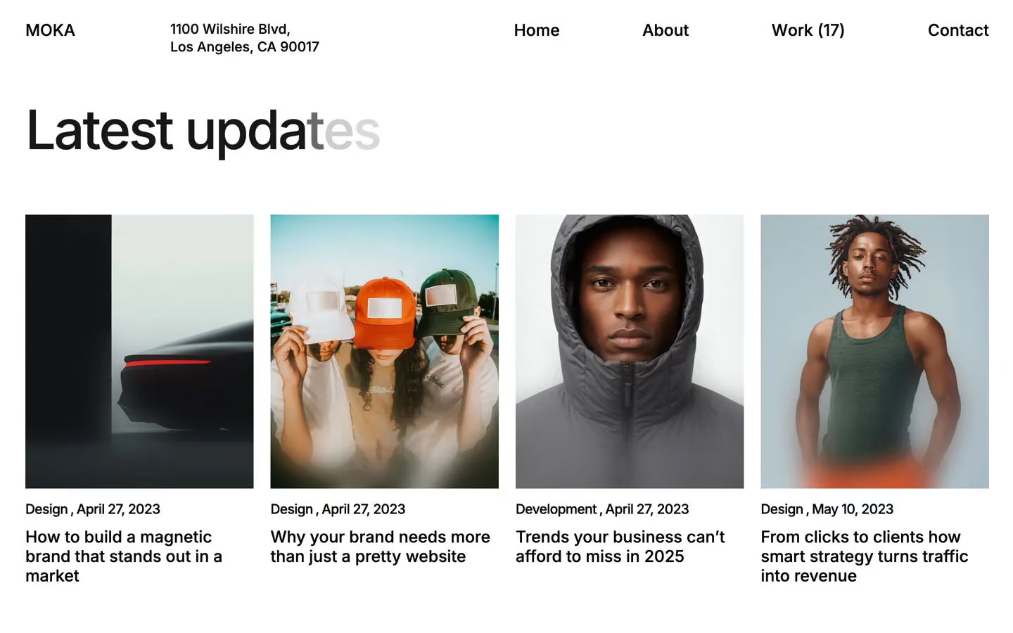
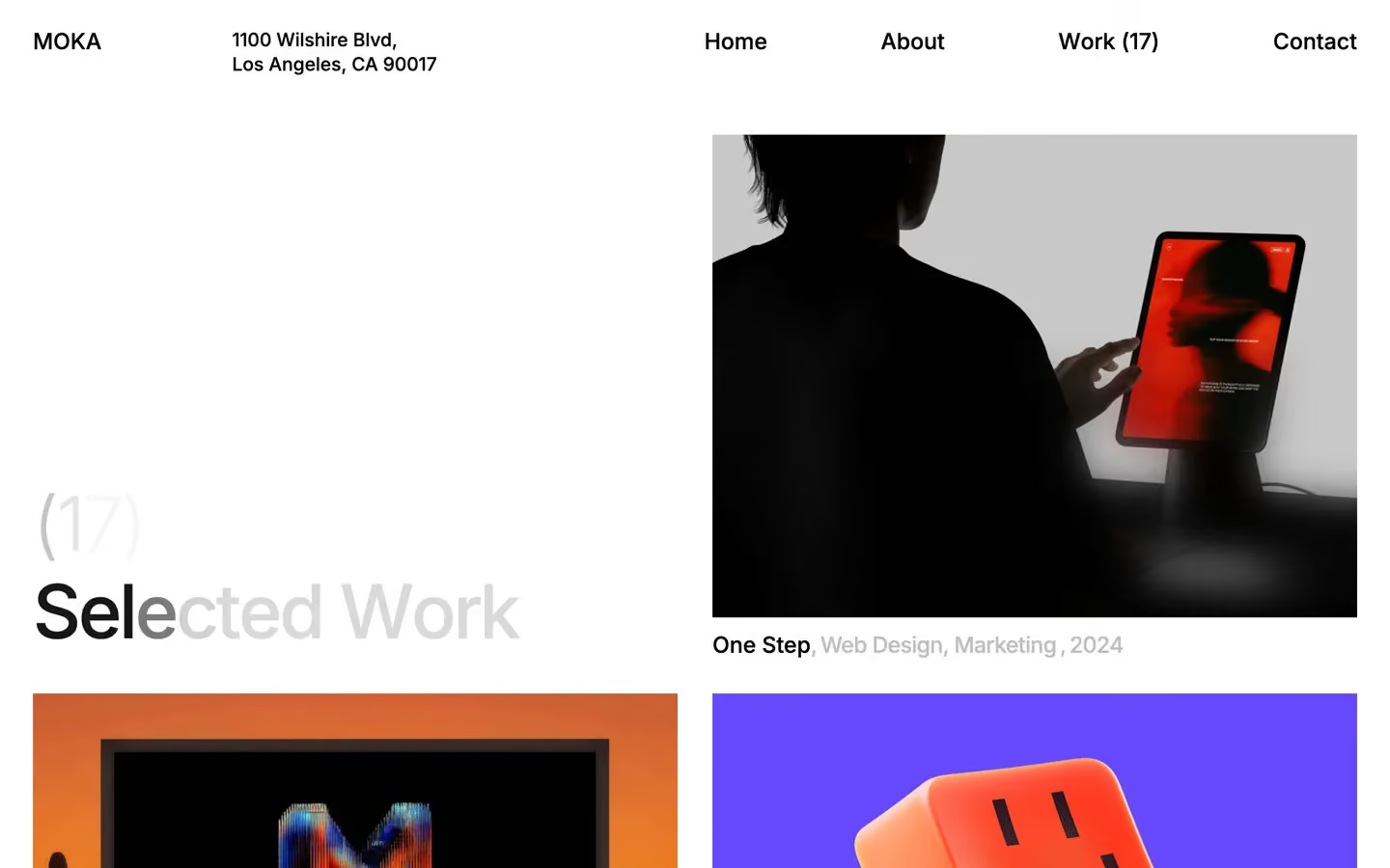
Moka is a stripped-back studio portfolio. It is black Inter on white and pale grey, with no rules, no borders, no shadows and almost no UI. The type is large and tight, the spacing is enormous (250–350px between sections), and the colour comes only from the project images.
Four signatures make it recognisable:
- One italic serif glyph. Headlines are Inter 500, but one character is swapped for Playfair Display italic: the & in brands & experiences, the O in the giant WORK.
- The giant white wordmark. A full-width WORK set at 46vw in Inter 300 with −2.8rem tracking, white on the #F5F5F5 band, cut off at the bottom by the next section. It is texture, not text to read.
- Faded meta after titles. Project captions put the title in black, then the categories and year at 25% black on the same line: Bold Moves, Web Design, Marketing, 2025. Counts sit after titles in a lighter weight: Selected Work (17).
- Offset hero. The hero headline sits bottom-left with its first line indented, and a single portrait image floats bottom-right. The top of the screen is empty except for a small address.
Moka is light-only and nearly monochrome.
Colors
Surfaces
#FFFFFFPage background and work section
#F5F5F5The about band behind the giant wordmark, the services panel, the footer
#000000Ink
#000000Text on primary
#000000All headlines, nav, titles
#000000Body copy
#000000 · 40%Service names in the services strip
#000000 · 25%Categories and years after project titles (.category-title, opacity .25)
#FFFFFFThe giant wordmark and text over images
#FFFFFF · 70%Secondary white text (--third-color)
#FFFFFFAction
#FFFFFFThe button style in the CSS variables: a white pill with black 14px text
#000000Lines & effects
#000000Only the 1px solid blockquote rule; there are no other borders
#F8F8F3 · 10%Blur tint with 15–40px backdrop blur
Typography
Inter · display-giant
The quick brown fox jumpsThe WORK wordmark, white, margin-left −5vw. 662px · 300 · 0.50 · -44.8px
Inter · headline-xl
The quick brown fox jumpsLarge repeated lines (20 uses). 80px · 500 · 1.20 · -0.15px
Inter · body-lg
The quick brown fox jumpsThe most-used text style (102 uses): longer copy and lists. 24px · 400 · 1.20 · -0.15px
Inter · label-caps
The quick brown fox jumpsShort uppercase labels. 24px · 500 · 1.10 · -0.96px
Inter · title
The quick brown fox jumpsNav links and project titles (One Step, Bold Moves). 19.2px · 500 · 1.20
Inter · caption
The quick brown fox jumpsBase body size and button text (--button--font-size: 14px). 14px · 400 · 1.43
Spacing & shape
| Purpose | Value |
|---|---|
| Container | width 100% with max-width: 95% (1368px at 1440), centred |
| Grid | a 12-column grid with a 15px column gap and a 50px row gap, items aligned to the bottom (place-items: end stretch) |
| Section rhythm | 250px top and bottom (--section--padding-top-bottom); the first band after the hero opens with 350px |
| Breakpoints | 991px, 767px and 479px, plus a 1920px+ step and a min-width: 768px rule set |
Spacing scale
| Token | Value | Preview |
|---|---|---|
xxs | 5px | |
xs | 10px | |
sm | 15px | |
md | 20px | |
lg | 30px | |
xl | 50px | |
2xl | 60px | |
3xl | 100px | |
4xl | 150px | |
5xl | 200px |
Layout spacing
| Token | Value | Preview |
|---|---|---|
column-gap | 15px | |
row-gap | 50px | |
section | 250px |
Border radius
Surfaces
How the surfaces stack, from the page background up. Hex codes and roles are in Colors above.
Motion
| Text roll (nav and links) | Split characters move y 0% → −100% while a duplicate rolls in from below; power1.in, staggered over 0.25–1.0s depending on word length (0.25, 0.34, 0.37, 0.43, 0.46, 0.49, 0.52, 0.58, 0.64, 1.0s) |
| Service strip | A continuous horizontal run of service names, faded at both ends |
| CSS transitions | transition: all with Webflow defaults; no custom durations or easings |
Do’s and don’ts
- Keep the interface to #000000, #FFFFFF and #F5F5F5, and let images bring the colour.
- Set headlines in Inter 500 with tight tracking (−2.4px at 64–80px).
- Swap one glyph per display line (&, O) for Playfair Display italic at the same size.
- Leave huge vertical space: 250px between sections, 350px to open the first band.
- Caption work with the title in black and the categories and year at 25% black on the same line.
- Use 4:3 images with square corners in a 2-column grid with a 30px gap.
- Add borders, divider lines, drop shadows or gradients.
- Grey the body copy. Paragraphs are pure #000000 at weight 500.
- Use #00000040 or #00000066 text on its own; it only works as meta beside a black title.
- Round images, or use radii other than 6.4px panels and the 48px pill.
- Set full words or paragraphs in Playfair Display.
- Add scroll animations, parallax or fades beyond the text roll.
- Put the white pill button on the white canvas, where it disappears.
Example prompt
Any page in the Moka style
More design systems like this
Portfolio design systems, the same colors first.


Bring any of them to your AI tool
All Access unlocks all 398 design systems, ready for Claude, ChatGPT, Gemini, Cursor, v0 and Lovable, plus 400+ templates on all 5 platforms.
Get All AccessUpgrade to All AccessHow to use the Moka design system
Pick a file to see what it’s for and where it goes.
What it is
The whole design system in one markdown file, written for AI: every color, type style, spacing value, component and motion rule, plus do's, don'ts and a ready prompt.
Best for
Claude, ChatGPT, Gemini, Cursor and v0, or any other AI tool that builds pages or code.
How to use it
- Put
DESIGN.mdin your project and mention it in your request, or save it as.cursor/rules/moka.mdc - For the rule file, start it with a front-matter block that sets
alwaysApply: true, so every chat uses it - Ask: “Build a pricing page using DESIGN.md.” Cursor follows the colors, fonts, spacing and rules
- Put
DESIGN.mdin the project root - Add one line to
CLAUDE.md: “Follow DESIGN.md for all UI.” - Ask for any page or component; Claude reads the file first
- Attach
DESIGN.mdto the chat (or paste it in) - Ask: “Build a landing page in this design system.”
- Keep the file in the chat or project knowledge, so follow-up pages stay on style
What it is
Every token as data, in the W3C Design Tokens format: colors with their roles, type styles, radius, spacing, and component tokens that point at them.
Best for
Figma (Tokens Studio), Style Dictionary and other design-token tools, and build scripts.
How to use it
- In Figma, open Tokens Studio, choose Import, and pick
tokens.json - Or point Style Dictionary’s
sourceat it to generate tokens for any platform - In code, import it like any JSON file
What it is
A Tailwind CSS v4 theme: every color, font, type style, radius and spacing value becomes a Tailwind utility, like bg-canvas, text-headline-lg or rounded-md.
Best for
Tailwind v4 projects, and AI builders that write Tailwind (v0, Lovable, Bolt).
How to use it
- Save
theme.cssnext to your main CSS file - Import it after Tailwind:
@import "tailwindcss"; @import "./theme.css"; - Use the classes:
bg-canvas text-ink rounded-md p-lg
What it is
The same tokens as plain CSS variables on :root. Component values point at the color variables, so changing one color updates everything that uses it.
Best for
Any website: plain CSS, Webflow custom code, Framer, WordPress.
How to use it
- Add it to your stylesheet, or in Webflow paste it into Site settings → Custom code inside a
<style>tag - Use the variables anywhere:
color: var(--color-ink) - Change a token once and every place that uses it follows