 flowmance
Ultra Design System


Ultra is a loud, one-colour agency site. The whole page is a flat orange-red (#E85914) and everything on it is black: bold uppercase Roboto, 3px rules and outlined pills. It reads like a screen-printed poster or a brutalist zine. There are no greys, no shadows, no gradients and no second accent. The only other colours on the page come from the project screenshots in the work strip.
Four signatures make it recognisable:
- One colour, one ink. #E85914 background, #000000 for every word, line and border. Hover states simply swap the two: black fill, orange text.
- The boxed nav. A three-cell header (logo / four links / BUY ULTRA pill) built from 3px black borders, each cell 130px tall, sitting on a 3px rule that runs the full width.
- Ruled poster hero. Three uppercase lines at 12vw (CREATE, ULTRA BUILD, LAUNCH), each on its own row between 3px black rules, staggered left / centred / left, with a small ✱ BASED IN NEW YORK tag and a large ↘ arrow on the right.
- The sideways work strip. Project screenshots in a horizontal track that moves as you scroll, separated by 3px vertical black lines, each with an outlined name bar underneath that alternates between square and pill.
Ultra is a single-theme, light-on-colour design: there is no dark mode and no white page.
Colors
Surfaces
#E85914Page background on every section, including nav and footer (CSS var --orange-red)
#E85914Same as canvas
#000000Hover fills on nav cells and the black wipe bars that reveal headings
#E85914Inputs are transparent on canvas with a 3px black bottom border
Ink
#000000Text on primary
#000000Every heading, label, link, icon and paragraph (CSS var --black)
#000000Same as ink
#E85914Text on inverse-canvas
Action
#E85914The outlined pill: transparent (shows canvas) with a 3px black border and black text
#000000The pill fills black on hover and its text turns #E85914
Lines & effects
#0000003px hero and nav rules, 3px button borders, 1–3px column dividers
Typography
Roboto · display-hero
The quick brown fox jumpsHero lines. 173px · 700 · 0.9 · 5px
Roboto · headline-lg
The quick brown fox jumpsBase h1 on inner pages. 38px · 700 · 1.16
Roboto · body-lg
The quick brown fox jumpsLead paragraphs: Ultra — creating user experience designs / we have 10 awards, the about text. 28px · 500 · 1.1
Roboto · title-md
The quick brown fox jumpsProject names in the work strip: Logan Template, Roby Template. 24px · 500 · 1
Roboto · label-lg
The quick brown fox jumpsNav links (.button-text, inside a 34px rolling mask). 26px · 700 · 1.23 · 1px
Roboto · eyebrow
The quick brown fox jumpsSection tags after a ✱: FEATURED WORK, ABOUT ULTRA, SEND A MESSAGE. 16px · 700 · 1
Spacing & shape
| Purpose | Value |
|---|---|
| Container | full width |
| Section rhythm | sections have no vertical padding of their own |
| Breakpoints | 991px (tablet), 767px (landscape phone), 479px (phone), plus a min-width: 768px rule set |
Spacing scale
| Token | Value | Preview |
|---|---|---|
hair | 4px | |
xs | 16px | |
sm | 20px | |
md | 30px | |
lg | 40px | |
xl | 70px |
Layout spacing
| Token | Value | Preview |
|---|---|---|
gutter | 10px | |
section | 40px | |
nav-cell | 130px |
Border radius
Motion
| Button hover | Background and text swap (#E85914 ↔ #000000), transition: all .2s |
| Text roll | Labels sit in a 34px overflow-hidden .button-text-wrapper with a duplicate copy below (buy ultra twice); on hover the copy rolls up to y: 0%, 300ms ease |
| Nav fill | .button-line-first, a black bar at the bottom of each nav link, starts at height 0 and grows on hover while the link colours invert |
| Heading reveal | .heading-overlay, a black bar parked at translateX(-100%) over each hero line, slides across to reveal the text on load |
| Work strip | The project row moves sideways as the page scrolls |
| Icon rotation | The ✱ and arrow rotate, 400ms ease |
Do’s and don’ts
- Paint the whole page #E85914 and set every piece of text, line and icon in #000000.
- Use Roboto 700 uppercase with 1px tracking for every label, nav item and button.
- Separate rows with 3px black rules and 40px of space above and below.
- Use the outlined pill (3px border, 50px radius, 12px 30px padding) and invert it to black on hover.
- Put ✱ before every section eyebrow.
- Let display type run at 12vw with 0.9 line height and +5px tracking.
- Add white sections, grey text or any second accent; the unused --yellow #FFEF43 and --azure #E7FBFC stay unused.
- Add drop shadows, gradients, blur or rounded image corners.
- Use radii other than 0, 30px (name bars) and 50px (buttons).
- Use thin or light Roboto weights for text, even though 100 and 300 are loaded.
- Fill a button with black at rest; the black fill is the hover state only.
- Animate colour with a fade longer than 400ms; swaps are quick (200ms on buttons).
Example prompt
Any page in the Ultra style
More design systems like this
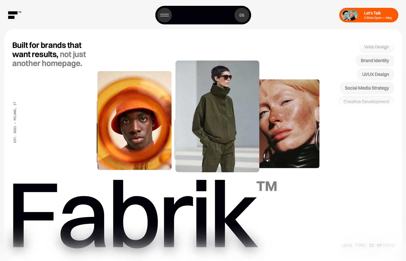
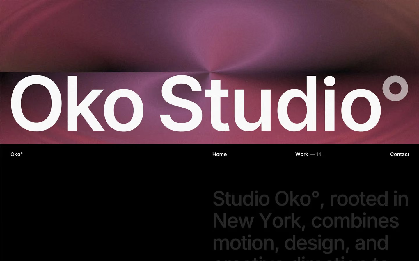
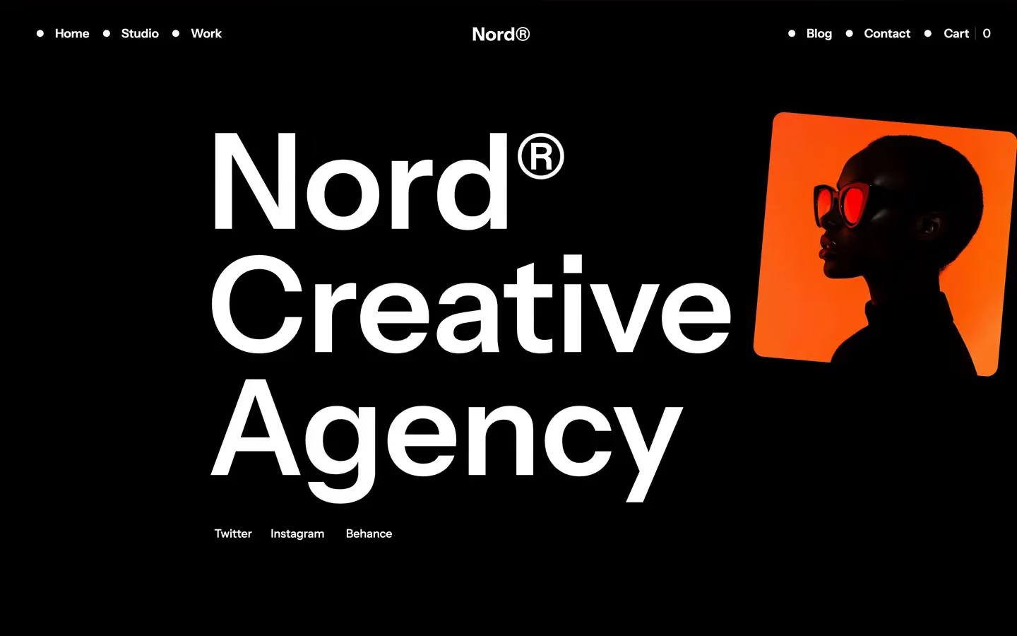
Agency design systems, the same colors first.

Bring any of them to your AI tool
All Access unlocks all 398 design systems, ready for Claude, ChatGPT, Gemini, Cursor, v0 and Lovable, plus 400+ templates on all 5 platforms.
Get All AccessUpgrade to All AccessHow to use the Ultra design system
Pick a file to see what it’s for and where it goes.
What it is
The whole design system in one markdown file, written for AI: every color, type style, spacing value, component and motion rule, plus do's, don'ts and a ready prompt.
Best for
Claude, ChatGPT, Gemini, Cursor and v0, or any other AI tool that builds pages or code.
How to use it
- Put
DESIGN.mdin your project and mention it in your request, or save it as.cursor/rules/ultra.mdc - For the rule file, start it with a front-matter block that sets
alwaysApply: true, so every chat uses it - Ask: “Build a pricing page using DESIGN.md.” Cursor follows the colors, fonts, spacing and rules
- Put
DESIGN.mdin the project root - Add one line to
CLAUDE.md: “Follow DESIGN.md for all UI.” - Ask for any page or component; Claude reads the file first
- Attach
DESIGN.mdto the chat (or paste it in) - Ask: “Build a landing page in this design system.”
- Keep the file in the chat or project knowledge, so follow-up pages stay on style
What it is
Every token as data, in the W3C Design Tokens format: colors with their roles, type styles, radius, spacing, and component tokens that point at them.
Best for
Figma (Tokens Studio), Style Dictionary and other design-token tools, and build scripts.
How to use it
- In Figma, open Tokens Studio, choose Import, and pick
tokens.json - Or point Style Dictionary’s
sourceat it to generate tokens for any platform - In code, import it like any JSON file
What it is
A Tailwind CSS v4 theme: every color, font, type style, radius and spacing value becomes a Tailwind utility, like bg-canvas, text-headline-lg or rounded-md.
Best for
Tailwind v4 projects, and AI builders that write Tailwind (v0, Lovable, Bolt).
How to use it
- Save
theme.cssnext to your main CSS file - Import it after Tailwind:
@import "tailwindcss"; @import "./theme.css"; - Use the classes:
bg-canvas text-ink rounded-md p-lg
What it is
The same tokens as plain CSS variables on :root. Component values point at the color variables, so changing one color updates everything that uses it.
Best for
Any website: plain CSS, Webflow custom code, Framer, WordPress.
How to use it
- Add it to your stylesheet, or in Webflow paste it into Site settings → Custom code inside a
<style>tag - Use the variables anywhere:
color: var(--color-ink) - Change a token once and every place that uses it follows