 flowmance
Oko Design System
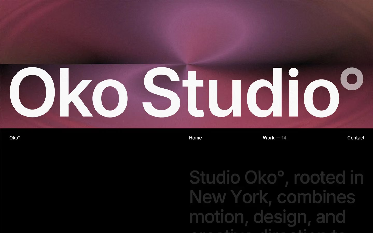
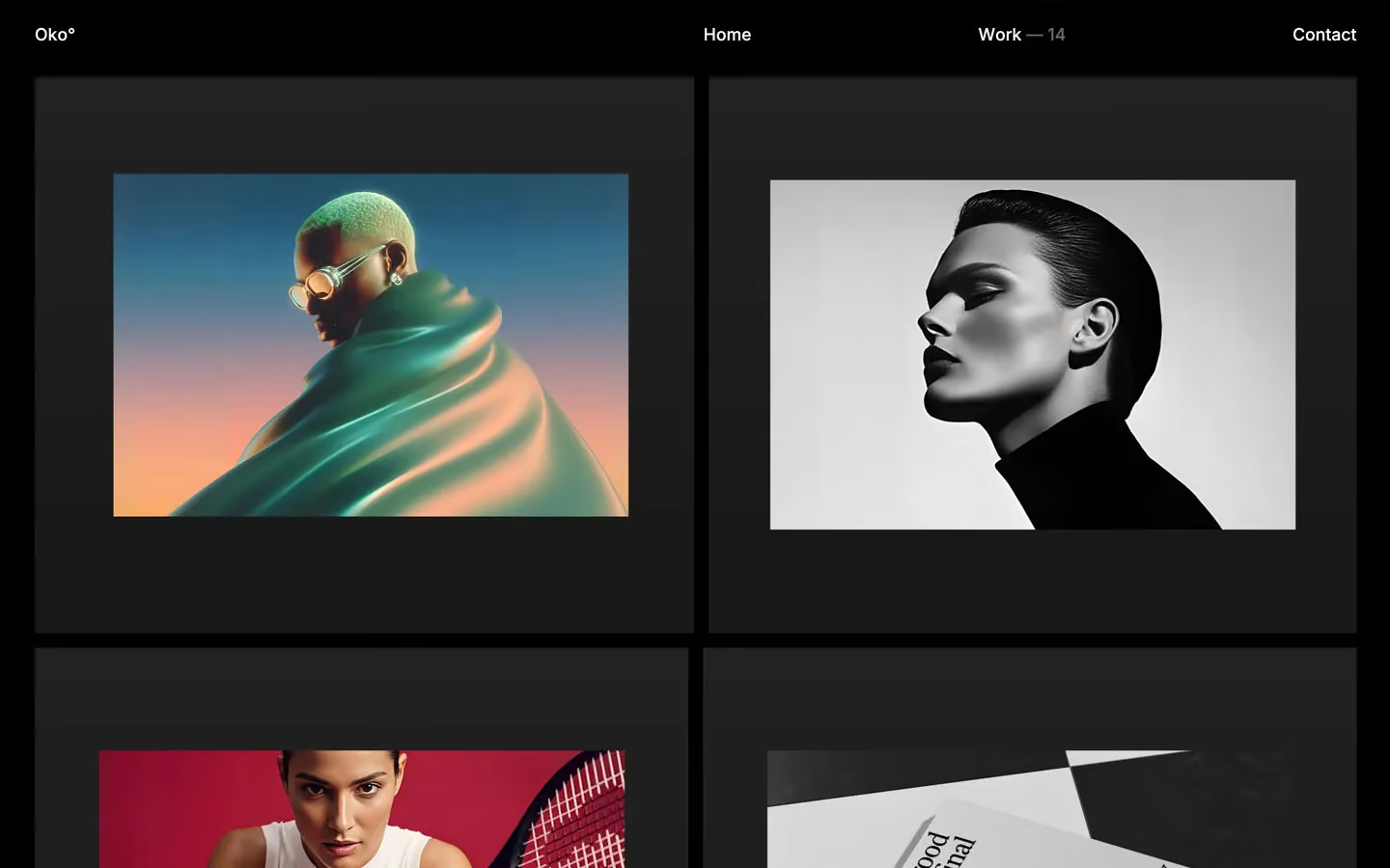
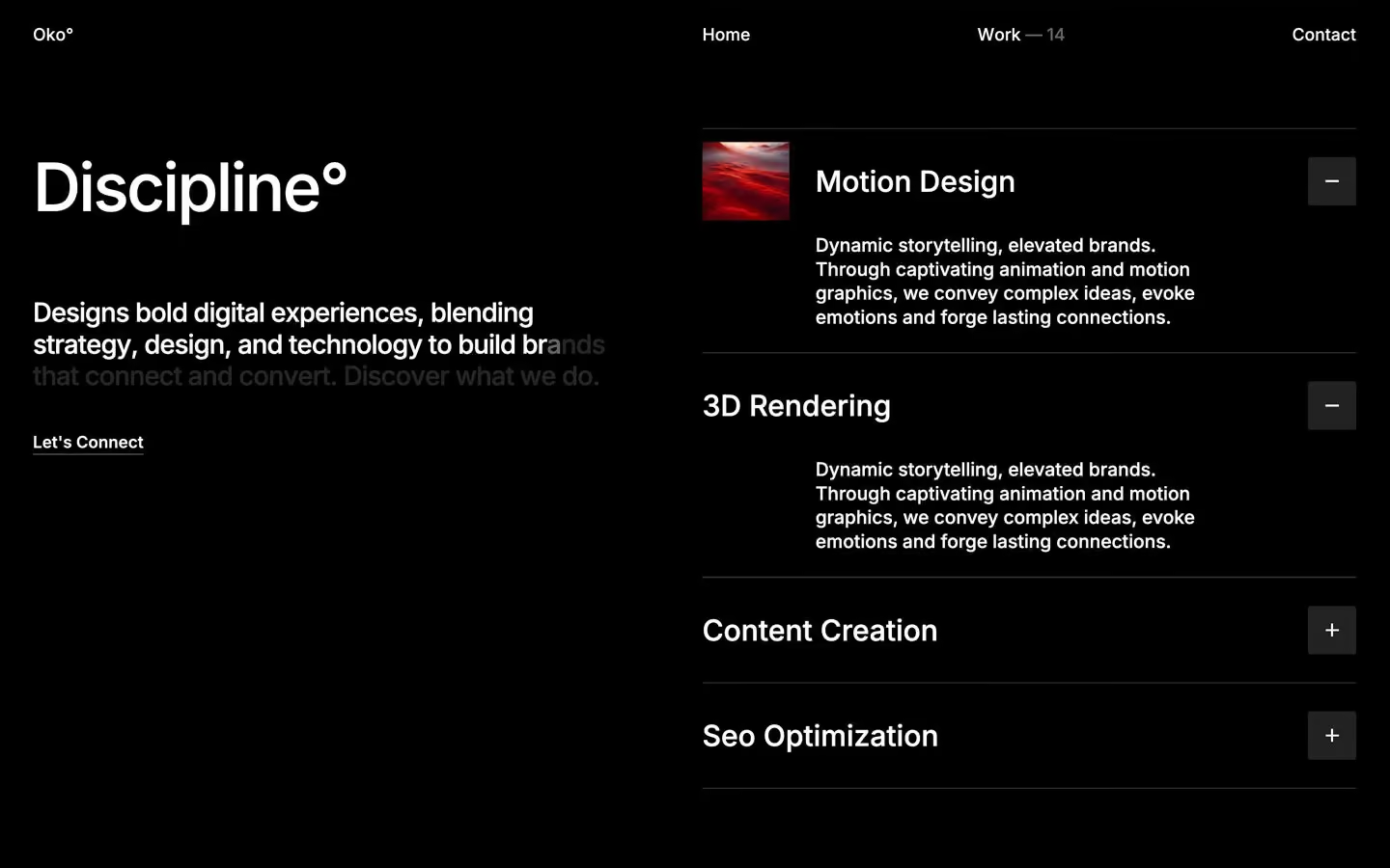
Oko is a dark, quiet studio site that gets its drama from scale and scroll. The page is pure black, nearly everything is white Inter 500, and there is almost no chrome: no filled buttons, no shadows, no rounded cards. Colour comes from grainy abstract hero art, saturated project photography and five small, tilted name tags on the team portraits.
Four signatures make it recognisable:
- The degree mark. Brand and section words end in °: Oko°, Oko Studio°, Discipline°, Creative Digital Lab°. It sits at the weight of the word, like a superscript.
- Text that lights up as you scroll. Large statements and paragraphs start at white 15% (ink-faint) and turn white word by word, scrubbed by scroll. Half-revealed lines (that connect and convert. Discover what we do.) are a normal state on screen.
- A difference-blend nav. The fixed nav (Oko°, Home, Work — 14, Contact) is authored in black with filter: invert() and mix-blend-mode: difference, so it reads white on black and flips dark where it crosses a light photo.
- The 24vw tracked-in title. Creative Digital Lab° runs at 24vw (346px at 1440) with −16px tracking, slides sideways, and has team portraits floating over and behind it.
Oko is a dark-only design.
Colors
Surfaces
#000000Page background, every section, the footer
#222222Work-card panels, accordion + buttons, the testimonial name block
#333333The dark-grey name tag (Marco)
Ink
#FFFFFFText on primary
#FFFFFFAll text once revealed: headlines, nav, links
#FFFFFFBody text is full white
#FFFFFF · 15%The start state of scroll-revealed text, never a resting colour
#FFFFFF · 7%Start state of the 24vw Creative Digital Lab° title before it lights up
#FFFFFF#FFFFFFAction
#000000Oko has no filled buttons; the main action is a white underlined text link on black
#FF7700Default name-tag colour (John)
Lines & effects
#3333331px solid rules between service rows
#000000 · 30%Blurred overlays on media
#000000 · 40%Darkening layer on images under text
#C1C1BEArrow glyph inside the 42px corner icon button
#9000FFThe other name tags (Elena, Maya, Luna)
#FF0051The other name tags (Elena, Maya, Luna)
#0059FFThe other name tags (Elena, Maya, Luna)
#00A0A3The other name tags (Elena, Maya, Luna)
Typography
Inter · display-hero
The quick brown fox jumpsCreative Digital Lab°, set as 24vw with −1rem tracking, one line, no wrap. 346px · 500 · 1.1 · -16px
Inter · headline-md
The quick brown fox jumpsService names 3D Rendering, Content Creation (2.2rem). 35px · 500 · 1
Inter · body-lg
The quick brown fox jumpsLighter long-copy paragraphs. 24px · 400 · 1.3 · -0.15px
Inter · title-md
The quick brown fox jumpsFooter and secondary link lists (1.4rem). 22px · 500 · 1.3
Inter · label
The quick brown fox jumpsNav links (1.1rem). 18px · 500 · 1.3
Inter · caption
The quick brown fox jumpsTestimonial name Liam Carter, Head of Marketing. 16px · 500 · 1.1 · -0.32px
Spacing & shape
| Purpose | Value |
|---|---|
| Container | 95% of the viewport wide (1368px at 1440), centred, so the side margin is about 36px |
| Grid | 2 columns with a 16px gap for most sections; the nav and footer use a 4-column, 16px grid (Oko° in column 1, Home in column 3, Work — 14 and Contact across 3–4) |
| Section rhythm | .section is 150px top and bottom |
| Breakpoints | 991, 767, 479px, plus a 1920px+ step |
Spacing scale
| Token | Value | Preview |
|---|---|---|
hair | 5px | |
xs | 10px | |
sm | 15px | |
md | 20px | |
lg | 30px | |
xl | 50px | |
2xl | 100px |
Layout spacing
| Token | Value | Preview |
|---|---|---|
column-gap | 16px | |
footer-bottom | 30px | |
hero-bottom | 70px | |
section | 150px |
Border radius
Surfaces
How the surfaces stack, from the page background up. Hex codes and roles are in Colors above.
Motion
| Text roll on hover (nav, CTA) | SplitText characters move y 0% → −100%, power1.in, staggered; totals 0.34s, 0.43s and 0.58s |
| Scroll-lit text | SplitText words go from white 15% to white, scrubbed: ScrollTrigger top bottom → bottom 50, scrub: 0.8, staggered across the paragraph (six instances) |
| Longer staggered reveals | y 0% → −100%, power1.in, 1.0–1.03s totals |
| Expo moves | 0.8s expo tweens on the scroll scenes |
| Fade and rise | opacity 0 → 1 500ms; move y → 0% 500ms; slower fades 1000ms outQuart |
| Accordion | + rotates 400ms ease; panel height 600ms outExpo or 400ms cubic-bezier(0.38, 0.005, 0.215, 1) |
| Underline wipe | Width change, 300–500ms ease |
| Tag and portrait tilt | Rotate 600ms outExpo, 900ms cubic-bezier(0.135, 0.9, 0.15, 1) |
| Loader badge | Continuous rotation, 40s per turn |
| Hover blur | filter 400ms ease |
Do’s and don’ts
- Keep the page #000000 with white Inter 500 text; use #222222 only for panels and small square controls.
- End brand and section words with ° at the same weight.
- Set big statements at 69px, line height 1.1, tracking −2.4px, and let them light up from white 15% to white on scroll.
- Make the main action an underlined 17px/600 text link (Let's Connect) with a line-wipe hover.
- Keep images and cards square (0 radius); use 3px only on small controls and 5px on name tags.
- Use one tag colour per person (#FF7700, #9000FF, #FF0051, #0059FF, #00A0A3) and tilt tags about 6°.
- Add filled or pill buttons, drop shadows or rounded cards.
- Use the tag colours anywhere except name tags. White on #FF7700 is only 2.7:1, so keep orange tags to 16px name labels and never use orange behind running text.
- Leave text at ink-faint (white 15%) or ink-ghost (7%) once it is in view. They are animation start states.
- Add Playfair Display or any second typeface, uppercase labels or weights above 600.
- Put a background or blur behind the nav; it relies on the difference blend.
- Shrink the 24vw title tracking: it stays at −16px.
Example prompt
Any page in the Oko style
More design systems like this
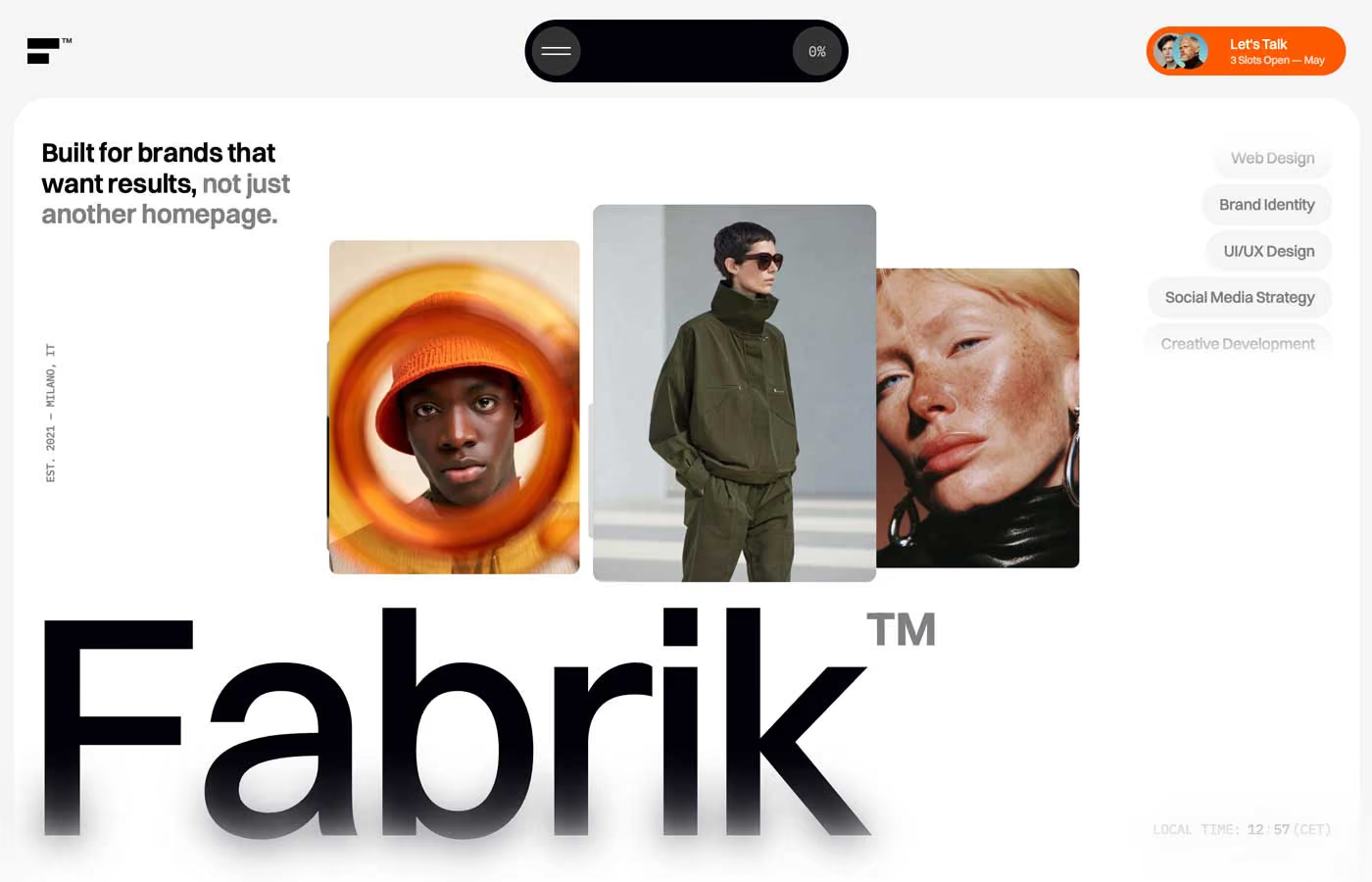
Agency design systems, the same colors first.


Bring any of them to your AI tool
All Access unlocks all 398 design systems, ready for Claude, ChatGPT, Gemini, Cursor, v0 and Lovable, plus 400+ templates on all 5 platforms.
Get All AccessUpgrade to All AccessHow to use the Oko design system
Pick a file to see what it’s for and where it goes.
What it is
The whole design system in one markdown file, written for AI: every color, type style, spacing value, component and motion rule, plus do's, don'ts and a ready prompt.
Best for
Claude, ChatGPT, Gemini, Cursor and v0, or any other AI tool that builds pages or code.
How to use it
- Put
DESIGN.mdin your project and mention it in your request, or save it as.cursor/rules/oko.mdc - For the rule file, start it with a front-matter block that sets
alwaysApply: true, so every chat uses it - Ask: “Build a pricing page using DESIGN.md.” Cursor follows the colors, fonts, spacing and rules
- Put
DESIGN.mdin the project root - Add one line to
CLAUDE.md: “Follow DESIGN.md for all UI.” - Ask for any page or component; Claude reads the file first
- Attach
DESIGN.mdto the chat (or paste it in) - Ask: “Build a landing page in this design system.”
- Keep the file in the chat or project knowledge, so follow-up pages stay on style
What it is
Every token as data, in the W3C Design Tokens format: colors with their roles, type styles, radius, spacing, and component tokens that point at them.
Best for
Figma (Tokens Studio), Style Dictionary and other design-token tools, and build scripts.
How to use it
- In Figma, open Tokens Studio, choose Import, and pick
tokens.json - Or point Style Dictionary’s
sourceat it to generate tokens for any platform - In code, import it like any JSON file
What it is
A Tailwind CSS v4 theme: every color, font, type style, radius and spacing value becomes a Tailwind utility, like bg-canvas, text-headline-lg or rounded-md.
Best for
Tailwind v4 projects, and AI builders that write Tailwind (v0, Lovable, Bolt).
How to use it
- Save
theme.cssnext to your main CSS file - Import it after Tailwind:
@import "tailwindcss"; @import "./theme.css"; - Use the classes:
bg-canvas text-ink rounded-md p-lg
What it is
The same tokens as plain CSS variables on :root. Component values point at the color variables, so changing one color updates everything that uses it.
Best for
Any website: plain CSS, Webflow custom code, Framer, WordPress.
How to use it
- Add it to your stylesheet, or in Webflow paste it into Site settings → Custom code inside a
<style>tag - Use the variables anywhere:
color: var(--color-ink) - Change a token once and every place that uses it follows