 flowmance
Fabrik Design System
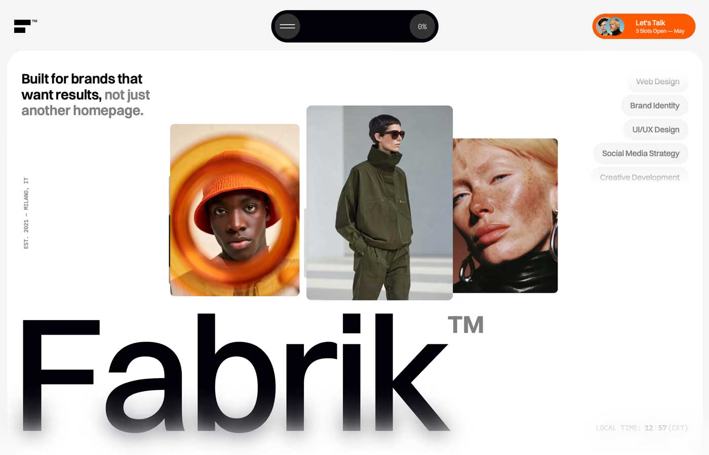
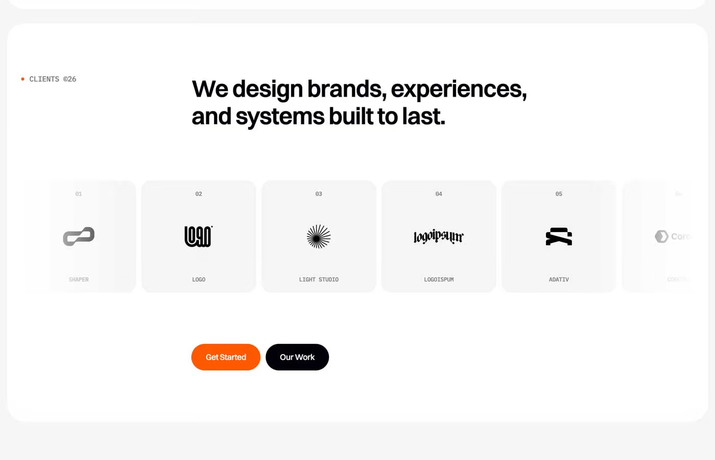

Fabrik is a calm, premium agency site on a soft #F5F5F5 grey. Content sits in big rounded panels, white or near-black (#020108), stacked with 10px gutters so the page feels like a set of cards laid on a table. One hot colour, signal orange #F65600, marks the main actions and the handwritten accent words.
Four signatures make it recognisable:
- The tight wordmark. Fabrik in Switzer 500 at about 248–256px with −12px tracking and line height 0.8, followed by a grey superscript ™, set at the bottom of a white hero card with a 34px radius.
- Script plus grotesk. Single words in a handwritten script (The Patience) sit inside Switzer headlines and titles: *Art* Direction, *Projects*, We let the *Art* speak for itself. The script is orange or soft grey.
- The floating control pill. A black pill fixed top-centre holds a round hamburger on the left and a round scroll-progress counter (0%, 22%, 45%) on the right. Top-right, an orange Let's Talk pill carries two avatars and 3 Slots Open — June.
- Mono meta. Small labels are monospaced and uppercase: • SERVICES, PLAN FEATURES :, JAMES CARTER | CEO, ACME CORP, a vertical EST. 2021 — MILANO, IT.
A soft blur band sits at the bottom of the viewport, so content fades and blurs as it scrolls off the bottom edge.
Colors
Surfaces
#F5F5F5Page background (whitesmoke) and pills or tiles that sit inside white panels
#FFFFFFWhite panels, the hero card, testimonial and plan cards
#E9E9E9The opened menu panel (with 30px blur)
#F0F0F0Light fills
#020108Dark panels: services, the work video grid, the dark plan card, the nav pill
#020108 · 40%Input placeholder
Ink
#FFFFFFText on primary
#FFFFFFText on secondary
#020108Headlines and text on light (142 uses)
#020108Same as ink: body copy on light panels is set in full ink
#808083Grey text: the second half of leads, service pills, the ™, logo-tile labels (107 uses)
#FFFFFFText on dark (198 uses)
#FFFFFF · 70%Secondary text on dark
#FFFFFF · 40%Secondary text on dark
#FFFFFFAction
#F65600Every main button, the Let's Talk pill, the service cards (33 fills)
#F65600#020108The dark pill button (Our Work)
#F65600Script words, + list markers, the dot before • SERVICES, the testimonial progress ring
Lines & effects
#020108 · 12%Dividers on light panels
#383436The progress circle and the menu button inside the nav pill
#333333With inverse-surface: The progress circle and the menu button inside the nav pill
#FFFFFF · 15%The rule above the metric grid
#FFFFFF · 30%Frosted chips; metric cards (with a #FFFFFF38 border)
#FFFFFF · 10%With glass: Frosted chips; metric cards (with a #FFFFFF38 border)
Typography
Switzer · display-hero
The quick brown fox jumpsFabrik (--hero-title: 15.5rem; the live Framer build renders 256px). 248px · 500 · 0.8 · -12px
Switzer · headline-lg
The quick brown fox jumpsWe design brands, experiences, and systems built to last. 46.4px · 700 · 1.15 · -1px
Switzer · title-lg
The quick brown fox jumpsHero lead, Studio Partnership©, Fixed Project©, testimonial quotes (h3, 1.7rem). 27.2px · 600 · 1.15 · -1.36px
Switzer · body-lg
The quick brown fox jumpsNav links and list text (110 uses, .navigation-text 1.2rem). 19.2px · 500 · 1.15 · -0.8px
Switzer · label
The quick brown fox jumpsButton labels Get Started, Our Work. 16px · 600 · 1.2 · -0.3px
IBM Plex Mono · eyebrow
The quick brown fox jumps• SERVICES, JAMES CARTER (84 uses). 14.4px · 600 · 1.15 · -0.3px
Spacing & shape
| Purpose | Value |
|---|---|
| Container | 1400px for content, 750px for centred text, 1600px for wide strips |
| Section rhythm | --section--padding-top-bottom is 250px, 100px at ≤991 and 60px at ≤767 |
| Breakpoints | 991, 767 and 479px, plus a 1920px+ step |
Spacing scale
| Token | Value | Preview |
|---|---|---|
hair | 7px | |
xs | 10px | |
sm | 20px | |
md | 30px | |
lg | 50px | |
xl | 60px | |
2xl | 120px |
Layout spacing
| Token | Value | Preview |
|---|---|---|
gutter | 10px | |
column-gap | 16px | |
section | 20px | |
panel | 100px |
Border radius
Surfaces
How the surfaces stack, from the page background up. Hex codes and roles are in Colors above.
Motion
| Button spring | transform 0.65s linear(0, 0.42 8%, 0.72 14%, 0.9 20%, 1.02 26%, 1.08 32%, 1.1 36%, 1.08 42%, 1.04 …) |
| Back-out pop | transform 0.4s cubic-bezier(0.34, 1.56, 0.64, 1) |
| Smooth expand | flex 0.55s cubic-bezier(0.16, 1, 0.3, 1) for expanding cards and accordions |
| Text swap | color 0.4s, font-size 0.4s cubic-bezier(0.16, 1, 0.3, 1) |
| Card hover | background 0.35s, transform 0.35s cubic-bezier(0.16, 1, 0.3, 1); transform 0.4s same curve |
| Fill change | background-color 0.3s |
| HTML build hover | .button:hover { opacity: 0.76 }, transition: all 0.2s |
| Scroll | Lead text turns from grey to ink as it scrolls in; the work grid scales inside a 400vh sticky section; the nav counter shows scroll percent |
Do’s and don’ts
- Put content in rounded panels (20px) on the #F5F5F5 page, alternating white #FFFFFF and black #020108.
- Use #F65600 for every primary action, as a pill with 16px weight 600 white text and a springy press.
- Add one handwritten script word (The Patience) per big headline, in orange or grey.
- Set display Switzer tight: −12px at 248px, −3px at 96px.
- Use uppercase IBM Plex Mono for eyebrows and meta, with an orange dot before section names.
- Keep ink-subtle #808083 for 16px+ text (pills, the end of leads, ™); at smaller sizes it is too light on #F5F5F5.
- Use orange for paragraphs or big background areas outside service cards and product photos.
- Put white text on orange smaller than 14px or lighter than weight 500; #FFFFFF on #F65600 is only about 3.4:1.
- Use sharp corners on panels, buttons or work images.
- Set a whole line in the script face.
- Add heavy drop shadows; depth comes from panel contrast and blur.
Example prompt
Any page in the Fabrik style
More design systems like this
Agency design systems, the same colors first.



Bring any of them to your AI tool
All Access unlocks all 398 design systems, ready for Claude, ChatGPT, Gemini, Cursor, v0 and Lovable, plus 400+ templates on all 5 platforms.
Get All AccessUpgrade to All AccessHow to use the Fabrik design system
Pick a file to see what it’s for and where it goes.
What it is
The whole design system in one markdown file, written for AI: every color, type style, spacing value, component and motion rule, plus do's, don'ts and a ready prompt.
Best for
Claude, ChatGPT, Gemini, Cursor and v0, or any other AI tool that builds pages or code.
How to use it
- Put
DESIGN.mdin your project and mention it in your request, or save it as.cursor/rules/fabrik.mdc - For the rule file, start it with a front-matter block that sets
alwaysApply: true, so every chat uses it - Ask: “Build a pricing page using DESIGN.md.” Cursor follows the colors, fonts, spacing and rules
- Put
DESIGN.mdin the project root - Add one line to
CLAUDE.md: “Follow DESIGN.md for all UI.” - Ask for any page or component; Claude reads the file first
- Attach
DESIGN.mdto the chat (or paste it in) - Ask: “Build a landing page in this design system.”
- Keep the file in the chat or project knowledge, so follow-up pages stay on style
What it is
Every token as data, in the W3C Design Tokens format: colors with their roles, type styles, radius, spacing, and component tokens that point at them.
Best for
Figma (Tokens Studio), Style Dictionary and other design-token tools, and build scripts.
How to use it
- In Figma, open Tokens Studio, choose Import, and pick
tokens.json - Or point Style Dictionary’s
sourceat it to generate tokens for any platform - In code, import it like any JSON file
What it is
A Tailwind CSS v4 theme: every color, font, type style, radius and spacing value becomes a Tailwind utility, like bg-canvas, text-headline-lg or rounded-md.
Best for
Tailwind v4 projects, and AI builders that write Tailwind (v0, Lovable, Bolt).
How to use it
- Save
theme.cssnext to your main CSS file - Import it after Tailwind:
@import "tailwindcss"; @import "./theme.css"; - Use the classes:
bg-canvas text-ink rounded-md p-lg
What it is
The same tokens as plain CSS variables on :root. Component values point at the color variables, so changing one color updates everything that uses it.
Best for
Any website: plain CSS, Webflow custom code, Framer, WordPress.
How to use it
- Add it to your stylesheet, or in Webflow paste it into Site settings → Custom code inside a
<style>tag - Use the variables anywhere:
color: var(--color-ink) - Change a token once and every place that uses it follows