 flowmance
Katix Design System


Katix is a warm, polished creative-agency site. It opens on a soft radial gradient that runs from terracotta and sand in the bottom-left to mauve and slate on the right, with a huge centred white headline. Below the hero the page turns clean and white: black General Sans titles, grey leads, terracotta accents and tidy grids of square-cornered photos. It ends on a near-black navy contact band and footer.
Four signatures make it recognisable:
- The sunset gradient. radial-gradient(circle at 0% 100%, #D26E5B, #E6B999 29%, #B2A3AC 63%, #72747F) fills the hero and returns as the Fun Facts band. It is the template's colour story.
- Spaced uppercase labels in terracotta. Eyebrows are 13px weight 600 uppercase with 3px tracking in #D26E5B (WHAT WE OFFER, MEET THE TEAM); buttons and nav use 12–13px uppercase with 1px tracking.
- Square terracotta buttons. #D26E5B with a 2px radius and white 12px uppercase labels, paired with a white button with terracotta text on the gradient.
- Big grey leads beside black titles. Section headers put a 40px black title next to a 26px weight-400 grey sentence (We work with our clients to deliver creative solutions that drive engagement.).
Colors
Surfaces
#FFFFFFPage background
#B2A3ACThe mauve band behind the three service photo cards (.section.gray); also the gradient's 63% stop
#12141DScrolled nav, contact band, side menu, footer, back-to-top square
#20222ESubscribe input on dark, with a 1px white-6% border
#FFFFFF · 6%Ink
#FFFFFFText on primary
#D26E5BText on secondary
#000000Headlines, service and project titles
#535353Paragraphs (the p default, 18px)
#7C7C7CLarge 26px section leads and grey arrow links (VIEW PORTFOLIO >)
#9C9C9CProject tags (Web Design, User Experiences), categories
#FFFFFF#FFFFFFText on inverse-canvas
#FFFFFF · 70%Paragraphs on dark (.paragraph-white); dropdown links use 65%
Action
#D26E5BFilled buttons, eyebrows, Instagram icon chips, line icons
#BB533FFilled button hover
#FFFFFFThe white button on the hero (VIEW ON WEBFLOW)
Lines & effects
#E6B999The 29% and 100% stops of the hero gradient
#72747FThe 29% and 100% stops of the hero gradient
#20222E · 25%Overlay on service photo cards under white text
#FFFFFF · 24%The 1px rule under the transparent nav on the hero
#494B58Bottom rule of the underline inputs in the contact form
Typography
General Sans · display-hero
The quick brown fox jumpsHero H1 We help our clients to build customize tools, centred, 3 lines. 90px · 600 · 0.82
General Sans · headline-metric
The quick brown fox jumpsFun-facts numbers 3, 100, 98%, 1000+. 42px · 500 · 1.05
General Sans · body-xl
The quick brown fox jumpsHero sub-line (white) and section leads (grey). 26px · 400 · 1.23
General Sans · title-lg
The quick brown fox jumpsJournal card titles (.blog-title). 22px · 600 · 1.36
General Sans · label
The quick brown fox jumpsFooter links. 16px · 500 · 1.25
General Sans · caption
The quick brown fox jumpsDropdown links. 15px · 500 · 1.33
Spacing & shape
| Purpose | Value |
|---|---|
| Container | max 1200px, centred |
| Section rhythm | 100px top and bottom (.section) |
| Section header patterns | centred (eyebrow + title, as in Founders) or a three-part row (eyebrow and title left, grey lead centre, button right, as in Our Portfolio) |
| Breakpoints | 991px, 767px and 479px, plus a min-width: 768px set |
Spacing scale
| Token | Value | Preview |
|---|---|---|
xs | 10px | |
sm | 16px | |
md | 30px | |
lg | 50px | |
xl | 80px | |
2xl | 100px |
Layout spacing
| Token | Value | Preview |
|---|---|---|
section-side | 72px | |
section | 100px | |
hero-top | 150px | |
hero-bottom | 180px | |
section-top-tall | 240px |
Border radius
Surfaces
How the surfaces stack, from the page background up. Hex codes and roles are in Colors above.
Motion
| Scroll reveal (most blocks) | opacity 0 → 1 over 1000ms outQuart, with y -30px → 0 over 1000ms outQuart or 1500ms outQuint |
| Quick reveal | opacity 0 → 1 500ms outQuint with y 30px → 0 |
| Nav underline | nav-line width grows 0 → 100%, 500ms ease, and shrinks on mouse out |
| Hamburger | Lines rotate, 500ms inOutBack |
| Side panel | translateX(100%) → 0 |
| Nav on scroll | Sticky dark bar shows on scroll up, hides on scroll down; background change 500ms |
| Button hover | transition: all 0.2s, #D26E5B → #BB533F |
| Footer and dropdown links | Colour fade, 300ms |
Do’s and don’ts
- Use the sunset radial gradient (#D26E5B → #E6B999 29% → #B2A3AC 63% → #72747F, anchored bottom-left) for the hero and one more full-width band.
- Use #D26E5B for filled buttons and for eyebrows on white, with #BB533F on hover; arrow links stay grey #7C7C7C and the hero eyebrow is white.
- Set eyebrows as 13px weight 600 uppercase with 3px tracking, and buttons as 12px uppercase with 1px tracking.
- Keep headlines black #000000 at weight 600, and pair them with a 26px weight-400 grey lead.
- Keep images and cards at 0px radius and buttons at 2px.
- End the page on #12141D with white text and underline-only inputs.
- Add shadows, glass or rounded cards.
- Put the gradient inside cards or buttons.
- Use Inter or the Butler serif; General Sans is the only face.
- Use the unused variables (#3CCF91, #FF715B, #68D4FF) as extra accents.
- Use ink-subtle #9C9C9C for text under 17px; it is about 2.7:1 on white, so keep it for project tags and meta only.
- Put #535353 paragraphs on the mauve #B2A3AC band; text there sits on photos and is white.
- Set running text in terracotta, or white on terracotta: #D26E5B with white is about 3.4:1, so keep it to bold uppercase buttons, eyebrows and chips, and keep #7C7C7C for the 26px leads and uppercase links only.
Example prompt
Any page in the Katix style
More design systems like this
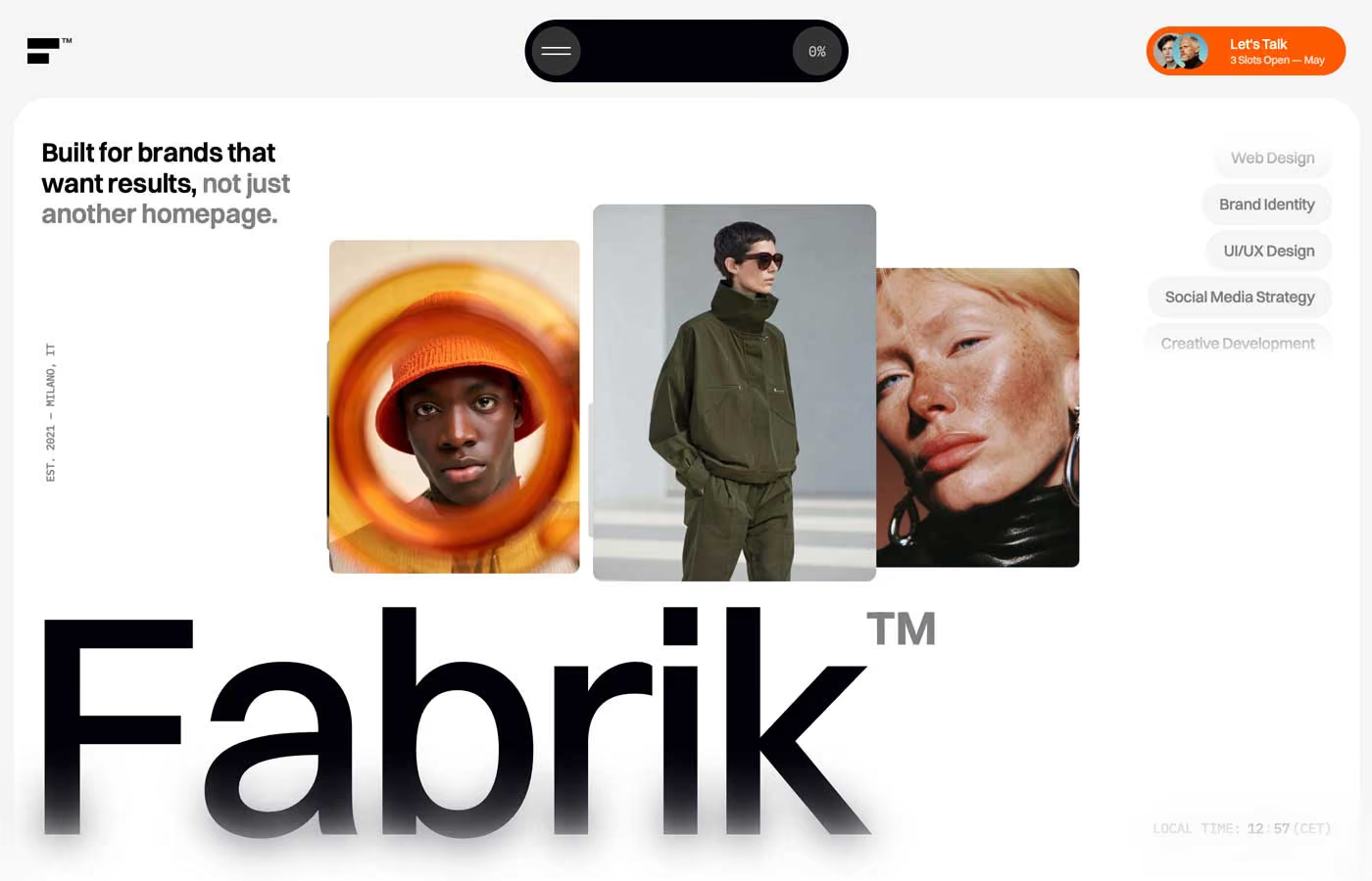
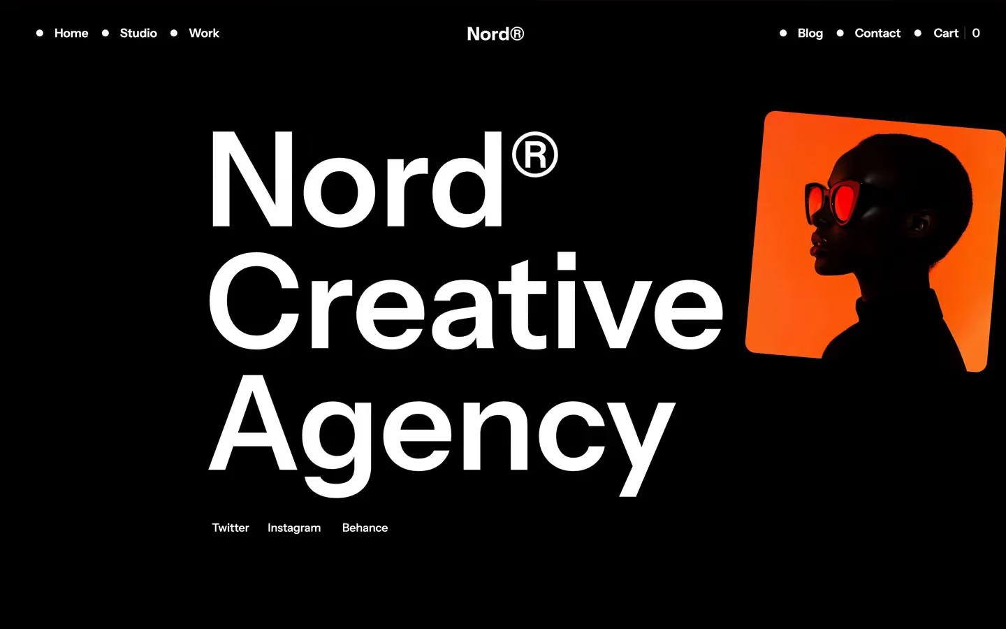
Agency design systems, the same colors first.


Bring any of them to your AI tool
All Access unlocks all 398 design systems, ready for Claude, ChatGPT, Gemini, Cursor, v0 and Lovable, plus 400+ templates on all 5 platforms.
Get All AccessUpgrade to All AccessHow to use the Katix design system
Pick a file to see what it’s for and where it goes.
What it is
The whole design system in one markdown file, written for AI: every color, type style, spacing value, component and motion rule, plus do's, don'ts and a ready prompt.
Best for
Claude, ChatGPT, Gemini, Cursor and v0, or any other AI tool that builds pages or code.
How to use it
- Put
DESIGN.mdin your project and mention it in your request, or save it as.cursor/rules/katix.mdc - For the rule file, start it with a front-matter block that sets
alwaysApply: true, so every chat uses it - Ask: “Build a pricing page using DESIGN.md.” Cursor follows the colors, fonts, spacing and rules
- Put
DESIGN.mdin the project root - Add one line to
CLAUDE.md: “Follow DESIGN.md for all UI.” - Ask for any page or component; Claude reads the file first
- Attach
DESIGN.mdto the chat (or paste it in) - Ask: “Build a landing page in this design system.”
- Keep the file in the chat or project knowledge, so follow-up pages stay on style
What it is
Every token as data, in the W3C Design Tokens format: colors with their roles, type styles, radius, spacing, and component tokens that point at them.
Best for
Figma (Tokens Studio), Style Dictionary and other design-token tools, and build scripts.
How to use it
- In Figma, open Tokens Studio, choose Import, and pick
tokens.json - Or point Style Dictionary’s
sourceat it to generate tokens for any platform - In code, import it like any JSON file
What it is
A Tailwind CSS v4 theme: every color, font, type style, radius and spacing value becomes a Tailwind utility, like bg-canvas, text-headline-lg or rounded-md.
Best for
Tailwind v4 projects, and AI builders that write Tailwind (v0, Lovable, Bolt).
How to use it
- Save
theme.cssnext to your main CSS file - Import it after Tailwind:
@import "tailwindcss"; @import "./theme.css"; - Use the classes:
bg-canvas text-ink rounded-md p-lg
What it is
The same tokens as plain CSS variables on :root. Component values point at the color variables, so changing one color updates everything that uses it.
Best for
Any website: plain CSS, Webflow custom code, Framer, WordPress.
How to use it
- Add it to your stylesheet, or in Webflow paste it into Site settings → Custom code inside a
<style>tag - Use the variables anywhere:
color: var(--color-ink) - Change a token once and every place that uses it follows