 flowmance
Tuscon Design System


Tuscon is a one-person designer portfolio with two moods. It opens on a very tall (400vh) gradient hero in royal blue fading to violet, where a cut-out portrait sits in an orange blob on the left and big white statements on the right fade in one after another as you scroll. After the hero the page turns plain white: black Switzer words at 140px slide sideways across the screen, and project shots sit inside soft coloured gradient frames with white title pills. A black full-screen footer is revealed underneath at the end.
Four signatures make it recognisable:
- The gradient storytelling hero. #4568DC → #7D69C7, top to bottom, 400vh tall. The portrait stays put while four 47px white statements (Hey! I'am Tuscon Doe, I'am award-winning product designer…, I work from the user experience…, Minimal designer and I really like…) go from faint to full white in turn.
- Sliding marquee words. Service names at 140px weight 500, black on white, separated by a thin diagonal slash (Digital Design ⁄ Marketing, Art Direction ⁄ Branding). The rows drift in opposite directions as you scroll and bleed off both edges of the screen.
- Gradient-framed project shots. Each project is a website screenshot floating inside a radial gradient frame (cyan, slate, peach, red-orange, green-purple), with a white title-lg pill and a white round arrow button pinned 40px from the bottom-left corner.
- The tilted wordmark. The Tuscon logo is an image 140px wide, skewed −10° so it rises to the right, centred in the nav between a row of social icons and three underlined text links.
Colors
Surfaces
#FFFFFFPage background after the hero
#ECECEC--white-smoke in the variables
#000000The fixed full-screen footer
Ink
#222222Text on primary
#000000Marquee words, project titles, expertise lists, nav over white
#757575--grey-2: base paragraph, list and blockquote colour on the blog and project pages
#FFFFFFHero statements, nav over the hero
#FFFFFF · 80%Based in Bronx, New York
#FFFFFFText on inverse-canvas
#FFFFFFAction
#FFFFFFThe white pill button
#222222Button background on hover, with white text
#E60004The small round "remove" button in the cart
Lines & effects
#0000001px dashed rule under every expertise item
#E4E4E41px border on the round cart close button
#FFFFFF · 20%1px underline under nav links over the hero
#4568DC--royal-blue to --medium-purple, the hero's vertical gradient
#7D69C7--royal-blue to --medium-purple, the hero's vertical gradient
Typography
Switzer · display-marquee
The quick brown fox jumpsMarquee service words (Digital Design, Marketing, Illustration). 140px · 500 · 1
Switzer · headline-statement
The quick brown fox jumps.title-1: the white hero statements (11 uses). 47px · 500 · 1
Switzer · title-lg
The quick brown fox jumpsProject names in the white pills (Porto, 3D Circle, Kaka, Mister X). 30px · 500 · 1.2
Switzer · body-lg
The quick brown fox jumps.black-paragraph: expertise items like Research, Branding (21 uses). 20px · 500 · 1.3
Switzer · label-nav
The quick brown fox jumpsAbout, Work, Contact. 18px · 500 · 1.11
Switzer · micro
The quick brown fox jumpsBody default; cart and utility text. 14px · 700 · 1.43
Spacing & shape
| Purpose | Value |
|---|---|
| Container | .container is max 1200px, centred, a flex column |
| Section rhythm | .section has 120px top and bottom padding, 80px at ≤991 and 60px at ≤479 |
| Breakpoints | Webflow's 991px, 767px and 479px, plus a min-width: 768px set of rules |
Spacing scale
| Token | Value | Preview |
|---|---|---|
xs | 7px | |
sm | 15px | |
md | 16px | |
lg | 30px | |
xl | 40px | |
2xl | 100px |
Layout spacing
| Token | Value | Preview |
|---|---|---|
nav-top | 50px | |
gutter | 72px | |
nav-height | 95px | |
section | 120px | |
section-marquee | 170px |
Border radius
Surfaces
How the surfaces stack, from the page background up. Hex codes and roles are in Colors above.
Motion
| Hero statement fade | Each .title-1 goes from low opacity to 1 as it scrolls into view (scroll-linked), so only the current line is fully white |
| Fade in | opacity 0 → 1, 500ms; a slower intro variant is 1000ms outQuart |
| Card pop | scale 0.8 → 1, 500ms swingFromTo, on scroll into view (5 project cards) |
| Slide in | y ±80px or x ±80px → 0, 500ms |
| Marquee drift | Rows move x 0 → −30% (and back the other way), 500ms steps driven by page scroll |
| Doodles | Lottie strokes around the portrait draw in over 1800ms ease |
| Nav colour switch | Filter change, 300ms ease, when the nav passes onto white sections; background colour changes use 500ms ease |
| Nav underline | border-bottom-color white 20% → 100%, 200ms |
| Button hover | background-color and color invert, 300ms |
| Small hover nudges | x ±10px, y 5px, 500ms, on arrow buttons |
Do’s and don’ts
- Open with the tall hero-from #4568DC → hero-to #7D69C7 gradient and set the intro as stacked 47px white statements with line height 1.0.
- Switch to a plain #FFFFFF canvas with #000000 text after the hero, and keep the interface monochrome.
- Set service words at 140px weight 500 and let the rows run off both edges, joined by a thin diagonal slash.
- Frame each project screenshot in its own radial gradient with square corners, and pin a white 20px-radius title pill 40px from the bottom-left.
- Underline list items with a 1px dashed #000000 rule and nav links with a 1px rule that brightens on hover.
- Use the white pill button (#FFFFFF, #222222 text, 100px radius, 59px tall) on colour or black, inverting on hover.
- Put the white button on the white canvas; it disappears.
- Set ink-muted #757575 text on surface-1 #ECECEC (about 3.9:1). On that grey, use ink #000000.
- Add shadows, borders on cards, or rounded corners on project images.
- Use Cuprum or a second family; everything is Switzer, mostly weight 500.
- Use the unused variable colours (#5482FF, #74D5F5, #FF5454, #826F8D) for UI.
- Track or uppercase the type; all letter spacing is 0px.
- Animate longer than 500ms for hovers and reveals; only intro fades (1000ms) and Lottie doodles (1800ms) run longer.
Example prompt
Any page in the Tuscon style
More design systems like this
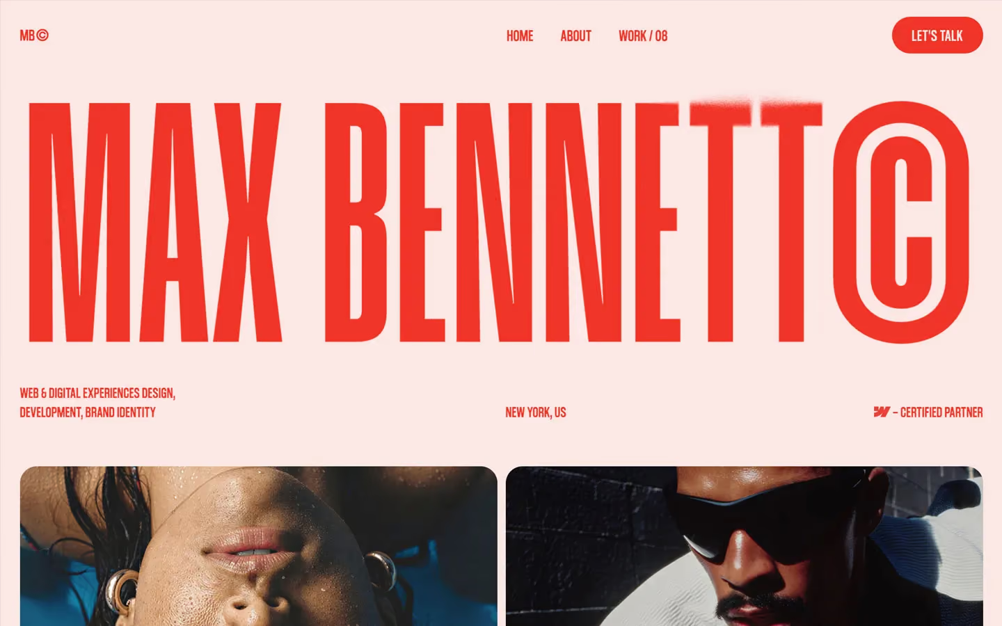
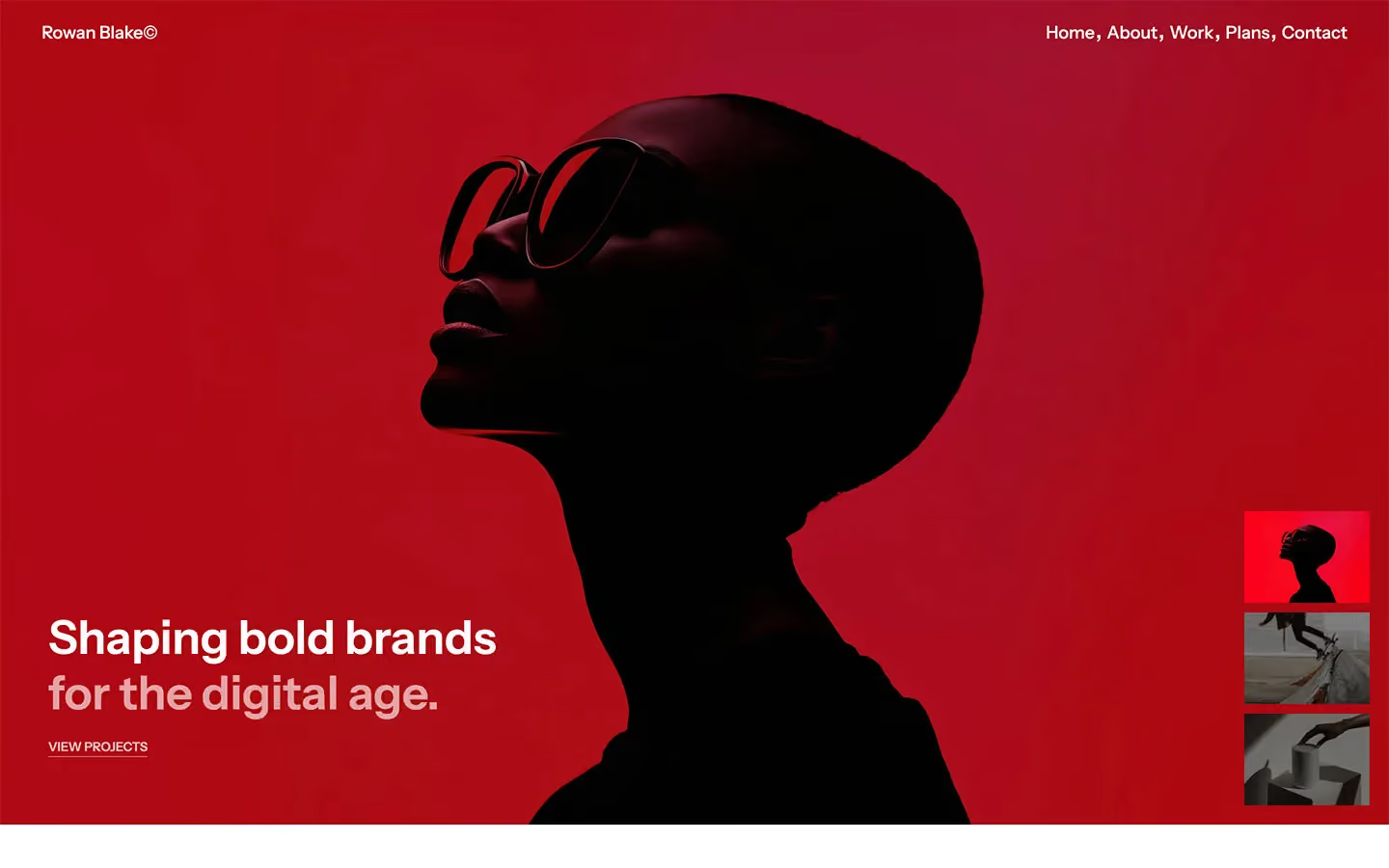
Portfolio design systems, the same colors first.


Bring any of them to your AI tool
All Access unlocks all 398 design systems, ready for Claude, ChatGPT, Gemini, Cursor, v0 and Lovable, plus 400+ templates on all 5 platforms.
Get All AccessUpgrade to All AccessHow to use the Tuscon design system
Pick a file to see what it’s for and where it goes.
What it is
The whole design system in one markdown file, written for AI: every color, type style, spacing value, component and motion rule, plus do's, don'ts and a ready prompt.
Best for
Claude, ChatGPT, Gemini, Cursor and v0, or any other AI tool that builds pages or code.
How to use it
- Put
DESIGN.mdin your project and mention it in your request, or save it as.cursor/rules/tuscon.mdc - For the rule file, start it with a front-matter block that sets
alwaysApply: true, so every chat uses it - Ask: “Build a pricing page using DESIGN.md.” Cursor follows the colors, fonts, spacing and rules
- Put
DESIGN.mdin the project root - Add one line to
CLAUDE.md: “Follow DESIGN.md for all UI.” - Ask for any page or component; Claude reads the file first
- Attach
DESIGN.mdto the chat (or paste it in) - Ask: “Build a landing page in this design system.”
- Keep the file in the chat or project knowledge, so follow-up pages stay on style
What it is
Every token as data, in the W3C Design Tokens format: colors with their roles, type styles, radius, spacing, and component tokens that point at them.
Best for
Figma (Tokens Studio), Style Dictionary and other design-token tools, and build scripts.
How to use it
- In Figma, open Tokens Studio, choose Import, and pick
tokens.json - Or point Style Dictionary’s
sourceat it to generate tokens for any platform - In code, import it like any JSON file
What it is
A Tailwind CSS v4 theme: every color, font, type style, radius and spacing value becomes a Tailwind utility, like bg-canvas, text-headline-lg or rounded-md.
Best for
Tailwind v4 projects, and AI builders that write Tailwind (v0, Lovable, Bolt).
How to use it
- Save
theme.cssnext to your main CSS file - Import it after Tailwind:
@import "tailwindcss"; @import "./theme.css"; - Use the classes:
bg-canvas text-ink rounded-md p-lg
What it is
The same tokens as plain CSS variables on :root. Component values point at the color variables, so changing one color updates everything that uses it.
Best for
Any website: plain CSS, Webflow custom code, Framer, WordPress.
How to use it
- Add it to your stylesheet, or in Webflow paste it into Site settings → Custom code inside a
<style>tag - Use the variables anywhere:
color: var(--color-ink) - Change a token once and every place that uses it follows