 flowmance
Quirky Design System


Quirky looks like a typewritten poster on manila paper. A warm burlywood canvas (#ECC886) carries near-black IBM Plex Mono, all in capitals, from a 120px hero down to 14px nav numbers. Stacks of black rules that get thicker as they go down act as dividers and decoration, and dark #151414 cards and bands flip the two colours. Photography is warm, grainy and cinematic.
Four signatures make it recognisable:
- Stepped rules. Groups of horizontal black lines of increasing weight: four under the hero (about 2px, 4px, 6px and 10px), two under each section title (thin then thick), three on project panels with the last one shortened to make room for a tag (ART DIRECTION, DESIGN).
- Monospace everything, all caps. One family, IBM Plex Mono weight 500, text-transform: uppercase on the body, no tracking except the 2px on nav numbers.
- Numbered nav. 01 ABOUT, 02 WORK, 03 JOURNAL, 04 CONTACT, each number rotated −90° and set beside an underlined label.
- Half-and-half project rows. Each project is a full-width row: a full-bleed photo on one half and a burlywood panel on the other, alternating sides.
The hero is sticky, so the next sections slide up over it.
Colors
Surfaces
#ECC886Page background (--burlywood)
#ECC886Quirky has no raised surfaces; panels are the canvas framed by rules
#151414Expertise cards, the testimonials band and its text
#ECC886Inputs are transparent on the canvas
Ink
#ECC886Text on primary
#151414All text, rules, icons (--black)
#151414Body text is full ink; there is no grey text tone
#ECC886Text on inverse-canvas
#151414Action
#151414The only filled button, the contact form's Send Message
#151414Lines & effects
#151414The stepped rules and the 2px footer column lines
#151414 · 35%The resting 1px underline under text links (.button-line-first)
#ECC886Rules and the 2px row borders inside the dark band
Typography
IBM Plex Mono · display-hero
The quick brown fox jumpsVIBRANT ✦ DESIGN APPROACH, centred (.hero-display). 120px · 500 · 1.20
IBM Plex Mono · headline-lg
The quick brown fox jumpsSection titles KNOW–HOW and project titles DUIS VELAT. 55px · 500 · 1.30
IBM Plex Mono · title-lg
The quick brown fox jumpsBlog titles (.blog-title, burlywood on dark). 29px · 500 · 1.30
IBM Plex Mono · quote
The quick brown fox jumpsTestimonial quotes. 24px · 500 · 1.30
IBM Plex Mono · label-nav
The quick brown fox jumpsNav links. 19px · 500 · 1.26
IBM Plex Mono · body
The quick brown fox jumpsParagraphs (p default). 16px · 500 · 1.30
Spacing & shape
| Purpose | Value |
|---|---|
| Container | max 1200px, centred |
| Breakpoints | 991px, 767px and 479px, plus a min-width step at 768px |
Spacing scale
| Token | Value | Preview |
|---|---|---|
xs | 10px | |
sm | 20px | |
md | 25px | |
lg | 30px | |
xl | 40px | |
2xl | 50px | |
3xl | 80px |
Layout spacing
| Token | Value | Preview |
|---|---|---|
nav-y | 30px | |
section | 100px |
Border radius
Motion
| Text roll (nav, links) | Label copies move y 0 → −100% and back, 300ms ease |
| Underline grow | .button-line-overlay width 0 → 100%, 300ms ease |
| Scroll-in rise | y 50px → 0 with opacity 0 → 1, 500ms |
| Rule and image reveal | Width or height changes, 500ms ease, on scroll into view |
| Icon pop | scale 1 → 1.1, 100ms ease |
| Star and arrow rotate | Rotation, 200–400ms ease |
| Card colour swap | Background and text colour, 400ms ease |
| Blog title | opacity 1 → 0.6, 300ms |
| Sticky hero | The hero stays at top: 0 while the next sections scroll over it |
Do’s and don’ts
- Use only #ECC886 and #151414, swapping them for dark cards and bands.
- Set everything in IBM Plex Mono 500, uppercase, with no tracking except 2px on nav numbers.
- Divide with stacked ink rules that get heavier downward, and end a shortened rule with a tag.
- Use underlined text links (1px line at 35% ink, solid line growing on hover) as the main call to action.
- Build project rows as two full-bleed halves with no gap, alternating photo sides.
- Keep photos square-cornered, warm and grainy.
- Add shadows, rounded cards or a third UI colour.
- Use filled buttons outside forms; the home page has none.
- Use Playfair Display, Roboto or Ranade, which are loaded or declared but unused.
- Use grey text; #8F8F8F in the CSS is overridden on the live page.
- Write in lowercase or sentence case.
- Use cold, bright or stock-office photos; they break the warm two-tone palette.
Example prompt
Any page in the Quirky style
More design systems like this
Agency design systems, the same colors first.
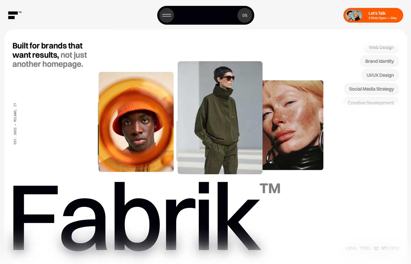
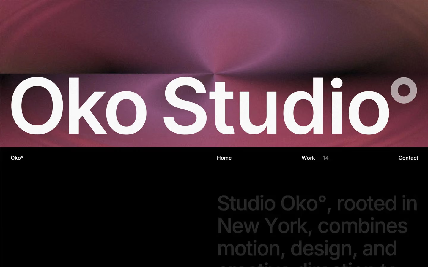
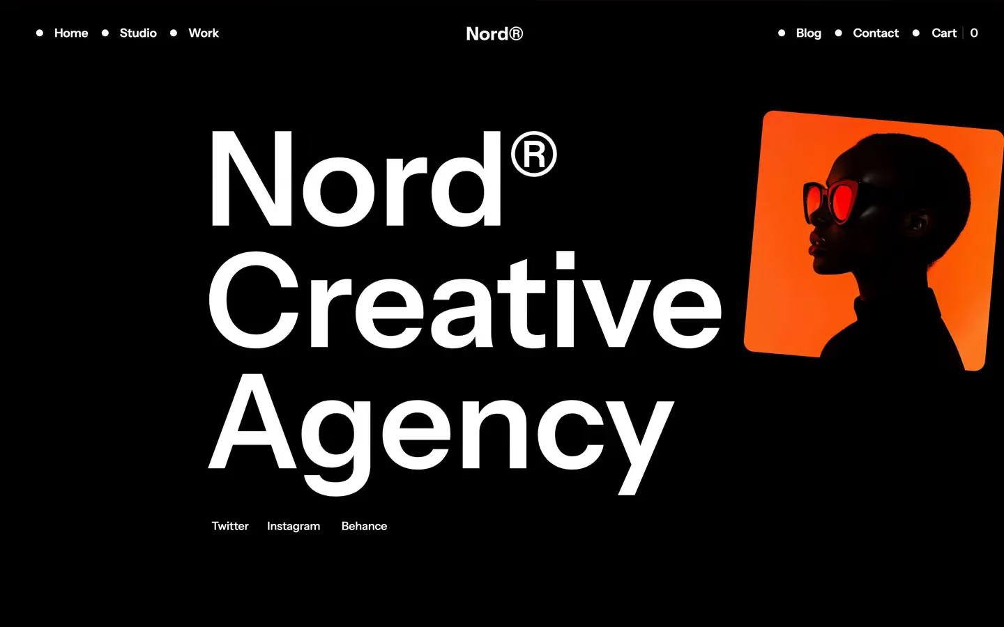

Bring any of them to your AI tool
All Access unlocks all 398 design systems, ready for Claude, ChatGPT, Gemini, Cursor, v0 and Lovable, plus 400+ templates on all 5 platforms.
Get All AccessUpgrade to All AccessHow to use the Quirky design system
Pick a file to see what it’s for and where it goes.
What it is
The whole design system in one markdown file, written for AI: every color, type style, spacing value, component and motion rule, plus do's, don'ts and a ready prompt.
Best for
Claude, ChatGPT, Gemini, Cursor and v0, or any other AI tool that builds pages or code.
How to use it
- Put
DESIGN.mdin your project and mention it in your request, or save it as.cursor/rules/quirky.mdc - For the rule file, start it with a front-matter block that sets
alwaysApply: true, so every chat uses it - Ask: “Build a pricing page using DESIGN.md.” Cursor follows the colors, fonts, spacing and rules
- Put
DESIGN.mdin the project root - Add one line to
CLAUDE.md: “Follow DESIGN.md for all UI.” - Ask for any page or component; Claude reads the file first
- Attach
DESIGN.mdto the chat (or paste it in) - Ask: “Build a landing page in this design system.”
- Keep the file in the chat or project knowledge, so follow-up pages stay on style
What it is
Every token as data, in the W3C Design Tokens format: colors with their roles, type styles, radius, spacing, and component tokens that point at them.
Best for
Figma (Tokens Studio), Style Dictionary and other design-token tools, and build scripts.
How to use it
- In Figma, open Tokens Studio, choose Import, and pick
tokens.json - Or point Style Dictionary’s
sourceat it to generate tokens for any platform - In code, import it like any JSON file
What it is
A Tailwind CSS v4 theme: every color, font, type style, radius and spacing value becomes a Tailwind utility, like bg-canvas, text-headline-lg or rounded-md.
Best for
Tailwind v4 projects, and AI builders that write Tailwind (v0, Lovable, Bolt).
How to use it
- Save
theme.cssnext to your main CSS file - Import it after Tailwind:
@import "tailwindcss"; @import "./theme.css"; - Use the classes:
bg-canvas text-ink rounded-md p-lg
What it is
The same tokens as plain CSS variables on :root. Component values point at the color variables, so changing one color updates everything that uses it.
Best for
Any website: plain CSS, Webflow custom code, Framer, WordPress.
How to use it
- Add it to your stylesheet, or in Webflow paste it into Site settings → Custom code inside a
<style>tag - Use the variables anywhere:
color: var(--color-ink) - Change a token once and every place that uses it follows