 flowmance
Oblik Design System


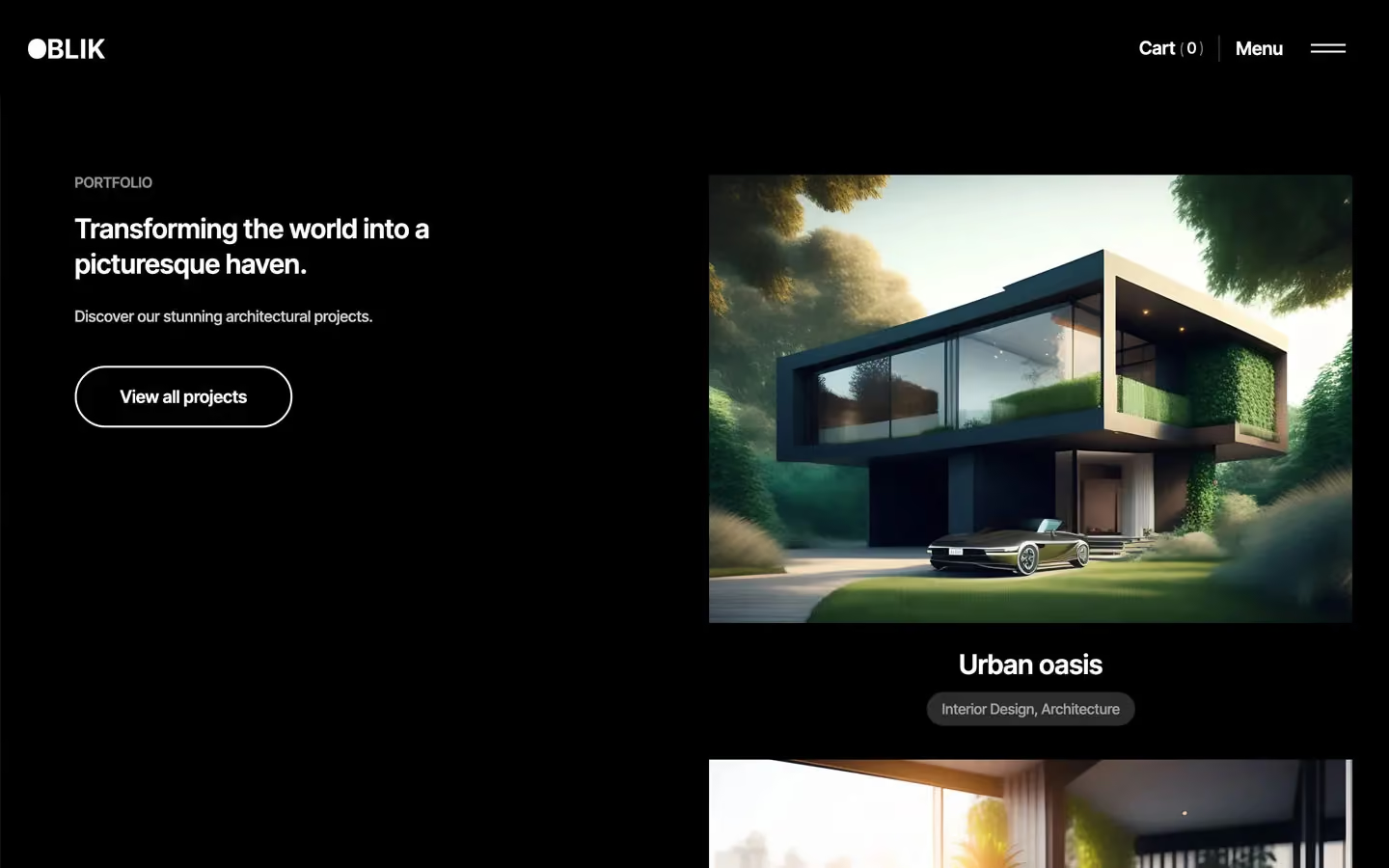
Oblik is a stark, gallery-like architecture and construction site. It is pure black and white, with semibold Inter Tight, outlined pill buttons and large square-cut renders of modern houses and interiors. The mood is calm and confident: lots of white space, one long rolling line of giant text, and a solid black band where the portfolio lives.
Four signatures make it recognisable:
- Outlined 2px pills. Main actions are hollow pills with a 2px border, a 40px radius and generous padding (20px 45px, 64px tall): black on white (Meet the team), white on dark (Request a Free Quote, View all projects).
- The rolling line. Oblik, Innovative Architecture, New York. and …the concept of architecture… run edge to edge at 130px semibold, cut off by the viewport and moving sideways as you scroll.
- Two-tone statements. Section statements are 28px semibold where the first half is black and the end fades to 50% (The breadth of our skilled expertise / and knowledge.). Plain paragraphs are black at 50% too.
- The black band and the black bar. The portfolio sits on a full-width #000000 band with a sticky left column and stacked project renders on the right. Once you scroll off the hero, the fixed nav turns into a solid 100px black bar.
Oblik is a light design with a black band (portfolio) and a black full-screen menu.
Colors
Surfaces
#FFFFFFPage background
#F7F7FCNewsletter field and its button wrapper
#F4F4F4One light panel
#81818B · 20%Underline under text links; newsletter field border
#000000Portfolio band, scrolled nav bar, full-screen menu
#333333Text typed in contact inputs
Ink
#FFFFFFText on primary
#000000Headlines, nav, buttons, service titles
#000000Body statements are full black at weight 600, so ink-muted equals ink
#000000 · 60%Footer links (.footer-link-main), full black on hover
#000000 · 50%Plain paragraphs (p { opacity: .5 }), service sub-items, the faded end of statements
#FFFFFFText on inverse-canvas
#FFFFFF · 80%PORTFOLIO eyebrow and lead text on black
#FFFFFFAction
#000000The filled pill (.button, form submit), the 55px circle arrow button
Lines & effects
#E1E1E11px hairline borders
#0000002px button and field borders, the 2px navigation-line
#B9BBC8Underline under text links; newsletter field border
#444444Project category chip on the black band (whole chip at 63% opacity)
#FFFFFF · 15%36px count circles in the menu
#000000 · 40%Overlay on the hero photo
Typography
Inter Tight · display-marquee
The quick brown fox jumpsRolling line Oblik, Innovative Architecture, New York. 130px · 600 · 1.2
Inter Tight · headline-md
The quick brown fox jumpsSection statements, Transforming the world into a picturesque haven., project titles. 28px · 600 · 1.3
Inter Tight · title-md
The quick brown fox jumpsService titles Architecture, Construction (.expertise-title). 21px · 600 · 1.43
Inter Tight · label-lg
The quick brown fox jumpsButton labels. 18px · 600 · 1.11
Inter Tight · body
The quick brown fox jumpsParagraphs and service sub-items (Architecture Design) at 50%. 17px · 600 · 1.4
Inter Tight · caption
The quick brown fox jumpsProject chips Interior Design, Architecture. 15px · 500 · 1.4
Spacing & shape
| Purpose | Value |
|---|---|
| Container | max 1200px (--page-main-size--container), centred |
| Section rhythm | 150px top and bottom (.section) |
| Breakpoints | 991px, 767px and 479px, plus a 1280px step |
Spacing scale
| Token | Value | Preview |
|---|---|---|
xxs | 5px | |
xs | 10px | |
sm | 15px | |
md | 20px | |
lg | 30px | |
xl | 40px | |
2xl | 60px | |
3xl | 100px |
Layout spacing
| Token | Value | Preview |
|---|---|---|
section-tight | 50px | |
gutter | 72px | |
section-band | 120px | |
section | 150px |
Border radius
Surfaces
How the surfaces stack, from the page background up. Hex codes and roles are in Colors above.
Motion
| Headline reveal | Lines rise from y 200% with skewY 7deg → 0deg, settling with y → 0% over 1100ms outQuint |
| Fade-up | opacity 0 → 1 with y 40px → 0, 500ms |
| Slow fade | opacity 0 → 1, 1000–1250ms outQuart |
| Button arrow swap | Label y 0 → −100px, arrow 100px → 0, 500ms |
| Nav on scroll | Background colour change, 300ms ease |
| Image hover | Filter change, 300ms ease; scale to 0.8 and back, 300ms outQuad on small elements |
| Link underline | Width grow, 300ms ease or 500ms |
| Menu icon | Rotate, 400ms ease |
| Rolling line | Horizontal move scrubbed by scroll |
| CSS hovers | Footer links opacity 0.6 → 1, .button opacity 0.79, 300ms |
Do’s and don’ts
- Keep the palette to #000000 and #FFFFFF, with grey made from opacity (black 50%, 60%; white 80%).
- Use the outlined 2px pill (40px radius, padding 20px 45px, 64px tall) for section actions.
- Run one rolling display-marquee line at 130px semibold across the full width.
- Write section statements in two tones: black, then the ending at 50%.
- Put the portfolio on a solid black band with a sticky left column.
- Keep images square-cornered and let split images touch the viewport edge.
- Add the unused lime #BFEA88 or the pink #F3EAF7, or any accent colour.
- Use ink-subtle (black at 50%, 4.0:1 on white) below 17px semibold; keep it for paragraphs and list items at that size or larger.
- Round images, even though a 20px variable exists.
- Add shadows or coloured overlays.
- Use Oswald or Hubot Sans for anything but the blockquote.
- Use filled black buttons for main section actions; the filled pill is for form submits.
Example prompt
Any page in the Oblik style
More design systems like this
Construction design systems, the same colors first.



Bring any of them to your AI tool
All Access unlocks all 398 design systems, ready for Claude, ChatGPT, Gemini, Cursor, v0 and Lovable, plus 400+ templates on all 5 platforms.
Get All AccessUpgrade to All AccessHow to use the Oblik design system
Pick a file to see what it’s for and where it goes.
What it is
The whole design system in one markdown file, written for AI: every color, type style, spacing value, component and motion rule, plus do's, don'ts and a ready prompt.
Best for
Claude, ChatGPT, Gemini, Cursor and v0, or any other AI tool that builds pages or code.
How to use it
- Put
DESIGN.mdin your project and mention it in your request, or save it as.cursor/rules/oblik.mdc - For the rule file, start it with a front-matter block that sets
alwaysApply: true, so every chat uses it - Ask: “Build a pricing page using DESIGN.md.” Cursor follows the colors, fonts, spacing and rules
- Put
DESIGN.mdin the project root - Add one line to
CLAUDE.md: “Follow DESIGN.md for all UI.” - Ask for any page or component; Claude reads the file first
- Attach
DESIGN.mdto the chat (or paste it in) - Ask: “Build a landing page in this design system.”
- Keep the file in the chat or project knowledge, so follow-up pages stay on style
What it is
Every token as data, in the W3C Design Tokens format: colors with their roles, type styles, radius, spacing, and component tokens that point at them.
Best for
Figma (Tokens Studio), Style Dictionary and other design-token tools, and build scripts.
How to use it
- In Figma, open Tokens Studio, choose Import, and pick
tokens.json - Or point Style Dictionary’s
sourceat it to generate tokens for any platform - In code, import it like any JSON file
What it is
A Tailwind CSS v4 theme: every color, font, type style, radius and spacing value becomes a Tailwind utility, like bg-canvas, text-headline-lg or rounded-md.
Best for
Tailwind v4 projects, and AI builders that write Tailwind (v0, Lovable, Bolt).
How to use it
- Save
theme.cssnext to your main CSS file - Import it after Tailwind:
@import "tailwindcss"; @import "./theme.css"; - Use the classes:
bg-canvas text-ink rounded-md p-lg
What it is
The same tokens as plain CSS variables on :root. Component values point at the color variables, so changing one color updates everything that uses it.
Best for
Any website: plain CSS, Webflow custom code, Framer, WordPress.
How to use it
- Add it to your stylesheet, or in Webflow paste it into Site settings → Custom code inside a
<style>tag - Use the variables anywhere:
color: var(--color-ink) - Change a token once and every place that uses it follows