 flowmance
Gridstone Design System
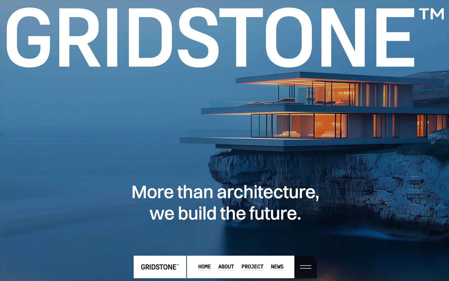
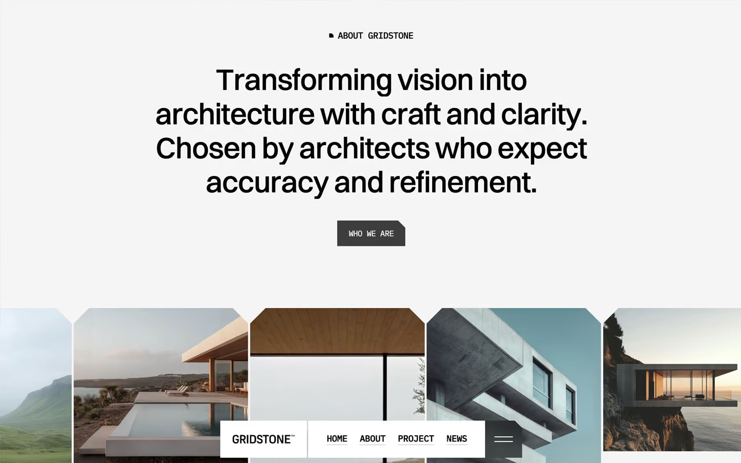

Gridstone is a light, precise architecture studio site. It feels like a technical monograph: whitesmoke pages, black Switzer statements in sentence case, small uppercase IBM Plex Mono labels, and large photographs of glass-and-concrete houses at blue hour. Everything is rectangular, but corners are often cut, not rounded, as if trimmed with a blade.
Four signatures make it recognisable:
- Chamfered corners. Buttons, the menu button, the menu panel, play buttons and some large images have one corner cut at 45° (a clip-path polygon; 10–12px on controls, about 75px on images). There are no rounded corners in view.
- Floating bottom nav bar. The navigation is fixed at the bottom centre (max 600px): a white logo block, a white block of mono uppercase links, and a dark square menu button with its top-right corner cut, separated by 2px gaps.
- Mono labels with a square bullet. Section eyebrows are IBM Plex Mono uppercase with a tiny black square before them: ■ WHAT WE DO, ■ FEATURED PROJECTS. Metrics like 75% use the same mono at 64px.
- Logo-scale hero. A white GRIDSTONE™ wordmark spans 97% of the viewport width across the top of the full-bleed hero photo, with a centred two-line statement near the bottom.
The page is light; the hero photo and the sticky black footer are the dark moments.
Colors
Surfaces
#F5F5F5Every content section (the footer-color variable, whitesmoke)
#FFFFFFNav blocks, the menu panel, form fields
#E9E9E9The about band (Founded in 2018…)
#FFFFFFContact form
#000000The sticky full-height footer
Ink
#FFFFFFText on primary
#000000Statements, labels, links
#000000 · 80%Lead paragraphs (We bring architecture to life…), input text
#000000 · 57%Metric descriptions, the about band's paragraphs
#FFFFFF#FFFFFFText on inverse-canvas
Action
#000000 · 75%The filled button; on #F5F5F5 it reads as a dark charcoal
#2B2B2BThe layer that slides up from below on hover
Lines & effects
#000000 · 10%1px rules between feature rows and project rows
#BBBBBB0.5px underlines under nav links
#000000 · 60%The menu square in the nav (black over photos, grey over light sections)
#FFFFFF · 17%Video play buttons and small overlays on images
#FFFFFF · 20%With glass: Video play buttons and small overlays on images
#000000 · 5%Full-screen layer behind the open menu
#000000 · 42%Placeholder text on field
#000000 · 35%Hero overlay (30% on other photos)
Typography
Switzer · display-cta
The quick brown fox jumpsThe large call-to-action title (--button--cta-title: 5rem), split by word (33 measured), below the captured screens. 80px · 500 · 1.15 · -1px
Switzer · headline-lg
The quick brown fox jumpsSection statements (274 split words measured). 48px · 500 · 1.15 · -1px
Switzer · title-lg
The quick brown fox jumpsFeature titles Design Excellence, Sustainable Impact. 22.4px · 500 · 1.15 · -0.4px
Switzer · body-lg
The quick brown fox jumpsLarge centred paragraphs. 22.4px · 500 · 1.3 · -0.4px
Switzer · label
The quick brown fox jumpsMenu links. 17.6px · 500 · 1.15 · -0.5px
IBM Plex Mono · eyebrow
The quick brown fox jumps■ WHAT WE DO. 14.4px · 500 · 1.15 · -0.5px
Spacing & shape
| Purpose | Value |
|---|---|
| Container | max 1400px; statements and centred text cap at 850px, 800px or 700px |
| Section rhythm | 150px top and bottom by default, often trimmed to 50–100px on one side so sections chain together |
| Breakpoints | 991px, 767px and 479px, plus a 1920px+ step |
Spacing scale
| Token | Value | Preview |
|---|---|---|
hair | 2px | |
xs | 3px | |
sm | 7px | |
md | 16px | |
lg | 20px | |
xl | 30px | |
2xl | 50px | |
3xl | 100px |
Layout spacing
| Token | Value | Preview |
|---|---|---|
column-gap | 16px | |
gutter | 29px | |
section | 150px |
Border radius
Surfaces
How the surfaces stack, from the page background up. Hex codes and roles are in Colors above.
Motion
| Text roll (links, nav) | Label y → −17px and copy x −110% → 0%, 300ms power1.out |
| Button | #2B2B2B layer translateY 100% → 0; label nudges y 4px / −3px in 200ms |
| Preloader counter | Digits roll in columns (y 0 → −100%…−420%), 900ms power4.out, staggered |
| Line draw | width 0% → 100%, 520ms power2.out, staggered |
| Fade-up | y 20px → 0, opacity 0 → 1, 830ms power2.out, staggered |
| Scroll reveals | ScrollTrigger top 75% → top 25%, played once (no scrub) |
| Menu open | Panel height 0 → 600px, 500ms |
| Section intros | y 2rem → 0, 800ms outExpo; opacity 0 → 1, 1000ms outQuart |
| Hero settle | Scale to 1 over 1500ms outExpo on page start |
| Parallax | Images move y ±15%, 10%, 25% or 50% while in view |
| Page transition | Panel y 0% → 100%, 500ms cubic-bezier(0.614, 0.03, 0, 0.983) |
Do’s and don’ts
- Use chamfered corners (one 10–12px cut on controls, about 75px on large photos) instead of border radius.
- Set every label, button, nav link and metric in IBM Plex Mono uppercase; set sentences in Switzer weight 500.
- Open sections with ■ EYEBROW and a 48px statement at −1px tracking.
- Keep the page #F5F5F5 with pure black #000000 text, and greys as black at 80% or 57%.
- Keep the navigation as the floating bottom bar of white blocks plus the dark menu square.
- Separate rows with 1px black-at-10% rules.
- Round corners or use pill buttons.
- Use the unused variable colours (#ffd500, #131313) or any accent colour.
- Add drop shadows; depth comes from layered images, blur and the sticky footer.
- Use Inter or Libre Caslon, or set sentences in mono.
- Use weights above 600 or uppercase Switzer.
- Put the nav at the top of the page.
Example prompt
Any page in the Gridstone style
More design systems like this
Construction design systems, the same colors first.



Bring any of them to your AI tool
All Access unlocks all 398 design systems, ready for Claude, ChatGPT, Gemini, Cursor, v0 and Lovable, plus 400+ templates on all 5 platforms.
Get All AccessUpgrade to All AccessHow to use the Gridstone design system
Pick a file to see what it’s for and where it goes.
What it is
The whole design system in one markdown file, written for AI: every color, type style, spacing value, component and motion rule, plus do's, don'ts and a ready prompt.
Best for
Claude, ChatGPT, Gemini, Cursor and v0, or any other AI tool that builds pages or code.
How to use it
- Put
DESIGN.mdin your project and mention it in your request, or save it as.cursor/rules/gridstone.mdc - For the rule file, start it with a front-matter block that sets
alwaysApply: true, so every chat uses it - Ask: “Build a pricing page using DESIGN.md.” Cursor follows the colors, fonts, spacing and rules
- Put
DESIGN.mdin the project root - Add one line to
CLAUDE.md: “Follow DESIGN.md for all UI.” - Ask for any page or component; Claude reads the file first
- Attach
DESIGN.mdto the chat (or paste it in) - Ask: “Build a landing page in this design system.”
- Keep the file in the chat or project knowledge, so follow-up pages stay on style
What it is
Every token as data, in the W3C Design Tokens format: colors with their roles, type styles, radius, spacing, and component tokens that point at them.
Best for
Figma (Tokens Studio), Style Dictionary and other design-token tools, and build scripts.
How to use it
- In Figma, open Tokens Studio, choose Import, and pick
tokens.json - Or point Style Dictionary’s
sourceat it to generate tokens for any platform - In code, import it like any JSON file
What it is
A Tailwind CSS v4 theme: every color, font, type style, radius and spacing value becomes a Tailwind utility, like bg-canvas, text-headline-lg or rounded-md.
Best for
Tailwind v4 projects, and AI builders that write Tailwind (v0, Lovable, Bolt).
How to use it
- Save
theme.cssnext to your main CSS file - Import it after Tailwind:
@import "tailwindcss"; @import "./theme.css"; - Use the classes:
bg-canvas text-ink rounded-md p-lg
What it is
The same tokens as plain CSS variables on :root. Component values point at the color variables, so changing one color updates everything that uses it.
Best for
Any website: plain CSS, Webflow custom code, Framer, WordPress.
How to use it
- Add it to your stylesheet, or in Webflow paste it into Site settings → Custom code inside a
<style>tag - Use the variables anywhere:
color: var(--color-ink) - Change a token once and every place that uses it follows