 flowmance
Nina Smith Design System


Nina Smith is a bold, two-colour personal portfolio. The whole page is pale aqua with every word, line and icon in one deep ultramarine blue, so it feels like a screen-printed poster. A giant Hello ✦ Hello ✦ marquee runs across the hero, the type is the slightly quirky geometric Fahkwang, and colour pops only in the work imagery (violet, neon pink, black product shots) and in the yellow button hover.
Four signatures make it recognisable:
- Blue on aqua, nothing else. #0115A8 on #CDEBEB for all text, rules, icons and the button. There is no black, no white text block and no grey.
- The Hello marquee. Hello at 13vw (187px at 1440), weight 700, with a four-pointed star ✦ between repeats, scrolling sideways and cut off at both edges. Inner pages reuse the idea with their own words (a job title on home 3, Sed lectus ✦ on the work page).
- The script wordmark. A stretched, slanted nina smith logo (an image, 90px wide) centred in the nav, flanked by abbreviated socials Fb. Be. Tw. Dr. Ig. on the left and a three-line hamburger with Menu on the right.
- Blue square button that turns yellow. #0115A8 with white text and a 3px radius; on hover it switches to khaki #FBE95E with black text.
Nina Smith is a light-only design.
Colors
Surfaces
#CDEBEBPage background, overlay menu, cart panel
#FFFFFF · 30%Preview cards on the landing page (they read as a lighter aqua)
Ink
#FFFFFFText on primary
#0115A8Every piece of text, icons, the logo
#0115A8Body text is the same blue (same as ink), at weight 700
#000000Text on accent
Action
#0115A8Buttons, the round close button
#FBE95EButton hover: khaki with black text
#FBE95E#FF0000The round remove button in the cart only (its × is an 8px image)
Lines & effects
#0115A82px menu underlines, cart border, blockquote rule, hamburger lines
#0115A8 · 43%The 1px outline of the small fixed switch
Typography
Fahkwang · display-marquee
The quick brown fox jumpsThe Hello ✦ marquee, white-space: nowrap. 187px · 700 · 1.4
Fahkwang · headline-lg
The quick brown fox jumpsSection titles on inner pages (h2 base). 32px · 700 · 1.13
Fahkwang · quote
The quick brown fox jumpsBlockquotes with a 3px blue left rule. 30px · 500 · 1.27
Fahkwang · title-price
The quick brown fox jumpsPlan prices. 24px · 600 · 1.88
Fahkwang · body-lg
The quick brown fox jumpsThe hero lead A creative multi-concept portfolio template…. 23px · 500 · 1.4
Fahkwang · label
The quick brown fox jumpsMenu, buttons. 16px · 700 · 1.25
Spacing & shape
| Purpose | Value |
|---|---|
| Section rhythm | 120px top and 100px bottom, 5% sides; 80px with 2% sides at ≤991; 60px top and bottom at ≤479 |
| Breakpoints | 991px (tablet), 767px (landscape phone) and 479px (phone), plus a min-width: 768px group |
Spacing scale
| Token | Value | Preview |
|---|---|---|
xs | 5px | |
sm | 15px | |
md | 16px | |
lg | 30px | |
xl | 40px | |
2xl | 50px |
Layout spacing
| Token | Value | Preview |
|---|---|---|
column-gap | 16px | |
footer-bottom | 30px | |
nav-height | 80px | |
section-bottom | 100px | |
section-top | 120px |
Border radius
Motion
| Marquee | The Hello ✦ line moves sideways in a continuous loop that starts on page load |
| Card hover | Filter change on the preview image over 200ms ease |
| Colour hover | Text, background and border colour over 200ms ease (300ms on some backgrounds); the button uses transition: all .3s |
| Fade in on scroll | opacity 0 → 1 over 1000ms outQuart with a move to 0px; some items 600ms outExpo |
| Slide in | x −30% → 0% (500ms, then 300ms ease) and x −30px → 0 |
| Menu | Display toggles at 0ms; items fade in over 300ms ease; a shape scales to 1 over 500ms outExpo and back to 0 over 600ms inOutBack |
| Cursor | A small blue dot follows the pointer |
Do’s and don’ts
- Use #CDEBEB for the background and #0115A8 for every piece of text, rule and icon.
- Set everything in Fahkwang, weight 700 by default, with no letter spacing.
- Open a page with a one-word marquee at 13vw, weight 700, with ✦ between the repeats.
- Use the blue square button (3px radius, padding 16px 18px) and switch it to #FBE95E with black text on hover.
- Put previews in white-30% tiles with a + icon and a 16px gap.
- Keep colour in the photography: violet, neon pink and black product shots.
- Add black, grey or white text, or a second text colour.
- Use the declared greens and royal blue (#2E856E, #3077F6); they are not part of the live design.
- Round cards or images, or add shadows.
- Use yellow as a section background; it is a hover state.
- Load Satoshi or add a second typeface.
- Put the marquee text over a photo.
Example prompt
Any page in the Nina Smith style
More design systems like this
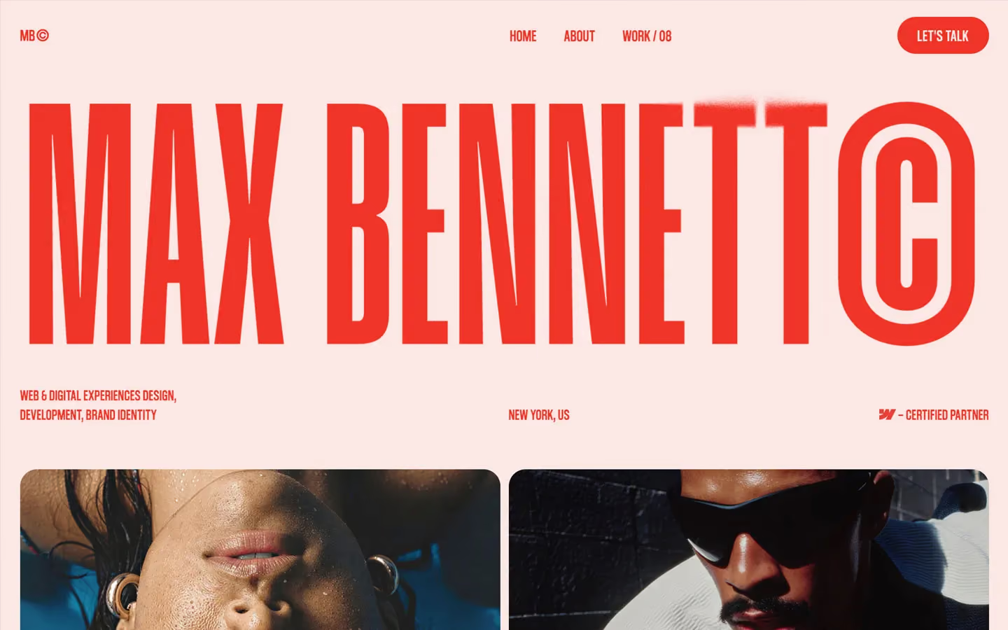
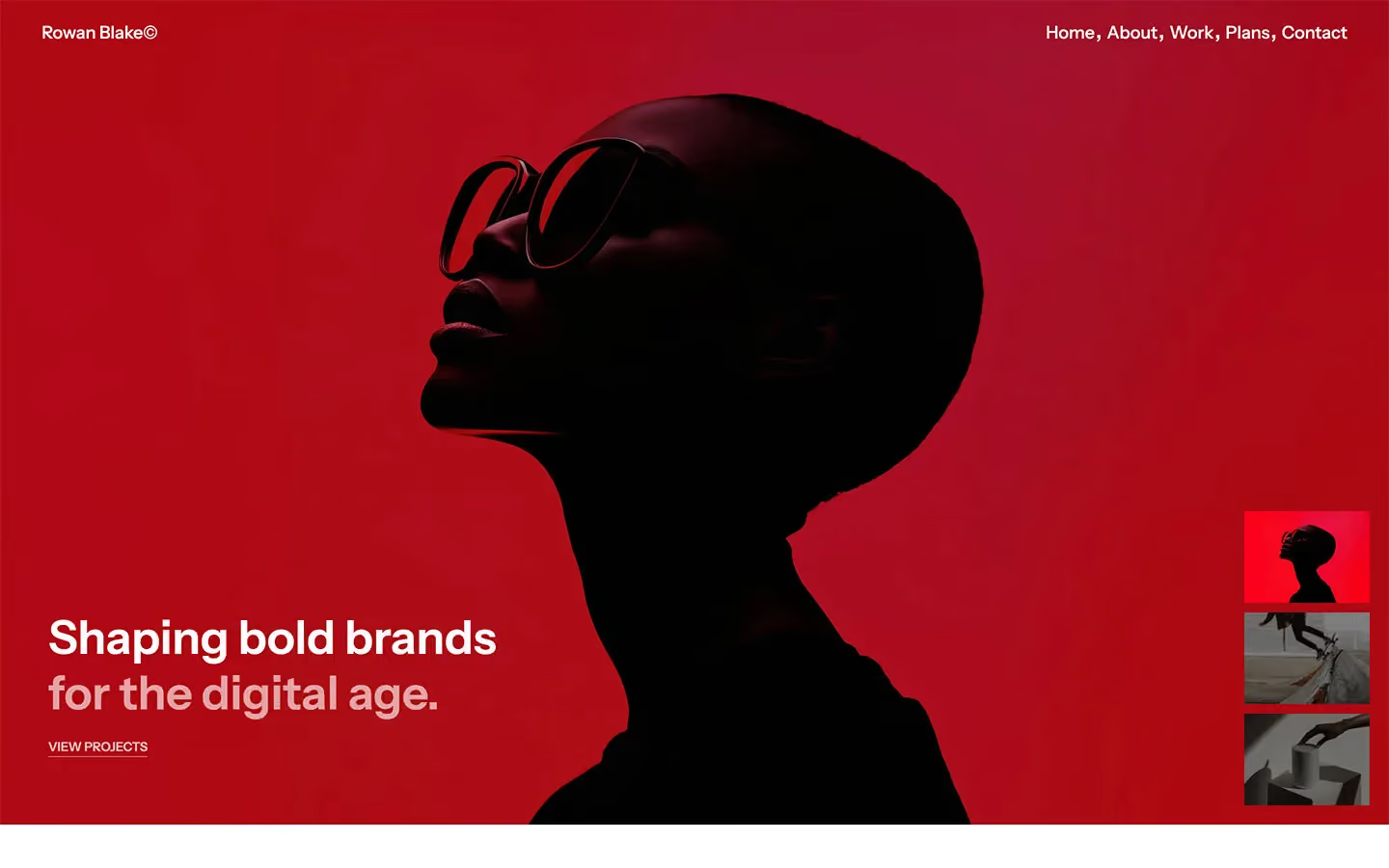
Portfolio design systems, the same colors first.


Bring any of them to your AI tool
All Access unlocks all 398 design systems, ready for Claude, ChatGPT, Gemini, Cursor, v0 and Lovable, plus 400+ templates on all 5 platforms.
Get All AccessUpgrade to All AccessHow to use the Nina Smith design system
Pick a file to see what it’s for and where it goes.
What it is
The whole design system in one markdown file, written for AI: every color, type style, spacing value, component and motion rule, plus do's, don'ts and a ready prompt.
Best for
Claude, ChatGPT, Gemini, Cursor and v0, or any other AI tool that builds pages or code.
How to use it
- Put
DESIGN.mdin your project and mention it in your request, or save it as.cursor/rules/nina.mdc - For the rule file, start it with a front-matter block that sets
alwaysApply: true, so every chat uses it - Ask: “Build a pricing page using DESIGN.md.” Cursor follows the colors, fonts, spacing and rules
- Put
DESIGN.mdin the project root - Add one line to
CLAUDE.md: “Follow DESIGN.md for all UI.” - Ask for any page or component; Claude reads the file first
- Attach
DESIGN.mdto the chat (or paste it in) - Ask: “Build a landing page in this design system.”
- Keep the file in the chat or project knowledge, so follow-up pages stay on style
What it is
Every token as data, in the W3C Design Tokens format: colors with their roles, type styles, radius, spacing, and component tokens that point at them.
Best for
Figma (Tokens Studio), Style Dictionary and other design-token tools, and build scripts.
How to use it
- In Figma, open Tokens Studio, choose Import, and pick
tokens.json - Or point Style Dictionary’s
sourceat it to generate tokens for any platform - In code, import it like any JSON file
What it is
A Tailwind CSS v4 theme: every color, font, type style, radius and spacing value becomes a Tailwind utility, like bg-canvas, text-headline-lg or rounded-md.
Best for
Tailwind v4 projects, and AI builders that write Tailwind (v0, Lovable, Bolt).
How to use it
- Save
theme.cssnext to your main CSS file - Import it after Tailwind:
@import "tailwindcss"; @import "./theme.css"; - Use the classes:
bg-canvas text-ink rounded-md p-lg
What it is
The same tokens as plain CSS variables on :root. Component values point at the color variables, so changing one color updates everything that uses it.
Best for
Any website: plain CSS, Webflow custom code, Framer, WordPress.
How to use it
- Add it to your stylesheet, or in Webflow paste it into Site settings → Custom code inside a
<style>tag - Use the variables anywhere:
color: var(--color-ink) - Change a token once and every place that uses it follows