 flowmance
Muty Design System

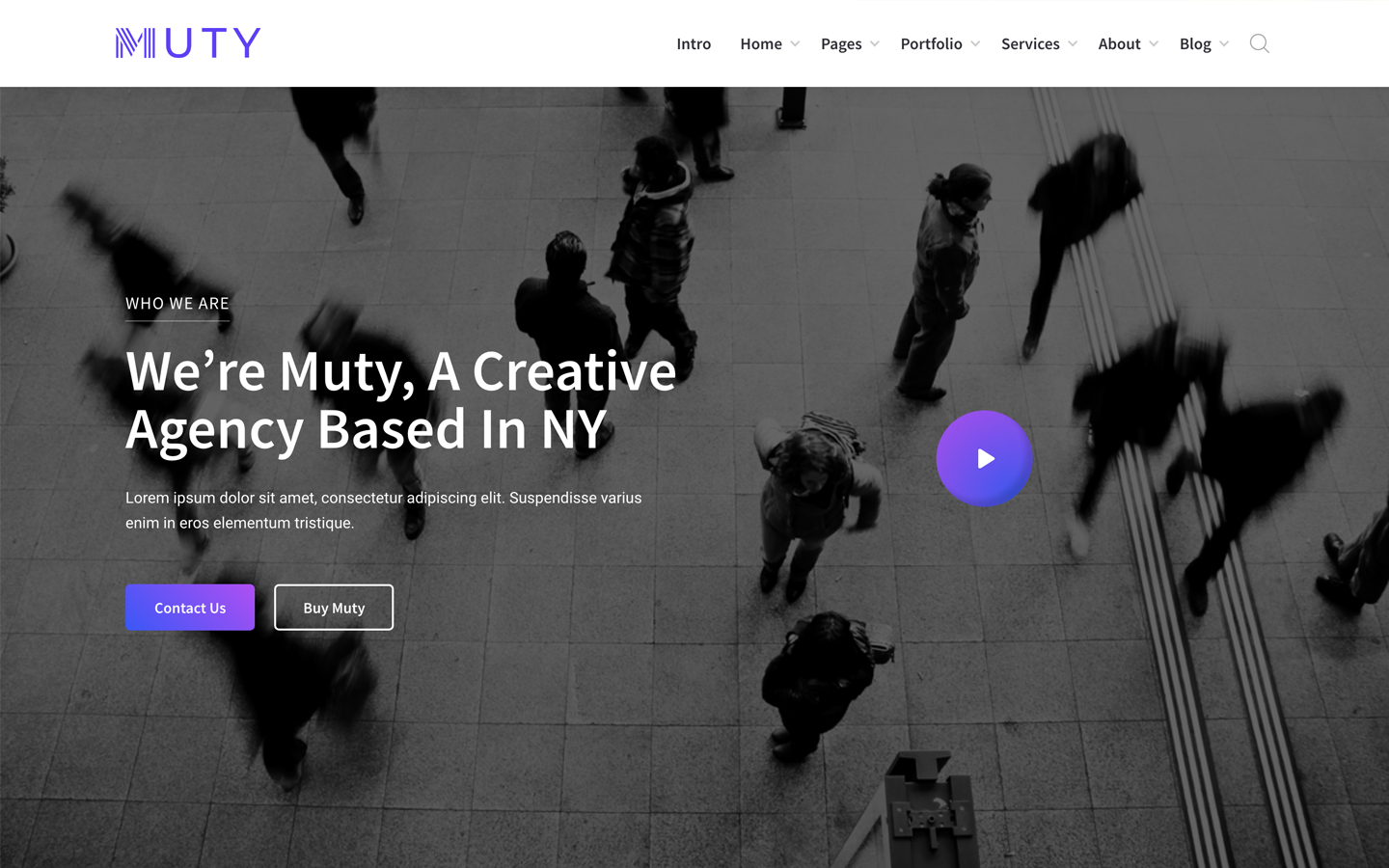

Muty is a cheerful, early-SaaS-style UI kit for agencies and startups. The intro page opens on a full-width violet-to-blue gradient with a big white Source Sans Pro headline, then drops onto a pale lavender-grey band where the five home layouts are shown as framed screenshots, and ends on a dark graphite call-to-action band. Every section starts with a small letter-spaced uppercase eyebrow with a thin underline, then a 39px headline and a centred grey Roboto paragraph.
Four signatures make it recognisable:
- The violet gradient. linear-gradient(225deg, #BF40FB, #3452FF) fills the hero, and the same two colours (at 45° or 49°) fill buttons on hover. Violet #6540FB is the solid brand colour between them.
- Underlined eyebrows. POWERFUL UI KIT TEMPLATE, PURCHASE MUTY NOW!, HOME VERSION 1: 15px weight 600 uppercase with 2px tracking, sitting on a 1px rule of the same colour (violet on light, grey for the layout labels, white 40% on the gradient) with 5px between text and rule.
- Outlined buttons. Buttons have no fill at rest: a 2px inset outline in violet (or white on dark) with a 5px radius. On hover the outline disappears and the gradient fills in, with white text.
- Two typefaces with clear jobs. Source Sans Pro (600) for headings, nav and labels; Roboto 400 for paragraphs, grey #919197 on light bands (white on the dark CTA band).
Muty is a light design with a gradient hero and a dark CTA band.
Colors
Surfaces
#FFFFFFBody and default .section background, footer, dropdowns
#FFFFFFFramed layout previews and cards, which sit on the lavender band
#F1F1F7The pale lavender-grey band (section dark-gray) behind the layout previews
#414147CTA band, with a 45° gradient from #313137 to #616167 and a photo
Ink
#6540FBText on primary
#FFFFFFText on primary-hover
#121217Headlines and footer titles
#333333Base body colour for unstyled text
#919197Paragraphs (p: Roboto 16px), input text and placeholders
#999999HOME VERSION 1–5 labels
#818187Dropdown links
#AAAAAAUppercase form field labels
#FFFFFF#FFFFFFText on the gradient and the dark band
#FFFFFFText on media
#FFFFFF · 72%Ready templates for: note in the hero
#FFFFFF · 60%Secondary text on dark
Action
#FFFFFFMuty has no filled buttons: the main button is transparent on white with violet text and a 2px violet inset outline
#3452FFHover fill is the gradient 49deg, #BF40FB → #3452FF with white text; #3452FF is its end colour
#6540FBEyebrows and their rule, outline buttons, blockquotes, submit text (--blue-violet)
Lines & effects
#E1E1E11px bottom border of form fields
#BF40FBHero gradient (225°) and the hover fill (--medium-orchid, --royal-blue)
#3452FFHero gradient (225°) and the hover fill (--medium-orchid, --royal-blue)
#313137#616167#FFFFFF · 40%The rule under the hero eyebrow
#FFFFFF · 15%1px bottom border of the transparent header
#000000 · 15%Preview card shadow
Typography
Source Sans Pro · display-hero
The quick brown fox jumpsMeet Muty, your design toolkit. 60px · 600 · 1.0
Source Sans Pro · headline-lg
The quick brown fox jumps5 Home Page Layouts, Build your website with style! (h2). 39px · 600 · 1.03
Source Sans Pro · title-md
The quick brown fox jumpsFooter titles; search overlay input (20px). 20px · 600 · 1.5
Source Sans Pro · eyebrow-hero
The quick brown fox jumpsREFINED AND PROFESSIONAL UI KIT TEMPLATE on the gradient. 18px · 400 · 1.44 · 1px
Source Sans Pro · label-nav
The quick brown fox jumpsIntro, Home, Pages, Portfolio, Services, About, Blog. 17px · 600 · 1.18
Roboto · body
The quick brown fox jumpsParagraphs. 16px · 400 · 1.63
Spacing & shape
| Purpose | Value |
|---|---|
| Container | .container-fluid is max 1200px, centred |
| Section rhythm | .section is 120px top and bottom with 15px sides |
| Breakpoints | 991px, 767px and 479px (Webflow defaults), plus some min-width: 768px rules |
Spacing scale
| Token | Value | Preview |
|---|---|---|
xs | 5px | |
sm | 10px | |
md | 20px | |
lg | 30px | |
xl | 70px |
Layout spacing
| Token | Value | Preview |
|---|---|---|
section-x | 15px | |
nav-y | 15px | |
nav-x | 20px | |
footer-bottom | 25px | |
footer-top | 70px | |
section | 120px |
Border radius
Motion
| Button hover | Gradient fill, white text, outline off; 300ms (transition: all .3s) |
| Dropdown open | Size 400ms outCubic, border 200ms outSine |
| Overlays (search, menu) | Opacity 0 ↔ 1, 400ms ease; panel y −100% ↔ 0%, 400–500ms |
| Image hover | scale 1 → 1.1, 400–500ms ease |
Do’s and don’ts
- Open every section with the underlined 15px uppercase eyebrow (2px tracking), a 39px weight 600 headline and a grey #919197 Roboto paragraph, all centred.
- Use the #BF40FB → #3452FF gradient for the hero and for button hovers, always on a diagonal.
- Keep buttons as 2px inset outlines with a 5px radius at rest, filled with the gradient only on hover.
- Use Source Sans Pro 600 for headings, nav and labels and Roboto 400 for paragraphs.
- Put layout previews and cards on the #F1F1F7 band as white frames with the 0 10px 12px -7px 15% shadow.
- Keep inputs borderless except for a 1px #E1E1E1 bottom line, with italic text.
- Set #919197 paragraphs below 16px, or long copy on the #F1F1F7 band: it is about 3.1:1 on white and 2.8:1 on the band. The template uses it at 16px / 26px only.
- Use #999999 labels or #AAAAAA field labels below 14px; they are under 3:1 on white. Keep them uppercase with 2px tracking and weight 600, and keep #818187 dropdown links (about 3.9:1) at 15px weight 600.
- Put white button text on the #BF40FB end of the gradient alone (about 3.9:1); keep the full gradient so the #3452FF end carries contrast, at 16px weight 600.
- Fill buttons at rest or use a radius above 5px.
- Use the extra Webflow colours (pink, yellow, crimson, green) for text, headings or wide bands.
- Use Roboto Slab, or set headlines in Roboto.
Example prompt
Any page in the Muty style
More design systems like this
Agency design systems, the same colors first.



Bring any of them to your AI tool
All Access unlocks all 398 design systems, ready for Claude, ChatGPT, Gemini, Cursor, v0 and Lovable, plus 400+ templates on all 5 platforms.
Get All AccessUpgrade to All AccessHow to use the Muty design system
Pick a file to see what it’s for and where it goes.
What it is
The whole design system in one markdown file, written for AI: every color, type style, spacing value, component and motion rule, plus do's, don'ts and a ready prompt.
Best for
Claude, ChatGPT, Gemini, Cursor and v0, or any other AI tool that builds pages or code.
How to use it
- Put
DESIGN.mdin your project and mention it in your request, or save it as.cursor/rules/muty.mdc - For the rule file, start it with a front-matter block that sets
alwaysApply: true, so every chat uses it - Ask: “Build a pricing page using DESIGN.md.” Cursor follows the colors, fonts, spacing and rules
- Put
DESIGN.mdin the project root - Add one line to
CLAUDE.md: “Follow DESIGN.md for all UI.” - Ask for any page or component; Claude reads the file first
- Attach
DESIGN.mdto the chat (or paste it in) - Ask: “Build a landing page in this design system.”
- Keep the file in the chat or project knowledge, so follow-up pages stay on style
What it is
Every token as data, in the W3C Design Tokens format: colors with their roles, type styles, radius, spacing, and component tokens that point at them.
Best for
Figma (Tokens Studio), Style Dictionary and other design-token tools, and build scripts.
How to use it
- In Figma, open Tokens Studio, choose Import, and pick
tokens.json - Or point Style Dictionary’s
sourceat it to generate tokens for any platform - In code, import it like any JSON file
What it is
A Tailwind CSS v4 theme: every color, font, type style, radius and spacing value becomes a Tailwind utility, like bg-canvas, text-headline-lg or rounded-md.
Best for
Tailwind v4 projects, and AI builders that write Tailwind (v0, Lovable, Bolt).
How to use it
- Save
theme.cssnext to your main CSS file - Import it after Tailwind:
@import "tailwindcss"; @import "./theme.css"; - Use the classes:
bg-canvas text-ink rounded-md p-lg
What it is
The same tokens as plain CSS variables on :root. Component values point at the color variables, so changing one color updates everything that uses it.
Best for
Any website: plain CSS, Webflow custom code, Framer, WordPress.
How to use it
- Add it to your stylesheet, or in Webflow paste it into Site settings → Custom code inside a
<style>tag - Use the variables anywhere:
color: var(--color-ink) - Change a token once and every place that uses it follows