 flowmance
Movix Design System

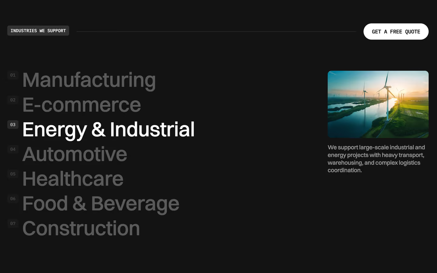
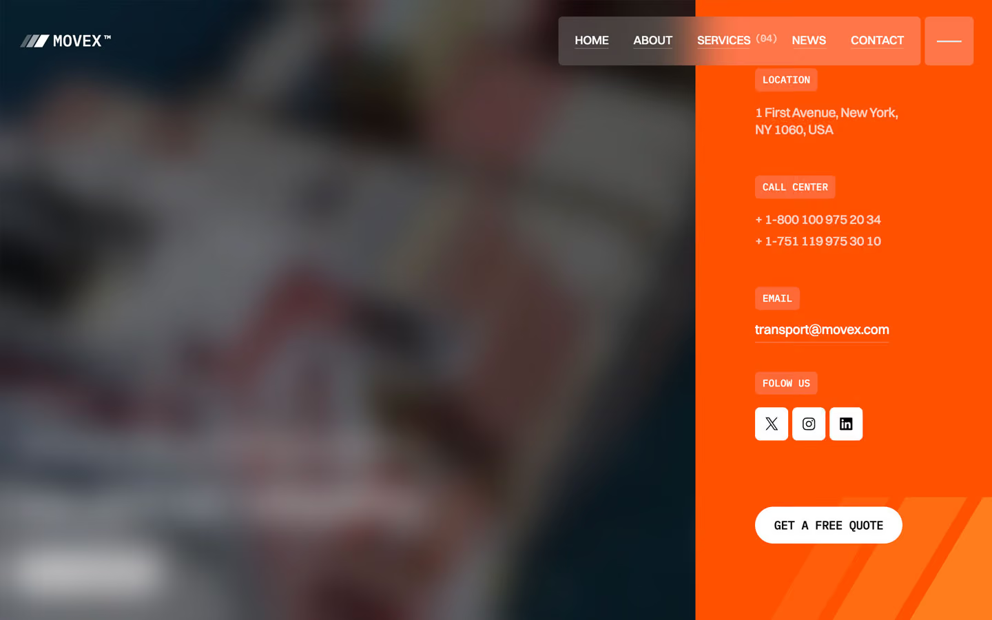
Movix (the demo brand is MOVEX™) is a calm, corporate logistics site. It reads like a well-made annual report for a freight company: white and light-grey pages with black Switzer headlines, small IBM Plex Mono labels in capitals, and big freight footage (ships, trucks, warehouses, a glowing globe) that runs full-bleed behind frosted-glass panels. The only colour in the interface is a signal red (#FF2600) on round arrow buttons.
Four signatures make it recognisable:
- Two-tone headlines. Each section headline starts in black and finishes in grey: Shipping requires control, not assumptions. in #000000, then We use real-time tracking, optimized routing… at about 38% black. The grey half is the explanation; the black half is the claim.
- Mono for almost everything small. Buttons, tags, tabs, roles and the logo are IBM Plex Mono, uppercase, 12–14px; only the nav links are uppercase Switzer (GET A FREE QUOTE, WHAT WE DO, MOVEX™ TRANSPORT DIRECTOR). Headlines and paragraphs are Switzer; the two never swap jobs.
- Frosted glass on freight video. The nav, the hero contact card, testimonial cards, service captions and tags are white at 13–20% with a 10–25px backdrop blur, sitting directly on moving footage with a black overlay.
- The crosshair grid. Thin + marks in a regular grid (about 110px apart, seen in the screenshots) sit over the hero and review images, like registration marks on a map.
Movix is a light design with a dark (#131313) band and full-bleed photo bands.
Colors
Surfaces
#FFFFFFPage background, white sections
#F2F2F2The grey services band (--colors--footer-color), the form submit button, focused inputs
#706E6E · 13%Light tags on white or grey (WHAT WE DO, SERVICES); reads as about #ECECEC
#131313The dark industries band (--colors--third-color)
#FFFFFFInputs, which go grey on focus
#F2F2F2With field: Inputs, which go grey on focus
Ink
#000000Text on primary
#000000Text on secondary
#FFFFFFText on accent
#000000Headlines, active tabs, button text
#000000 · 70%Paragraphs and list items (p { opacity: .7 })
#000000 · 44%Inactive service tabs (AIR FREIGHT) in 14px mono
#000000 · 38%The grey second half of headlines (30px and up) and input placeholders
#FFFFFFText on the dark band and on photos
#FFFFFF · 70%Text on the dark band and on photos
#FFFFFFAction
#FFFFFFThe main pill button (GET A FREE QUOTE, LEAVE A REVIEW)
#2B2B2BA dark panel that slides up inside the button on hover; the text turns white
#E6E6E6Pill buttons on white (OUR SERVICES, LEARN MORE)
#FF260050px round arrow buttons on service cards, the active-tab arrow, the contact card arrow
Lines & effects
#000000 · 12%1px rules: the line above the button row, tab dividers
#313131Icon squares on the dark band
#FFFFFF · 19%Rules inside testimonial cards and between dark-band rows
#FFFFFF · 20%Nav bar, menu button, contact card, testimonial and service captions
#FFFFFF · 13%Tags on photos (WE ARE MOVEX, CUSTOMER REVIEWS)
#000000 · 50%Hero video overlay; other images use 20% and 30%
Typography
Switzer · display-hero
The quick brown fox jumpsHero More than transport, we power global… (--counter-title, 3.5rem), split into characters. 56px · 500 · 1.15 · -0.5px
Switzer · headline-lg
The quick brown fox jumpsFrom cargo transit to warehousing, we offer unparalleled support. 46px · 500 · 1.15 · -0.8px
Inter · title-lg
The quick brown fox jumpsService-card captions (Our non-asset Land model…), dark-band quote. 22px · 500 · 1.15 · -0.5px
Switzer · body
The quick brown fox jumpsParagraphs at 70%. 16px · 500 · 1.3 · -0.4px
Switzer · label-nav
The quick brown fox jumpsNav links HOME, ABOUT, SERVICES (0.9rem). 14px · 500 · 1.15 · -0.3px
IBM Plex Mono · eyebrow
The quick brown fox jumpsTags, roles, LET'S TALK (0.75rem). 12px · 500 · 1.15
Spacing & shape
| Purpose | Value |
|---|---|
| Container | 100% wide, max 1400px, centred |
| Section rhythm | 100px top and bottom on white sections; the grey band ends with 270px, the dark band with 150px |
| Breakpoints | 991, 767 and 479px |
Spacing scale
| Token | Value | Preview |
|---|---|---|
xs | 10px | |
sm | 20px | |
md | 30px | |
lg | 50px | |
xl | 60px | |
2xl | 120px |
Layout spacing
| Token | Value | Preview |
|---|---|---|
field-x | 22px | |
section-x | 29px | |
glass-gap | 70px | |
column-gap | 100px | |
section | 100px | |
section-bottom-dark | 150px |
Border radius
Surfaces
How the surfaces stack, from the page background up. Hex codes and roles are in Colors above.
Motion
| Smooth scroll | Lenis on the whole page |
| Link underline wipe | x −110% → 0%, 300ms, power1.out |
| Text roll on hover | Label y 0 → −17px inside a 15px mask, 300ms, power1.out |
| Button fill | #2B2B2B panel y 100% → 0%, 500ms, cubic-bezier(0.614, 0.03, 0, 0.983) |
| Pop-in (icons, tags) | x 20px → 0, y 10px → 0, rotation 15° → 0°, scale 0.9 → 1, opacity 0 → 1, 300ms, sine.inOut |
| Menu panel | x 100% → 0%, 600ms, power1.out |
| Headline split | Lines or characters y → −100% and 0% → −120…−420% (number rolls), 400–500ms, power1.out / power2.out, staggered |
| Arrow nudge | x 0 → −14px, 200ms, power1.out |
| Fade-in on scroll | Opacity 0 → 1, 1000ms outQuart; slide x 30px → 0, 800ms outExpo |
| Parallax | ScrollTrigger top bottom → bottom top, scrub 0.8 |
| Logo marquee | x 0 → −65%, 120000ms, linear loop |
| Input focus | 400ms cubic-bezier(0.25, 0.46, 0.45, 0.94) |
Do’s and don’ts
- Write section headlines in two tones: black #000000 for the claim, ink-faint (black at 38%) for the explanation.
- Set every button, tag, tab and role in IBM Plex Mono uppercase at 12–14px.
- Use white #FFFFFF pills (30px radius, 45px tall) on photos and #E6E6E6 pills on white.
- Put glass panels (white at 13–20%, 10–25px blur) only on photography or video.
- Use the 2-column grid with a 100px gap and 100px section padding.
- Keep #FF2600 to round arrow icons.
- Use red for text, labelled buttons or backgrounds.
- Set headlines in mono or labels in Switzer.
- Add drop shadows to cards; depth comes from glass and overlap.
- Use ink-subtle (black at 44%) for anything except inactive 14px mono tabs. It is under 4.5:1 on white.
- Use ink-faint below 30px, except as a placeholder.
- Put white text on a photo without a 20–50% black overlay.
Example prompt
Any page in the Movix style
More design systems like this
Logistic design systems, the same colors first.


Bring any of them to your AI tool
All Access unlocks all 398 design systems, ready for Claude, ChatGPT, Gemini, Cursor, v0 and Lovable, plus 400+ templates on all 5 platforms.
Get All AccessUpgrade to All AccessHow to use the Movix design system
Pick a file to see what it’s for and where it goes.
What it is
The whole design system in one markdown file, written for AI: every color, type style, spacing value, component and motion rule, plus do's, don'ts and a ready prompt.
Best for
Claude, ChatGPT, Gemini, Cursor and v0, or any other AI tool that builds pages or code.
How to use it
- Put
DESIGN.mdin your project and mention it in your request, or save it as.cursor/rules/movix.mdc - For the rule file, start it with a front-matter block that sets
alwaysApply: true, so every chat uses it - Ask: “Build a pricing page using DESIGN.md.” Cursor follows the colors, fonts, spacing and rules
- Put
DESIGN.mdin the project root - Add one line to
CLAUDE.md: “Follow DESIGN.md for all UI.” - Ask for any page or component; Claude reads the file first
- Attach
DESIGN.mdto the chat (or paste it in) - Ask: “Build a landing page in this design system.”
- Keep the file in the chat or project knowledge, so follow-up pages stay on style
What it is
Every token as data, in the W3C Design Tokens format: colors with their roles, type styles, radius, spacing, and component tokens that point at them.
Best for
Figma (Tokens Studio), Style Dictionary and other design-token tools, and build scripts.
How to use it
- In Figma, open Tokens Studio, choose Import, and pick
tokens.json - Or point Style Dictionary’s
sourceat it to generate tokens for any platform - In code, import it like any JSON file
What it is
A Tailwind CSS v4 theme: every color, font, type style, radius and spacing value becomes a Tailwind utility, like bg-canvas, text-headline-lg or rounded-md.
Best for
Tailwind v4 projects, and AI builders that write Tailwind (v0, Lovable, Bolt).
How to use it
- Save
theme.cssnext to your main CSS file - Import it after Tailwind:
@import "tailwindcss"; @import "./theme.css"; - Use the classes:
bg-canvas text-ink rounded-md p-lg
What it is
The same tokens as plain CSS variables on :root. Component values point at the color variables, so changing one color updates everything that uses it.
Best for
Any website: plain CSS, Webflow custom code, Framer, WordPress.
How to use it
- Add it to your stylesheet, or in Webflow paste it into Site settings → Custom code inside a
<style>tag - Use the variables anywhere:
color: var(--color-ink) - Change a token once and every place that uses it follows