 flowmance
Moduli Design System
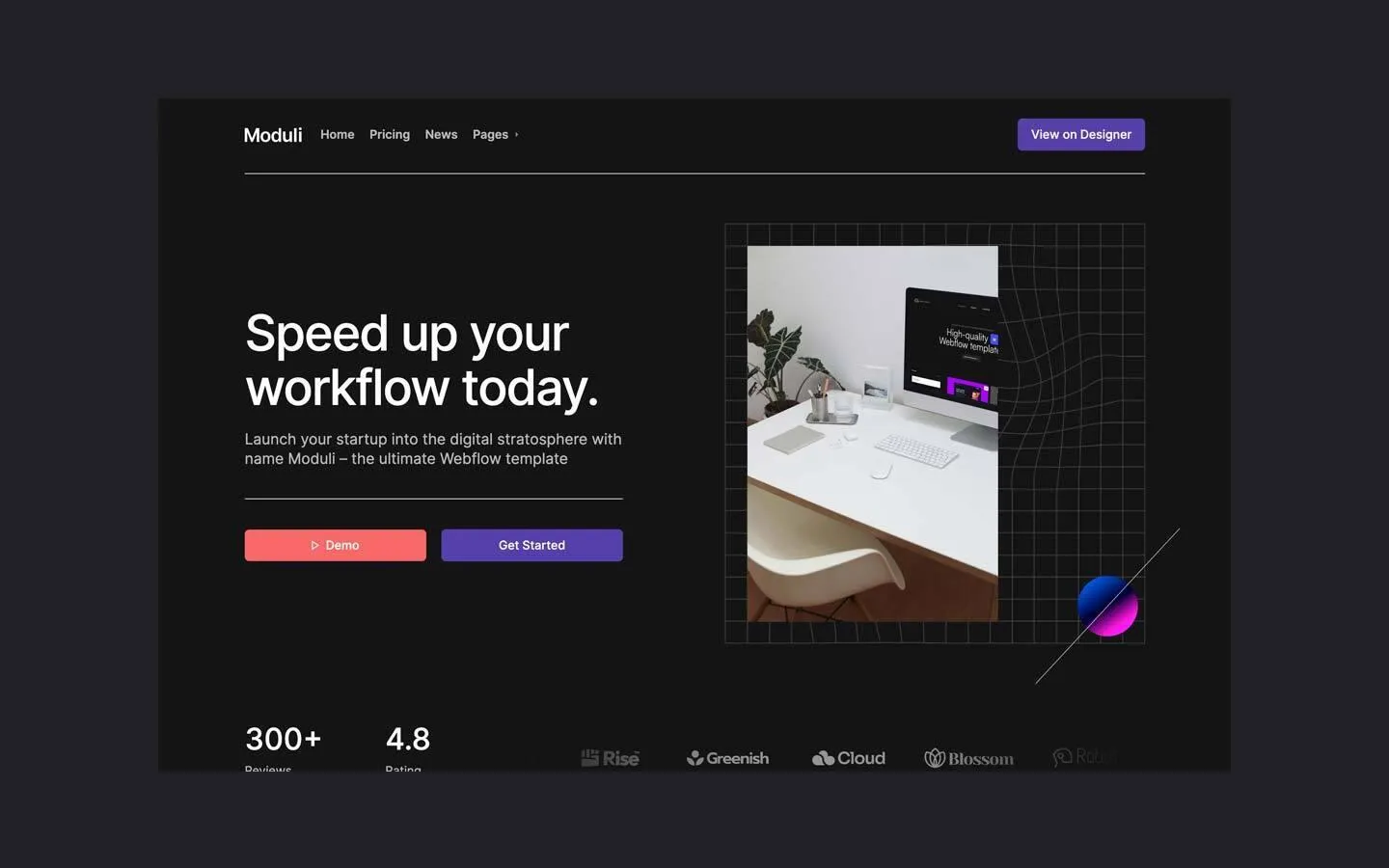
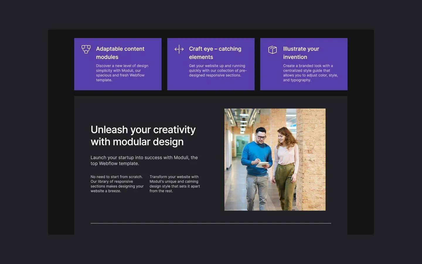
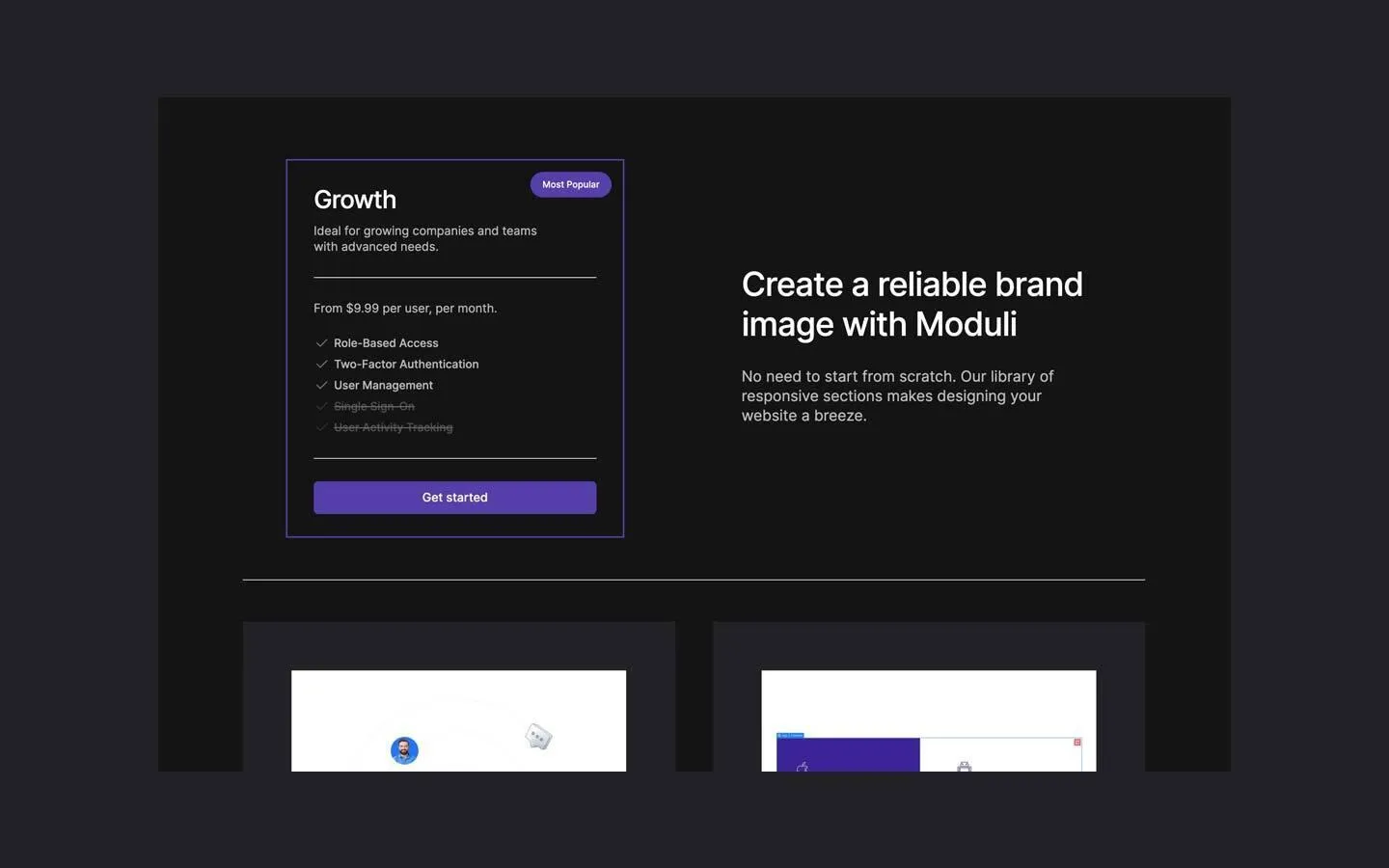
Moduli is a dark, blocky startup site. Everything sits on a near-black #141415 canvas inside a 1200px column: white Inter 500 headlines, 70% white body copy, and solid colour blocks with square corners. Solid violet tiles and buttons carry the brand, a coral red marks the secondary action and the play button, and thin white 1px rules cut the page into horizontal slices.
Four signatures make it recognisable:
- Hairline rules. A container-width 1px white rule sits under the nav, under the hero lead, inside the panels and above the footer. They divide blocks instead of whitespace alone.
- Square colour tiles. Three solid violet (#5440AA) feature tiles in a row, each with a white line icon top-left and text indented beside it. No radius, no shadow.
- Violet plus coral. Two side-by-side hero buttons: coral ▷ Demo and violet Get Started, same width and height. Coral returns only on the video play button.
- Framed hero image. The hero photo sits inside a square grid of thin grey lines that bends like a warped mesh on the right, with a magenta-to-blue sphere floating at the lower right.
Moduli is a dark-only design.
Colors
Surfaces
#141415Page background
#222224Inset charcoal panels (modular design, testimonials), showcase frames, input fields
#28282EA slightly lighter step for small raised blocks inside a panel
#222224Input background, no border
Ink
#FFFFFFText on violet
#FFFFFF#FFFFFFHeadlines, stats, names, card titles
#FFFFFF · 70%Body copy, leads, nav links, quotes (45 text elements)
#FFFFFF · 40%Placeholders and struck-through plan features
#FFFFFFAction
#5440AAMain buttons, feature tiles, slider arrows, Most Popular badge, the 2px pricing-card border
#5440AA#F76969The coral Demo button and the video play button
Lines & effects
#FFFFFF1px horizontal rules
#FFFFFF · 40%Inactive slider dots (the active dot is white)
Typography
Inter · display-hero
The quick brown fox jumpsHero H1 Speed up your workflow today. 66px · 500 · 1.1 · -2px
Inter · headline-lg
The quick brown fox jumpsSection titles: Unleash your creativity with modular design, Create a reliable brand image with Moduli. 44px · 500 · 1.2 · -1px
Inter · title-xl
The quick brown fox jumpsBlock titles: Watch tutorial, Visual Aesthetics, Building Blocks. 32px · 500 · 1.0
Inter · body-quote
The quick brown fox jumpsTestimonial quotes, at 70%. 21px · 500 · 1.3
Inter · label-nav
The quick brown fox jumpsNav links, at 70%. 16px · 600 · 1.25
Inter · micro
The quick brown fox jumpsMost Popular badge. 12px · 500 · 1.67
Spacing & shape
| Purpose | Value |
|---|---|
| Container | 1200px, centred (all 9 measured containers) |
| Section rhythm | about 100px between major blocks (estimated from the screenshots); panels sit about 25px below the feature tiles |
| Breakpoints | Webflow's 991, 767 and 479px; tiles and splits stack at 767px |
Spacing scale
| Token | Value | Preview |
|---|---|---|
xs | 12px | |
sm | 16px | |
md | 24px | |
lg | 50px | |
xl | 70px | |
2xl | 80px |
Layout spacing
| Token | Value | Preview |
|---|---|---|
column-gap | 25px | |
panel | 72px | |
section | 100px |
Border radius
Surfaces
How the surfaces stack, from the page background up. Hex codes and roles are in Colors above.
Motion
| Scroll reveal | opacity 0 → 1 over 1000ms outQuart |
| Pop in | From y 28px, scale 0.9, opacity 0 to y 0, scale 1, opacity 1 over 200ms (out) / 500ms (reset) |
| Logo marquee | x 0% → −30% over 35000ms, looping |
| Dropdown | Caret rotates over 300ms ease; border 200ms outSine; size 400ms outCubic |
| Buttons and links | Transition 0.3s (some 0.1s on background and colour) |
Do’s and don’ts
- Keep the canvas #141415 and group content in #222224 panels at container width.
- Use solid #5440AA for main buttons and feature tiles, and #F76969 only for the secondary button and play button.
- Set headlines in Inter 500 (not 600 or 700), with −2px tracking at 66px and −1px at 44px.
- Separate blocks with 1px white rules at container width.
- Keep photos, tiles, panels and cards square; round only buttons and inputs (6px) and circles.
- Pair two equal-width buttons in the hero: coral Demo and violet Get Started.
- Add shadows, glows or glass; the template is flat.
- Use a grey hex for text; use white at 70% (ink-muted) or 40% (ink-faint).
- Put ink-faint on body text; it is for placeholders and struck-through items only.
- Round the feature tiles or photos.
- Use coral for links, badges, tiles or long labels. White on #F76969 is only about 2.9:1, so keep coral buttons to one or two words at 16px weight 500 or heavier.
- Use bold 700 weights for headlines.
Example prompt
Any page in the Moduli style
More design systems like this
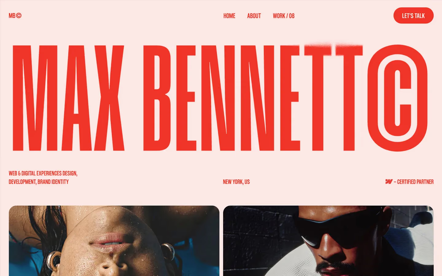
Design systems in the same colors.
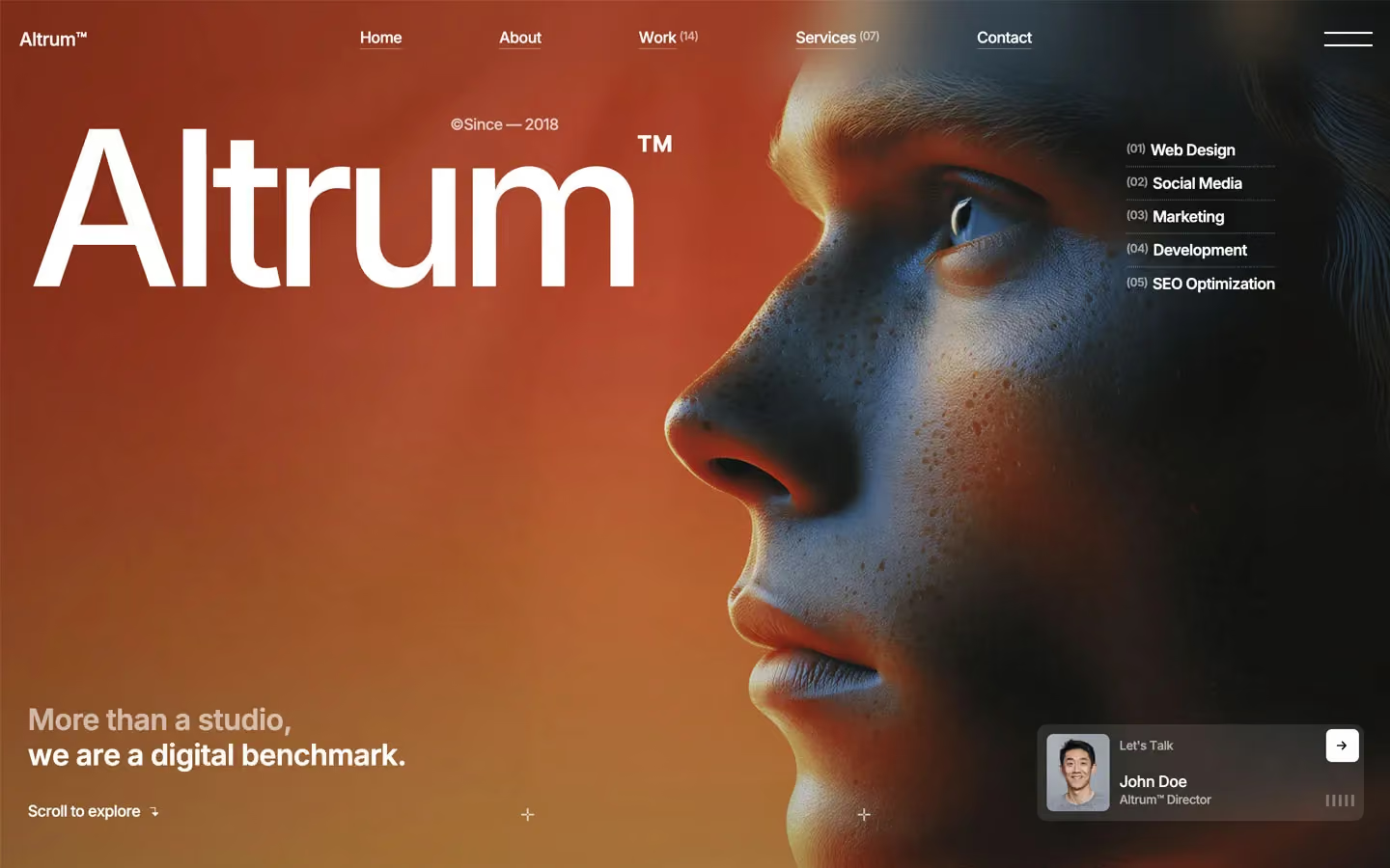
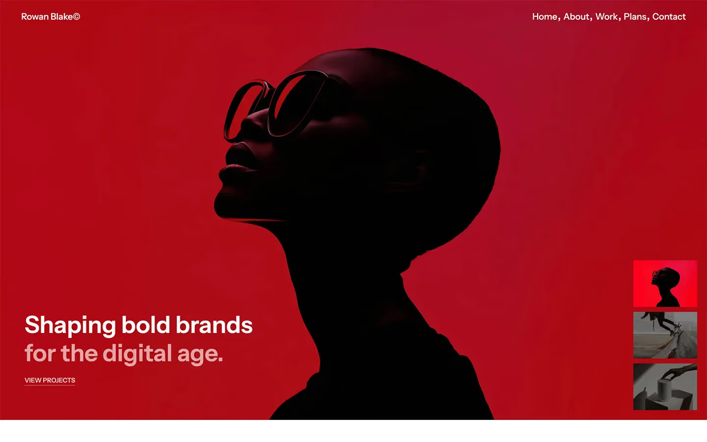
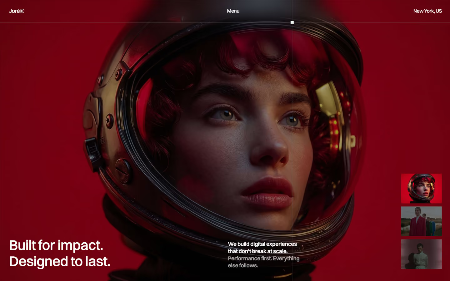
Bring any of them to your AI tool
All Access unlocks all 398 design systems, ready for Claude, ChatGPT, Gemini, Cursor, v0 and Lovable, plus 400+ templates on all 5 platforms.
Get All AccessUpgrade to All AccessHow to use the Moduli design system
Pick a file to see what it’s for and where it goes.
What it is
The whole design system in one markdown file, written for AI: every color, type style, spacing value, component and motion rule, plus do's, don'ts and a ready prompt.
Best for
Claude, ChatGPT, Gemini, Cursor and v0, or any other AI tool that builds pages or code.
How to use it
- Put
DESIGN.mdin your project and mention it in your request, or save it as.cursor/rules/moduli.mdc - For the rule file, start it with a front-matter block that sets
alwaysApply: true, so every chat uses it - Ask: “Build a pricing page using DESIGN.md.” Cursor follows the colors, fonts, spacing and rules
- Put
DESIGN.mdin the project root - Add one line to
CLAUDE.md: “Follow DESIGN.md for all UI.” - Ask for any page or component; Claude reads the file first
- Attach
DESIGN.mdto the chat (or paste it in) - Ask: “Build a landing page in this design system.”
- Keep the file in the chat or project knowledge, so follow-up pages stay on style
What it is
Every token as data, in the W3C Design Tokens format: colors with their roles, type styles, radius, spacing, and component tokens that point at them.
Best for
Figma (Tokens Studio), Style Dictionary and other design-token tools, and build scripts.
How to use it
- In Figma, open Tokens Studio, choose Import, and pick
tokens.json - Or point Style Dictionary’s
sourceat it to generate tokens for any platform - In code, import it like any JSON file
What it is
A Tailwind CSS v4 theme: every color, font, type style, radius and spacing value becomes a Tailwind utility, like bg-canvas, text-headline-lg or rounded-md.
Best for
Tailwind v4 projects, and AI builders that write Tailwind (v0, Lovable, Bolt).
How to use it
- Save
theme.cssnext to your main CSS file - Import it after Tailwind:
@import "tailwindcss"; @import "./theme.css"; - Use the classes:
bg-canvas text-ink rounded-md p-lg
What it is
The same tokens as plain CSS variables on :root. Component values point at the color variables, so changing one color updates everything that uses it.
Best for
Any website: plain CSS, Webflow custom code, Framer, WordPress.
How to use it
- Add it to your stylesheet, or in Webflow paste it into Site settings → Custom code inside a
<style>tag - Use the variables anywhere:
color: var(--color-ink) - Change a token once and every place that uses it follows