 flowmance
LunaArc Design System



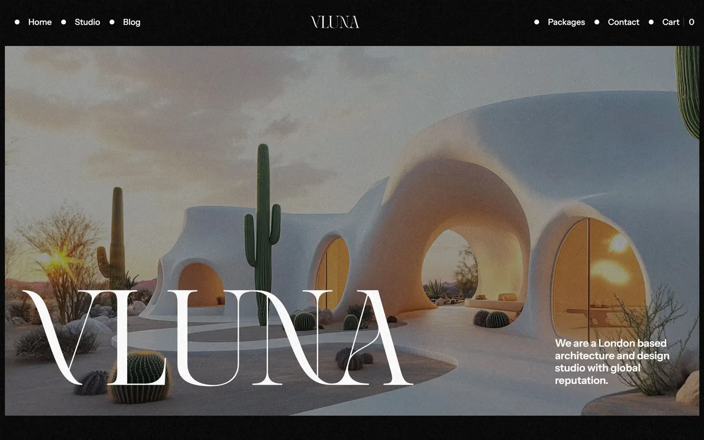
LunaArc is a dark architecture-studio site that feels like a film still: a near-black #040404 page dusted with visible TV-style grain, heavy white Instrument Sans headlines, and large, calm renders of sculptural buildings at dusk. Nothing is rounded. Colour comes only from the photography (sea blues, warm interior glows, meadow greens); the interface is black, one charcoal step and white.
Four signatures make it recognisable:
- Grain over everything. A fixed full-viewport layer (.tv-dots, 900px tall, position fixed) lays film noise over the whole page, photos included. Every screenshot shows it.
- Stacked uppercase navigation in a grid. The header is a four-column grid (1fr .7fr 1fr 1fr, 40px gap): LUNA ARC ® on the left, a two-line uppercase tagline (CRAFTING TIMELESS / STRUCTURES THAT INSPIRE), links stacked vertically in two short columns (HOME / STUDIO / NEWS, CONTACT / CART 0), and social abbreviations IG DB X BE on the right.
- A muted phrase inside a white headline. Section titles are 58px semibold white, and some drop one key phrase to 50% white: We excel at bringing visionary designs from concept to completion.
- Square, inset media. The hero photo and the #141414 CTA band sit 10px in from the viewport edges with 0px corners; service cards are full-bleed photos with the text laid straight onto the image.
LunaArc is dark-only. It is a Webflow Ecommerce build (cart, checkout and package product pages).
Colors
Surfaces
#040404Page, sections, footer (--main-color)
#141414The inset CTA band, testimonial cards, logo tiles, cart panel (--third-color)
#242424Footer subscribe field
#242424Footer subscribe field
Ink
#FFFFFFText on primary
#FFFFFF#FFFFFFHeadlines, nav, buttons, metrics
#FFFFFF · 70%Paragraphs and dates
#FFFFFF · 60%Footer column titles (.footer-title)
#FFFFFF · 50%The muted phrase inside headlines (.gray-text-color)
#FFFFFFAction
#040404The main button is the canvas colour with a hairline border, not a light fill
#141414.button fill and its hover
#222222With secondary: .button fill and its hover
Lines & effects
#D9DAE2Contact-form placeholder (--body-text-color)
#FFFFFF · 15%1px dividers
#FFFFFF · 12%1px border on the primary button and form inputs
#FFFFFF · 13%1px border on the primary button and form inputs
#000000 · 25%Overlay on service and hero photos so white text reads
Typography
Instrument Sans · display-wordmark
The quick brown fox jumpsA 16vw line measured three times below the screenshots (the large footer wordmark row). 230px · 600 · 1.2 · -1px
Instrument Sans · headline-lg
The quick brown fox jumpsAll section titles (.main-title-page, h2). 58px · 600 · 1.1
Instrument Sans · title-lg
The quick brown fox jumpsLead under the CTA title (Experience innovative architectural solutions…). 30px · 600 · 1.3
Instrument Sans · body-lg
The quick brown fox jumps.small-text at 80%; footer titles are 20px weight 400, line height 1.1, at 60% (.footer-title). 20px · 500 · 1.0
Instrument Sans · label-link
The quick brown fox jumpsUnderlined text links with an arrow (.button-line). 21px · 400 · 1.0
Instrument Sans · caption
The quick brown fox jumpsDates and meta (.data-text, 70%). 14px · 500 · 1.4
Spacing & shape
| Purpose | Value |
|---|---|
| Container | max 1240px, centred (.container) |
| Grid | 12 equal columns with 0 column gap and a 10vw row gap (.main-grid) |
| Section rhythm | 200px top and bottom on plain sections (.section, 100px at ≤991px and below, side padding stays 3%); 150px inside the #141414 band |
| Breakpoints | 991, 767 and 479px (Webflow defaults), plus a ≥1280px step |
Spacing scale
| Token | Value | Preview |
|---|---|---|
hair | 3px | |
xs | 10px | |
sm | 20px | |
md | 25px | |
lg | 40px | |
xl | 60px |
Layout spacing
| Token | Value | Preview |
|---|---|---|
inset | 10px | |
column-gap | 25px | |
section-band | 150px | |
section | 200px |
Border radius
Surfaces
How the surfaces stack, from the page background up. Hex codes and roles are in Colors above.
Motion
| Page load fade | opacity 0 → 1 with move to 0,0, 1000ms outQuart |
| Text and line reveal | y 10% or 100% → 0%, 500ms, on scroll into view (outQuint on titles) |
| Button text roll | Label y 0 → −100%, 500ms, on hover; reverses on mouse out |
| Link underline | Width grows, 300ms ease |
| Arrow nudge | Diagonal move x 3px, y −3px, 300ms ease on hover, back to 0, 0 on mouse out |
| Slide-ins | x −30px → 0, 500ms outQuart; x 30px → 0, 800ms outExpo |
| Rotations | Rotations at 500ms on scroll-linked elements (drawing and decorative marks) |
| Scale | To 1, 300ms outSine |
| Text colour / border | 500ms outQuint / 200ms outSine (inputs) |
| Scroll-linked | Scroll-linked scenes (parallax on images and the logo tracks) |
| CSS transitions | all .3s on buttons, transform .3s, color .3s on cards |
Do’s and don’ts
- Keep the page on canvas #040404 with the grain overlay on top of everything.
- Set every section title in headline-lg (58px, 600, 1.1); in some, drop one phrase to ink-faint (white 50%).
- Use 0px radius on every card, image, input and button.
- Use surface-1 #141414 for the one inset band per page and for testimonial and logo tiles.
- Make the main button the dark outlined one (#040404, 1px #FFFFFF1F border, 53px tall) and use link-line for most other actions.
- Inset hero images and bands 10px from the viewport edges.
- Add the unused blue #4361EE or any other accent colour.
- Round corners or add drop shadows.
- Use ink-faint (50%) below 24px; it is for the headline phrase only.
- Use Space Grotesk or any second typeface.
- Put white text on a photo without the 25% black scrim.
- Animate longer than 1000ms or with bounce.
Example prompt
Any page in the LunaArc style
More design systems like this
Construction design systems, the same colors first.



Bring any of them to your AI tool
All Access unlocks all 398 design systems, ready for Claude, ChatGPT, Gemini, Cursor, v0 and Lovable, plus 400+ templates on all 5 platforms.
Get All AccessUpgrade to All AccessHow to use the LunaArc design system
Pick a file to see what it’s for and where it goes.
What it is
The whole design system in one markdown file, written for AI: every color, type style, spacing value, component and motion rule, plus do's, don'ts and a ready prompt.
Best for
Claude, ChatGPT, Gemini, Cursor and v0, or any other AI tool that builds pages or code.
How to use it
- Put
DESIGN.mdin your project and mention it in your request, or save it as.cursor/rules/lunaarc.mdc - For the rule file, start it with a front-matter block that sets
alwaysApply: true, so every chat uses it - Ask: “Build a pricing page using DESIGN.md.” Cursor follows the colors, fonts, spacing and rules
- Put
DESIGN.mdin the project root - Add one line to
CLAUDE.md: “Follow DESIGN.md for all UI.” - Ask for any page or component; Claude reads the file first
- Attach
DESIGN.mdto the chat (or paste it in) - Ask: “Build a landing page in this design system.”
- Keep the file in the chat or project knowledge, so follow-up pages stay on style
What it is
Every token as data, in the W3C Design Tokens format: colors with their roles, type styles, radius, spacing, and component tokens that point at them.
Best for
Figma (Tokens Studio), Style Dictionary and other design-token tools, and build scripts.
How to use it
- In Figma, open Tokens Studio, choose Import, and pick
tokens.json - Or point Style Dictionary’s
sourceat it to generate tokens for any platform - In code, import it like any JSON file
What it is
A Tailwind CSS v4 theme: every color, font, type style, radius and spacing value becomes a Tailwind utility, like bg-canvas, text-headline-lg or rounded-md.
Best for
Tailwind v4 projects, and AI builders that write Tailwind (v0, Lovable, Bolt).
How to use it
- Save
theme.cssnext to your main CSS file - Import it after Tailwind:
@import "tailwindcss"; @import "./theme.css"; - Use the classes:
bg-canvas text-ink rounded-md p-lg
What it is
The same tokens as plain CSS variables on :root. Component values point at the color variables, so changing one color updates everything that uses it.
Best for
Any website: plain CSS, Webflow custom code, Framer, WordPress.
How to use it
- Add it to your stylesheet, or in Webflow paste it into Site settings → Custom code inside a
<style>tag - Use the variables anywhere:
color: var(--color-ink) - Change a token once and every place that uses it follows