 flowmance
Krak Design System


Krak is a moody, poster-like agency site built from just two colours: a warm off-black (#151414) and a sandy wheat (#E3D0B4). Every word is uppercase Uncut Sans, the big ones at 110–150px, broken up by outlined words and a single italic Playfair Display word in lowercase. Thin wheat lines frame the page like a printed grid, and the photography (amber, orange, foggy cinematic renders) carries the only other colour.
Four signatures make it recognisable:
- Three-style headlines. One headline mixes solid caps, an outlined word (transparent fill, 1px wheat stroke) and an italic serif word: HIGH–end / DIGTAL / AGENCY, OUR WORK with WORK outlined, contact–us. An en dash joins the sans and serif parts.
- Wheat hairline grid. A 1px wheat rule under the nav and between sections, and 1px wheat column dividers between two-column blocks and in the footer.
- Mixed-corner chips. Service chips and work tags mix shapes: one fully rounded, one square, and some with 0 30px corners (square on one diagonal, rounded on the other).
- Text-roll buttons. Nav links and buttons hold two copies of their label; on hover one rolls out and the other rolls in.
Krak is dark-only.
Colors
Surfaces
#151414Page background (--black-2)
#151414Krak has no raised surfaces; panels are the canvas framed by lines
#151414Inputs are transparent on the canvas with a wheat underline
#E3D0B4Work-card tags, the outline button's hover fill
Ink
#151414Text on primary
#E3D0B4All text, logo, icons (--wheat)
#E3D0B4Body text is full wheat; there is no lighter text tone
#151414Text on inverse-canvas
#E3D0B4Action
#E3D0B4The filled Send Message button
#E3D0B4Lines & effects
#E3D0B4The 1px stroke on outlined display words (fill transparent)
#E3D0B41px rules, column dividers, skill bars, input underlines, button borders
Typography
Uncut Sans · display-xl · shown in Inter (fallback)
The quick brown fox jumpsThe outlined middle word of the hero (DIGTAL). 150px · 500 · 1.10
Uncut Sans · headline-md · shown in Inter (fallback)
The quick brown fox jumpsSPECIALIZATIONS. 50px · 500 · 1.30
Uncut Sans · body-lg · shown in Inter (fallback)
The quick brown fox jumpsIntro paragraph beside the laptop mockup. 23px · 500 · 1.30
Uncut Sans · label-button · shown in Inter (fallback)
The quick brown fox jumpsButton labels (.button-text). 18px · 600 · 1.83 · 1px
Spacing & shape
| Purpose | Value |
|---|---|
| Container | max 1200px for text blocks |
| Section rhythm | sections pad 50px top and bottom and 5% left and right, separated by a full-width 1px wheat rule with 40px of space above and below (.hero-line) |
| Breakpoints | 991px, 767px and 479px, plus a min-width step at 768px |
Spacing scale
| Token | Value | Preview |
|---|---|---|
xs | 10px | |
sm | 16px | |
md | 20px | |
lg | 30px | |
xl | 35px | |
2xl | 40px | |
3xl | 50px | |
4xl | 70px |
Layout spacing
| Token | Value | Preview |
|---|---|---|
section | 50px | |
nav-row | 80px | |
hero-bottom | 100px | |
hero-top | 200px |
Border radius
Motion
| Text roll (nav, buttons) | Two stacked label copies in a 24px overflow-hidden wrapper; on hover they move y 0 → 100%, 500ms, and back with 300ms ease |
| Button fill | .button-overlay height 0 → 100%, 500ms ease |
| Heading reveal | Lines rise y 100% → 0%, 500–600ms outBack; a #151414 .heading-overlay block slides away from translateX(-100%) |
| Fade-up | y 40–50px → 0 with opacity, 500ms, on scroll into view |
| Skill bars | Width 0 → n%, 500ms ease, on scroll into view |
| Icon hover | scale 1 → 1.1, 100ms ease |
| Arrow and icon rotate | Rotation, 200–400ms ease |
| Chip colour swap | Background and text colour, 400ms ease |
| Scroll parallax | Images drift while scrolling in view |
Do’s and don’ts
- Use only two colours: canvas #151414 and wheat #E3D0B4, for text, lines and fills.
- Set all text uppercase in Uncut Sans; tracking 2px on nav, 1px on buttons and labels.
- Build display headlines from solid caps plus one outlined word (1px #E3D0B4 stroke, transparent fill) and at most one lowercase Playfair Display italic word.
- Separate sections with a full-width 1px wheat rule and split two-column blocks with a 1px wheat column.
- Use 4px outline buttons with a text roll, and 30px chips mixing round, square and 0 30px corners.
- Keep photos square-cornered with warm amber and orange tones.
- Add greys, opacity steps, shadows or a third UI colour; the declared red, yellow and azure are unused.
- Use Playfair Display for more than one word per headline, or for body text.
- Round photos or cards.
- Use Roboto, which is loaded but unused.
- Write in sentence case or lowercase outside the single serif word.
- Use bright, cold or stock-office photography; it breaks the warm two-tone palette.
Example prompt
Any page in the Krak style
More design systems like this
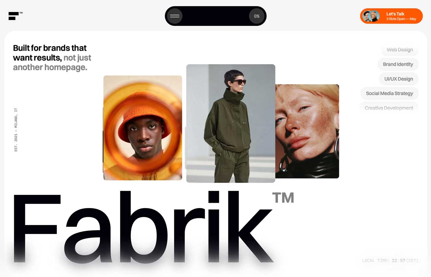
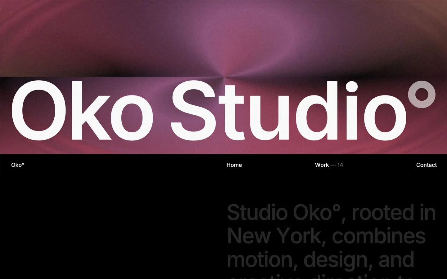
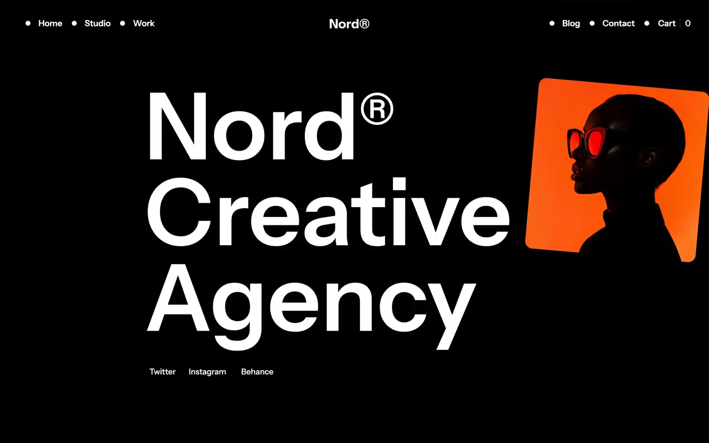
Agency design systems, the same colors first.

Bring any of them to your AI tool
All Access unlocks all 398 design systems, ready for Claude, ChatGPT, Gemini, Cursor, v0 and Lovable, plus 400+ templates on all 5 platforms.
Get All AccessUpgrade to All AccessHow to use the Krak design system
Pick a file to see what it’s for and where it goes.
What it is
The whole design system in one markdown file, written for AI: every color, type style, spacing value, component and motion rule, plus do's, don'ts and a ready prompt.
Best for
Claude, ChatGPT, Gemini, Cursor and v0, or any other AI tool that builds pages or code.
How to use it
- Put
DESIGN.mdin your project and mention it in your request, or save it as.cursor/rules/krak.mdc - For the rule file, start it with a front-matter block that sets
alwaysApply: true, so every chat uses it - Ask: “Build a pricing page using DESIGN.md.” Cursor follows the colors, fonts, spacing and rules
- Put
DESIGN.mdin the project root - Add one line to
CLAUDE.md: “Follow DESIGN.md for all UI.” - Ask for any page or component; Claude reads the file first
- Attach
DESIGN.mdto the chat (or paste it in) - Ask: “Build a landing page in this design system.”
- Keep the file in the chat or project knowledge, so follow-up pages stay on style
What it is
Every token as data, in the W3C Design Tokens format: colors with their roles, type styles, radius, spacing, and component tokens that point at them.
Best for
Figma (Tokens Studio), Style Dictionary and other design-token tools, and build scripts.
How to use it
- In Figma, open Tokens Studio, choose Import, and pick
tokens.json - Or point Style Dictionary’s
sourceat it to generate tokens for any platform - In code, import it like any JSON file
What it is
A Tailwind CSS v4 theme: every color, font, type style, radius and spacing value becomes a Tailwind utility, like bg-canvas, text-headline-lg or rounded-md.
Best for
Tailwind v4 projects, and AI builders that write Tailwind (v0, Lovable, Bolt).
How to use it
- Save
theme.cssnext to your main CSS file - Import it after Tailwind:
@import "tailwindcss"; @import "./theme.css"; - Use the classes:
bg-canvas text-ink rounded-md p-lg
What it is
The same tokens as plain CSS variables on :root. Component values point at the color variables, so changing one color updates everything that uses it.
Best for
Any website: plain CSS, Webflow custom code, Framer, WordPress.
How to use it
- Add it to your stylesheet, or in Webflow paste it into Site settings → Custom code inside a
<style>tag - Use the variables anywhere:
color: var(--color-ink) - Change a token once and every place that uses it follows