 flowmance
Kairon Design System
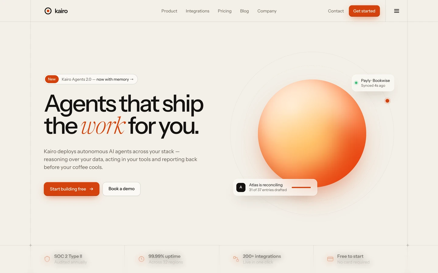
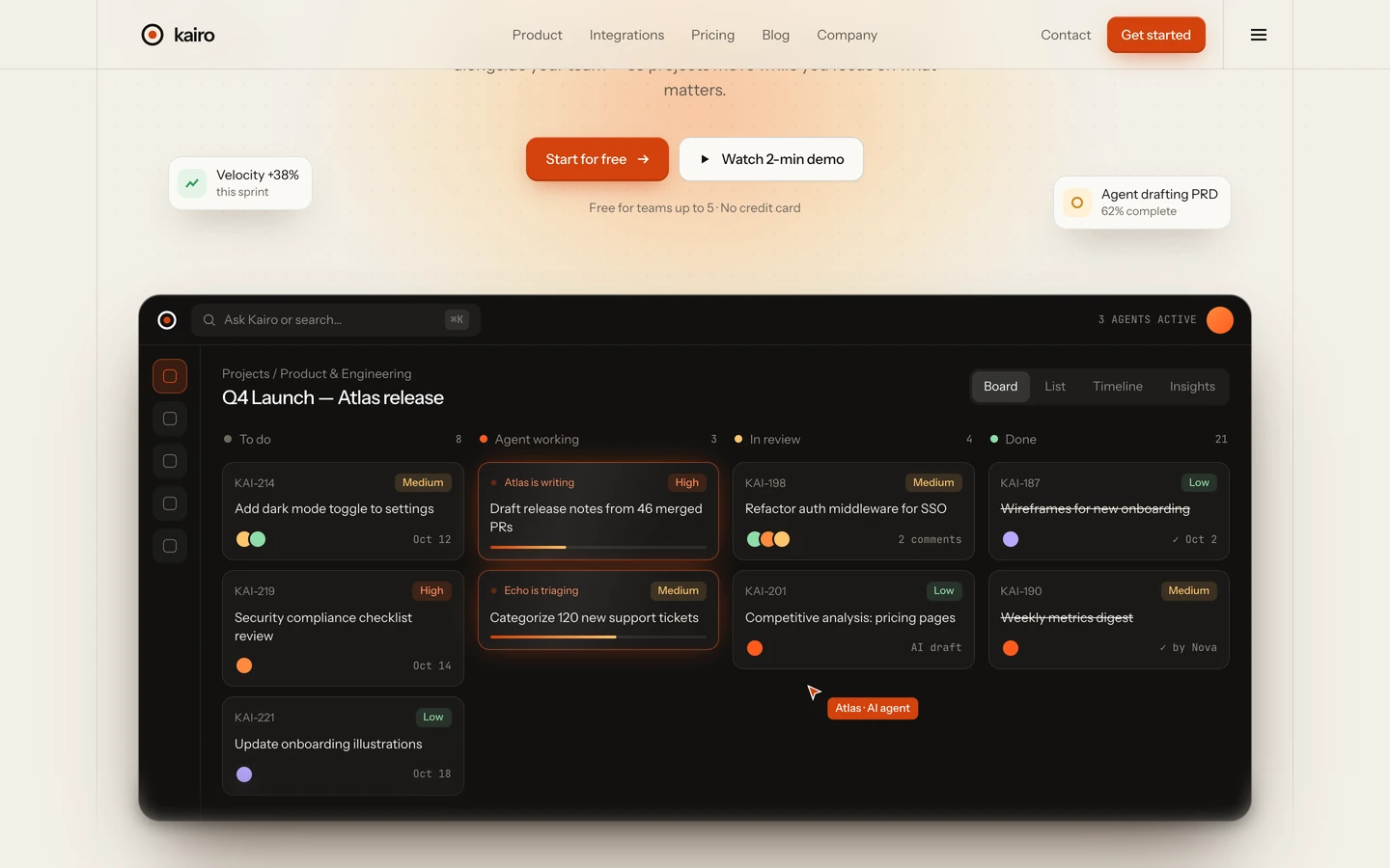
Kairon is a warm, paper-toned software template. It reads like a well-set product brochure: a beige canvas (#F3EFE7), near-black Instrument Sans headlines with tight negative tracking, quiet warm-grey body text, and a single burnt-orange accent (#D3420D) that appears on the main button, small tags and one italic word per headline. Structure is drawn with 1px hairlines rather than boxes, so the page feels like a technical drawing on cream paper.
Four signatures make it recognisable:
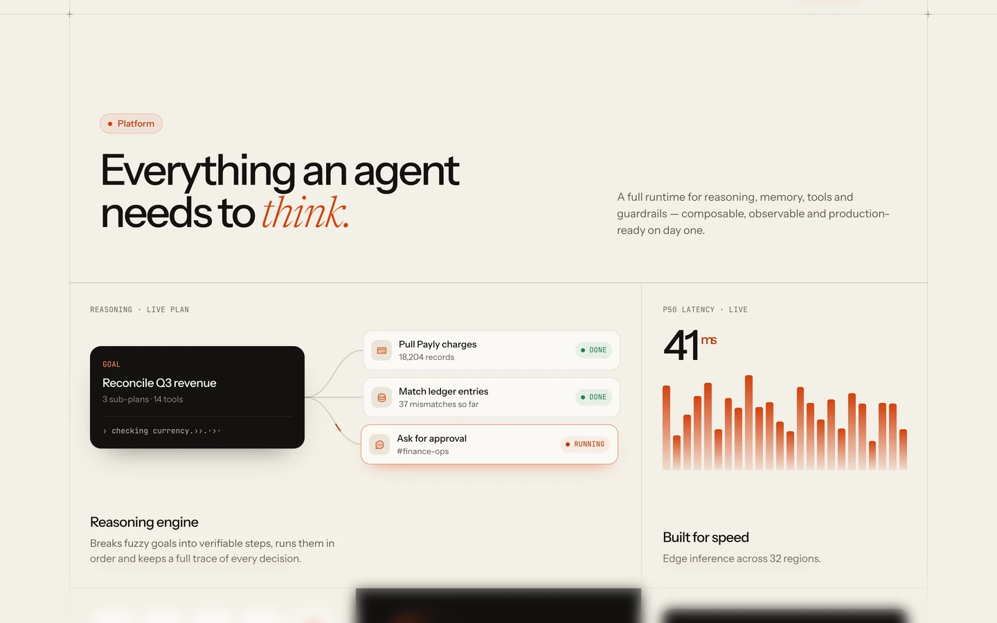
- One italic serif word. Each big headline is Instrument Sans with its last word swapped for Newsreader Light Italic in orange: One system., Every page, ready. In the homepage previews the same trick gives the work for you, done effortlessly., Every tool.
- The hairline page frame. Two vertical 1px lines run down the page at the edges of the 1240px container, crossed by horizontal rules between sections. A small + marks each intersection.
- Mono eyebrows. Category labels (MARKETING, CMS TEMPLATE, UTILITY, PRODUCT UPDATES, MONTHLY) are JetBrains Mono 11–12px uppercase in warm grey above page-card and stat titles.
- The dark switcher dock. A floating near-black bar fixed at the bottom centre with mono tabs All 01 02 03, the active one filled orange.
Kairon is a light-only design.
Colors
Surfaces
#F3EFE7Page background, page-grid cells, inputs
#FBF9F5Preview cards and lighter panels that sit on the canvas
#F3EFE7Ink
#FFFFFFText on primary
#F3EFE7Text on secondary
#141210Headlines, card titles, logo
#2A2622Footer links and secondary dark text
#625A52Body copy, lead paragraphs, nav links
#6F675EMono eyebrows, card descriptions, placeholders
#A39A8ERare small meta only; fails contrast as text under 18px
Action
#D3420DGet started button and the active switcher tab
#D3420D#D3420DItalic serif headline words, tag dots
#B93A0BText inside orange tags (Webflow template · v1.0, Inner pages)
#D3420D · 8%Tag pill background, with a 1px orange inset ring at 20%
#141210Round arrow buttons, dark chips
#3DBE7AOne status dot
Lines & effects
#141210 · 10%Page frame, cell dividers, card borders and inset rings
#F3EFE7 · 74%Translucent canvas layer over content (nav backdrop area)
#141210 · 92%The floating switcher bar
Typography
Instrument Sans · display-wordmark
The quick brown fox jumpsMeasured 6 times below the footer columns, most likely the split letters of a giant kairon wordmark (not in the screenshots). 317px · 600 · 0.74 · -25.3px
Instrument Sans · headline-lg
The quick brown fox jumpsH2 Every page, ready. 62px · 500 · 0.98 · -3.1px
Instrument Sans · title-lg
The quick brown fox jumpsStat values: 3 homes · 15 pages, GSAP Interactions (4 uses). 24px · 500 · 1.2 · -0.72px
Instrument Sans · body-lg
The quick brown fox jumpsLead paragraphs under H1 and H2. 17px · 400 · 1.5
Instrument Sans · caption
The quick brown fox jumpsSmall meta. 13px · 400 · 1.5
Instrument Sans · label
The quick brown fox jumpsNav links. 14px · 500 · 1.5
Spacing & shape
| Purpose | Value |
|---|---|
| Container | 1240px, centred, outlined by the two vertical hairlines of the page frame |
| Grid | the pages index is a 4-column grid with a 1px gap whose gap colour is the line, so cells read as a ruled table |
| Section rhythm | sections carry no padding of their own; space comes from the cells |
| Section header | an orange tag pill, then the H2 on the left with a body-lg lead in the right third, aligned to the H2 baseline |
Spacing scale
| Token | Value | Preview |
|---|---|---|
hair | 1px | |
xs | 8px | |
sm | 14px | |
md | 15px | |
lg | 30px |
Layout spacing
| Token | Value | Preview |
|---|---|---|
column-gap | 1px | |
cell | 44px | |
section | 64px | |
nav | 72px |
Border radius
Surfaces
How the surfaces stack, from the page background up. Hex codes and roles are in Colors above.
Motion
| Headline reveal | SplitText lines; y → 0 from below inside a mask, easeOut, about 1.3–1.4s including stagger; triggers at top 90% / top 95% |
| Line hide / swap | yPercent → 100, easeOut, about 1.65s including stagger |
| Button label roll | Duplicated label, color 0.2s |
| Link and tab colour | color 0.3s; backgrounds 0.25s; box-shadow 0.25s |
| Arrow and preview hover | transform 0.5s and 0.7s cubic-bezier(0.16, 1, 0.3, 1) |
Do’s and don’ts
- Set headlines in Instrument Sans 500 with about −5.5% tracking, and swap the last word for Newsreader 300 italic in accent #D3420D.
- Keep the canvas #F3EFE7 and lift cards to surface-1 #FBF9F5 with a 1px line ring and the warm 0 24px 40px −30px shadow.
- Draw structure with 1px #141210 at 10% hairlines and mark crossings with a small +.
- Put a JetBrains Mono 11px uppercase eyebrow in ink-subtle #6F675E above every page-card title.
- Use the orange button-primary (38px, 10px radius, glow) once per view; secondary actions are dark circles of about 44px with ↗.
- Keep Get started white text at 14px weight 500 or larger: white on #D3420D is 4.61:1, just over the line.
- Use orange for more than one word of a headline, or for body text.
- Use cool or neutral greys; every grey in Kairon is warm (#625A52, #6F675E, #A39A8E).
- Use ink-faint #A39A8E for text under 18px; it is 2.4:1 on the canvas.
- Add drop shadows that are grey or centred; Kairon shadows are warm and pushed down with a negative spread.
- Round cards beyond 10–14px, or make buttons into pills (only tags are pills).
- Set mono in lowercase for labels, or use it larger than 12px.
- Animate hovers longer than 0.7s or use bounce easing.
- Shrink tag text below 13px weight 500: accent-ink #B93A0B on the 8% orange tint is 4.48:1, at the limit.
Example prompt
Any page in the Kairon style
More design systems like this
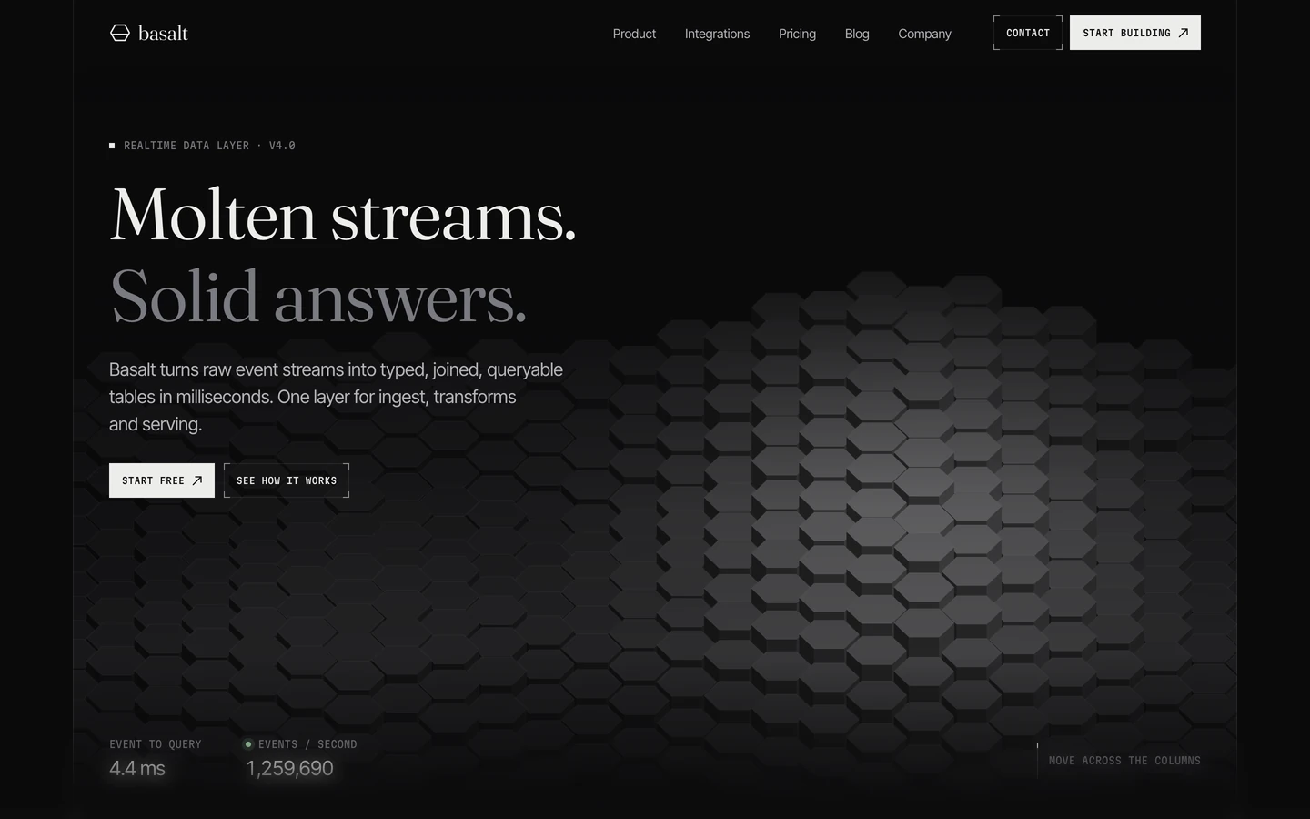
Tech design systems, the same colors first.

Bring any of them to your AI tool
All Access unlocks all 398 design systems, ready for Claude, ChatGPT, Gemini, Cursor, v0 and Lovable, plus 400+ templates on all 5 platforms.
Get All AccessUpgrade to All AccessHow to use the Kairon design system
Pick a file to see what it’s for and where it goes.
What it is
The whole design system in one markdown file, written for AI: every color, type style, spacing value, component and motion rule, plus do's, don'ts and a ready prompt.
Best for
Claude, ChatGPT, Gemini, Cursor and v0, or any other AI tool that builds pages or code.
How to use it
- Put
DESIGN.mdin your project and mention it in your request, or save it as.cursor/rules/kairon.mdc - For the rule file, start it with a front-matter block that sets
alwaysApply: true, so every chat uses it - Ask: “Build a pricing page using DESIGN.md.” Cursor follows the colors, fonts, spacing and rules
- Put
DESIGN.mdin the project root - Add one line to
CLAUDE.md: “Follow DESIGN.md for all UI.” - Ask for any page or component; Claude reads the file first
- Attach
DESIGN.mdto the chat (or paste it in) - Ask: “Build a landing page in this design system.”
- Keep the file in the chat or project knowledge, so follow-up pages stay on style
What it is
Every token as data, in the W3C Design Tokens format: colors with their roles, type styles, radius, spacing, and component tokens that point at them.
Best for
Figma (Tokens Studio), Style Dictionary and other design-token tools, and build scripts.
How to use it
- In Figma, open Tokens Studio, choose Import, and pick
tokens.json - Or point Style Dictionary’s
sourceat it to generate tokens for any platform - In code, import it like any JSON file
What it is
A Tailwind CSS v4 theme: every color, font, type style, radius and spacing value becomes a Tailwind utility, like bg-canvas, text-headline-lg or rounded-md.
Best for
Tailwind v4 projects, and AI builders that write Tailwind (v0, Lovable, Bolt).
How to use it
- Save
theme.cssnext to your main CSS file - Import it after Tailwind:
@import "tailwindcss"; @import "./theme.css"; - Use the classes:
bg-canvas text-ink rounded-md p-lg
What it is
The same tokens as plain CSS variables on :root. Component values point at the color variables, so changing one color updates everything that uses it.
Best for
Any website: plain CSS, Webflow custom code, Framer, WordPress.
How to use it
- Add it to your stylesheet, or in Webflow paste it into Site settings → Custom code inside a
<style>tag - Use the variables anywhere:
color: var(--color-ink) - Change a token once and every place that uses it follows