 flowmance
Jobly Design System


Jobly is a clean, cheerful job board. It reads like a friendly product site rather than a corporate portal: a white page broken by pale mint bands, heavy forest-green Inter headlines, small rectangular buttons with barely rounded corners, and real people in circular portraits. Colour stays in one family (greens from deep forest to near-white mint), with a single blush-pink tag for "Featured" and flat, colourful company icons on the job cards.
Signatures:
- The portrait orbit. The hero's right half is a large dashed circle (1px dashed green at 34%) with six circular portraits (110px, 7px white ring) sitting on it and a white circle holding the Jobly wordmark in the middle.
- Forest green on mint. Headings on light backgrounds, links and the main button are #1C4A36 (titles on photos are white). Backgrounds step through white #FFFFFF, mint #F2F8F5 and mint-cream #E4F5EE. Nothing else gets a fill except the pink Featured tag.
- Small white eyebrow chips. Section titles are often introduced by a tiny white (or mint) label with a 2px radius: Build your future with us, F.A.Q, What They Think.
- Inline category lists. Plain-text rows of links like Popular Categories: Customer Services Project Management Development, grey label first, then darker links that underline on hover.
Colors
Surfaces
#FFFFFFPage background, nav, job cards, footer
#F2F8F5Alternating "mint" sections (Featured Jobs, From Blog)
#E4F5EEHero band, cart count, Part Time tags
#FFFFFFInputs and their typed text; placeholder #686868
#333333Text on field
#1C4A36The Got a question? CTA band
Ink
#FFFFFFText on primary
#1C4A36Text on secondary
#1C4A36Headlines, nav links, labels, body default (--dark-slate-grey)
#686868Paragraphs, category links, job meta (--dim-grey)
#919191Lead-in labels like Popular Categories: and All Categories:
#B6B6B6The / separators between job meta values
#611A2CText on accent
#FFFFFF#FFFFFFText on inverse-canvas
Action
#1C4A36Dark buttons: View All Listing, Apply For Job
#346B53--sea-green-hover, the variable named for the dark-button hover
#E4F5EELight buttons: Log In / Register, Find Jobs, store buttons
#F5E4F4Featured tag only
Lines & effects
#346B53Testimonial quote text
#E4E4E4Input borders, FAQ row dividers
#346B53 · 34%1px dashed orbit circle in the hero
#1C4A36 · 63%Bottom of the gradient on location photos (transparent to green)
#222222 · 40%Dark wash behind lightboxes and overlays
Typography
Inter · display-hero
The quick brown fox jumpsGet your dream job with Jobly. 65px · 700 · 1.0
Inter · headline-lg
The quick brown fox jumpsSection titles: How Jobly Works, Testimonials, the FAQ title (.title-2). 46px · 700 · 1.04
Inter · body-quote
The quick brown fox jumpsTestimonial quote, in quote-ink. 30px · 400 · 1.17
Inter · title-lg
The quick brown fox jumpsJob titles (Customer Support Agent), location names. 22px · 700 · 1.18
Inter · label-md
The quick brown fox jumpsDropdown links, store buttons. 15px · 600 · 1.33
Inter · caption
The quick brown fox jumpsEyebrow chips and job-type tags (.top-text). 13px · 500 · 1.54
Spacing & shape
| Purpose | Value |
|---|---|
| Container | max 1200px, centred (.container) |
| Section rhythm | 80px top and bottom (.section; 60px at ≤991 and below); the CTA band uses 50px |
| Breakpoints | 991px, 767px and 479px (Webflow defaults) |
Spacing scale
| Token | Value | Preview |
|---|---|---|
hair | 4px | |
xs | 10px | |
sm | 15px | |
md | 20px | |
lg | 30px | |
xl | 50px | |
2xl | 70px | |
3xl | 100px |
Layout spacing
| Token | Value | Preview |
|---|---|---|
section-cta | 50px | |
section-side | 72px | |
nav-height | 75px | |
section | 80px |
Border radius
Surfaces
How the surfaces stack, from the page background up. Hex codes and roles are in Colors above.
Motion
| Button and link hover | transition: all 0.2s; nav links opacity 0.2s |
| Dropdown colour | background-color 0.1s, color 0.1s |
| Scroll-into-view fade | Scroll into view: opacity 0 → 1, 300ms ease |
| Rise on reveal | Move y −15px → 0, 300ms ease |
| Dropdown open | Dropdown open / close with opacity and scale, 350ms outExpo |
Do’s and don’ts
- Use ink #1C4A36 for headings and links on light backgrounds, and ink-muted #686868 for paragraphs.
- Alternate white #FFFFFF and mint #F2F8F5 sections with 80px vertical padding.
- Keep buttons small and square-ish: 4px radius, 44px tall, 12px × 20px padding, 14px weight 600.
- Introduce sections with a 2px-radius eyebrow chip in 13px weight 500.
- Put people in circles with a white ring (7px on 110px portraits, 4px on 90px avatars).
- Use the green gradient (transparent → #1C4A36 at 63%) under white text on photos.
- Add drop shadows, glass or blur; Jobly is flat.
- Use the pink #F5E4F4 for anything but the Featured tag.
- Round cards or photos; only chips, buttons and inputs get their 2–5px corners.
- Set ink-subtle #919191 below 14px or use it for sentences; it is about 3.2:1 on white, under 3:1 on the mint bands, and only labels a list (Popular Categories:).
- Use ink-faint #B6B6B6 for text; it is only for / separators.
- Add letter spacing, uppercase labels or a second typeface.
Example prompt
Any page in the Jobly style
More design systems like this
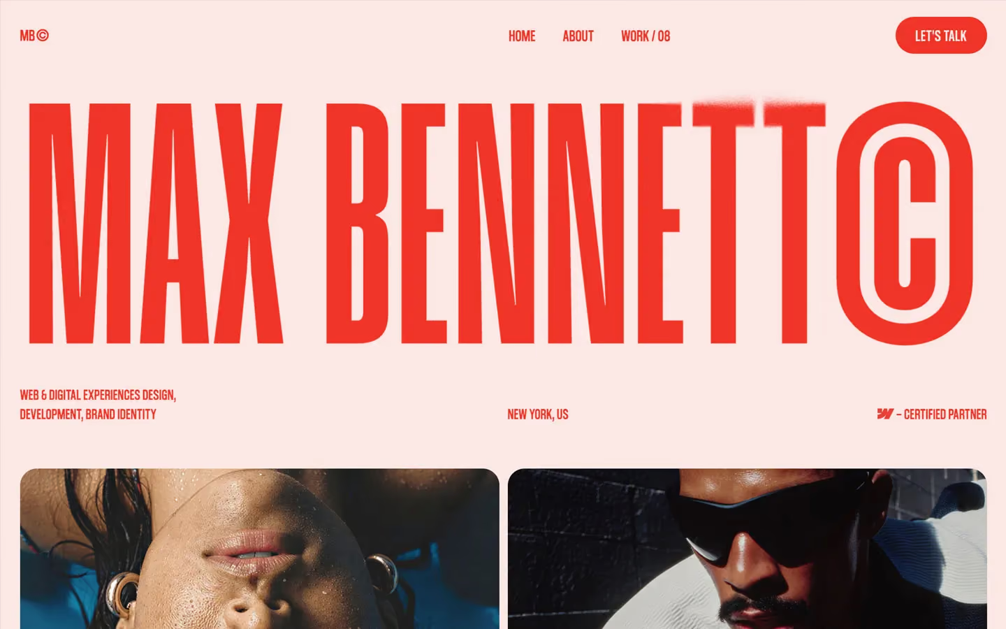
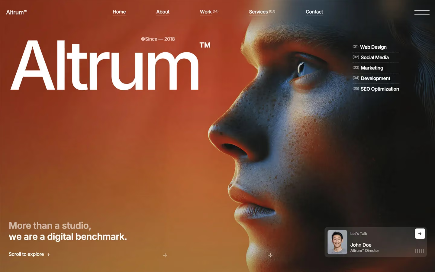
Job Portal design systems, the same colors first.


Bring any of them to your AI tool
All Access unlocks all 398 design systems, ready for Claude, ChatGPT, Gemini, Cursor, v0 and Lovable, plus 400+ templates on all 5 platforms.
Get All AccessUpgrade to All AccessHow to use the Jobly design system
Pick a file to see what it’s for and where it goes.
What it is
The whole design system in one markdown file, written for AI: every color, type style, spacing value, component and motion rule, plus do's, don'ts and a ready prompt.
Best for
Claude, ChatGPT, Gemini, Cursor and v0, or any other AI tool that builds pages or code.
How to use it
- Put
DESIGN.mdin your project and mention it in your request, or save it as.cursor/rules/jobly.mdc - For the rule file, start it with a front-matter block that sets
alwaysApply: true, so every chat uses it - Ask: “Build a pricing page using DESIGN.md.” Cursor follows the colors, fonts, spacing and rules
- Put
DESIGN.mdin the project root - Add one line to
CLAUDE.md: “Follow DESIGN.md for all UI.” - Ask for any page or component; Claude reads the file first
- Attach
DESIGN.mdto the chat (or paste it in) - Ask: “Build a landing page in this design system.”
- Keep the file in the chat or project knowledge, so follow-up pages stay on style
What it is
Every token as data, in the W3C Design Tokens format: colors with their roles, type styles, radius, spacing, and component tokens that point at them.
Best for
Figma (Tokens Studio), Style Dictionary and other design-token tools, and build scripts.
How to use it
- In Figma, open Tokens Studio, choose Import, and pick
tokens.json - Or point Style Dictionary’s
sourceat it to generate tokens for any platform - In code, import it like any JSON file
What it is
A Tailwind CSS v4 theme: every color, font, type style, radius and spacing value becomes a Tailwind utility, like bg-canvas, text-headline-lg or rounded-md.
Best for
Tailwind v4 projects, and AI builders that write Tailwind (v0, Lovable, Bolt).
How to use it
- Save
theme.cssnext to your main CSS file - Import it after Tailwind:
@import "tailwindcss"; @import "./theme.css"; - Use the classes:
bg-canvas text-ink rounded-md p-lg
What it is
The same tokens as plain CSS variables on :root. Component values point at the color variables, so changing one color updates everything that uses it.
Best for
Any website: plain CSS, Webflow custom code, Framer, WordPress.
How to use it
- Add it to your stylesheet, or in Webflow paste it into Site settings → Custom code inside a
<style>tag - Use the variables anywhere:
color: var(--color-ink) - Change a token once and every place that uses it follows