 flowmance
Hana Design System
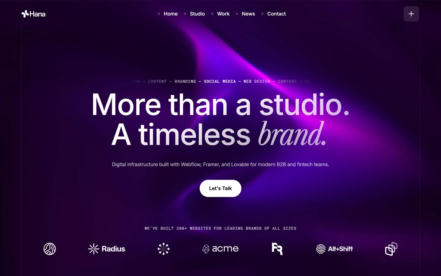
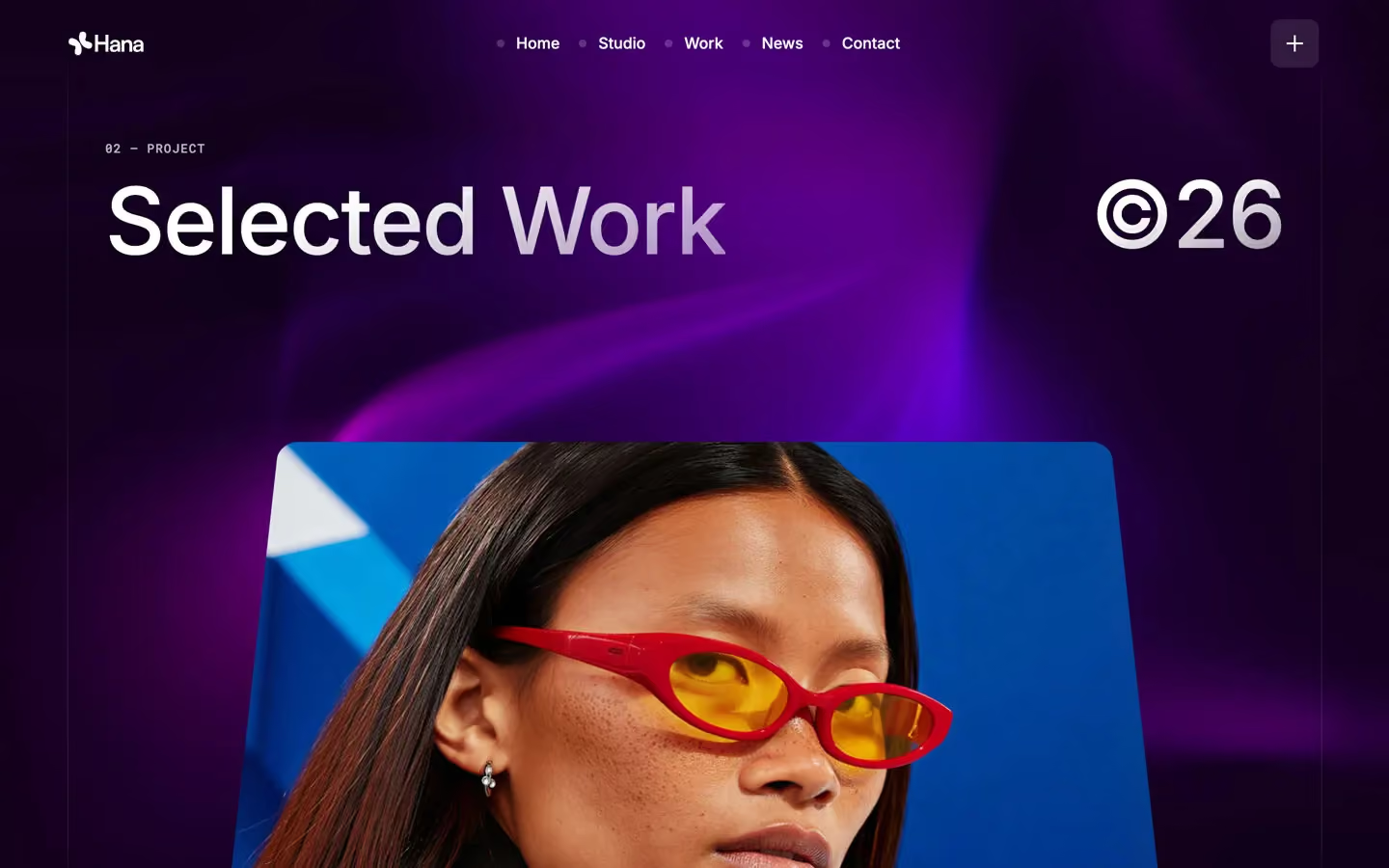
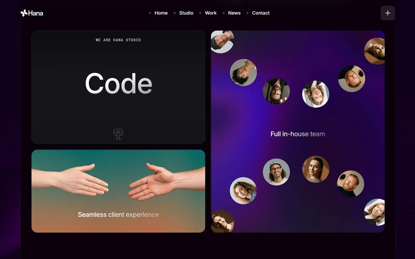
Hana is a dark studio site lit from behind. A live WebGL scene (Unicorn Studio, fixed full-screen) paints a slow purple-to-magenta glow across a near-black violet canvas, and everything else floats on top of it: centred white Inter headlines, frosted glass cards, small Roboto Mono labels and one white pill button. It feels nocturnal and premium, closer to a product launch page than a printed portfolio.
Four signatures make it recognisable:
- The glow behind the page. The canvas is #09000B, but almost no screen shows it flat. A fixed purple-magenta light field sits behind every section, and dark sections (panel-dark, 30px radius) slide over it like slabs.
- One italic serif word. Headlines are Inter 500, but the key word is swapped for Libre Caslon Condensed italic 300 at the same size: More than a studio. / A timeless *brand.*
- Mono eyebrows and indexes. Roboto Mono 12.8px, uppercase, +1px tracking, for every small label: 02 — PROJECT, WE ARE HANA STUDIO, the hero marquee CONTENT — BRANDING — SOCIAL MEDIA — WEB DESIGN, testimonial names.
- The framed column. Two thin vertical hairlines run down the page at the container edges. A short purple glow (accent #8700D5 gradient) travels along them.
Hana is a dark-only design.
Colors
Surfaces
#09000BPage background, dark section slabs, pricing cards, footer
#0D0D10Form fields and the subscribe field
#222222Small index chips (32px squares)
#0D0D10Ink
#09000BText on primary
#FFFFFFText on primary-hover
#09000BText on secondary
#420084Text on tint
#FFFFFFHeadlines, nav, labels, quotes
#FFFFFF · 70%Paragraphs, footer links, eyebrows (paragraphs carry opacity: .7)
#FFFFFF · 50%Secondary meta, faded marquee words, placeholders (48–60%)
#FFFFFFAction
#FFFFFFThe white pill button and form submit
#2B2B2BThe .button-transition fill that rises inside the pill on hover
#B3B2AFFooter subscribe button (CSS value)
#8700D5The glow streak: linear-gradient(45deg, transparent, #8700D5 91%, transparent)
#420084The pricing gradient card, linear-gradient(36deg, …)
#91029BThe pricing gradient card, linear-gradient(36deg, …)
Lines & effects
#D6C9FFA lavender chip with deep-purple text; measured 9× in the live page but not visible in the four screenshots
#FFFFFF · 10%Field borders, card dividers, the vertical frame lines
#FFFFFF · 7%Chip borders, quiet dividers
#FFFFFF · 15%The pricing card wrapper border
#120116 · 20%Testimonial and service cards
#FFFFFF · 10%The + menu card (nav dots are white at 20% + 50px blur)
#09000B · 40%Icon buttons on photos
#09000B · 20%Project title pills on photos
Typography
Inter · display-hero
The quick brown fox jumpsh1 and the big section titles (Selected Work, ©26, Testimonials — Reviews). 96px · 500 · 1.0 · -2px
Inter · headline-lg
The quick brown fox jumpsh2 leads: Where ambition meets thoughtful execution. 51px · 500 · 1.0 · -2px
Inter · title-lg
The quick brown fox jumpsCard titles (Digital Brand Experience). 22.4px · 500 · 1.34 · -0.5px
Inter · body-lg
The quick brown fox jumpsTestimonial quotes. 22.4px · 500 · 1.3 · -0.5px
Inter · label
The quick brown fox jumpsNav links, pricing tags. 16px · 500 · 1.0
Roboto Mono · eyebrow
The quick brown fox jumpsEyebrows, marquee, names, snapshot cells. 12.8px · 500 · 1.0 · 1px
Spacing & shape
| Purpose | Value |
|---|---|
| Container | max 1300px, centred |
| Section rhythm | .section is 150px top and bottom |
| Breakpoints | 991px, 767px and 479px |
Spacing scale
| Token | Value | Preview |
|---|---|---|
xs | 10px | |
sm | 20px | |
md | 30px | |
lg | 50px | |
xl | 60px | |
2xl | 100px |
Layout spacing
| Token | Value | Preview |
|---|---|---|
grid-gap | 20px | |
gutter | 29px | |
section | 150px |
Border radius
Surfaces
How the surfaces stack, from the page background up. Hex codes and roles are in Colors above.
Motion
| Fade-up on enter | opacity 0 → 1, y 20px → 0 (also 10px), 500ms |
| Hover reveal (tooltip, overlays) | opacity 0 ↔ 1, y 20px ↔ 0, 300ms ease |
| Button fill and label roll | y 100% → 0%, 500ms cubic-bezier(0.614, 0.03, 0, 0.983) |
| Scale settle | scale → 1, 400ms outSine (hover) or 500ms |
| Slow reveal | opacity → 1, 1000ms outQuart |
| Line wipe / size | Width change, 400ms outExpo |
| Headline split | SplitText characters, GSAP expo, 0.8s |
| Scroll scenes | ScrollTrigger scrub 0.8; scroll-linked moves of images (x ±42vw, y 40vh, ±5vh) and text brightening |
| Marquees | Continuous loops for the hero services line, logos and Testimonials — Reviews |
Do’s and don’ts
- Keep a purple-magenta light behind the page and let panel-dark slabs (#09000B, 30px radius) cover it for dense content.
- Centre display-hero headlines (96px, 500, line height 1.0, −2px) and swap one word for Libre Caslon Condensed italic 300.
- Put a Roboto Mono uppercase eyebrow (12.8px, +1px) above every major heading.
- Use glass cards (glass #12011633, blur 30px, 30px radius, 40px padding) with the gradient hairline instead of borders.
- Use the white pill (primary #FFFFFF, #09000B text, 56px) as the only filled button.
- Set paragraphs at 70% white, 16px, weight 400, line height 1.3.
- Add drop shadows or flat grey cards. Depth comes from blur and light.
- Fill buttons, text or icons with purple; accent #8700D5 is for glows and gradients only.
- Use pure #000000 for the canvas.
- Use the serif for more than one word per heading, or in body text.
- Open line height on display or headline sizes above 1.0, or use weights above 600.
- Use ink-subtle (white 50%) for paragraphs; keep it for meta, placeholders and faded display words.
Example prompt
Any page in the Hana style
More design systems like this
Agency design systems, the same colors first.


Bring any of them to your AI tool
All Access unlocks all 398 design systems, ready for Claude, ChatGPT, Gemini, Cursor, v0 and Lovable, plus 400+ templates on all 5 platforms.
Get All AccessUpgrade to All AccessHow to use the Hana design system
Pick a file to see what it’s for and where it goes.
What it is
The whole design system in one markdown file, written for AI: every color, type style, spacing value, component and motion rule, plus do's, don'ts and a ready prompt.
Best for
Claude, ChatGPT, Gemini, Cursor and v0, or any other AI tool that builds pages or code.
How to use it
- Put
DESIGN.mdin your project and mention it in your request, or save it as.cursor/rules/hana.mdc - For the rule file, start it with a front-matter block that sets
alwaysApply: true, so every chat uses it - Ask: “Build a pricing page using DESIGN.md.” Cursor follows the colors, fonts, spacing and rules
- Put
DESIGN.mdin the project root - Add one line to
CLAUDE.md: “Follow DESIGN.md for all UI.” - Ask for any page or component; Claude reads the file first
- Attach
DESIGN.mdto the chat (or paste it in) - Ask: “Build a landing page in this design system.”
- Keep the file in the chat or project knowledge, so follow-up pages stay on style
What it is
Every token as data, in the W3C Design Tokens format: colors with their roles, type styles, radius, spacing, and component tokens that point at them.
Best for
Figma (Tokens Studio), Style Dictionary and other design-token tools, and build scripts.
How to use it
- In Figma, open Tokens Studio, choose Import, and pick
tokens.json - Or point Style Dictionary’s
sourceat it to generate tokens for any platform - In code, import it like any JSON file
What it is
A Tailwind CSS v4 theme: every color, font, type style, radius and spacing value becomes a Tailwind utility, like bg-canvas, text-headline-lg or rounded-md.
Best for
Tailwind v4 projects, and AI builders that write Tailwind (v0, Lovable, Bolt).
How to use it
- Save
theme.cssnext to your main CSS file - Import it after Tailwind:
@import "tailwindcss"; @import "./theme.css"; - Use the classes:
bg-canvas text-ink rounded-md p-lg
What it is
The same tokens as plain CSS variables on :root. Component values point at the color variables, so changing one color updates everything that uses it.
Best for
Any website: plain CSS, Webflow custom code, Framer, WordPress.
How to use it
- Add it to your stylesheet, or in Webflow paste it into Site settings → Custom code inside a
<style>tag - Use the variables anywhere:
color: var(--color-ink) - Change a token once and every place that uses it follows