 flowmance
Foreruns Design System


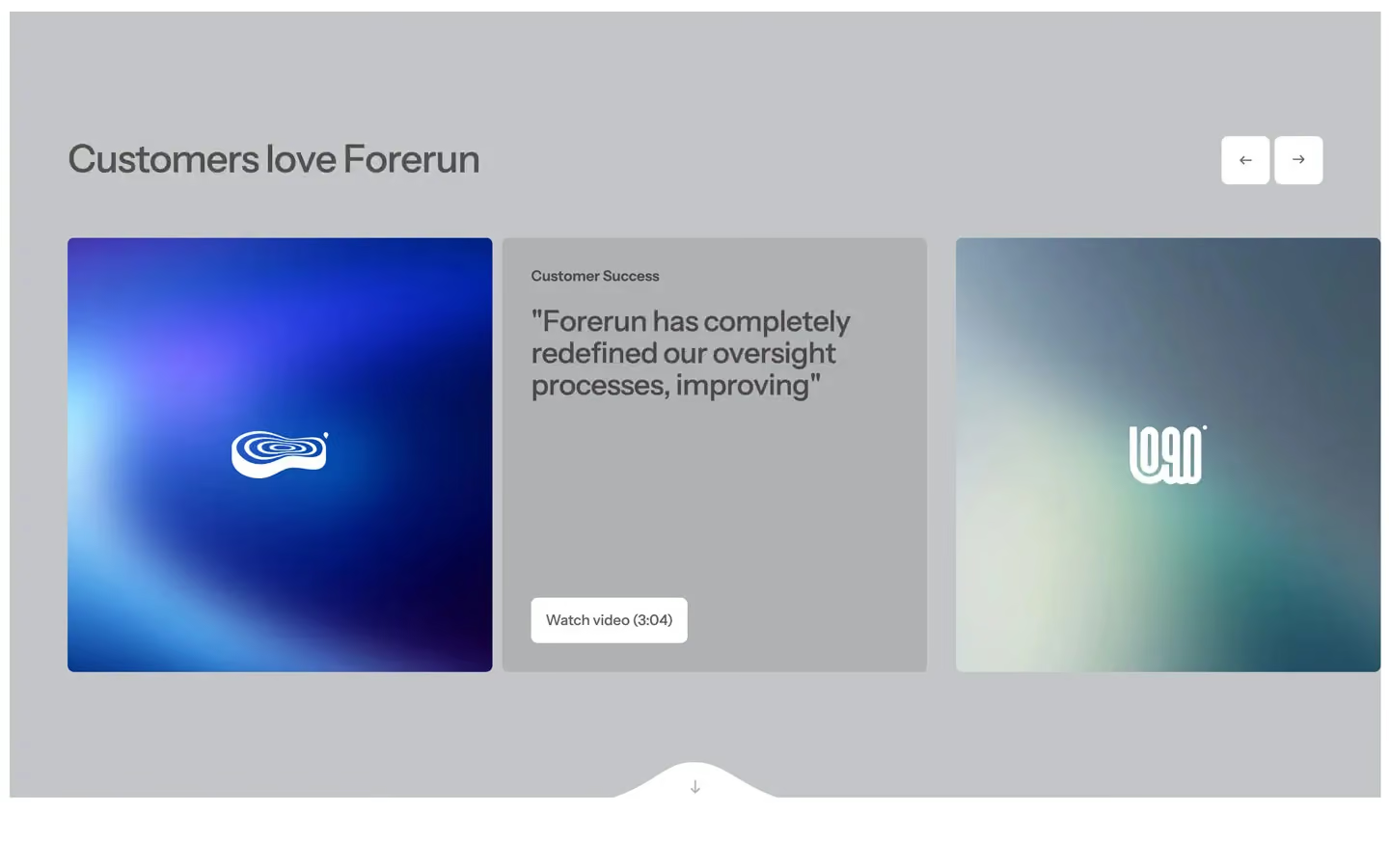
Foreruns (the site brand is Forerun) is a calm, polished consulting site. It reads like a clean annual report: white pages, cool grey bands, black Instrument Sans at medium weight, and large photographs held in a thin white frame. Nothing is loud. Emphasis comes from fading half of a sentence, not from colour or weight.
Four signatures make it recognisable:
- Two-tone sentences. Headlines and leads set the first half in full colour and the rest at 59% opacity: Strategic direction / for leadership roles., Direct answers to your most / important questions, Our goal is to help you lead tomorrow's trends today / arming you with the clarity….
- The 10px frame. The hero photo and the grey bands are inset 10px from the browser edges, so a thin white border runs round them.
- The notch. Each framed block ends in a white, curved bump at the bottom centre with a small ↓ arrow, which leads into the next section.
- Soft 7px everything. Buttons, cards, logo tiles, images and inputs all use the same 7px radius; frosted and black cards sit on the grey bands.
Foreruns is a light design with one black card and dark photo cards.
Colors
Surfaces
#FFFFFFPage background and white sections
#C4C5C7Grey bands (logo strip and main testimonial, testimonials, footer)
#D9DAE2Light grey fills, button overlay circle
#000000The main testimonial card
#727272 · 15%Newsletter field
#000000 · 10%1px border on contact inputs
#333333Text typed in contact inputs
Ink
#000000Text on primary
#000000 · 62%Text on secondary
#000000Headlines, paragraphs, links
#000000Body text is full black
#000000 · 59%Second half of two-tone headlines, small labels (Questions & Answers), card meta
#FFFFFFText on inverse-canvas
#FFFFFFAction
#FFFFFFWhite button (Get in Touch, Watch video (3:04)) placed on photos and grey bands
#FFFFFF#C4C5C7Form submit on white
Lines & effects
#D9DAE21px rules: FAQ rows, the icon-grid top border
#FFFFFF · 30%1px rule under the nav on the hero photo
#FFFFFF · 30%Frosted chips and panels on photos
#727272 · 25%Testimonial cards
#FFFFFF · 20%Active and hovered nav link
#12121242px corner arrow button on cards
Typography
Instrument Sans · display-xl
The quick brown fox jumpsA 7vw split-text statement lower on the page (not in the screenshots); use for one short line at most. 101px · 500 · 1.2 · -1px
Instrument Sans · headline-lg
The quick brown fox jumpsMetrics $5B, 97%. 50px · 500 · 1.1 · -1px
Instrument Sans · body-lg
The quick brown fox jumpsHero lead, service card text, testimonial quotes. 22px · 500 · 1.3
Instrument Sans · title-sm
The quick brown fox jumpsFAQ questions. 19px · 500 · 1
Instrument Sans · caption
The quick brown fox jumpsTestimonial name (John Reyes,) at 70%. 17px · 600 · 1.6
Instrument Sans · label
The quick brown fox jumpsNav links. 16px · 500 · 1.25
Spacing & shape
| Purpose | Value |
|---|---|
| Container | max 1300px, centred |
| Section rhythm | 130px top and bottom on white sections and testimonial bands (100px at ≤991, 60px at ≤767); the logo band has 0 top and 120px bottom (100px at ≤991); the footer 60px top and 40px bottom (20px bottom at ≤767, 50px top at ≤479) |
| Breakpoints | 991, 767 and 479px, plus a 1280px+ step |
Spacing scale
| Token | Value | Preview |
|---|---|---|
xs | 15px | |
sm | 30px | |
md | 40px | |
lg | 60px | |
xl | 100px | |
2xl | 120px |
Layout spacing
| Token | Value | Preview |
|---|---|---|
frame | 10px | |
page-x | 29px | |
column-gap | 30px | |
footer-bottom | 40px | |
footer-top | 60px | |
section | 130px |
Border radius
Surfaces
How the surfaces stack, from the page background up. Hex codes and roles are in Colors above.
Motion
| Split text reveal | Words and lines go y 20px → 0, opacity 0 → 1, staggered, totals 0.92s, 1.54s and 1.70s; ScrollTrigger starts at top 75%, plays once, no scrub |
| Text roll on buttons | Label y 0% → −100% and copy y 100% → 0%, 500ms (outQuint on some) |
| Card hover slide | Content moves x −30px ↔ 0, 500ms outQuart in and 800ms outExpo back |
| Arrow nudge | ↗ moves x 3px, y −3px, 300ms ease |
| FAQ | + rotates over 500ms; the answer height opens over 300ms ease (400ms outCubic on some) |
| Fade in on load | opacity 0 → 1 and move to 0, 0, 1000ms outQuart |
| Scale | Back to 1, 300ms outSine |
| Horizontal sweep (one element) | x −250px → 200px, 0.5s power1.in |
| CSS transitions | Nav links 0.2s, buttons 0.3s, transforms 0.3s |
Do’s and don’ts
- Split headlines into two tones, the second half at 59% opacity (ink-subtle #00000096 on white).
- Inset photos and #C4C5C7 bands 10px from the viewport and end them with the white notch and ↓.
- Use 7px radius on every button, card, tile, input and image wrapper.
- Keep type Instrument Sans 500, with −1px tracking only at 40px and up.
- Put white buttons (#FFFFFF, black text, 47px) on photos and grey bands, and frosted cards (#72727240 + 100px blur) on bands.
- Use 130px section padding and a 1300px container.
- Add the unused blue #4361EE or any accent colour.
- Use box shadows. Depth is blur, bands and gradients.
- Use bold weights (700) or uppercase headings.
- Use a radius other than 7px on UI (30px is only for the cart panel).
- Use the white newsletter button's #C1C1BE text on small labels elsewhere; it is very low contrast on white.
- Fade whole headlines; only the second half drops to 59%.
Example prompt
Any page in the Foreruns style
More design systems like this
Business design systems, the same colors first.


Bring any of them to your AI tool
All Access unlocks all 398 design systems, ready for Claude, ChatGPT, Gemini, Cursor, v0 and Lovable, plus 400+ templates on all 5 platforms.
Get All AccessUpgrade to All AccessHow to use the Foreruns design system
Pick a file to see what it’s for and where it goes.
What it is
The whole design system in one markdown file, written for AI: every color, type style, spacing value, component and motion rule, plus do's, don'ts and a ready prompt.
Best for
Claude, ChatGPT, Gemini, Cursor and v0, or any other AI tool that builds pages or code.
How to use it
- Put
DESIGN.mdin your project and mention it in your request, or save it as.cursor/rules/foreruns.mdc - For the rule file, start it with a front-matter block that sets
alwaysApply: true, so every chat uses it - Ask: “Build a pricing page using DESIGN.md.” Cursor follows the colors, fonts, spacing and rules
- Put
DESIGN.mdin the project root - Add one line to
CLAUDE.md: “Follow DESIGN.md for all UI.” - Ask for any page or component; Claude reads the file first
- Attach
DESIGN.mdto the chat (or paste it in) - Ask: “Build a landing page in this design system.”
- Keep the file in the chat or project knowledge, so follow-up pages stay on style
What it is
Every token as data, in the W3C Design Tokens format: colors with their roles, type styles, radius, spacing, and component tokens that point at them.
Best for
Figma (Tokens Studio), Style Dictionary and other design-token tools, and build scripts.
How to use it
- In Figma, open Tokens Studio, choose Import, and pick
tokens.json - Or point Style Dictionary’s
sourceat it to generate tokens for any platform - In code, import it like any JSON file
What it is
A Tailwind CSS v4 theme: every color, font, type style, radius and spacing value becomes a Tailwind utility, like bg-canvas, text-headline-lg or rounded-md.
Best for
Tailwind v4 projects, and AI builders that write Tailwind (v0, Lovable, Bolt).
How to use it
- Save
theme.cssnext to your main CSS file - Import it after Tailwind:
@import "tailwindcss"; @import "./theme.css"; - Use the classes:
bg-canvas text-ink rounded-md p-lg
What it is
The same tokens as plain CSS variables on :root. Component values point at the color variables, so changing one color updates everything that uses it.
Best for
Any website: plain CSS, Webflow custom code, Framer, WordPress.
How to use it
- Add it to your stylesheet, or in Webflow paste it into Site settings → Custom code inside a
<style>tag - Use the variables anywhere:
color: var(--color-ink) - Change a token once and every place that uses it follows