 flowmance
Axioma Design System
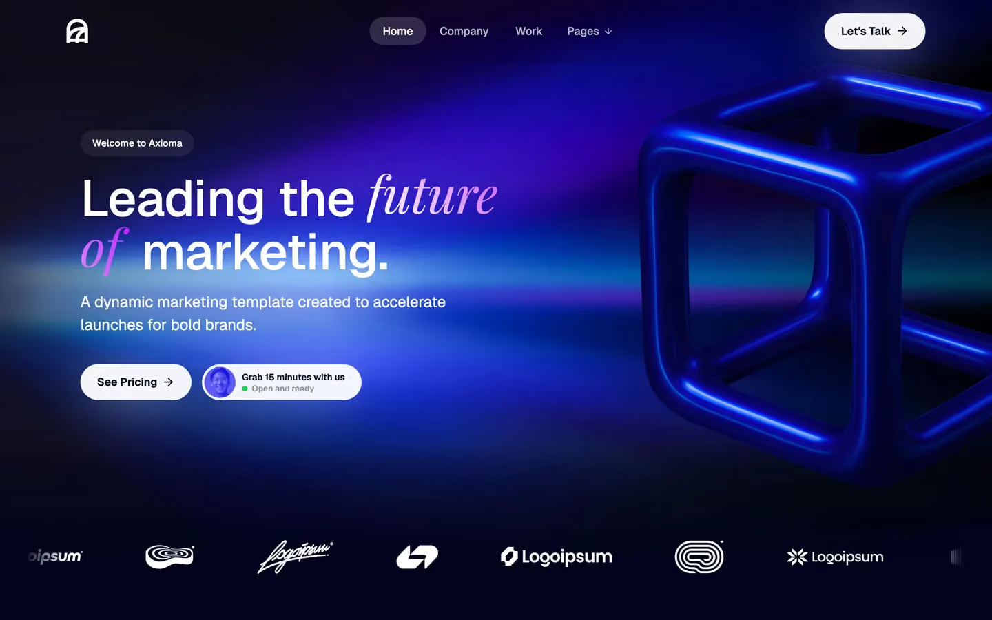
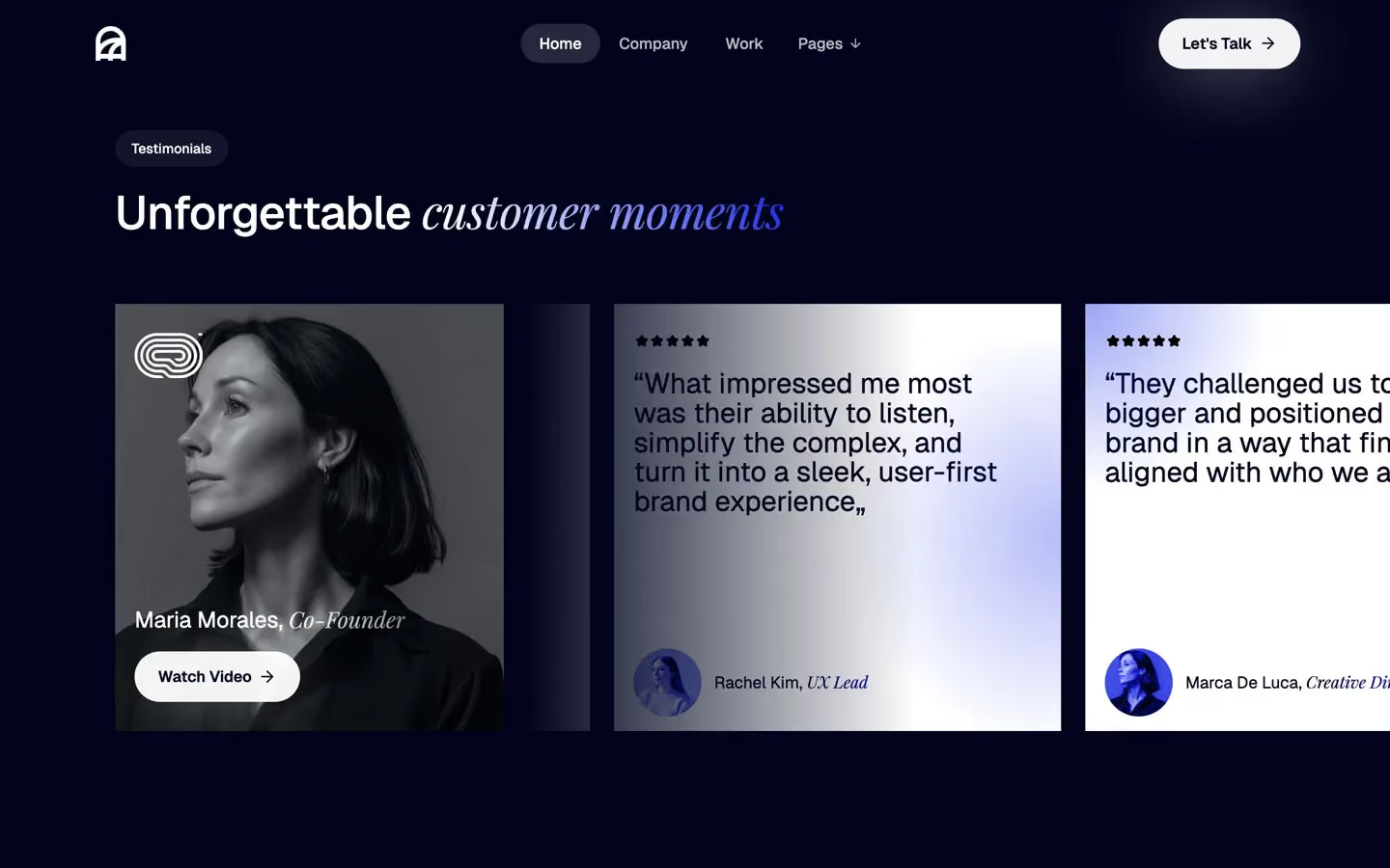
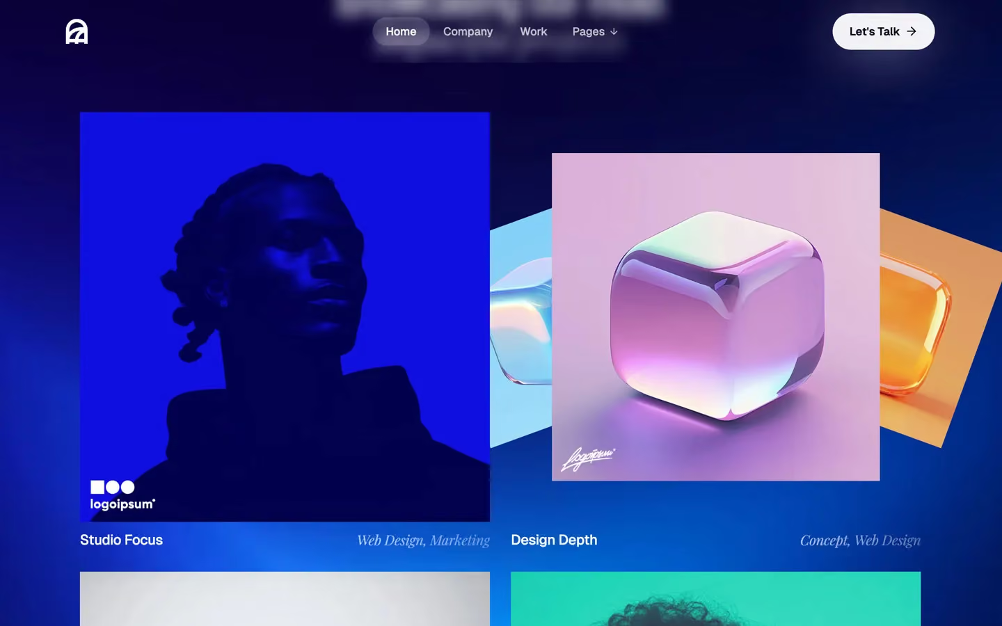
Axioma is a dark, polished marketing-agency site with an editorial accent. The page is midnight navy (#00031C) crossed by electric-blue light streaks and a glossy blue 3D cube. Headlines are clean Geist 500 with tight tracking, and one word or phrase in each is swapped for Playfair Display italic, which gives the site its signature. Actions are bright white pills that glow on the dark.
Four signatures make it recognisable:
- The serif swap. Nearly every headline mixes Geist and Playfair Display italic: Leading the *future of* marketing., Made for clients with a *mission in mind*, Showcasing our most *impactful projects*; the 56px CTA headline is all Geist. The italic part often carries a gradient fill (white → #110FDF on dark, #00031C → #110FDF on white). Small meta does the same: Maria Morales, *Co-Founder*, *Web Design, Marketing*.
- Glowing white pills. Let's Talk →, See Pricing →, View All Work →: white at 95%, navy text, 800px radius, with a 0 7px 80px −12px white glow.
- Pill nav. Centred links are 41px pills; the active one (Home) has a white-15% fill. The nav turns dark (black pill button, dark text) over the white pricing band.
- Booking chip. Next to the hero button: a white pill with a round avatar, Grab 15 minutes with us and a green dot with Open and ready.
Axioma is dark-first, with one white band for pricing.
Colors
Surfaces
#00031CPage background
#FFFFFF · 7%Eyebrow pills (Welcome to Axioma), frosted with a 7px blur
#FFFFFF · 12%Frosted panels over imagery
#FFFFFF · 15%Active nav pill
#FFFFFF · 16%Input border
#FFFFFFThe pricing band, testimonial cards, the contact submit
Ink
#00031CText on primary
#FFFFFF#FFFFFFHeadlines, nav, lead text
#FFFFFF · 70%Paragraphs (39 elements at 0.7 opacity)
#FFFFFF · 40%Italic project tags (Web Design, Marketing)
#FFFFFF#00031CText on inverse-canvas
#00031C · 70%Paragraphs and features on white
Action
#FFFFFF · 95%The main pill button and the booking chip
#FFFFFF · 95%#110FDFPricing buttons, linear-gradient(342deg, …); also italic accents and blue glows
#B300FF · 51%With secondary: Pricing buttons, linear-gradient(342deg, …); also italic accents and blue glows
#1DD35AThe Open and ready status dot only
Lines & effects
#FFFFFF · 70%Glow under white pills: 0 7px 80px -12px
#B300FF · 40%Glow under the gradient buttons
#FFFFFF · 20%Hairlines on dark
#FFFFFF · 13%With line: Hairlines on dark
#C0C0C0Dividers on the white band
#222222Text in the light Pages dropdown
Typography
Geist · display-hero
The quick brown fox jumpsLeading the future of marketing. 73px · 500 · 1.0 · -0.6px
Geist · headline-lg
The quick brown fox jumpsSection titles: We are Axioma, Showcasing our most impactful projects. 48px · 500 · 1.0 · -0.6px
Playfair Display · serif-lg
The quick brown fox jumpsSection titles: We are Axioma, Showcasing our most impactful projects. 48px · 400 · 1.0 · -0.6px
Geist · quote
The quick brown fox jumpsTestimonial quotes (25 uses in the slider). 29px · 400 · 1.05
Geist · body-lg
The quick brown fox jumpsHero lead. 22px · 400 · 1.5
Geist · title-md
The quick brown fox jumpsProject names, and their italic tags. 20px · 500 · 1.55 · -0.3px
Spacing & shape
| Purpose | Value |
|---|---|
| Container | 1200px max for content; the nav row is 1240px; centred title blocks narrow to 700px |
| Section rhythm | 120px top and bottom with 72px sides (5% at 1440) |
| Breakpoints | Webflow's 991, 767 and 479px |
Spacing scale
| Token | Value | Preview |
|---|---|---|
xs | 10px | |
sm | 16px | |
md | 20px | |
lg | 30px | |
xl | 50px | |
2xl | 72px | |
3xl | 130px |
Layout spacing
| Token | Value | Preview |
|---|---|---|
section-x | 72px | |
nav-height | 90px | |
section | 120px | |
section-top | 160px |
Border radius
Motion
| Fade-up reveal | Opacity 0 → 1, 1000ms outQuart, with a move to 0% |
| Line reveal | y 100% or 200% → 0%, 500ms (outExpo on titles) |
| Blur in | Filter, 500ms; 400ms ease on hover |
| Scale | To 0.5 at 500ms outExpo; back to 1 at 400ms outSine |
| Slider | x → 0%, 500ms inOutExpo; 400ms outSine |
| Rotate | 600ms outExpo (arrows and icons) |
| Dropdown | Chevron 400ms inOutQuint; panel 600ms inOutQuint; lines 200ms inOutQuint |
| Hover | transition: all; nav pills 0.15s, others 0.2–0.3s |
Do’s and don’ts
- Pair Geist 500 headlines with one Playfair Display italic phrase at the same size, with a gradient fill.
- Keep the canvas #00031C and use the white band (#FFFFFF, #00031C text) only for pricing and testimonial cards.
- Use the white glowing pill (#FFFFFF at 95%, 800px radius, 52px) for main actions, with a → after the label.
- Put an eyebrow pill (white 7%, 30px radius, 14px) above each section title.
- Light sections with #110FDF radial washes instead of solid blue blocks.
- Keep images and cards square-cornered; only buttons and pills are round.
- Italicise whole headlines or use Playfair for body text.
- Add drop shadows to cards; glows belong under buttons only.
- Use #1DD35A for anything but the status dot.
- Put ink-faint (white at 40%) on text under 17px.
- Round the images or pricing cards.
- Animate reveals longer than 1000ms.
Example prompt
Any page in the Axioma style
More design systems like this
Agency design systems, the same colors first.


Bring any of them to your AI tool
All Access unlocks all 398 design systems, ready for Claude, ChatGPT, Gemini, Cursor, v0 and Lovable, plus 400+ templates on all 5 platforms.
Get All AccessUpgrade to All AccessHow to use the Axioma design system
Pick a file to see what it’s for and where it goes.
What it is
The whole design system in one markdown file, written for AI: every color, type style, spacing value, component and motion rule, plus do's, don'ts and a ready prompt.
Best for
Claude, ChatGPT, Gemini, Cursor and v0, or any other AI tool that builds pages or code.
How to use it
- Put
DESIGN.mdin your project and mention it in your request, or save it as.cursor/rules/axioma.mdc - For the rule file, start it with a front-matter block that sets
alwaysApply: true, so every chat uses it - Ask: “Build a pricing page using DESIGN.md.” Cursor follows the colors, fonts, spacing and rules
- Put
DESIGN.mdin the project root - Add one line to
CLAUDE.md: “Follow DESIGN.md for all UI.” - Ask for any page or component; Claude reads the file first
- Attach
DESIGN.mdto the chat (or paste it in) - Ask: “Build a landing page in this design system.”
- Keep the file in the chat or project knowledge, so follow-up pages stay on style
What it is
Every token as data, in the W3C Design Tokens format: colors with their roles, type styles, radius, spacing, and component tokens that point at them.
Best for
Figma (Tokens Studio), Style Dictionary and other design-token tools, and build scripts.
How to use it
- In Figma, open Tokens Studio, choose Import, and pick
tokens.json - Or point Style Dictionary’s
sourceat it to generate tokens for any platform - In code, import it like any JSON file
What it is
A Tailwind CSS v4 theme: every color, font, type style, radius and spacing value becomes a Tailwind utility, like bg-canvas, text-headline-lg or rounded-md.
Best for
Tailwind v4 projects, and AI builders that write Tailwind (v0, Lovable, Bolt).
How to use it
- Save
theme.cssnext to your main CSS file - Import it after Tailwind:
@import "tailwindcss"; @import "./theme.css"; - Use the classes:
bg-canvas text-ink rounded-md p-lg
What it is
The same tokens as plain CSS variables on :root. Component values point at the color variables, so changing one color updates everything that uses it.
Best for
Any website: plain CSS, Webflow custom code, Framer, WordPress.
How to use it
- Add it to your stylesheet, or in Webflow paste it into Site settings → Custom code inside a
<style>tag - Use the variables anywhere:
color: var(--color-ink) - Change a token once and every place that uses it follows