Customize a logo template through typography, color, spacing, lockups, supporting graphics, and usage rules so the final identity feels deliberate and consistent.
Customizing a logo template is not about making it unrecognizable. It is about building a coherent identity around a useful starting mark until every brand decision feels intentional.
List a few traits the identity should communicate. A technical software company, boutique hotel, architecture studio, and children's brand should not all make the same customization choices even if they begin from a similar geometric mark.
Typography is one of the strongest ways to change the character of a logo system. Test typeface, weight, letter spacing, capitalization, and the scale relationship between symbol and name.
Start with a reliable monochrome version, then define primary and secondary brand colors. Make sure contrast works on both light and dark backgrounds.
Decide how much clear space the logo needs and prepare horizontal, stacked, and compact versions only when they solve real use cases.
Favicons, app icons, social avatars, and browser tabs may need a simplified symbol. Do not force a detailed full lockup into spaces where it cannot remain legible.
Supporting typography, photography, illustration, icons, color, and layout create most of the brand experience. Consistency across those systems is what stops a template-based logo from feeling generic.
A ready-made logo can save exploratory time, but the final identity still benefits from the same discipline as a custom one: clear rules, consistent application, and choices grounded in the brand rather than the demo.


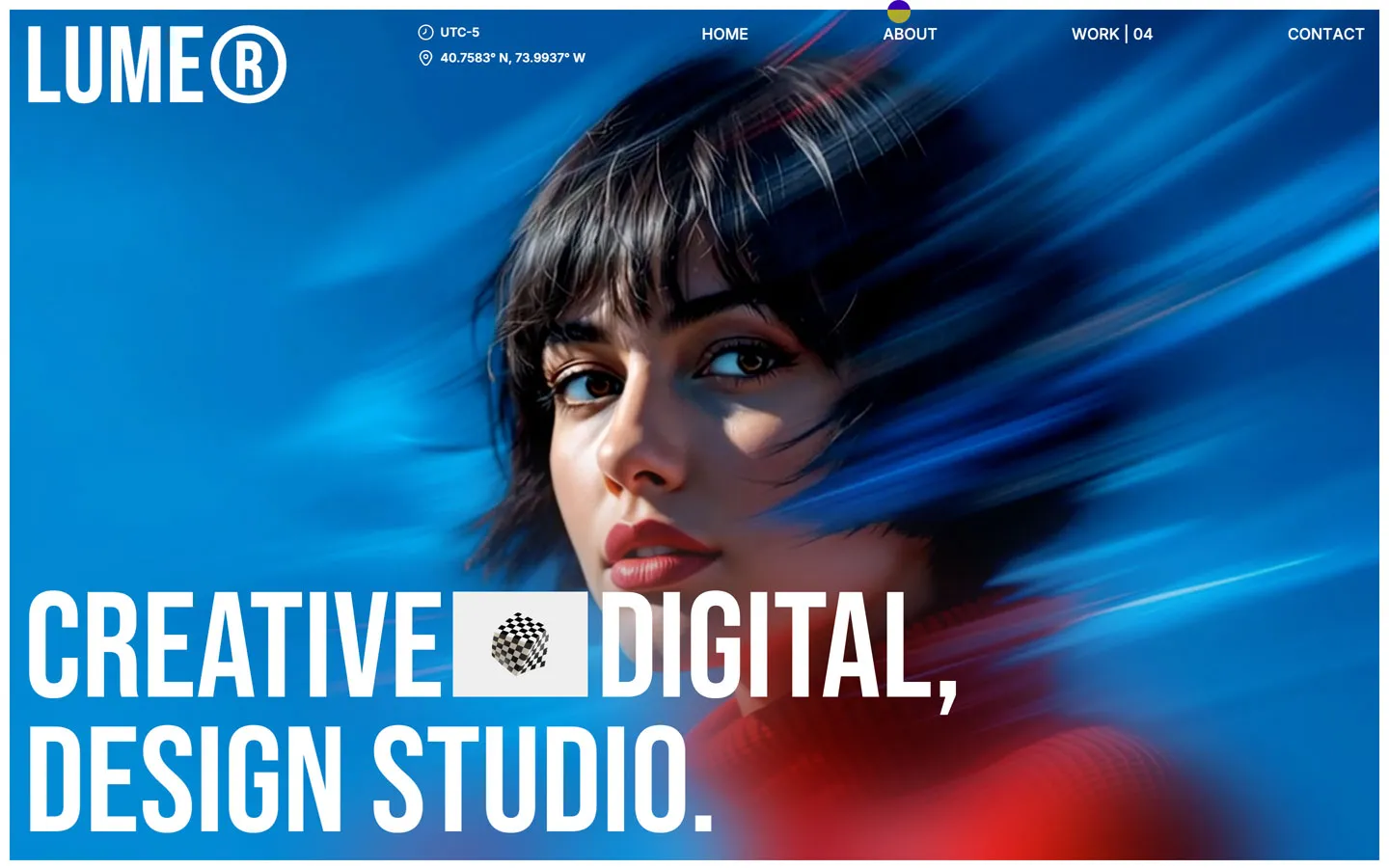
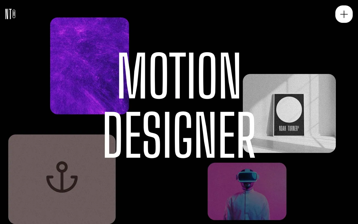
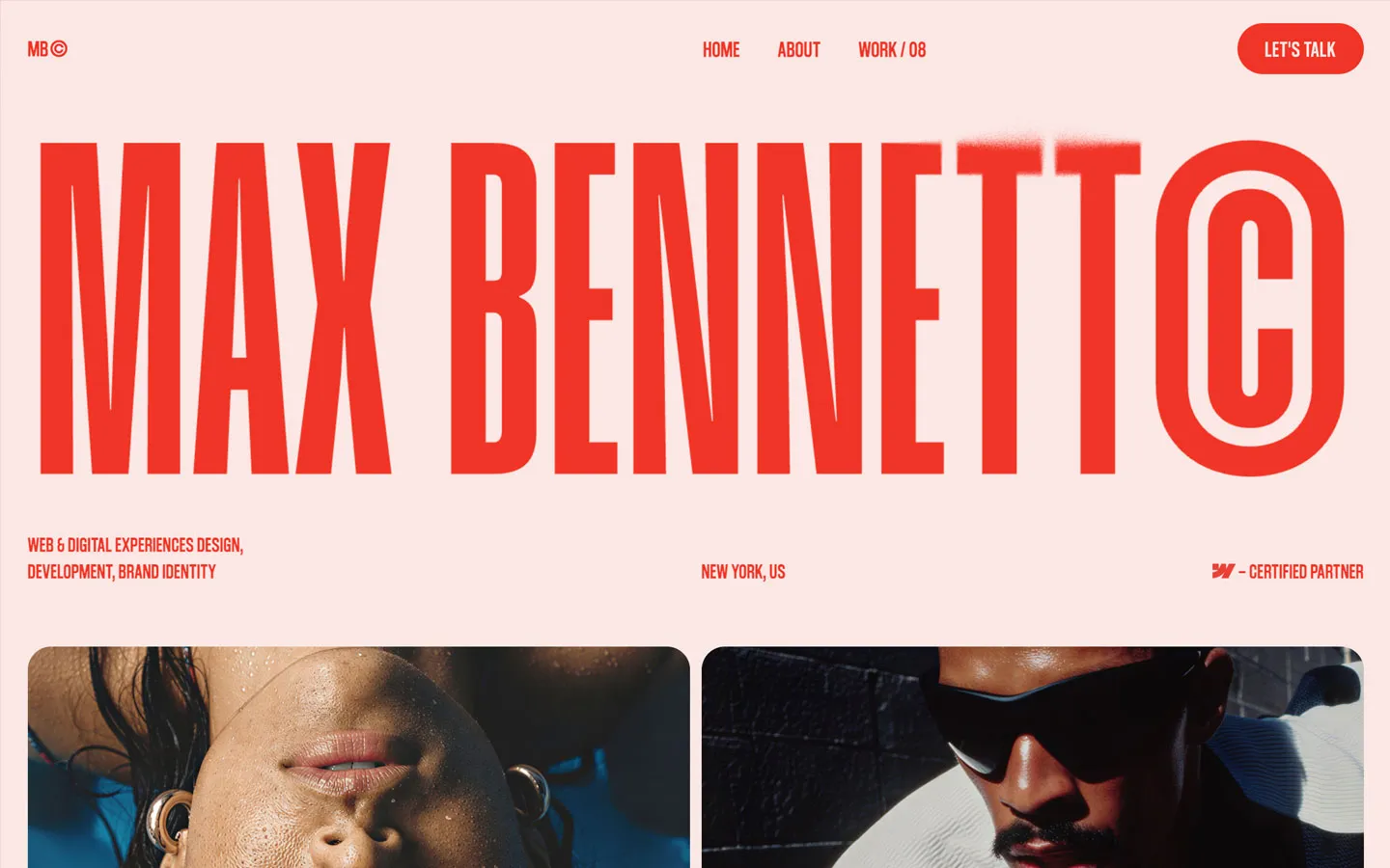


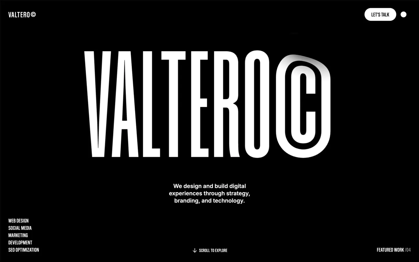
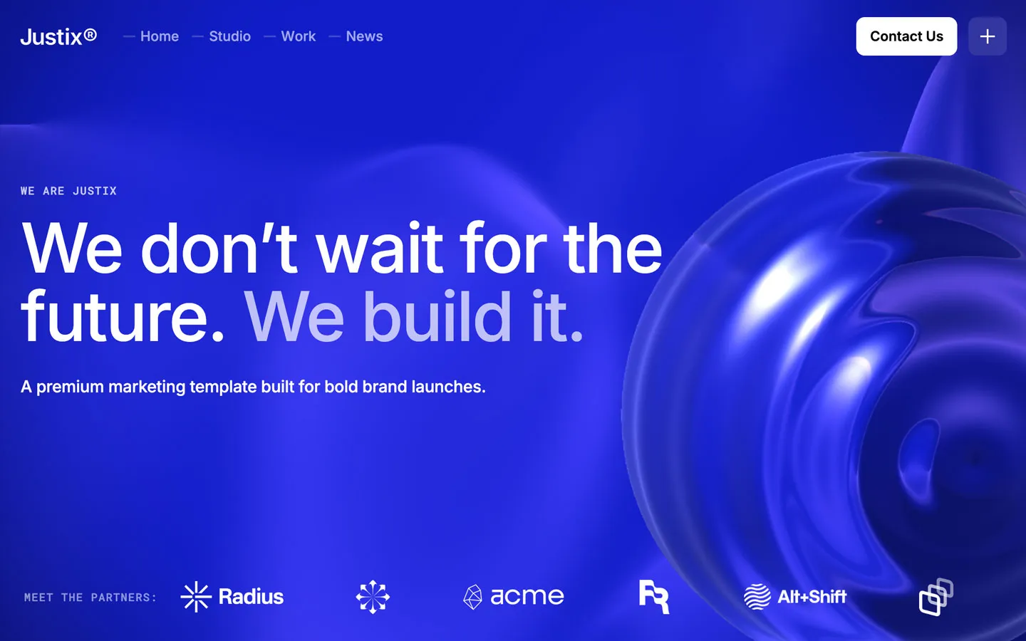


Don’t miss out on our superb, customizable templates designed to enhance your web design experience. We constantly add new templates and components.

Explore stunning Webflow, Framer, HTML5, Next.js and Figma templates designed to spark your next big idea.


*Rest assured that your data is safe with us, and you'll only hear from us 1 time per month.