A practical guide to turning a ready-made logo into a distinctive brand asset through typography, spacing, color, proportion, context, and consistency.
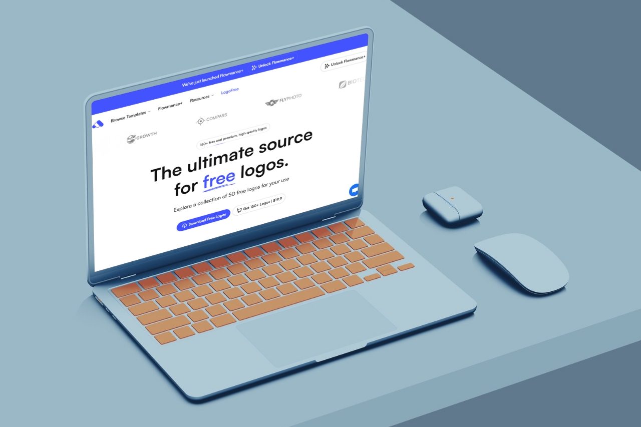
A ready-made logo is most useful as a starting structure, not a finished identity. The fastest way to make it feel specific is to change the decisions around it: typography, spacing, color, proportions, supporting graphics, and how the mark behaves across real brand touchpoints.
Write down the personality the identity needs to communicate: technical, warm, premium, playful, editorial, minimal, or something else. Without that direction, customization becomes random styling.
A symbol can feel completely different beside a geometric sans serif, a humanist sans, or a high-contrast serif. Test the wordmark at small sizes, in navigation, on social graphics, and in plain black before deciding.
Small changes to the distance between symbol and wordmark, the scale relationship, and the surrounding clear space often make a logo feel more considered. Avoid stretching or compressing the original geometry.
Build a primary one-color version first. If the logo only works with a gradient or several colors, it may become difficult to use across invoices, favicons, embroidery, dark backgrounds, and print.
Then add a small brand palette that supports the identity rather than treating every color as part of the logo itself.
A full horizontal lockup may work in a website header but fail in a favicon or app icon. Prepare at least a primary lockup, compact mark, monochrome version, and light-on-dark version.
If the underlying mark is strong, dozens of decorative changes can make it worse. Customization should improve fit with the brand, not disguise the source through unnecessary complexity.
The logo is only one part of recognition. Consistent type, color, imagery, spacing, and tone usually do more to make a ready-made mark feel unique than adding another shape to the logo.
If you begin with a pre-designed asset, treat it the same way you would a website template: preserve the useful foundation, then adapt the system until the final result belongs to the brand.






Don’t miss out on our superb, customizable templates designed to enhance your web design experience. We constantly add new templates and components.

Explore stunning Webflow, Framer, HTML5, Next.js and Figma templates designed to spark your next big idea.


*Rest assured that your data is safe with us, and you'll only hear from us 1 time per month.