 flowmance
Sanare Design System

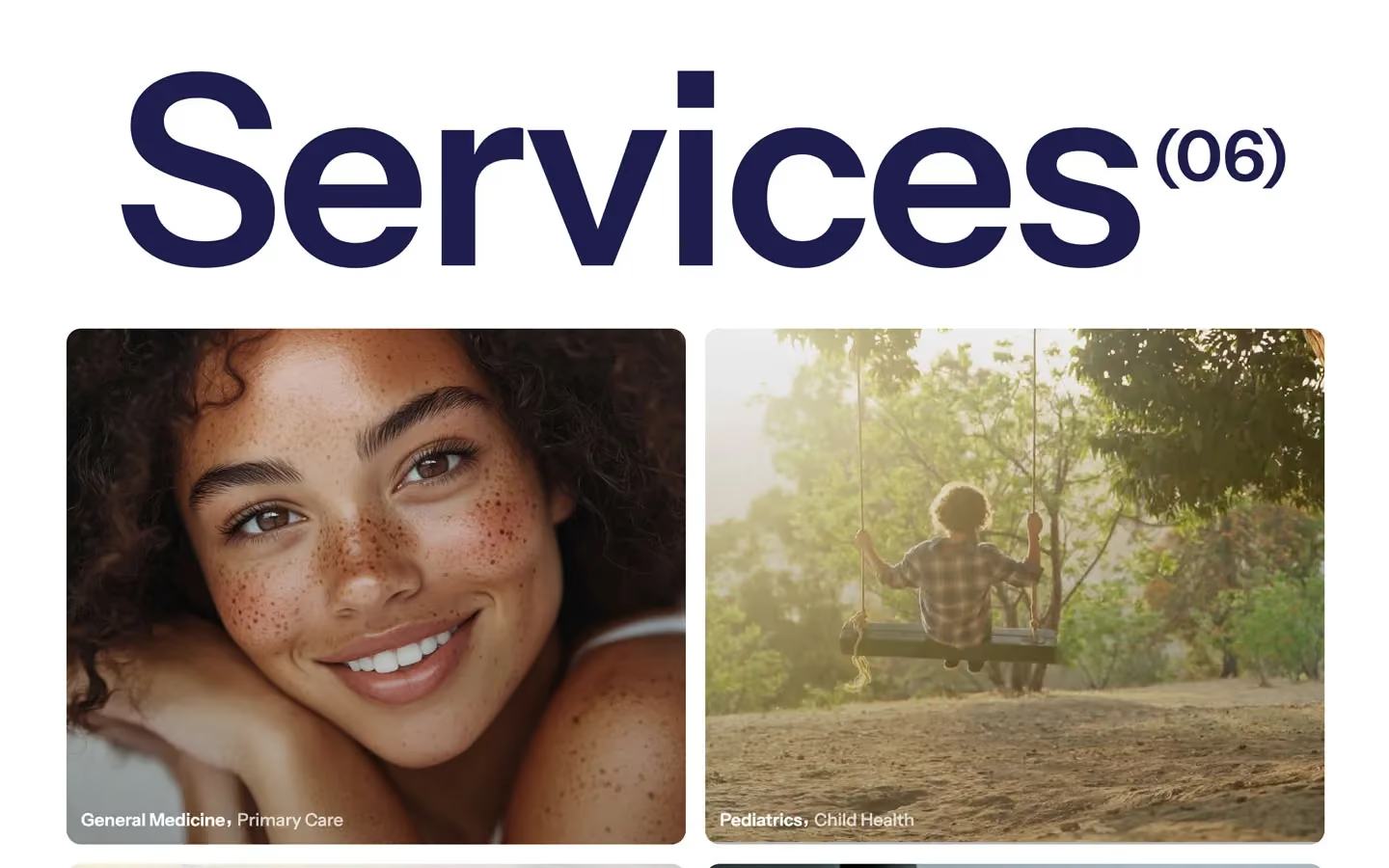

Sanare is a calm, trustworthy clinic site. It is white and airy, with one deep navy (#182D42) doing almost all the work: text, the testimonial band and the only filled button. Warm, sun-lit portrait photography (freckled skin, children running at golden hour, a doctor in a white coat) brings all the colour, and the type is a friendly grotesk, Instrument Sans, set mostly in semibold.
Four signatures make it recognisable:
- The giant section word. A section such as Services is set at 12vw (172.8px at 1440) in navy, weight 600, tracking −3px, with a bracketed count (06) raised top-right like a footnote. It runs nearly edge to edge.
- The full-bleed hero with a rotating phrase. A navy-tinted doctor photo fills the first screen. Over it sits Get care today for in white and a second line, sleep issues., in white at 70%, which rotates through conditions. Three small photo thumbnails (about 130×94px) sit at the bottom left.
- Underlined uppercase text links instead of buttons. BOOK APPOINTMENT, FIND A DOCTOR and MEET THE DOCTOR are 13px semibold uppercase with a thin underline. The only filled button is the navy form submit.
- The fading conditions list. A stack of 47px semibold condition names (Digestive Issues, Inflammation, Hormone Health) where the active one is full navy and the rest are navy at 20%.
Sanare is a light design with one navy band (testimonials).
Colors
Surfaces
#FFFFFFPage background, every section except testimonials
#FFFFFFCards are white too: testimonial cards on the navy band, the booking card on a photo
#000000 · 20%1px underline on form inputs
#182D42The testimonial band
Ink
#FFFFFFText on primary
#182D42Headlines, nav, links, labels (--colors--main-color)
#182D42Body copy is full navy, the same as ink
#777777Call: and Email: prefixes on doctor cards, 17px semibold
#182D42 · 20%Inactive items in the conditions list (opacity 0.2)
#FFFFFFText on inverse-canvas
#FFFFFFHero headline and its rotating second line
#FFFFFF · 70%Muted text on media
Action
#182D42The navy filled button (form submit), the 42px icon button
Lines & effects
#1E1E4C · 20%1px bottom rule on FAQ accordion rows
#E1E1E1Title-row rule, the divider variable
#D8DFE0Title-row rule, the divider variable
#000000 · 44%Input placeholder text
#FFFFFF · 40%Small translucent chips over photos (2 uses)
#000000 · 30%Overlay on service and hero images
Typography
Instrument Sans · display-section
The quick brown fox jumpsServices(06), the viewport-wide section word (12vw). 173px · 600 · 1.0 · -3px
Instrument Sans · headline-lg
The quick brown fox jumpsReal Stories, Real Care, .second-title. 48px · 600 · 1.1
Instrument Sans · title-lg
The quick brown fox jumpsTestimonial quotes. 23px · 600 · 1.15
Instrument Sans · body-lg
The quick brown fox jumpsLead paragraphs, the service card second part Primary Care. 18px · 500 · 1.4
Instrument Sans · label-nav
The quick brown fox jumpsNav links Home Clinic Services Plans. 17px · 500 · 1.88
Instrument Sans · eyebrow
The quick brown fox jumpsText links BOOK APPOINTMENT, FIND A DOCTOR, top-line titles. 13px · 600 · 1.15
Spacing & shape
| Purpose | Value |
|---|---|
| Container | max 1440px (--container-size--container), centred |
| Grid | a 12-column grid with a 16px gap for the intro and title rows (flex from 991px) |
| Section rhythm | 120px top and bottom (.section), 90px at ≤991 and 60px at ≤479 |
| Breakpoints | 991px, 767px and 479px, plus 1280px and 1920px steps |
Spacing scale
| Token | Value | Preview |
|---|---|---|
hair | 5px | |
xs | 10px | |
sm | 15px | |
md | 20px | |
lg | 30px | |
xl | 50px | |
2xl | 100px |
Layout spacing
| Token | Value | Preview |
|---|---|---|
column-gap | 16px | |
gutter | 72px | |
section | 120px | |
section-band | 150px |
Border radius
Motion
| Scroll reveal | opacity 0 → 1 with y 20% → 0%, 600ms outQuart |
| Slow fade-in | opacity 0 → 1, 1000ms outQuart, x/y 0px settle |
| Line reveal | y 100% or 130% → 0% with skewY 6deg → 0deg, 400–500ms outSine |
| Hover fade | opacity, 200–300ms ease (icons, labels) |
| Underline grow | Size change, 500ms |
| Accordion icon | Rotate, 500ms |
| Card hover | transform: scale(0.97), 300ms (card-testimonial) |
| Image hover | transform 0.3s cubic-bezier(0.165, 0.84, 0.44, 1) |
| Button hover | opacity 0.8, all 0.3s |
| Hero slider | Slides fade with 500ms opacity; the rotating word moves in from y 100% |
Do’s and don’ts
- Keep the page white #FFFFFF with all text in navy #182D42, and the testimonial band in solid navy.
- Open a major section with one giant display-section word plus a raised count like (06).
- Use underlined 13px uppercase text links for calls to action; keep the filled navy button for form submits.
- Use Instrument Sans 600 for every heading and 500 for body, with normal tracking.
- Use warm, natural-light patient photography with a dark gradient under any white text.
- Show hierarchy with opacity on navy (0.75, 0.35, 0.2), not with new greys.
- Add the unused red #F9031C or the light blue #9ADBFF, or any second accent.
- Add drop shadows; cards are flat white on navy or on photos.
- Use ink-subtle #777777 below 17px semibold. It sits at 4.48:1 on white, so keep it for the Call: / Email: prefixes only.
- Use ink-faint (navy at 20%) for anything readable. It is only for inactive rows in the 47px conditions list.
- Use the declared-but-unloaded Clash Grotesk or Coolvetica.
- Give inputs boxes; they are underline-only with a 0 left padding.
Example prompt
Any page in the Sanare style
More design systems like this
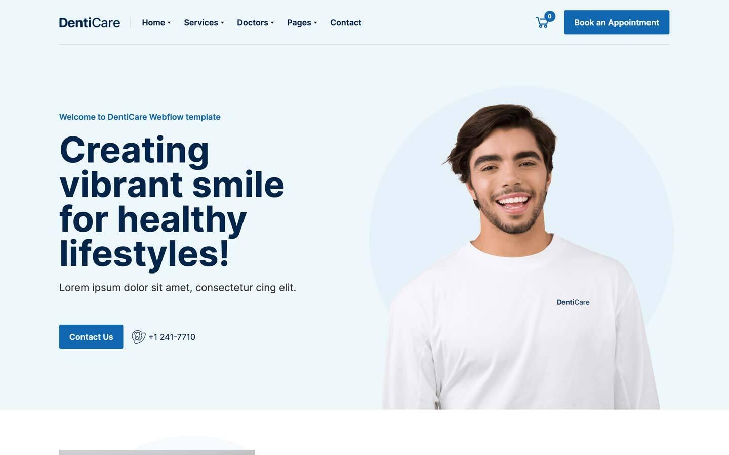
Health design systems, the same colors first.


Bring any of them to your AI tool
All Access unlocks all 398 design systems, ready for Claude, ChatGPT, Gemini, Cursor, v0 and Lovable, plus 400+ templates on all 5 platforms.
Get All AccessUpgrade to All AccessHow to use the Sanare design system
Pick a file to see what it’s for and where it goes.
What it is
The whole design system in one markdown file, written for AI: every color, type style, spacing value, component and motion rule, plus do's, don'ts and a ready prompt.
Best for
Claude, ChatGPT, Gemini, Cursor and v0, or any other AI tool that builds pages or code.
How to use it
- Put
DESIGN.mdin your project and mention it in your request, or save it as.cursor/rules/sanare.mdc - For the rule file, start it with a front-matter block that sets
alwaysApply: true, so every chat uses it - Ask: “Build a pricing page using DESIGN.md.” Cursor follows the colors, fonts, spacing and rules
- Put
DESIGN.mdin the project root - Add one line to
CLAUDE.md: “Follow DESIGN.md for all UI.” - Ask for any page or component; Claude reads the file first
- Attach
DESIGN.mdto the chat (or paste it in) - Ask: “Build a landing page in this design system.”
- Keep the file in the chat or project knowledge, so follow-up pages stay on style
What it is
Every token as data, in the W3C Design Tokens format: colors with their roles, type styles, radius, spacing, and component tokens that point at them.
Best for
Figma (Tokens Studio), Style Dictionary and other design-token tools, and build scripts.
How to use it
- In Figma, open Tokens Studio, choose Import, and pick
tokens.json - Or point Style Dictionary’s
sourceat it to generate tokens for any platform - In code, import it like any JSON file
What it is
A Tailwind CSS v4 theme: every color, font, type style, radius and spacing value becomes a Tailwind utility, like bg-canvas, text-headline-lg or rounded-md.
Best for
Tailwind v4 projects, and AI builders that write Tailwind (v0, Lovable, Bolt).
How to use it
- Save
theme.cssnext to your main CSS file - Import it after Tailwind:
@import "tailwindcss"; @import "./theme.css"; - Use the classes:
bg-canvas text-ink rounded-md p-lg
What it is
The same tokens as plain CSS variables on :root. Component values point at the color variables, so changing one color updates everything that uses it.
Best for
Any website: plain CSS, Webflow custom code, Framer, WordPress.
How to use it
- Add it to your stylesheet, or in Webflow paste it into Site settings → Custom code inside a
<style>tag - Use the variables anywhere:
color: var(--color-ink) - Change a token once and every place that uses it follows