 flowmance
Newspapper Design System
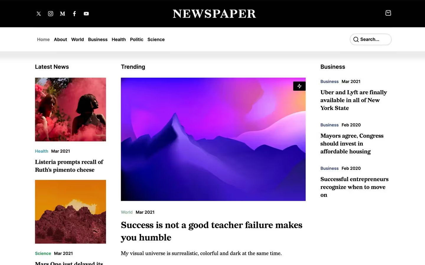
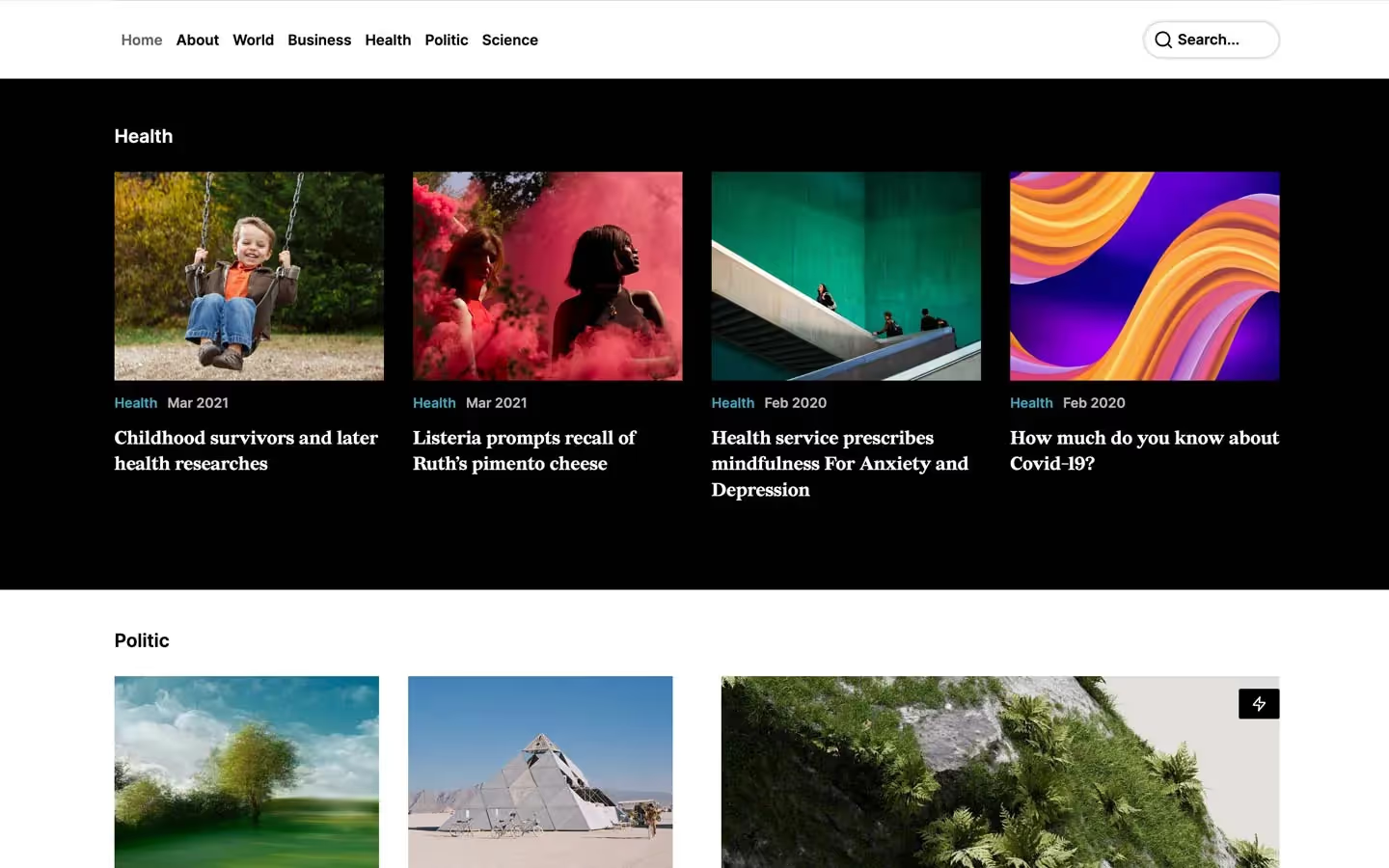
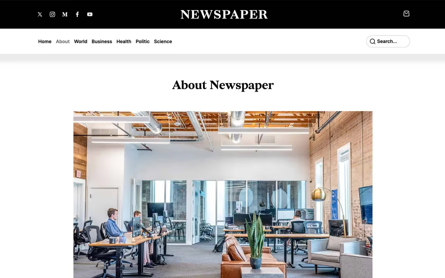
Newspapper is a classic online newspaper: white page, black masthead, a dense three-column front page and serif headlines that do all the talking. It reads like a print paper's web edition. Redaction, a sharp book serif, sets every headline and excerpt; Inter sets everything functional (nav, section names, categories, dates). Colour comes only from the photos and from small coloured category labels.
Four signatures make it recognisable:
- Black masthead. A full-width black bar with social icons on the left, the serif wordmark NEWSPAPER centred and a cart icon on the right. Under it a white sticky nav with a soft grey halo shadow.
- Serif over sans. Every small card has an Inter 14/600 meta line (Business Feb 2020) above a Redaction 19/700 headline. The category word is coloured, the date is black.
- Colour-coded categories. Business is navy #2E4285, World sage #88B49B, Politic coral #F6584D, Health teal #41A1B9, Science green #17974E.
- One black band. A single section (Health) flips to a black background with white serif titles, breaking the white page.
Colors
Surfaces
#FFFFFFPage background
#FFFFFFSame as canvas: cards have no fill, and the cart panel is white with a #EEEEEE border
#2F3330Text typed into the newsletter field
#D0D5DDSearch pill border
#000000The black masthead and the Health band
Ink
#FFFFFFText on primary
#1C4A36Text on secondary
#12141DText on accent
#000000Headlines, nav, dates, section labels
#000000Excerpts and paragraphs are full black too (base p is var(--black))
#4D4D4DList items in posts, input placeholders (--dim-grey)
#6B6B6BRare secondary meta (--dim-grey-2)
#FAFAFAText on inverse-canvas
#FFFFFF · 70%Secondary text on the black band
Action
#000000Black buttons and the lightning badge on trending images
#4D4D4D.button:hover background
#E4F5EESearch button: pale mint with forest-green text
#39FF14Newsletter subscribe button: neon green
#1C4A36Hover fill for both the search and subscribe buttons, with white text
#FF0E0EThe round remove button in the cart
Lines & effects
#E1E1E1Form input border
#EEEEEE · 93%The hairline above the sticky nav, cart borders
#CCCCCCDivider borders (--light-grey)
#2E4285#88B49B#F6584D#41A1B9#17974ETypography
Redaction · display-post
The quick brown fox jumpsPost-page H1. 38px · 700 · 1.16
Redaction · headline-quote
The quick brown fox jumpsBlockquotes: 2px black left rule, 25px left padding. 36px · 400 · 1
Redaction · title-lg
The quick brown fox jumpsH3 in articles. 24px · 700 · 1.25
Redaction · body-lg
The quick brown fox jumpsExcerpts and paragraphs. 18px · 400 · 1.33
Inter · label-nav
The quick brown fox jumpsNav links. 15px · 600 · 1.07
Redaction · caption
The quick brown fox jumpsSmall serif notes and credits. 13px · 500 · 1.38
Spacing & shape
| Purpose | Value |
|---|---|
| Container | max 1200px, centred |
| Breakpoints | 991px, 767px and 479px (Webflow defaults) |
Spacing scale
| Token | Value | Preview |
|---|---|---|
xs | 7px | |
sm | 10px | |
md | 16px | |
lg | 20px | |
xl | 30px | |
2xl | 40px | |
3xl | 50px | |
4xl | 60px | |
5xl | 80px | |
6xl | 100px |
Layout spacing
| Token | Value | Preview |
|---|---|---|
section-top | 40px | |
band-bottom | 64px | |
band-top | 70px |
Border radius
Motion
| Nav link hover | opacity 1 → 0.6, 200ms |
| Button hover | Background colour, 300ms (.button) or 200ms (search, subscribe) |
| Page load | Content fades in opacity 0 → 1, 1000ms outQuart, with a y −20px move over 500ms |
| Image hover | Filter and scale change over 400–500ms ease (scale 1.2 → 1) |
| Cart / mobile menu | Panel slides x 100vw → 0 or y 100vh → 0, 500ms; overlay fades 300ms ease |
Do’s and don’ts
- Set every headline in Redaction 700 and every meta, nav and button label in Inter 600.
- Start every card with the meta line: category in its own colour (#2E4285, #88B49B, #F6584D, #41A1B9, #17974E), then the date in #000000.
- Keep photos at 3:2 with square corners.
- Use the black masthead (#000000) and one black band per page for contrast.
- Keep the sticky white nav with its 0 0 12px 26px #00000014 halo.
- Use the 1200px container with 50px column gaps on the front page and 30px in category rows.
- Round cards or images. Only buttons (4–8px), the search pill and circles are rounded.
- Use category colours for buttons, backgrounds or headlines.
- Set World (#88B49B) or Politic (#F6584D) labels below 14px semibold; they are light on white and need the size and weight.
- Add a second serif, uppercase labels or letter spacing.
- Use the neon accent #39FF14 for anything but the subscribe button.
- Put grey text on the excerpts; body copy is full black.
Example prompt
Any page in the Newspapper style
More design systems like this
Blog design systems, the same colors first.


Bring any of them to your AI tool
All Access unlocks all 398 design systems, ready for Claude, ChatGPT, Gemini, Cursor, v0 and Lovable, plus 400+ templates on all 5 platforms.
Get All AccessUpgrade to All AccessHow to use the Newspapper design system
Pick a file to see what it’s for and where it goes.
What it is
The whole design system in one markdown file, written for AI: every color, type style, spacing value, component and motion rule, plus do's, don'ts and a ready prompt.
Best for
Claude, ChatGPT, Gemini, Cursor and v0, or any other AI tool that builds pages or code.
How to use it
- Put
DESIGN.mdin your project and mention it in your request, or save it as.cursor/rules/newspapper.mdc - For the rule file, start it with a front-matter block that sets
alwaysApply: true, so every chat uses it - Ask: “Build a pricing page using DESIGN.md.” Cursor follows the colors, fonts, spacing and rules
- Put
DESIGN.mdin the project root - Add one line to
CLAUDE.md: “Follow DESIGN.md for all UI.” - Ask for any page or component; Claude reads the file first
- Attach
DESIGN.mdto the chat (or paste it in) - Ask: “Build a landing page in this design system.”
- Keep the file in the chat or project knowledge, so follow-up pages stay on style
What it is
Every token as data, in the W3C Design Tokens format: colors with their roles, type styles, radius, spacing, and component tokens that point at them.
Best for
Figma (Tokens Studio), Style Dictionary and other design-token tools, and build scripts.
How to use it
- In Figma, open Tokens Studio, choose Import, and pick
tokens.json - Or point Style Dictionary’s
sourceat it to generate tokens for any platform - In code, import it like any JSON file
What it is
A Tailwind CSS v4 theme: every color, font, type style, radius and spacing value becomes a Tailwind utility, like bg-canvas, text-headline-lg or rounded-md.
Best for
Tailwind v4 projects, and AI builders that write Tailwind (v0, Lovable, Bolt).
How to use it
- Save
theme.cssnext to your main CSS file - Import it after Tailwind:
@import "tailwindcss"; @import "./theme.css"; - Use the classes:
bg-canvas text-ink rounded-md p-lg
What it is
The same tokens as plain CSS variables on :root. Component values point at the color variables, so changing one color updates everything that uses it.
Best for
Any website: plain CSS, Webflow custom code, Framer, WordPress.
How to use it
- Add it to your stylesheet, or in Webflow paste it into Site settings → Custom code inside a
<style>tag - Use the variables anywhere:
color: var(--color-ink) - Change a token once and every place that uses it follows