 flowmance
Naomi Stone Design System


Naomi Stone is a one-person photographer and director portfolio built as a single dark stage. The home page is one sticky 900px frame that plays like a short film as you scroll: an outlined wordmark, a fade, an outlined "GET IN TOUCH" line, tilted colour photos that land on top of each other, then a contact form. The interface is black, white and two greys. The photos carry all the colour.
Four signatures make it recognisable:
- The outlined caps wordmark. NAOMI STONE at 170px in Optiker-K, a wide caps-only display face, tracked out 7px and drawn as a thin white outline with a black fill. Each letter is its own element.
- Letters that flip in. Every letter starts turned 90° on the Y axis, shifted −10px x / −30px y and invisible, then turns flat in 600ms on a sharp ease-out curve, one after another.
- Tilted photo stack. Portrait photos slide in from below or the side and land a few degrees off straight, piling up on the right half of the stage like prints dropped on a table.
- Spaced grey caps lines. Small lines such as PHOTOGRAPHER - DIRECTOR and SCROLL DOWN are Optiker-K with 6px and 2px tracking in grey, centred under the big type.
Naomi Stone is a dark-only design.
Colors
Surfaces
#000000Page background (--black)
#101010Footer band (--black-2) and the top of the nav fade
Ink
#FFFFFFText on primary
#000000Text on primary-hover
#FFFFFFWordmark outline, logo, nav icon, input text, links
#FFFFFF · 70%Paragraphs (p), placeholders, dark-link
#FFFFFF · 80%List items (li)
#7C7C7CPHOTOGRAPHER - DIRECTOR, the overlay menu words (--grey)
#FFFFFF · 46%SCROLL DOWN under the mouse icon
#FFFFFF · 40%The footer copyright line only
#FFFFFFAction
#494949The filled pill button (--dim-grey)
#FFFFFFThe button inverts to white with black text on hover
#FFFFFF · 20%Resting underline of button-liner text links
Lines & effects
#494B581px border of every input and the textarea
#7C7C7CMouse-icon outline, back-to-top circle, cart remove button
#747474Left border and top border of the cart drawer
#FFFFFF · 20%#101010 · 20%Flat overlay on every project photo
Typography
Optiker-K · display-hero · shown in Space Grotesk (fallback)
The quick brown fox jumpsNAOMI STONE, GET IN TOUCH (outlined, one element per letter). 170px · 400 · 0.9 · 7px
Satoshi · headline-lg
The quick brown fox jumpsBase h1 on inner pages (blog post, shop). 38px · 600 · 1.16
Satoshi · title-lg
The quick brown fox jumpsBlockquote, with a 3px #7C7C7C left rule and padding 0 20px 0 30px. 28px · 400 · 1.14
Optiker-K · eyebrow · shown in Space Grotesk (fallback)
The quick brown fox jumpsPHOTOGRAPHER - DIRECTOR. 19px · 400 · 1.58 · 6px
Optiker-K · label-button · shown in Space Grotesk (fallback)
The quick brown fox jumpsButton labels (CONTACT ME). 17px · 400 · 1.18 · 1px
Satoshi · body-lg
The quick brown fox jumpsParagraphs, at 70% white. 18px · 400 · 1.33
Spacing & shape
| Purpose | Value |
|---|---|
| Container | max 1200px, centred (.container) |
| Section rhythm (inner pages) | .section uses 100px top and bottom and 5% side padding |
| Breakpoints | 991px, 767px and 479px (Webflow defaults) |
Spacing scale
| Token | Value | Preview |
|---|---|---|
xs | 10px | |
sm | 16px | |
md | 23px | |
lg | 50px | |
xl | 72px |
Layout spacing
| Token | Value | Preview |
|---|---|---|
footer | 50px | |
hamburger | 70px | |
section | 100px | |
section-stage | 120px |
Border radius
Surfaces
How the surfaces stack, from the page background up. Hex codes and roles are in Colors above.
Motion
| Letter flip-in | Each letter from rotateY 90°, x −10px, y −30px, opacity 0 to rotateY 0°, 0, 0, opacity 1. 600ms, cubic-bezier(0.425, 0.005, 0, 1), staggered letter by letter. Triggered on load and on scroll into view. |
| Scene fade | Big type to opacity 0.2 (500ms) as the next scene arrives. Elements leave with opacity 0 in 400ms outExpo. |
| Photo fly-in | Photos move from y −100vw, y 20vw or y 35vw, x ±5vw to 0, 0 in 500ms on the same curve, landing tilted. Scrubbed by the sticky stage. |
| Slow reveal | opacity 0 → 1, 1000ms outQuart (page finish) |
| Mask slide | y 100% → 0%, 500–600ms, on menu words and other clipped labels |
| Link underline grow | Width change, 500ms |
| Button hover | all 0.2s: #494949 → #FFFFFF, white → black text |
| Social link hover | opacity 0.6 → 1, all 0.3s |
| Custom cursor | Follows the mouse over project cards (cursor: none) |
Do’s and don’ts
- Keep the canvas pure #000000 and the footer #101010.
- Set the wordmark and section words in Optiker-K, outlined, with wide positive tracking (7px at 170px).
- Animate letters one by one: rotateY 90° → 0, 600ms, cubic-bezier(0.425, 0.005, 0, 1).
- Use pill outline fields: transparent fill, 1px #494B58, 25px radius, 50px tall.
- Use the single #494949 pill button that inverts to white on hover.
- Let tilted, hard-cornered photos carry all the colour.
- Use the red #FF3A1B, yellow #FFEA00 or green #00663F variables. They are unused.
- Fill the two big display lines solid or set them in Satoshi. They are always outlines in Optiker-K; only the overlay menu words are solid #7C7C7C.
- Round photos, add shadows, or put coloured overlays on images.
- Track Satoshi, or set Optiker-K without tracking.
- Use ink-faint (40% white) for anything but the 15px copyright line. It is below 4.5:1 on black; keep it for meta text only.
- Break the stage into many headed sections. One sticky scene with two outlined lines is the whole home page.
Example prompt
Any page in the Naomi Stone style
More design systems like this
Portfolio design systems, the same colors first.
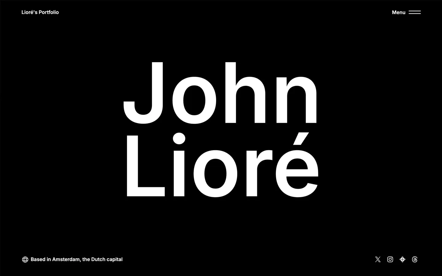
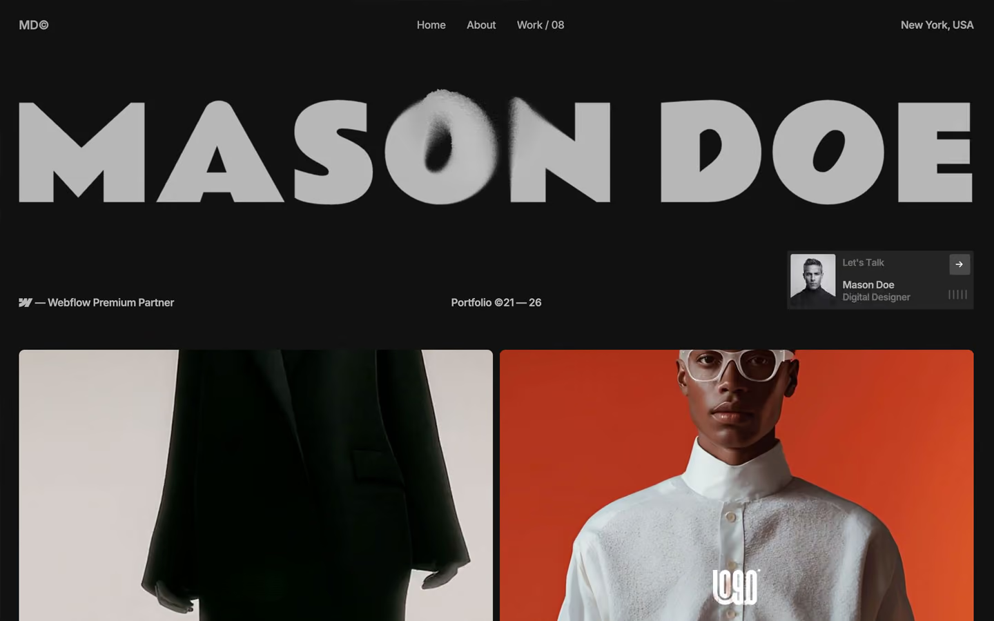

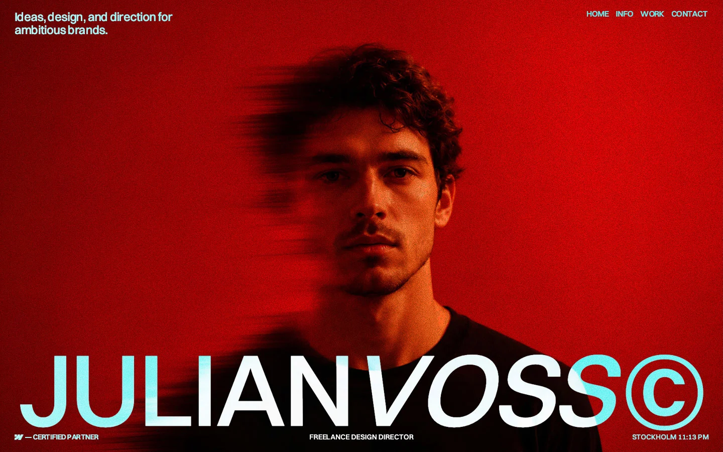
Bring any of them to your AI tool
All Access unlocks all 398 design systems, ready for Claude, ChatGPT, Gemini, Cursor, v0 and Lovable, plus 400+ templates on all 5 platforms.
Get All AccessUpgrade to All AccessHow to use the Naomi Stone design system
Pick a file to see what it’s for and where it goes.
What it is
The whole design system in one markdown file, written for AI: every color, type style, spacing value, component and motion rule, plus do's, don'ts and a ready prompt.
Best for
Claude, ChatGPT, Gemini, Cursor and v0, or any other AI tool that builds pages or code.
How to use it
- Put
DESIGN.mdin your project and mention it in your request, or save it as.cursor/rules/naomi.mdc - For the rule file, start it with a front-matter block that sets
alwaysApply: true, so every chat uses it - Ask: “Build a pricing page using DESIGN.md.” Cursor follows the colors, fonts, spacing and rules
- Put
DESIGN.mdin the project root - Add one line to
CLAUDE.md: “Follow DESIGN.md for all UI.” - Ask for any page or component; Claude reads the file first
- Attach
DESIGN.mdto the chat (or paste it in) - Ask: “Build a landing page in this design system.”
- Keep the file in the chat or project knowledge, so follow-up pages stay on style
What it is
Every token as data, in the W3C Design Tokens format: colors with their roles, type styles, radius, spacing, and component tokens that point at them.
Best for
Figma (Tokens Studio), Style Dictionary and other design-token tools, and build scripts.
How to use it
- In Figma, open Tokens Studio, choose Import, and pick
tokens.json - Or point Style Dictionary’s
sourceat it to generate tokens for any platform - In code, import it like any JSON file
What it is
A Tailwind CSS v4 theme: every color, font, type style, radius and spacing value becomes a Tailwind utility, like bg-canvas, text-headline-lg or rounded-md.
Best for
Tailwind v4 projects, and AI builders that write Tailwind (v0, Lovable, Bolt).
How to use it
- Save
theme.cssnext to your main CSS file - Import it after Tailwind:
@import "tailwindcss"; @import "./theme.css"; - Use the classes:
bg-canvas text-ink rounded-md p-lg
What it is
The same tokens as plain CSS variables on :root. Component values point at the color variables, so changing one color updates everything that uses it.
Best for
Any website: plain CSS, Webflow custom code, Framer, WordPress.
How to use it
- Add it to your stylesheet, or in Webflow paste it into Site settings → Custom code inside a
<style>tag - Use the variables anywhere:
color: var(--color-ink) - Change a token once and every place that uses it follows