 flowmance
CodeBuild Design System


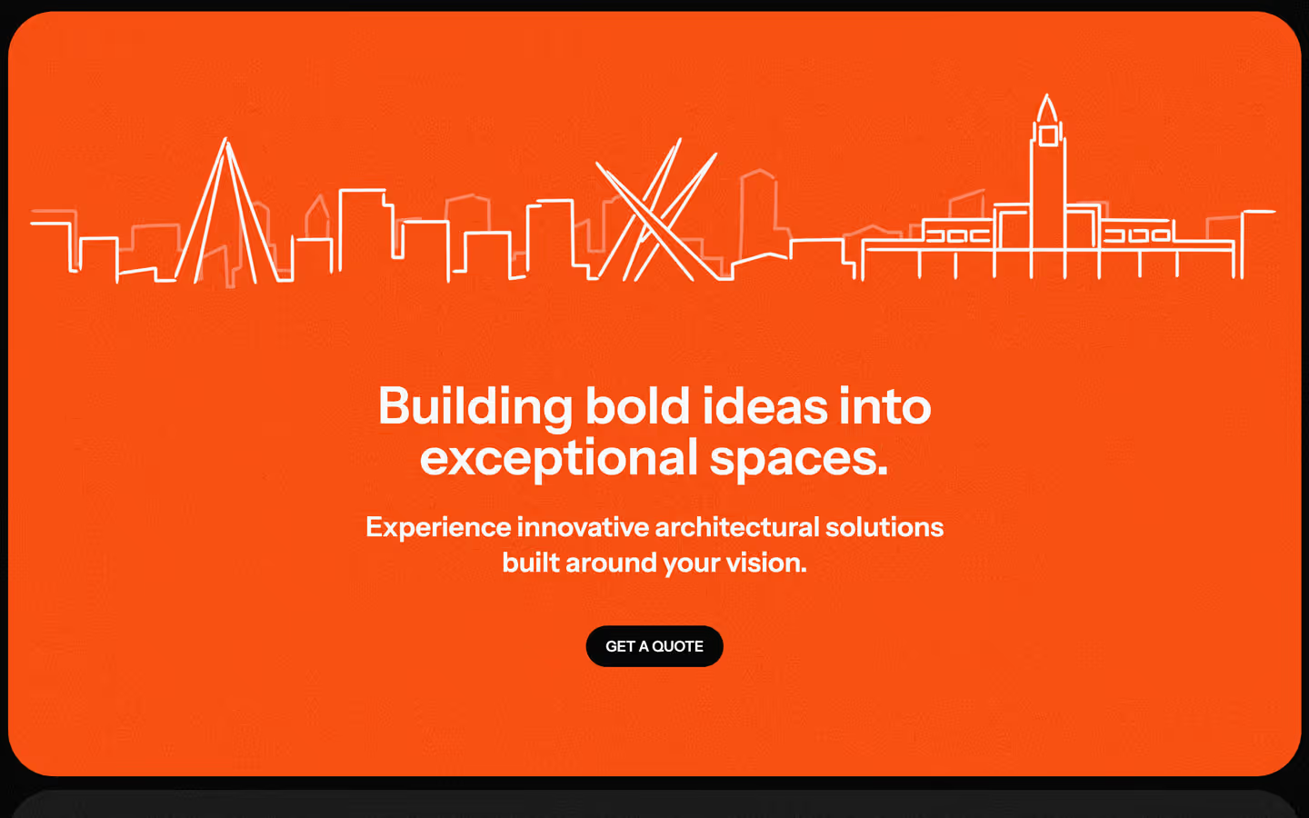
CodeBuild is a dark, solid construction-company site. The page is black, and every section is a #161616 panel with 50px corners floating 10px in from the screen edges, so the page reads as a stack of rounded slabs. A fine film grain covers everything. Type is Instrument Sans: bold 56–70px headlines, small uppercase pill labels, and big metrics. Safety orange, #FF4F00, is the single accent: the quote button, icon tiles and two full orange panels (the client-logo grid and the closing call-to-action band). The live site names itself CoreBuild / CORE BUILD ™.
Four signatures make it recognisable:
- Stacked rounded slabs. Hero, sections, the orange band and the testimonials are separate panels with a 50px radius, 10px from the viewport sides and 15px apart, on a black page.
- Film grain over everything. A fixed full-screen layer (.tv-dots, 100vh) adds visible noise to photos, panels and type alike.
- Pill label left, headline right. Sections open with an uppercase eyebrow in a #222222 pill (FUN FACTS, OUR SERVICES, TESTIMONIALS) on the left and a 56px headline from column 4, with the end of the sentence at 70% white (…from blueprint to build.). Square slider arrows sit at the far right.
- Safety orange as a tool colour. #FF4F00 appears only on the GET A QUOTE pill, 40px icon buttons, feature icon tiles and two full-width orange panels (client logos, call-to-action band), never on text.
CodeBuild is a dark-only design.
Colors
Surfaces
#000000Page behind the panels, footer (--main-color)
#161616Section panels and the hero frame (--second-color)
#222222Pill labels (.small-text), button hover
#333333Testimonial cards, slider arrows (13 elements)
#FFFFFFContact inputs: white pills with black text
#FFFFFF · 20%Input border
#242424Footer subscribe field
Ink
#FFFFFFText on primary
#FFFFFFText on secondary
#FFFFFFText on accent
#FFFFFFHeadlines, labels, nav
#FFFFFF · 70%Paragraphs (p at opacity: .7), the greyed end of headlines, dates
#FFFFFF · 50%Metric + affixes, small meta
#000000Text on field
#FFFFFF#D9DAE2--body-text-color, subscribe button text
Action
#FF4F00GET A QUOTE pill and submit (--third-color)
#222222Button hover: the orange turns charcoal
#000000The black GET A QUOTE pill on the orange band
#FF4F00Orange band, feature icon tiles, icon buttons
Lines & effects
#FFFFFF · 15%1px divider rules inside panels
#FFFFFF · 63%One stronger 1px border
#000000 · 40%Layers over hero and card photos
#000000 · 20%With scrim: Layers over hero and card photos
Typography
Instrument Sans · display-metric
The quick brown fox jumps471, 7. 120px · 500 · 0.8 · -0.5px
Instrument Sans · metric-affix
The quick brown fox jumpsThe raised + at 50% white. 62px · 400 · 0.8 · -0.5px
Instrument Sans · headline-hero
The quick brown fox jumpsTransform your construction company's website with CoreBuild. 70px · 600 · 1
Instrument Sans · title-xl
The quick brown fox jumpsSubhead on the orange band. 30px · 600 · 1.3
Instrument Sans · body-lg
The quick brown fox jumpsParagraphs at 70%. 20px · 500 · 1.4
Instrument Sans · label-card
The quick brown fox jumpsService-card labels Architectural Design, input text. 17px · 600 · 1.4
Spacing & shape
| Purpose | Value |
|---|---|
| Container | max 1240px, centred (.container, 9 uses) |
| Grid | 12 columns with no column gap and a 10vw row gap (.main-grid) |
| Breakpoints | 991px, 767px and 479px, plus min-width steps at 768 and 1280px |
Spacing scale
| Token | Value | Preview |
|---|---|---|
hair | 4px | |
xs | 9px | |
sm | 16px | |
md | 20px | |
lg | 40px | |
xl | 50px |
Layout spacing
| Token | Value | Preview |
|---|---|---|
column-gap | 0px | |
inset | 10px | |
panel-gap | 15px | |
gutter | 43px | |
section | 150px |
Border radius
Surfaces
How the surfaces stack, from the page background up. Hex codes and roles are in Colors above.
Motion
| Fade-in | Opacity 0 → 1, 1000ms outQuart; settle x 0, y 0, 1000ms outQuart |
| Text reveal | y → 0%, 500ms outQuint, with a text-colour change 500ms outQuint |
| Text roll | Label y 0 → −100%, 500ms, inside a mask |
| Slide-in | x −30px → 0, 500ms outQuart; x 30px → 0, 800ms outExpo; wide x ±45vw → 0, 500ms |
| Arrow nudge | x 3px, y −3px, 300ms ease, and back |
| Underline grow | Size change, 300ms ease; 400ms outCubic |
| Icon rotate | Rotate, 500ms (7 hover targets) |
| Scale | scale → 1, 300ms outSine |
| Border | 200ms outSine |
| Button | transition: all .3s to #222222 |
| Testimonial card | scale(.97), transform .3s, color .3s |
| Logo grid | Logos cycle vertically inside a 3.4rem mask |
Do’s and don’ts
- Put each content section on a #161616 panel with a 50px radius, 10px from the screen edges and 15px from the next panel.
- Use #FF4F00 only for the quote button, icon buttons, feature tiles and the two orange panels (logos, call to action).
- Open sections with an uppercase pill label (#222222) and a 56px weight-600 headline from column 4.
- Fade the end of a headline to 70% white to stress the second half.
- Keep orange-button labels at 16px weight 600 uppercase; white on #FF4F00 is about 3.3:1, so never use smaller or lighter text on orange.
- Keep the film-grain layer on top of everything.
- Put content directly on the #000000 page without a panel (the footer is the one exception).
- Use orange for headlines, paragraphs or large background areas other than the two orange panels.
- Square off panels or cards; they are always 50px.
- Use Space Grotesk; it is loaded but unused.
- Add shadows or blur; depth is surface steps and grain.
- Put ink-subtle (50% white) on body text; keep it for affixes and small meta.
Example prompt
Any page in the CodeBuild style
More design systems like this
Construction design systems, the same colors first.


Bring any of them to your AI tool
All Access unlocks all 398 design systems, ready for Claude, ChatGPT, Gemini, Cursor, v0 and Lovable, plus 400+ templates on all 5 platforms.
Get All AccessUpgrade to All AccessHow to use the CodeBuild design system
Pick a file to see what it’s for and where it goes.
What it is
The whole design system in one markdown file, written for AI: every color, type style, spacing value, component and motion rule, plus do's, don'ts and a ready prompt.
Best for
Claude, ChatGPT, Gemini, Cursor and v0, or any other AI tool that builds pages or code.
How to use it
- Put
DESIGN.mdin your project and mention it in your request, or save it as.cursor/rules/codebuild.mdc - For the rule file, start it with a front-matter block that sets
alwaysApply: true, so every chat uses it - Ask: “Build a pricing page using DESIGN.md.” Cursor follows the colors, fonts, spacing and rules
- Put
DESIGN.mdin the project root - Add one line to
CLAUDE.md: “Follow DESIGN.md for all UI.” - Ask for any page or component; Claude reads the file first
- Attach
DESIGN.mdto the chat (or paste it in) - Ask: “Build a landing page in this design system.”
- Keep the file in the chat or project knowledge, so follow-up pages stay on style
What it is
Every token as data, in the W3C Design Tokens format: colors with their roles, type styles, radius, spacing, and component tokens that point at them.
Best for
Figma (Tokens Studio), Style Dictionary and other design-token tools, and build scripts.
How to use it
- In Figma, open Tokens Studio, choose Import, and pick
tokens.json - Or point Style Dictionary’s
sourceat it to generate tokens for any platform - In code, import it like any JSON file
What it is
A Tailwind CSS v4 theme: every color, font, type style, radius and spacing value becomes a Tailwind utility, like bg-canvas, text-headline-lg or rounded-md.
Best for
Tailwind v4 projects, and AI builders that write Tailwind (v0, Lovable, Bolt).
How to use it
- Save
theme.cssnext to your main CSS file - Import it after Tailwind:
@import "tailwindcss"; @import "./theme.css"; - Use the classes:
bg-canvas text-ink rounded-md p-lg
What it is
The same tokens as plain CSS variables on :root. Component values point at the color variables, so changing one color updates everything that uses it.
Best for
Any website: plain CSS, Webflow custom code, Framer, WordPress.
How to use it
- Add it to your stylesheet, or in Webflow paste it into Site settings → Custom code inside a
<style>tag - Use the variables anywhere:
color: var(--color-ink) - Change a token once and every place that uses it follows