 flowmance
Arbiter Design System
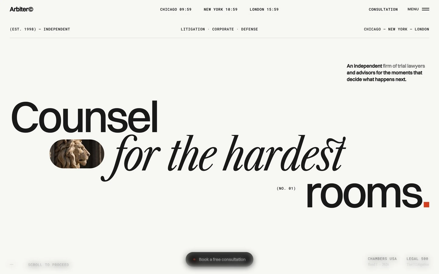
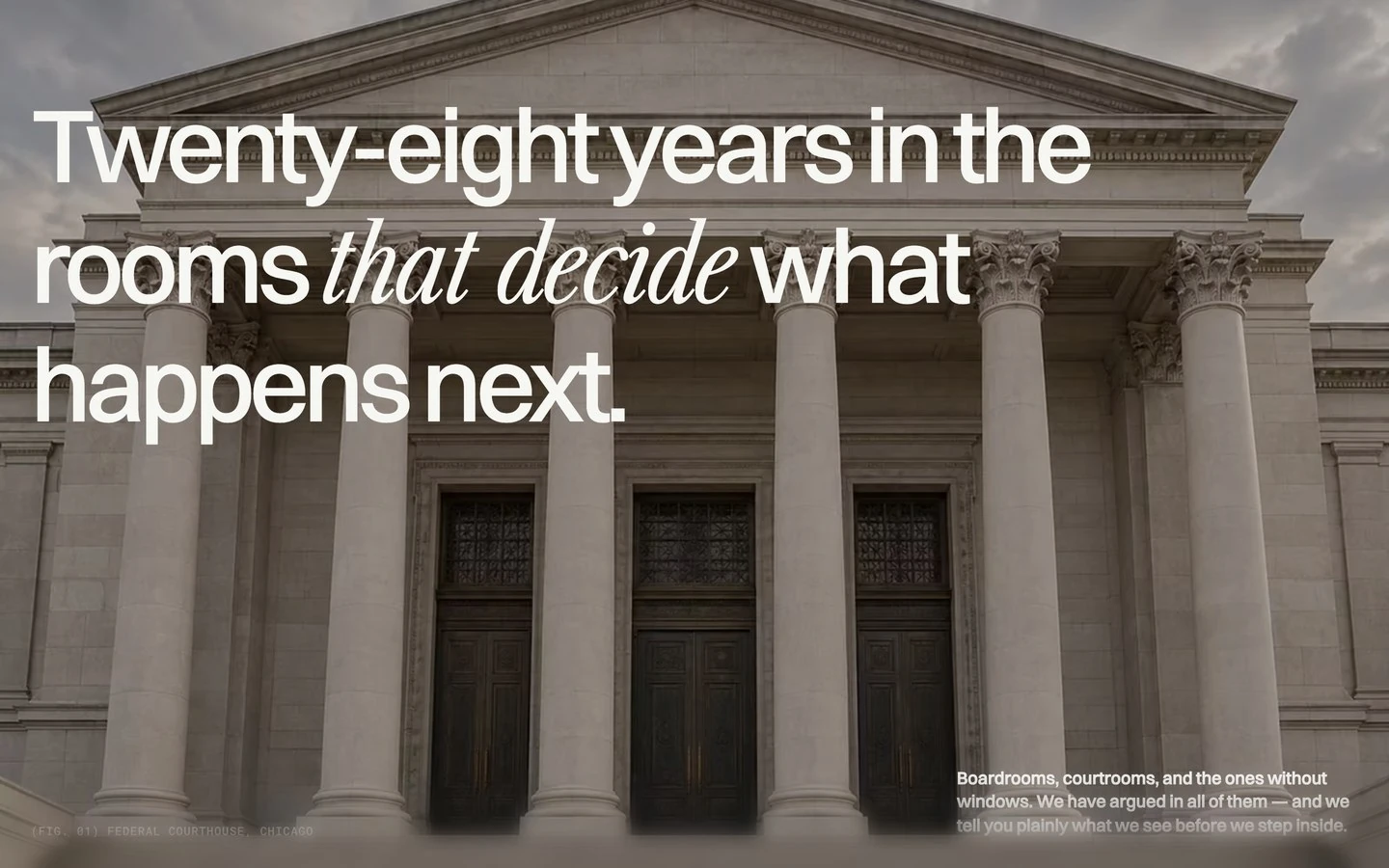

Arbiter is an editorial template for a trial-law firm. It reads like a serious magazine cover: a warm off-white page, enormous tightly tracked Switzer headlines, and single words swapped into a condensed Caslon italic for emphasis. Small Roboto Mono uppercase labels carry the facts (cities, dates, counts), and one signal red (#D4401F) marks numerals, dots and a square full stop. Photography is quiet, warm and architectural.
Four signatures make it recognisable:
- Sans headline, serif italic word. Most big titles mix Switzer 500 with Libre Caslon Condensed italic: Counsel / for the hardest / rooms., Six practices, one standard., The people on your file., …tell you plainly where you stand. The italic word may be red.
- Red marks. A 6px red dot before every mono section label (● OUR POSITION (01)), red italic numerals on cards and rows (01, 05), and a red square full stop after rooms.
- Mono meta everywhere. Roboto Mono 12px uppercase with 0.72px tracking: three live city clocks in the nav (CHICAGO 18:27, NEW YORK 19:27, LONDON 00:27), (EST. 1998) — INDEPENDENT, counts in brackets (06).
- The image pill. A small photo cropped to a pill (a stone lion) sits inside the hero headline and expands to full screen as you scroll.
Colors
Surfaces
#F6F6F3Page background
#FFFFFFRare white fills (3 uses)
#191919Result cards
#111110The dark CTA band at the end of the page (u-theme-dark)
Ink
#F6F6F3Text on primary
#191919Headlines, body, labels
#191919Same as ink: body text is full ink
#747474Bracketed counts (01), accolade sub-lines, small meta
#A3A39CThe grey phrase in the hero lead (firm of trial lawyers); large text only
#FFFFFFNav text over images (the nav stays legible over dark areas)
#F6F6F3Text on dark cards and the dark band
#F6F6F3 · 65%Text on dark cards and the dark band
Action
#191919The main pill button
#191919#D4401FDots, italic numerals, emphasised italic words, the square full stop (26 text, 14 fill uses)
Lines & effects
#DBDBD21px rules above cards and between rows, outline buttons, progress track
#191919Progress fill and the active rule
#F6F6F3 · 10%Rules on dark
Typography
Switzer · display-wordmark
The quick brown fox jumpsThe footer Arbiter© wordmark, one span per letter. 368px · 500 · 0.85 · -11.05px
Switzer · headline
The quick brown fox jumpsSection titles (H2) and the manifesto (line height 1.02 there). 60px · 500 · 0.98 · -2.1px
Libre Caslon Condensed · title-index
The quick brown fox jumpsRed practice numerals 01–06. 56px · 300 · 0.9
Libre Caslon Condensed · quote-serif
The quick brown fox jumpsLarger serif lines (8 uses). 44px · 300 · 1.1 · -1.54px
Switzer · body-lg
The quick brown fox jumpsLeads; the nav logo (about 18px). 18px · 600 · 1.4
Switzer · label
The quick brown fox jumpsButtons; partner roles and practices use the same size and weight at line height 1.45. 14px · 600 · 1.0
Spacing & shape
| Purpose | Value |
|---|---|
| Section header | the title left in headline, the dotted mono label with count right-aligned on the title's baseline |
| Section rhythm | about 160px between sections (sections carry no padding; spacing is inside) |
| Breakpoints | Webflow defaults (991, 767, 479) |
Spacing scale
| Token | Value | Preview |
|---|---|---|
hair | 1px | |
sm | 16px | |
md | 24px | |
lg | 32px |
Layout spacing
| Token | Value | Preview |
|---|---|---|
gutter | 32px | |
footer-top | 64px | |
section | 160px |
Border radius
Surfaces
How the surfaces stack, from the page background up. Hex codes and roles are in Colors above.
Motion
| Hero pill to full screen | clipPath: inset(24% 38% 24% 38% round 1.5rem) → inset(0 round 0) and scale 1.4 → 1, 1s power2.inOut, scrubbed |
| Image reveal | clipPath: inset(100% 0 0 0) → inset, 1.4s expo.inOut, with scale 1.4 → 1 over 1.8s expo.out |
| Headline lines | SplitText yPercent 130 → 0, 1.2s staggered expo.out; also yPercent 60 → 0 with opacity, 1.05s |
| Word light-up | opacity 0.12 → 1, staggered over 3.8s, scrubbed |
| Stacked results | Covered card scale → 0.94, opacity → 0.55, 0.5s, scrubbed between card positions |
| Accordion | height 0 → auto and icon rotation 0 → 45°, 0.6s expo.inOut |
| Menu | yPercent −100 → 0, 0.9s expo.inOut; hamburger y ±3.2, rotation ±45°, 0.5s |
| Cursor follow | QuickTo 0.5–0.7s power3 |
Do’s and don’ts
- Mix Switzer 500 headlines with one Libre Caslon Condensed italic word at the same size.
- Mark section labels with a 6px #D4401F dot, a Roboto Mono 12px uppercase label and a bracketed count.
- Use #D4401F for italic numerals (01–06) and the square full stop.
- Keep body text #191919 on #F6F6F3, Switzer 16px/500, line height 1.5.
- Use the #191919 pill (48px, 16px 24px) with a red dot for the main action.
- Separate rows and cards with 1px #DBDBD2 rules.
- Fill buttons, bands or cards with red.
- Set a whole headline in serif, or use Inter Tight or Libre Caslon Display (loaded but unused).
- Add shadows, blur or gradients.
- Put #747474 below 12px or on long text: it is 4.3:1 on #F6F6F3. Keep ink-subtle for 12px mono counts and short meta.
- Use #A3A39C for anything under 18px.
- Set running text in #D4401F: it is 4.3:1 on #F6F6F3. Keep red for numerals and italic words at 17px+ and for dots and marks.
- Use more than one dark band; dark is for result cards and the closing CTA.
Example prompt
Any page in the Arbiter style
More design systems like this
Business design systems, the same colors first.


Bring any of them to your AI tool
All Access unlocks all 398 design systems, ready for Claude, ChatGPT, Gemini, Cursor, v0 and Lovable, plus 400+ templates on all 5 platforms.
Get All AccessUpgrade to All AccessHow to use the Arbiter design system
Pick a file to see what it’s for and where it goes.
What it is
The whole design system in one markdown file, written for AI: every color, type style, spacing value, component and motion rule, plus do's, don'ts and a ready prompt.
Best for
Claude, ChatGPT, Gemini, Cursor and v0, or any other AI tool that builds pages or code.
How to use it
- Put
DESIGN.mdin your project and mention it in your request, or save it as.cursor/rules/arbiter.mdc - For the rule file, start it with a front-matter block that sets
alwaysApply: true, so every chat uses it - Ask: “Build a pricing page using DESIGN.md.” Cursor follows the colors, fonts, spacing and rules
- Put
DESIGN.mdin the project root - Add one line to
CLAUDE.md: “Follow DESIGN.md for all UI.” - Ask for any page or component; Claude reads the file first
- Attach
DESIGN.mdto the chat (or paste it in) - Ask: “Build a landing page in this design system.”
- Keep the file in the chat or project knowledge, so follow-up pages stay on style
What it is
Every token as data, in the W3C Design Tokens format: colors with their roles, type styles, radius, spacing, and component tokens that point at them.
Best for
Figma (Tokens Studio), Style Dictionary and other design-token tools, and build scripts.
How to use it
- In Figma, open Tokens Studio, choose Import, and pick
tokens.json - Or point Style Dictionary’s
sourceat it to generate tokens for any platform - In code, import it like any JSON file
What it is
A Tailwind CSS v4 theme: every color, font, type style, radius and spacing value becomes a Tailwind utility, like bg-canvas, text-headline-lg or rounded-md.
Best for
Tailwind v4 projects, and AI builders that write Tailwind (v0, Lovable, Bolt).
How to use it
- Save
theme.cssnext to your main CSS file - Import it after Tailwind:
@import "tailwindcss"; @import "./theme.css"; - Use the classes:
bg-canvas text-ink rounded-md p-lg
What it is
The same tokens as plain CSS variables on :root. Component values point at the color variables, so changing one color updates everything that uses it.
Best for
Any website: plain CSS, Webflow custom code, Framer, WordPress.
How to use it
- Add it to your stylesheet, or in Webflow paste it into Site settings → Custom code inside a
<style>tag - Use the variables anywhere:
color: var(--color-ink) - Change a token once and every place that uses it follows