Minimalism works when it improves hierarchy, speed, readability, and focus—not simply when a page has lots of white space and very little content.
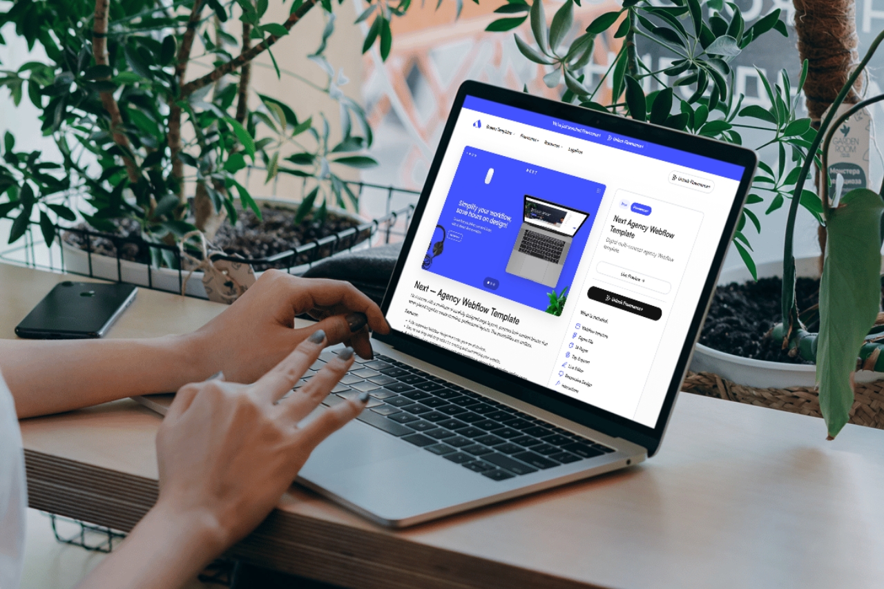
Minimalist web design works when removing elements makes the message clearer. It fails when “minimal” becomes an excuse for vague copy, weak navigation, tiny typography, or missing information.
A strong minimal site still communicates enough. The designer removes decoration that does not help hierarchy, comprehension, trust, or conversion while keeping the content visitors need to make a decision.
When there are fewer visual elements, type scale, line length, spacing, and contrast become the interface. A weak hierarchy is much more obvious on a sparse page.
Space is useful when it groups related content and separates different ideas. Randomly increasing margins does not create sophistication; it can simply make the page feel disconnected.
A minimal layout often gives photography or product imagery more attention. Use fewer, better images with consistent crops and a clear visual direction instead of filling every empty area.
Small transitions, reveals, and feedback can add polish. Excessive scroll effects undermine the clarity that minimalism is supposed to create.
Service details, proof, pricing context, contact information, accessibility, and useful navigation still matter. A visitor should not have to guess what the company does because the page is trying to look mysterious.
A sparse layout can still be slow if it loads oversized video, many font files, or heavy scripts. Visual minimalism and technical minimalism are separate decisions.
Browse current Webflow and Framer templates for minimal starting systems, then customize them around the brand rather than preserving the demo aesthetic.


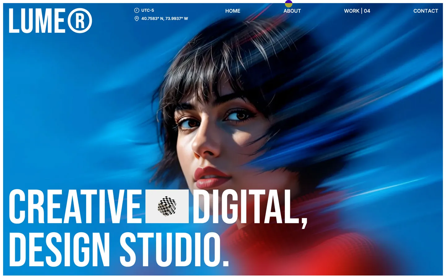

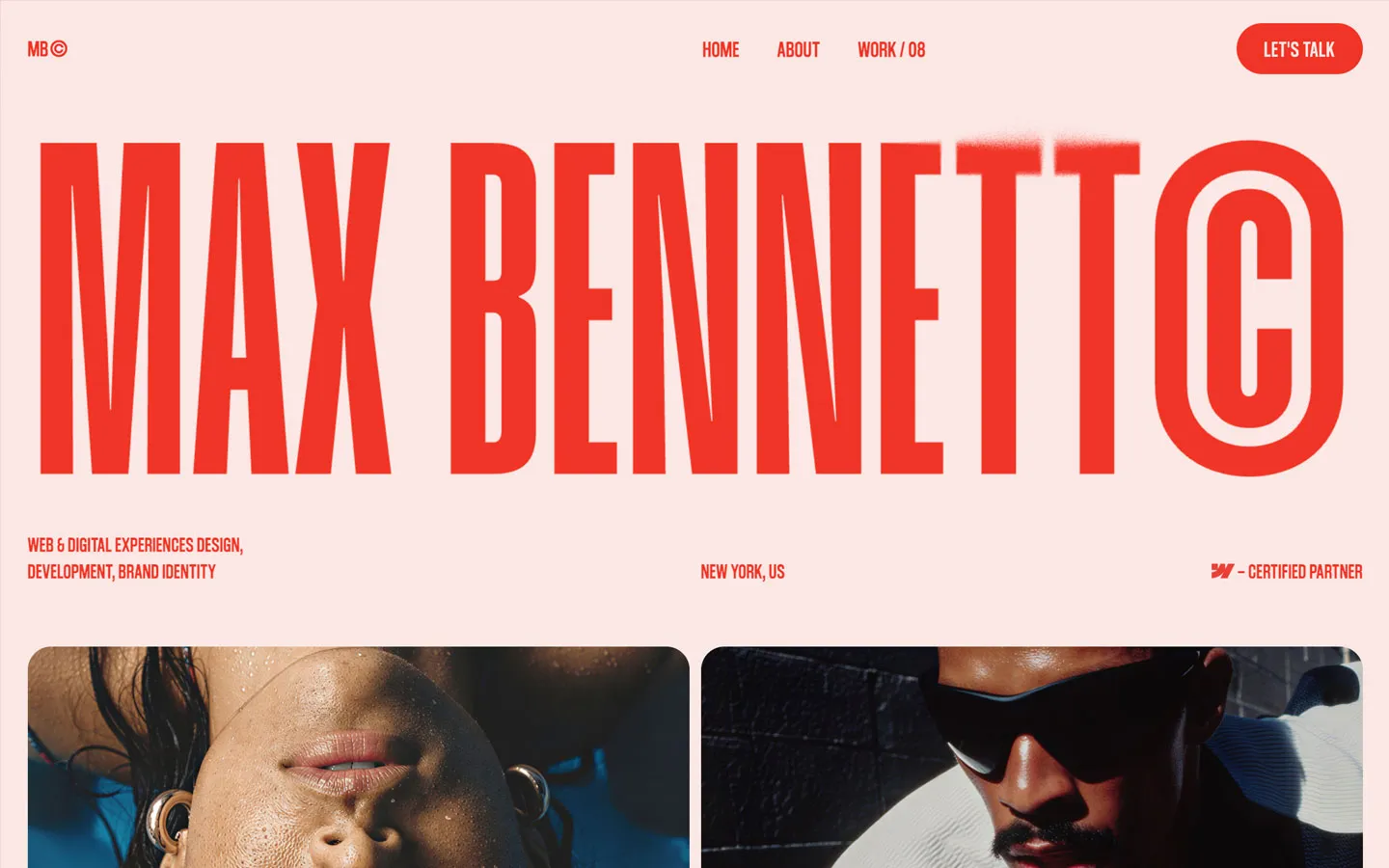


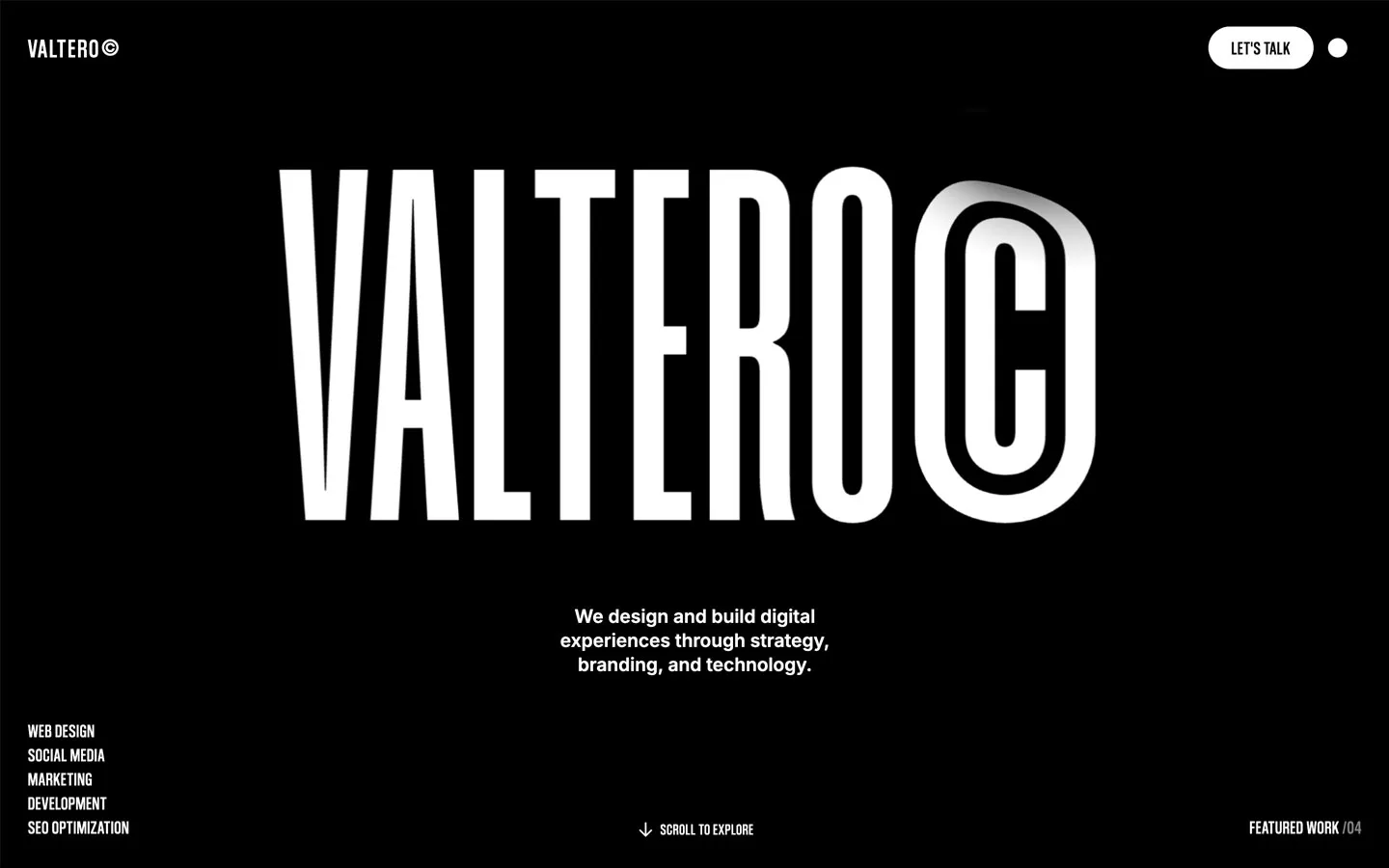


Don’t miss out on our superb, customizable templates designed to enhance your web design experience. We constantly add new templates and components.

Explore stunning Webflow, Framer, HTML5, Next.js and Figma templates designed to spark your next big idea.


*Rest assured that your data is safe with us, and you'll only hear from us 1 time per month.