A grounded look at web design trends in 2026: stronger typography, expressive motion, modular systems, AI-assisted production, 3D, accessibility, and more useful personalization.
The interesting part of web design in 2026 is not one visual trend. It is the way expressive design and better systems are starting to meet. Sites can be more cinematic, more interactive, and more individual than a few years ago, while the tools behind them are becoming more structured and reusable.
That does not mean every homepage needs 3D, giant type, AI, and a scroll sequence. The strongest work still knows what to leave out.
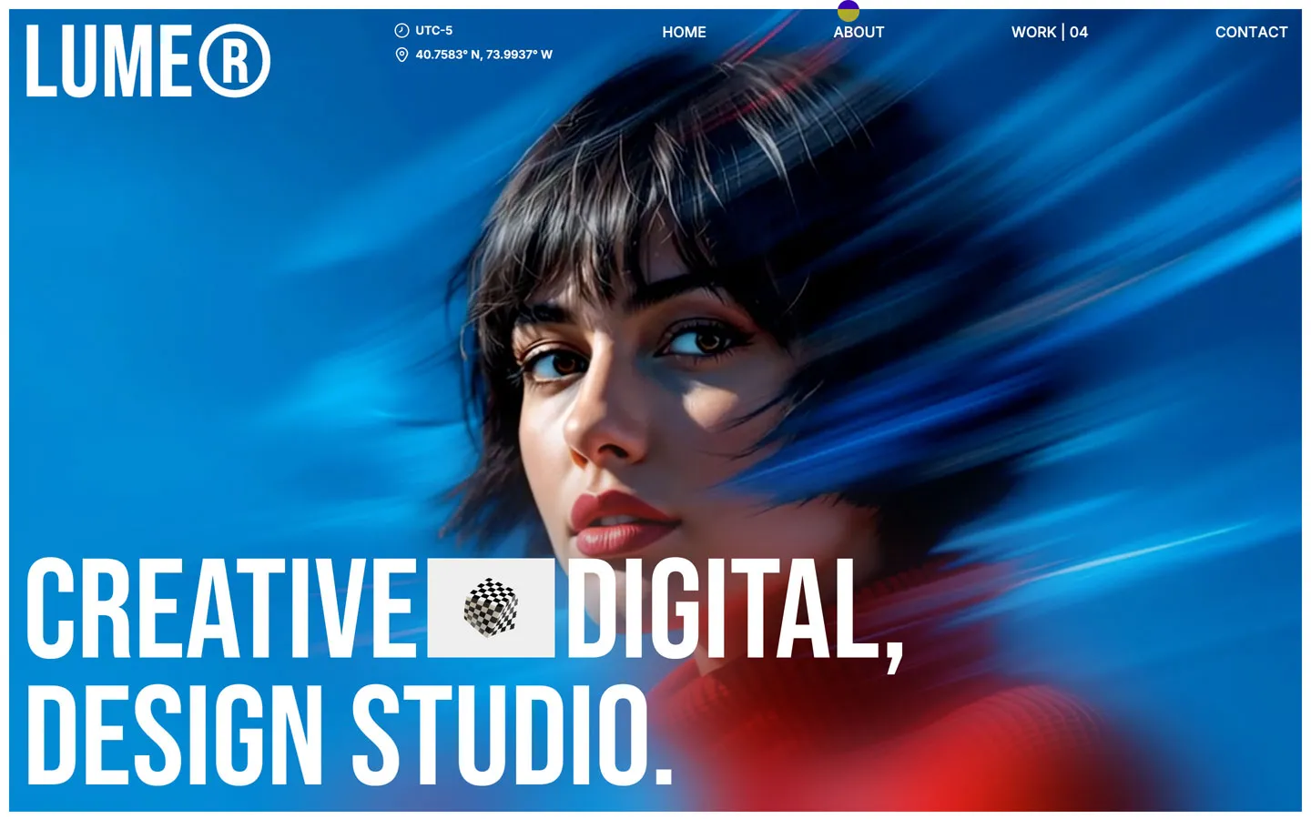
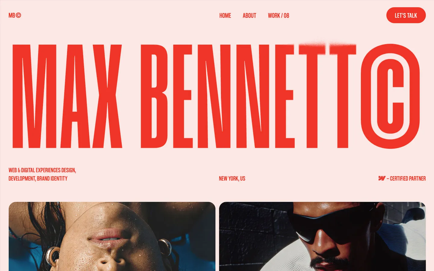
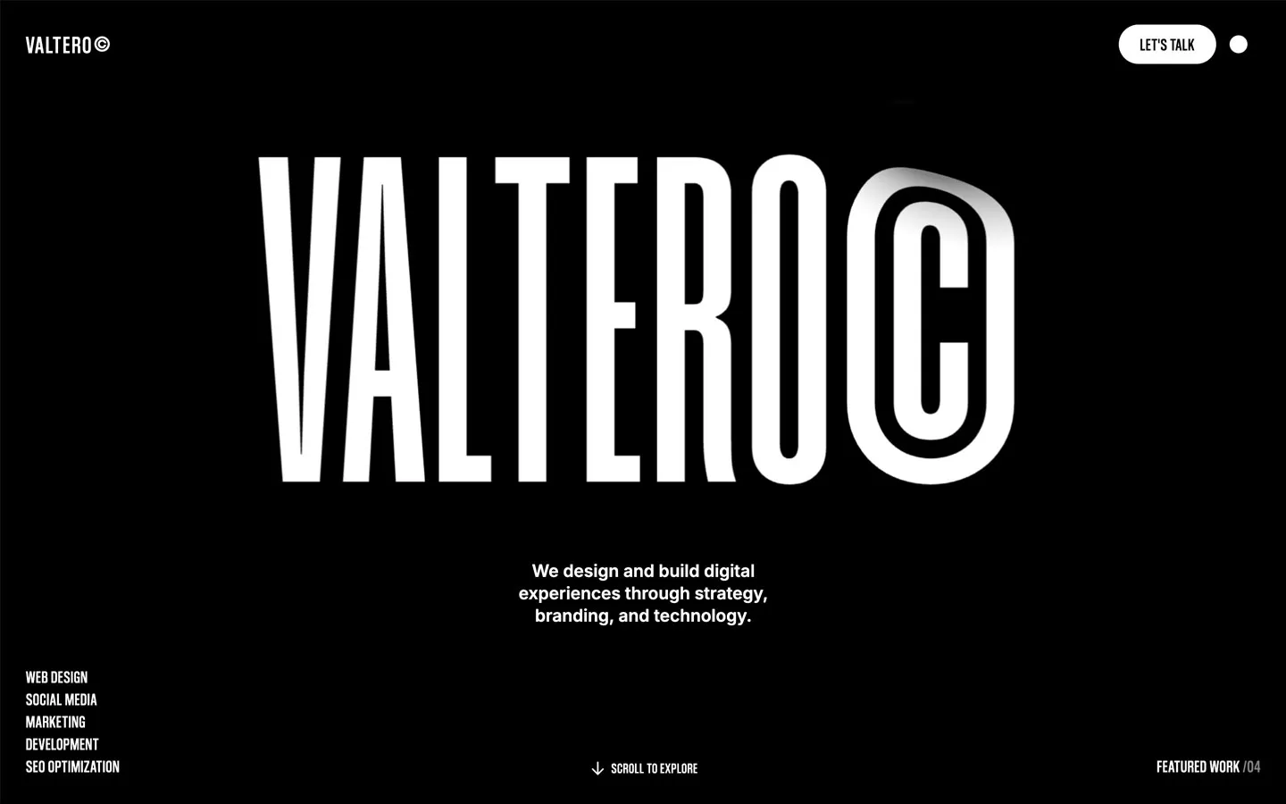
Large type is not new, but it is being used with more confidence. Headlines are becoming part of the composition rather than sitting politely inside a standard hero.
What feels current is not simply making text bigger. It is using type scale, line breaks, variable fonts, contrast, and spacing to create a distinct voice without needing a screen full of decoration.
The practical challenge is responsive behavior. Expressive type has to survive a 13-inch laptop and a phone, not just a wide design mockup.
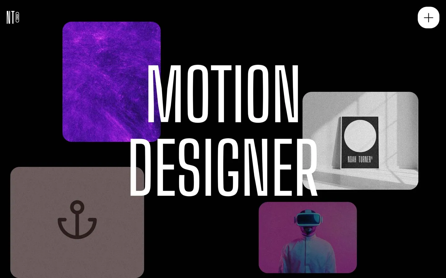
There is still plenty of scroll-driven animation, but good motion increasingly feels tied to the story of the page. Transitions help reveal relationships, move between states, or control pacing rather than existing as a separate special effect.
A useful test is simple: if the motion is removed, does the page still make sense? If not, important content may be too dependent on animation.
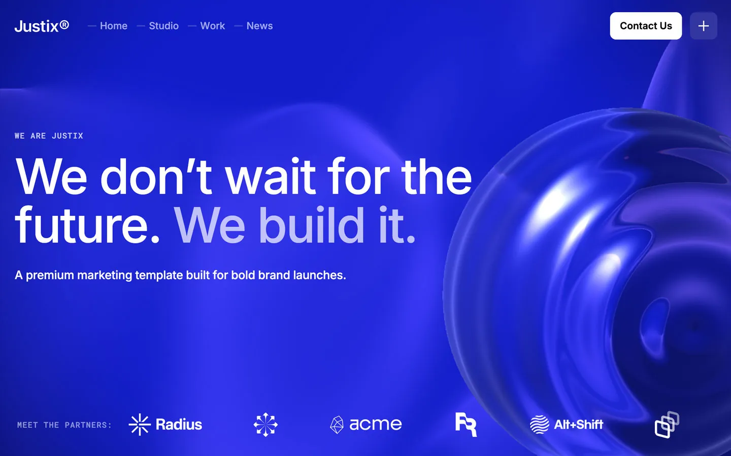
3D elements are most effective when they behave like part of the brand world: a sculptural product object, a material study, an interactive model, or a spatial environment that supports the message.
Generic floating objects are easier to spot now. The bar is higher because the technology is more accessible.
Printed matter, scanned texture, editorial grids, raw photography, packaging, architectural materials, handwriting, and imperfect surfaces are appearing alongside very polished digital UI.
This mix can make a site feel less synthetic. It also gives brands a way to use modern web technology without making every experience look like software.
The production side of web design is changing too. Modern visual builders increasingly support reusable components, variables, variants, and shared libraries.
Webflow, for example, now combines visual components with properties and variants, shared variables, code components, and a dedicated component canvas. That makes it easier to build visually rich sites without treating every page as a one-off composition.
The trend here is not a particular look. It is a more mature way of building.
The most useful AI workflows are often the least visible in the finished site. They help generate or refactor code, explore visual directions, create temporary assets, audit pages, draft variations, or speed up repetitive tasks.
Webflow now supports AI-generated code components inside its own workflow. Other design and development tools are moving in a similar direction.
The creative advantage still comes from taste and editing. Generating more options is easy; knowing which option belongs in the project is the harder skill.
Cards, panels, floating windows, modular grids, and layered content systems remain common, but the better examples feel less like generic dashboards. The modules are being used as a compositional language rather than a default UI kit.
This is especially useful for sites that need to combine many kinds of content without losing clarity.
Minimal design is not disappearing. It is becoming less sterile.
Instead of perfect white grids with identical sans-serif type, we are seeing more texture, softer photography, unusual type pairings, tactile materials, imperfect spacing, and subtle motion inside otherwise restrained layouts.
Minimalism works best when it removes noise without removing personality.
Contrast, focus states, readable type, keyboard navigation, alt text, motion sensitivity, and clear interaction states are increasingly treated as design decisions rather than a compliance pass at the end.
This usually improves the work for everyone. A button that is easier to understand with a keyboard is also often easier to understand with a mouse.
Teams are paying more attention to fluid behavior between breakpoints: type that scales smoothly, grids that reflow before they collapse, and sections that adapt to content rather than only to preset device sizes.
Webflow's current breakpoint tools even allow designers to inspect several responsive frames together, which reflects the broader move toward designing systems rather than isolated screenshots.
Personalization can be valuable when it shortens the path to relevant information: showing the right content for a region, role, account state, or stage in a customer journey.
It becomes less useful when the site tries to guess too much and creates an unpredictable experience. Clear defaults still matter.
Probably not a particular gradient, card radius, or 3D style. The work most likely to hold up is the work with a clear point of view, strong type, good content hierarchy, deliberate motion, and a system that can evolve without being rebuilt every year.
Trends are useful as references. They are much less useful as a checklist.
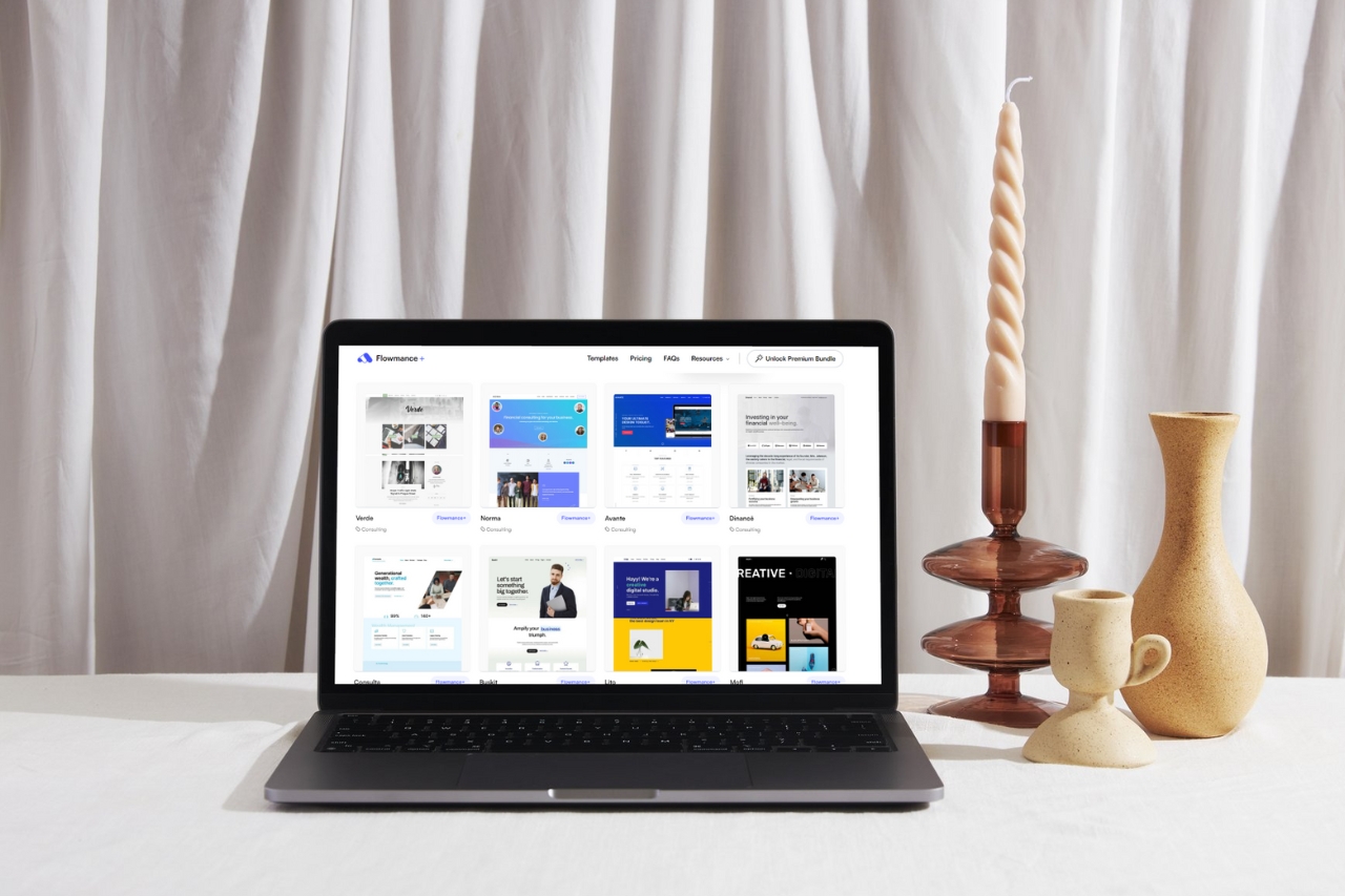
For current examples across different visual directions, browse the Webflow and Framer template libraries.
Updated September 2026 using current Webflow design-system, breakpoint, and code-component capabilities as technical references.






Don’t miss out on our superb, customizable templates designed to enhance your web design experience. We constantly add new templates and components.

Explore stunning Webflow, Framer, HTML5, Next.js and Figma templates designed to spark your next big idea.


*Rest assured that your data is safe with us, and you'll only hear from us 1 time per month.