 flowmance
Justix Design System


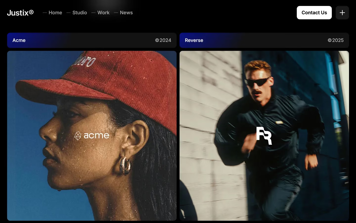
Justix is a sharp, tech-flavoured marketing studio site. It opens on a full-screen electric-blue WebGL scene with a glossy 3D blob, then drops to pure black, where everything sits in thin-bordered bento cards lit from one corner by the same blue. Headlines are Inter 500 with tight tracking, and small uppercase Roboto Mono labels give it a technical, dashboard feel.
Four signatures make it recognisable:
- Electric blue #000ED6. It is the only colour. It fills the hero, glows from the corner of cards (radial-gradient(circle at 0% 0%, #000ED6, transparent 47%)), lines the popular pricing card, and fills progress bars.
- Mono eyebrows. Every section opens with a Roboto Mono uppercase label at 13px with 1px tracking: WE ARE JUSTIX, WHY CHOOSE US, START YOUR JOURNEY, (04).
- Two-tone headlines. Part of a headline is dimmed: Built for ambitious brands with ambitious at 40%, We build it. in lavender. Long statements reveal word by word on scroll, from 40% to full white.
- Dash nav. Each nav link has a 14 × 2px dash before it: — Home — Studio — Work — News, next to a small white Contact Us button and a square + menu button.
Justix is a dark-only design.
Colors
Surfaces
#000000Page background below the hero
#111111Testimonial panels, work card header bars
#222222The + menu square
#333333FAQ number chips
#0D0D10Inputs and the subscribe field
Ink
#000000Text on primary
#FFFFFF#FFFFFF#FFFFFFHeadlines, nav, labels
#FFFFFF · 70%Paragraphs (p { opacity: .7 }), list items, footer links
#FFFFFF · 60%Section intros on the right of title rows, category titles
#FFFFFF · 40%Dimmed words in headlines and unrevealed words in scroll-reveal text (219 uses)
#000000Text on secondary
#FFFFFFAction
#FFFFFFWhite buttons
#2B2B2BThe dark fill that slides up inside the button on hover
#000ED6Hero field, corner glows, popular-plan glow, progress fill
#C9CDFFThe lavender tone used on 7 elements, matching the second sentence of the hero
#B3B2AFThe footer subscribe button and its hover fill
#232323With secondary: The footer subscribe button and its hover fill
Lines & effects
#FFFFFF · 15%1px borders on bento and pricing cards
#FFFFFF · 10%Input borders, FAQ chip borders
#242424Solid 1px borders on 4 cards
#FFFFFF · 10%The floating plus card
#09000B · 40%40px icon chips on images
Typography
Inter · display-hero
The quick brown fox jumpsWe don't wait for the future. 80px · 500 · 1.0 · -2px
Inter · headline-lg
The quick brown fox jumpsBuilt for ambitious brands that value clarity. 51px · 500 · 1.0 · -2px
Inter · title-lg
The quick brown fox jumpsScroll-reveal statement, testimonial quotes, card statements. 27px · 500 · 1.1 · -1px
Inter · body-lg
The quick brown fox jumpsHero subline A premium marketing template built for bold brand launches. 19px · 500 · 1.3 · -0.2px
Inter · nav
The quick brown fox jumpsNav links. 16px · 500 · 1.1
Inter · label
The quick brown fox jumpsButtons. 16px · 600 · 1.0
Spacing & shape
| Purpose | Value |
|---|---|
| Container | max 1300px, centred |
| Section rhythm | 150px top on every section; .section drops to 80px top and bottom at ≤991, and the bottom to 20px at ≤479 |
| Breakpoints | 991px, 767px, 479px |
Spacing scale
| Token | Value | Preview |
|---|---|---|
xs | 10px | |
sm | 20px | |
md | 30px | |
lg | 50px | |
xl | 60px | |
2xl | 100px |
Layout spacing
| Token | Value | Preview |
|---|---|---|
card-gap | 10px | |
grid-gap | 20px | |
gutter | 29px | |
nav-height | 85px | |
section | 150px |
Border radius
Surfaces
How the surfaces stack, from the page background up. Hex codes and roles are in Colors above.
Motion
| Smooth scroll | Lenis on the page |
| Hero | Unicorn Studio WebGL blob |
| Word reveal | SplitText words go from 40% to 100% white, ScrollTrigger from top bottom to bottom 100, scrub 0.8 |
| Split stagger in | power1.out, 350–1000ms with stagger; expo 800ms for larger moves |
| Fade up | opacity 0 → 1, y 20px → 0, 500ms; or 300ms ease on hover reveals |
| Slow fade | Opacity to 1 over 1000ms outQuart |
| Scale in | scale → 1, 400ms outSine |
| Text roll | y 100% → 0%, 500ms cubic-bezier(0.614, 0.03, 0, 0.983) |
| Logo marquee | Continuous power1.in loop over about 230–265s |
| Parallax | y −5vh ↔ 5vh and x −42vw ↔ 42vw, scroll-linked |
| Button hover | Dark layer slides up, label rolls, 300ms ease |
| Arrow nudge | x ±3px, y −3px, 500ms |
| Subscribe hover | Background change, 300ms |
Do’s and don’ts
- Keep the canvas #000000 and use #000ED6 only as light: radial corner glows, the hero field, the popular-plan inset glow.
- Open each section with a Roboto Mono uppercase eyebrow at 13px with 1px tracking.
- Set headlines in Inter 500 with −1 to −2px tracking, and dim one or two words to #FFFFFF66 for emphasis.
- Use black cards with a 1px #FFFFFF26 border and a 10px radius, 10px apart.
- Use the small white button (45px tall, 10px radius) with the #2B2B2B slide-up hover.
- Lay out title rows on a 4-column grid: eyebrow, title, empty, intro at 60%.
- Fill buttons, text or large areas below the hero with blue; it is a glow, not a fill.
- Use #FFFFFF66 (ink-faint) for text under 27px; it is for dimmed headline words only.
- Use pill shapes or radii above 25px.
- Use the declared Libre Caslon font or any serif.
- Add drop shadows; use the inset glow and hairlines instead.
- Use uppercase Inter; uppercase belongs to Roboto Mono.
Example prompt
Any page in the Justix style
More design systems like this
Marketing design systems, the same colors first.


Bring any of them to your AI tool
All Access unlocks all 398 design systems, ready for Claude, ChatGPT, Gemini, Cursor, v0 and Lovable, plus 400+ templates on all 5 platforms.
Get All AccessUpgrade to All AccessHow to use the Justix design system
Pick a file to see what it’s for and where it goes.
What it is
The whole design system in one markdown file, written for AI: every color, type style, spacing value, component and motion rule, plus do's, don'ts and a ready prompt.
Best for
Claude, ChatGPT, Gemini, Cursor and v0, or any other AI tool that builds pages or code.
How to use it
- Put
DESIGN.mdin your project and mention it in your request, or save it as.cursor/rules/justix.mdc - For the rule file, start it with a front-matter block that sets
alwaysApply: true, so every chat uses it - Ask: “Build a pricing page using DESIGN.md.” Cursor follows the colors, fonts, spacing and rules
- Put
DESIGN.mdin the project root - Add one line to
CLAUDE.md: “Follow DESIGN.md for all UI.” - Ask for any page or component; Claude reads the file first
- Attach
DESIGN.mdto the chat (or paste it in) - Ask: “Build a landing page in this design system.”
- Keep the file in the chat or project knowledge, so follow-up pages stay on style
What it is
Every token as data, in the W3C Design Tokens format: colors with their roles, type styles, radius, spacing, and component tokens that point at them.
Best for
Figma (Tokens Studio), Style Dictionary and other design-token tools, and build scripts.
How to use it
- In Figma, open Tokens Studio, choose Import, and pick
tokens.json - Or point Style Dictionary’s
sourceat it to generate tokens for any platform - In code, import it like any JSON file
What it is
A Tailwind CSS v4 theme: every color, font, type style, radius and spacing value becomes a Tailwind utility, like bg-canvas, text-headline-lg or rounded-md.
Best for
Tailwind v4 projects, and AI builders that write Tailwind (v0, Lovable, Bolt).
How to use it
- Save
theme.cssnext to your main CSS file - Import it after Tailwind:
@import "tailwindcss"; @import "./theme.css"; - Use the classes:
bg-canvas text-ink rounded-md p-lg
What it is
The same tokens as plain CSS variables on :root. Component values point at the color variables, so changing one color updates everything that uses it.
Best for
Any website: plain CSS, Webflow custom code, Framer, WordPress.
How to use it
- Add it to your stylesheet, or in Webflow paste it into Site settings → Custom code inside a
<style>tag - Use the variables anywhere:
color: var(--color-ink) - Change a token once and every place that uses it follows