Make a website template feel custom by changing structure, content rhythm, typography, imagery, components, and interactions — not just colors and logos.
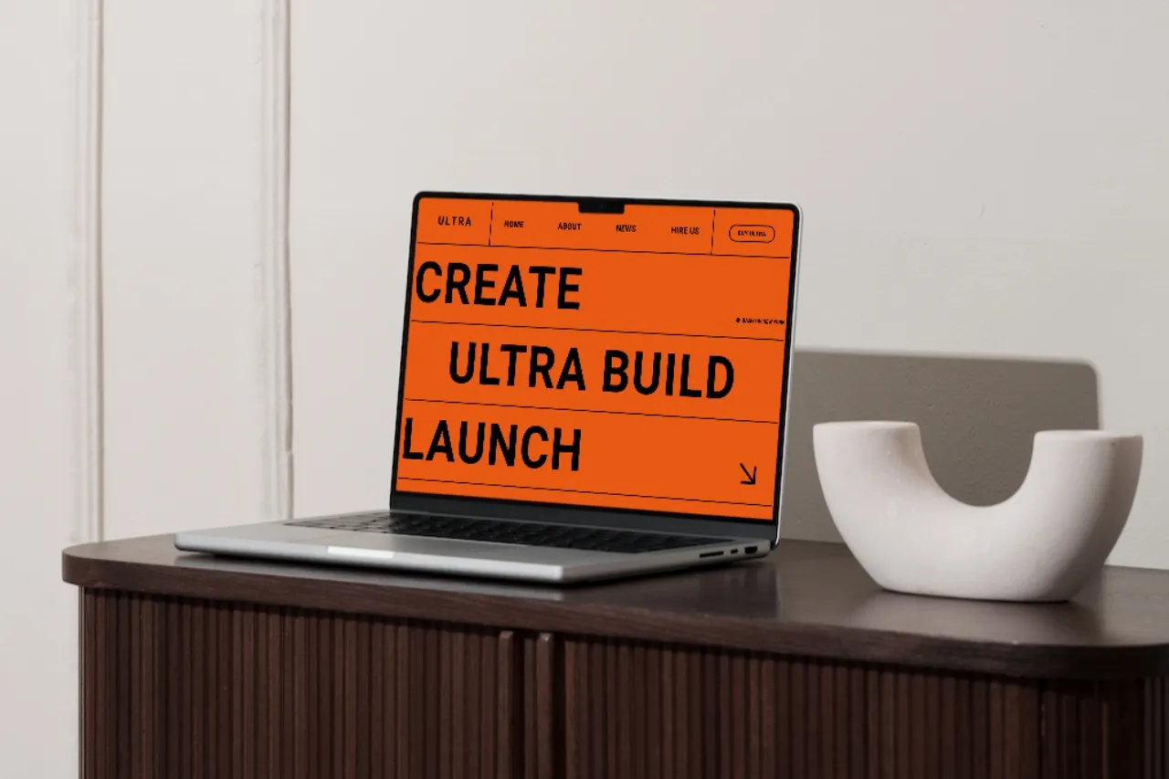
The difference between a generic template site and a convincing custom site is rarely the template itself. It is how far the final design moves beyond the demo's content, hierarchy, and visual rhythm.
Changing the logo and brand color is not enough. You need to change the decisions that make the original demo recognizable.
The order of sections has a big effect on how a website feels. A demo might move from hero to logos to services to projects because that sequence works for the fictional brand. Your business may need a completely different story.
Remove sections that do not earn their place. Move proof closer to the claim it supports. Put the strongest case study earlier. If pricing is the main decision point, do not bury it near the footer.
Real copy changes a layout naturally. A three-word demo headline may become a two-line statement. A service card may need half as much text. A case study may need metrics, credits, or a different image ratio.
Let the content create design decisions instead of forcing the content to fit the demo.
Switching the font is only the first step. Review the full type system: display sizes, body text, labels, line height, letter spacing, maximum text width, and the relationship between headings and supporting copy.
A new type system can change the personality of a template more than a completely new color palette.
Stock images are often what make template-based sites feel most obvious. Define an image language for the project: documentary photography, clean product renders, editorial crops, black-and-white portraits, architectural detail, illustration, or something else that fits the brand.
Keep cropping and color treatment consistent. A coherent image system makes unrelated sections feel like one website.
Interactions should support the brand, not preserve the template's personality. A playful studio may benefit from expressive motion. A financial or legal business may need something calmer.
Remove effects that do not fit. Slow down or simplify others. Add custom motion only where it improves hierarchy or feedback.
Cards, buttons, navigation, project previews, and CTAs make up a large part of the visual identity. Updating these recurring pieces consistently has more impact than redesigning one isolated section.
In Webflow, components and variants can help you keep those changes systematic. In Figma, the same principle applies to component sets and shared styles.
You paid for the useful foundation. Keep it.
A well-structured CMS, responsive grid, or flexible case-study layout does not need to be replaced just to make the site “custom.” The goal is to preserve the parts that save work while changing the parts the audience actually perceives as brand expression.
Most strong sites do not need every section to be unique. One memorable hero treatment, project transition, image system, navigation behavior, or editorial layout can be enough to give the site its own identity.
Trying to make every block special usually creates noise.
Customization often breaks the assumptions the original responsive design was built around. Larger type, different images, longer copy, and new section order can all create mobile issues.
Run a full responsive pass after the design direction is stable. Do not assume the template remains responsive simply because the original demo was.
When the site is close to finished, open the original template and the customized version side by side. If the same section order, image rhythm, type scale, and motion are still obvious, push the customization one step further.
If the underlying quality is still there but the final site feels like it belongs to a different brand, the template has done exactly what it should.
For starting points across different visual directions, browse Webflow, Framer, and Figma templates.


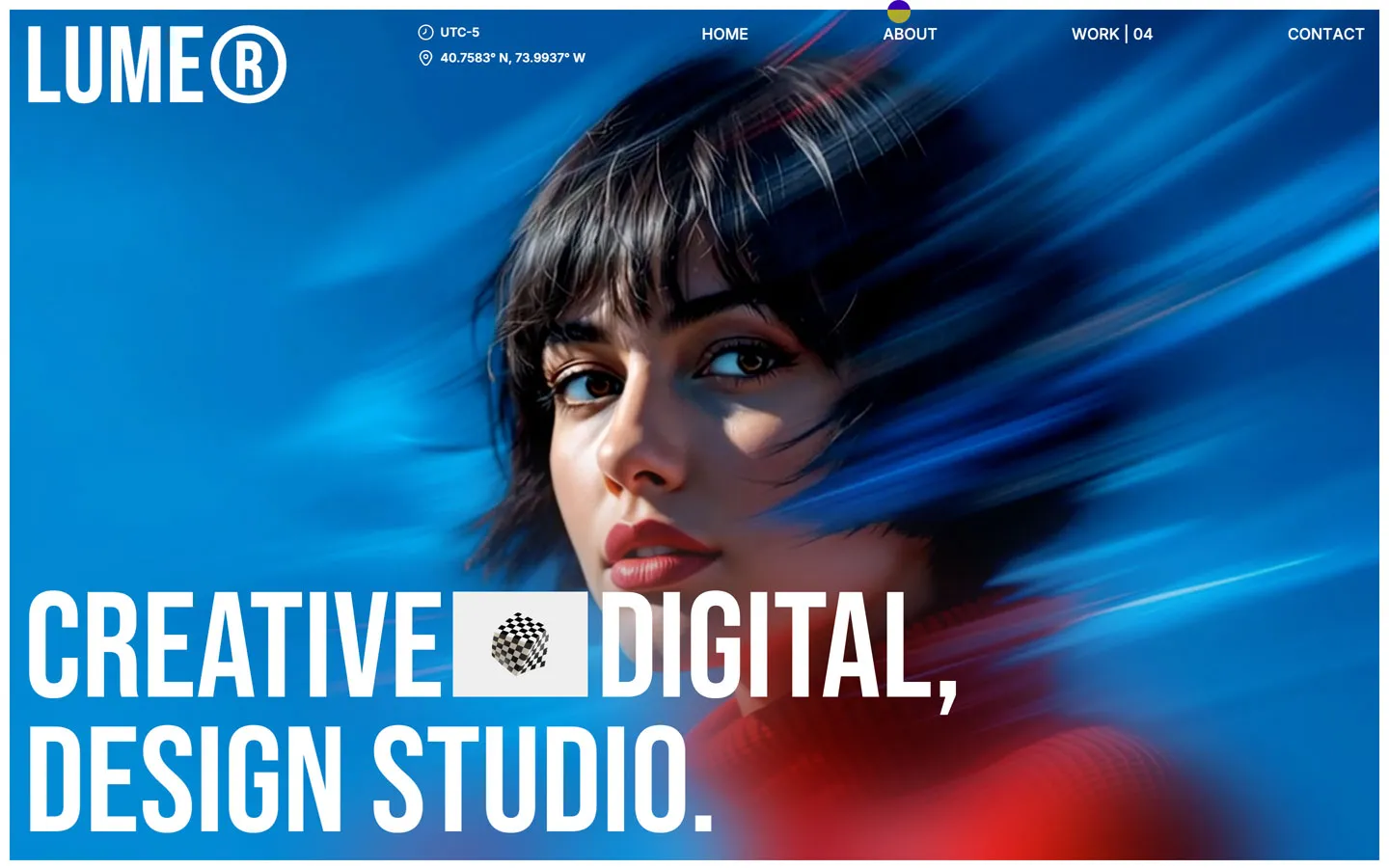
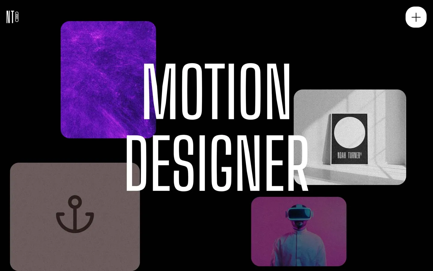
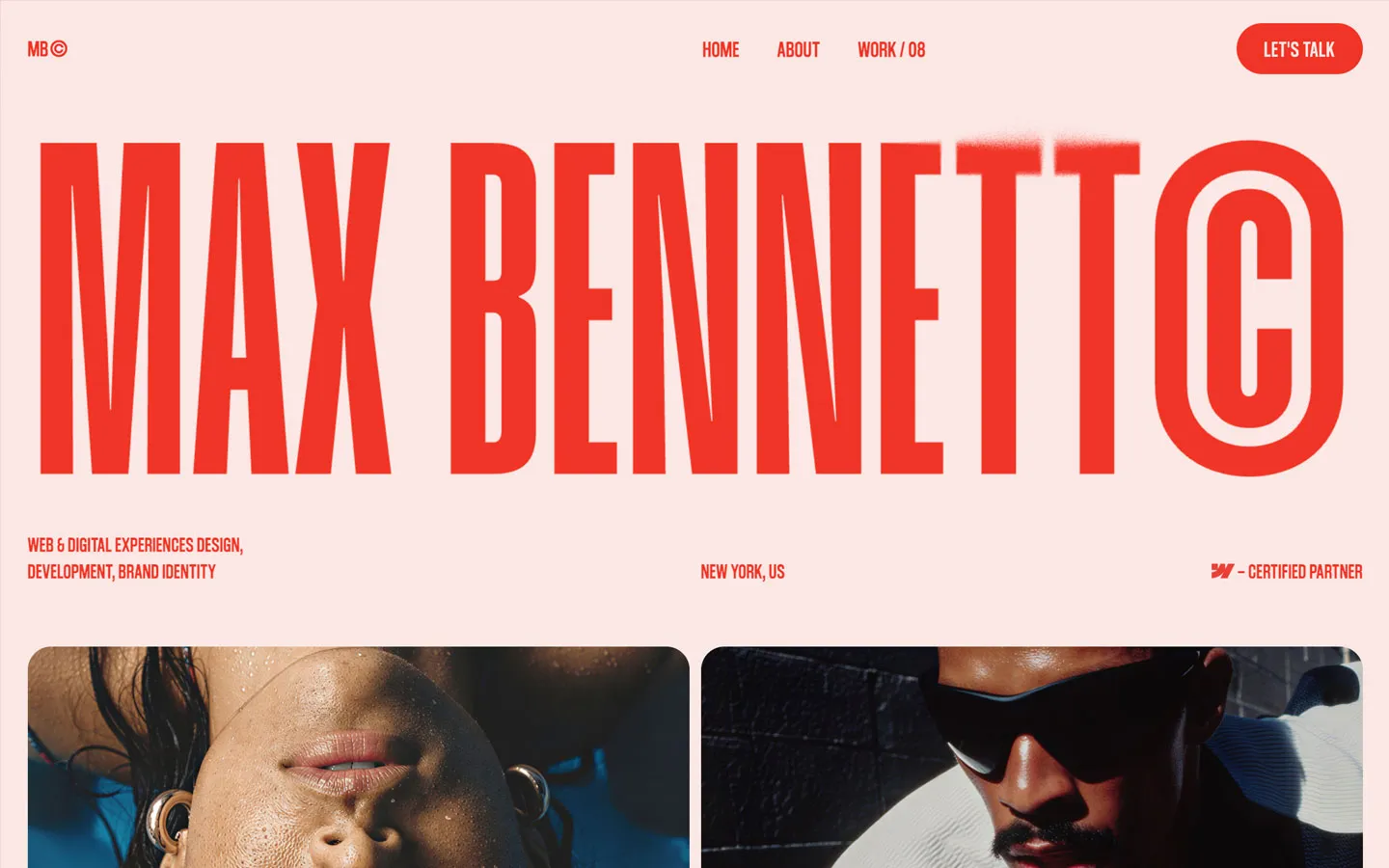


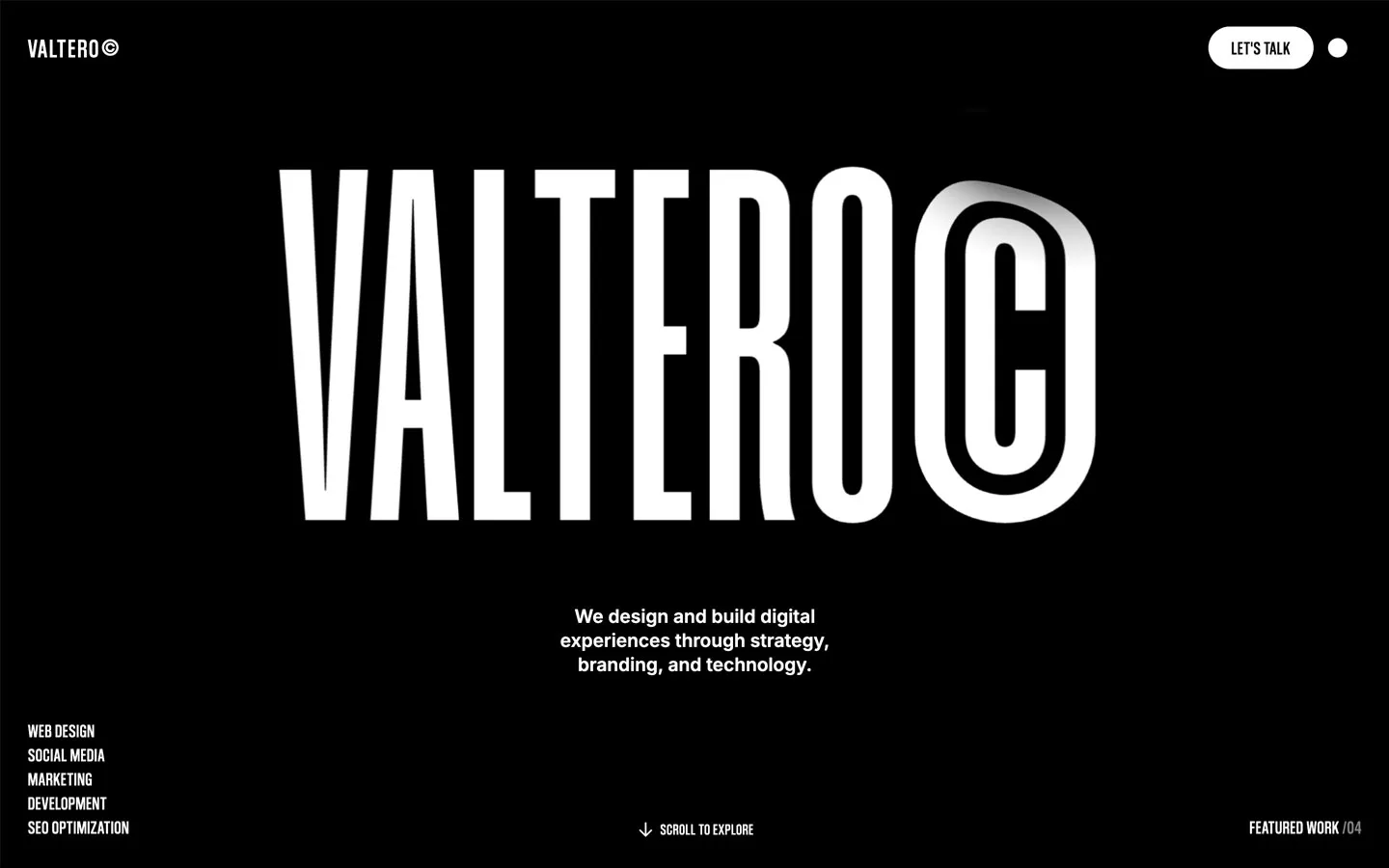
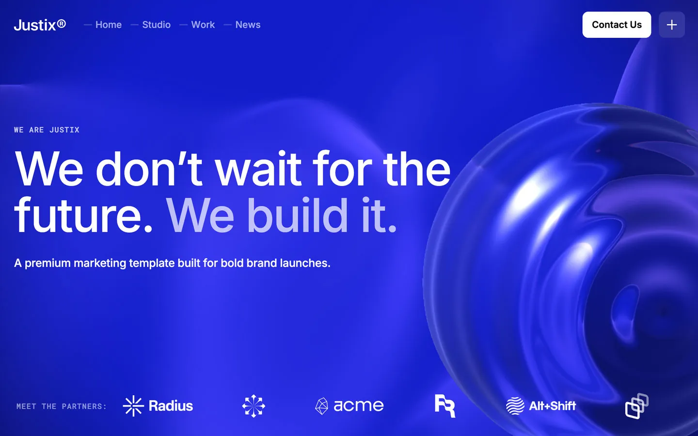


Don’t miss out on our superb, customizable templates designed to enhance your web design experience. We constantly add new templates and components.

Explore stunning Webflow, Framer, HTML5, Next.js and Figma templates designed to spark your next big idea.


*Rest assured that your data is safe with us, and you'll only hear from us 1 time per month.