Choose a website template by structure, content needs, platform, responsive behavior, CMS, licensing, and customization potential — not by the homepage alone.
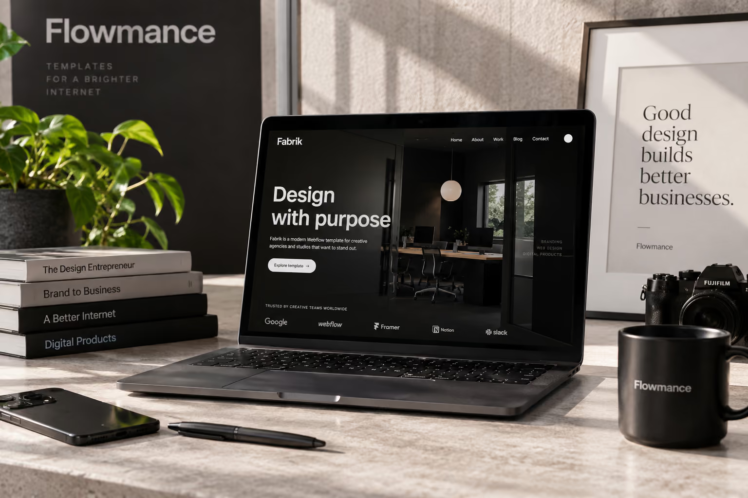
The right website template is the one that fits your content and workflow before it fits your taste. A beautiful homepage can get your attention, but the pages underneath it determine whether the template will actually save time.
If you are choosing a template for a business site in 2026, start with the practical questions first. Visual style is easier to change than a weak page structure.
Write the page list before opening a template marketplace. A small service business may need Home, About, Services, Case Studies, Blog, and Contact. A SaaS company may also need Pricing, Integrations, Features, Documentation, or comparison pages.
If the template already has a strong version of the difficult pages, that is more valuable than a homepage that happens to look perfect.
Some content needs to be managed repeatedly: projects, articles, team members, jobs, locations, properties, or products. If that applies to the project, inspect the CMS structure before buying.
Look at what fields exist, how collection pages are designed, and whether the system will still work when you have twenty items instead of the three used in the demo.
A strong design in the wrong platform can create more work than it saves.
Use Webflow templates when the project belongs in Webflow, Framer templates for a Framer workflow, HTML templates when direct source files and hosting control matter, and Figma templates when design and approval come before implementation.
Do not choose a platform because the demo looks better. Choose it because the team can maintain the finished site there.
A template can look balanced because every demo heading was written to fit one line.
Imagine your actual service names, client names, testimonials, project titles, and navigation labels in the layout. Long content quickly reveals whether the system is flexible or fragile.
Never buy a template from a desktop screenshot alone. Open the live preview on a phone and tablet. Check navigation, type sizes, image crops, card layouts, forms, and interactive sections.
Pay particular attention to anything that depends on hover. Important information should still make sense on touch devices.
You are not only buying finished pages. You are buying the logic behind them.
Consistent spacing, typography, buttons, cards, containers, and recurring components make a template easier to expand. If every section seems to use a different rule, future pages may become messy quickly.
Forty pages are not automatically better than twelve. A smaller template with the right page types can be far more useful than a large one full of layouts you will delete.
Look for coverage, not volume: does it include the important content patterns the project needs?
A good template should survive significant customization. Ask yourself what happens if you change the typeface, use a different image direction, remove two homepage sections, or switch a light design to a darker palette.
The best starting points have a clear identity without being so rigid that every finished site looks like the demo.
Especially for client work, review commercial-use rights, project limits, redistribution restrictions, and any rules around reuse. A template that fits the design but not the intended license is not the right template.
Licenses and pricing can change, so use the current seller or marketplace terms rather than an old article or screenshot.
The site will probably grow. New case studies will be added, pages will get longer, a new service may launch, and someone other than the designer may need to edit it.
Choose a template that can absorb that growth without requiring the whole site to be rebuilt.
The perfect template is rarely the one that needs zero changes. It is the one that gives you a strong structure and leaves enough room to make the finished site feel specific to the business.


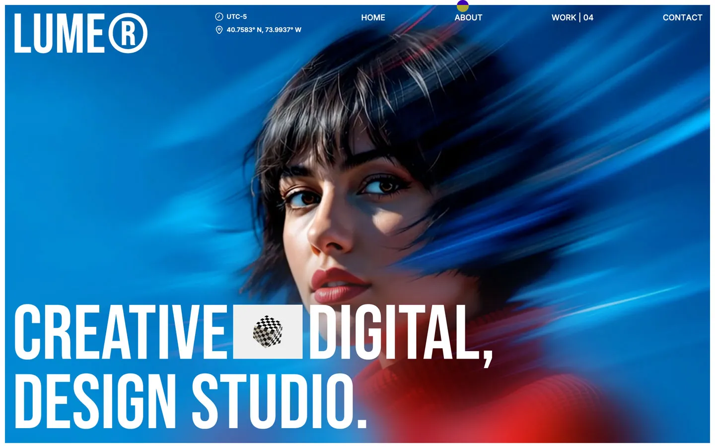
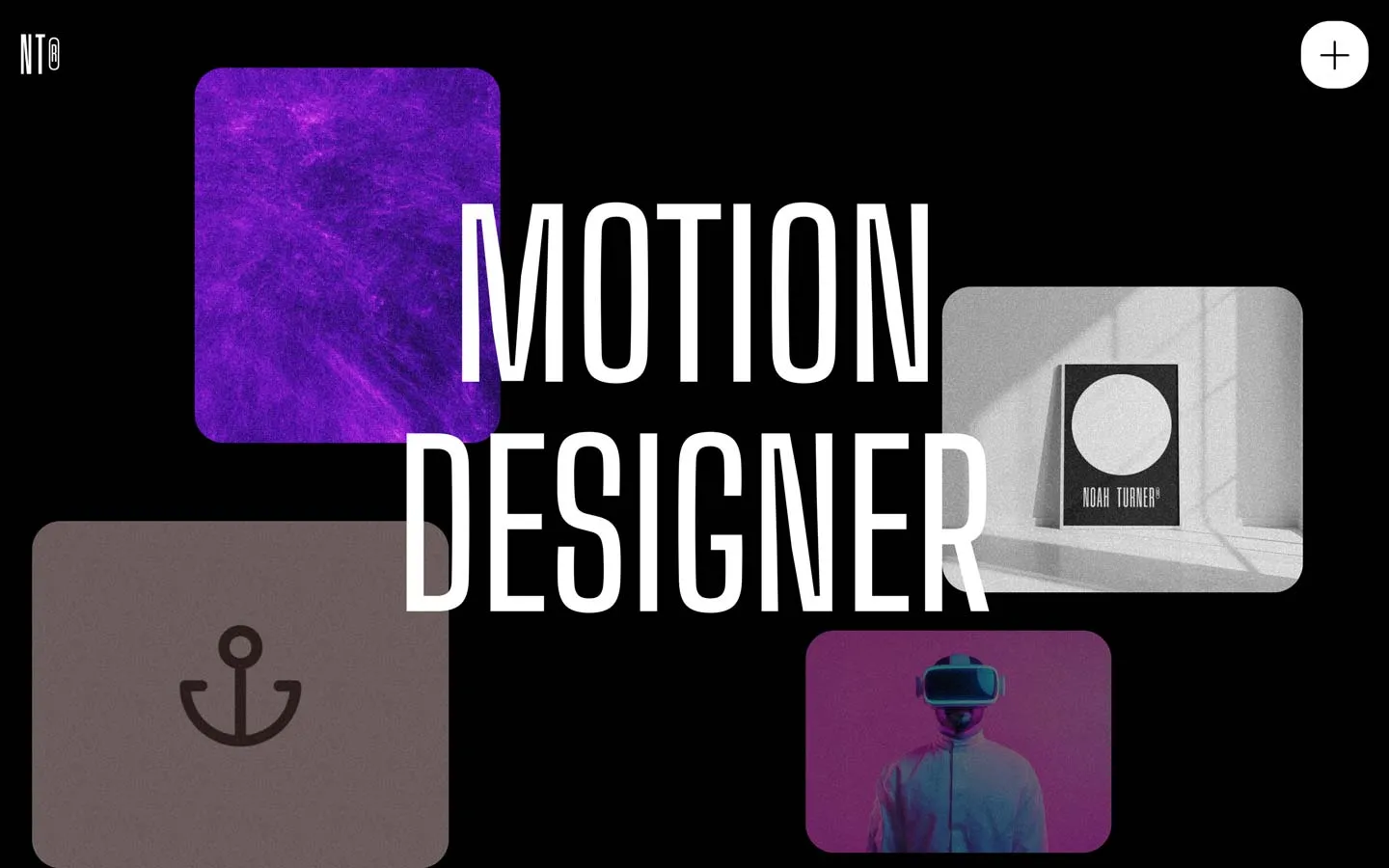
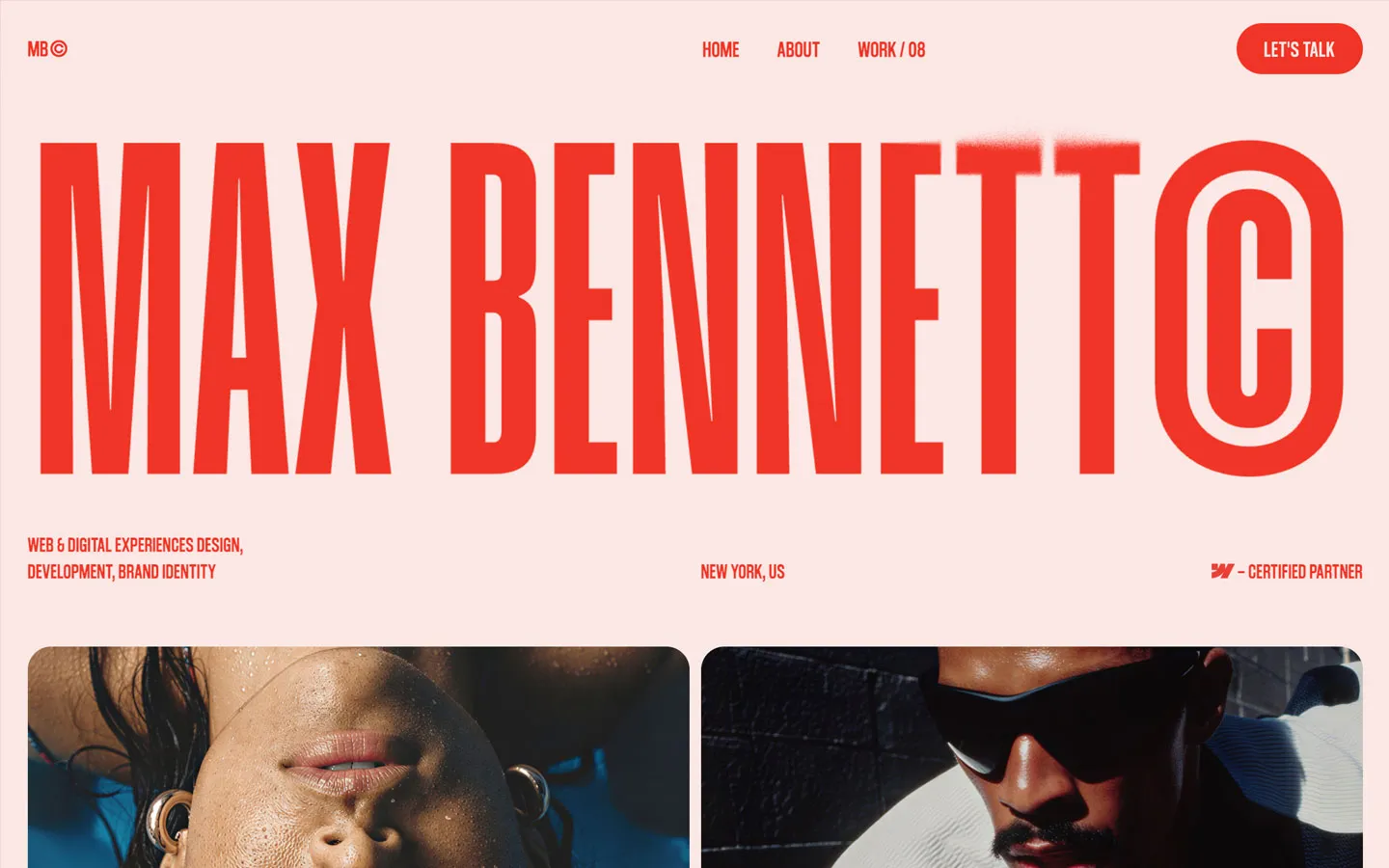


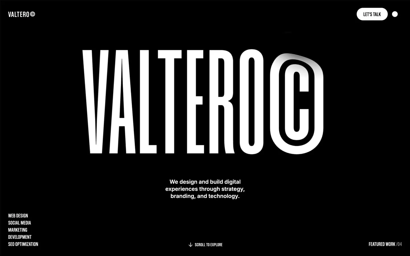
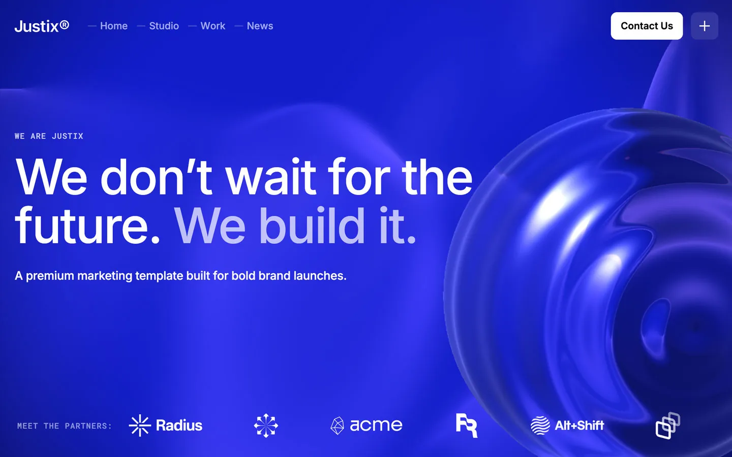


Don’t miss out on our superb, customizable templates designed to enhance your web design experience. We constantly add new templates and components.

Explore stunning Webflow, Framer, HTML5, Next.js and Figma templates designed to spark your next big idea.


*Rest assured that your data is safe with us, and you'll only hear from us 1 time per month.