How to adapt a Webflow template across desktop, tablet, and mobile without breaking its design. A practical guide to breakpoints, content, images, type, and testing.

A responsive template is a starting point, not a guarantee. The original demo may work perfectly at every breakpoint, but the moment you replace a short headline with a real one, add another navigation item, or change the image ratio, the layout can behave differently.
The right way to customize a Webflow template is to review responsiveness as part of the editing process, not as a final check before publishing.
Webflow starts from the desktop breakpoint. Styles set there cascade both down to tablet and mobile and up to optional larger breakpoints. Smaller-breakpoint overrides then cascade downward, while large-screen overrides cascade upward.
This is important because a change made at the wrong breakpoint can create unnecessary overrides. Before fixing a mobile problem, check whether the better solution is actually to adjust the base desktop style so the layout behaves naturally across more widths.
Webflow's current breakpoint system also lets you add larger 1280px, 1440px, and 1920px breakpoints when a project genuinely needs them. Use them selectively; more breakpoints are not automatically better.
Demo copy is usually written to fit the composition. Client copy is not.
Replace the hero title, navigation labels, service names, project titles, and footer content early in the project. Long words and realistic text expose responsive problems much sooner than placeholder content does.
A layout that only works with a two-word heading is not finished.
Checking desktop, tablet, and mobile presets is useful, but real devices sit at many widths in between. Drag the Webflow canvas through intermediate sizes and watch for the moment a layout begins to feel compressed.
Common trouble spots include:
Not everything needs a fixed pixel value. Relative units, percentage widths, max-width constraints, Flexbox, and Grid can make layouts adapt more naturally before a breakpoint override is needed.
The goal is not to eliminate breakpoints. It is to let the layout do as much of the work as possible on its own.
Large typography is often the first thing that breaks after customization. A headline that looks perfect at 80px on a wide screen may dominate a 13-inch laptop or wrap badly on mobile.
Check font size, line height, letter spacing, maximum width, and the actual words together. Sometimes the best mobile adjustment is not simply a smaller font; it can be a different max-width or a cleaner line break.
Replacing a landscape demo image with a portrait image can change the balance of an entire section. Check object-fit settings, aspect ratio, focal point, and crop on each important breakpoint.
For image-heavy templates, compress assets before upload and avoid sending an oversized source file to a small card. Responsive design and performance are closely connected.
Removing difficult sections from mobile is an easy fix, but it can create a weaker site. If content is important on desktop, it is usually important on mobile too.
First try reflowing the section, stacking columns, simplifying decorative effects, or reducing motion. Hide content only when it is genuinely non-essential.
Hover effects can add a lot to a desktop experience, but mobile users do not hover in the same way. Make sure important information is not only revealed by hover and that interactive targets are comfortable to tap.
Heavy scroll effects may also need to be simplified on smaller devices. The goal is not to preserve every animation; it is to preserve the experience.
Webflow components are useful for recurring elements such as navigation, cards, and footers. Current component properties, slots, and variants can keep a shared structure consistent while allowing different content or visual treatments per instance.
That consistency helps responsive work because a fix made to the main component can propagate across the site instead of being repeated manually.
Flowmance templates are designed to provide a responsive starting point, but every meaningful customization changes the conditions the original design was tested against. The final responsive quality is therefore part of the project work, not something inherited forever from the template.
For current starting points, browse the Flowmance Webflow templates.
Reference: Webflow's current breakpoint documentation.




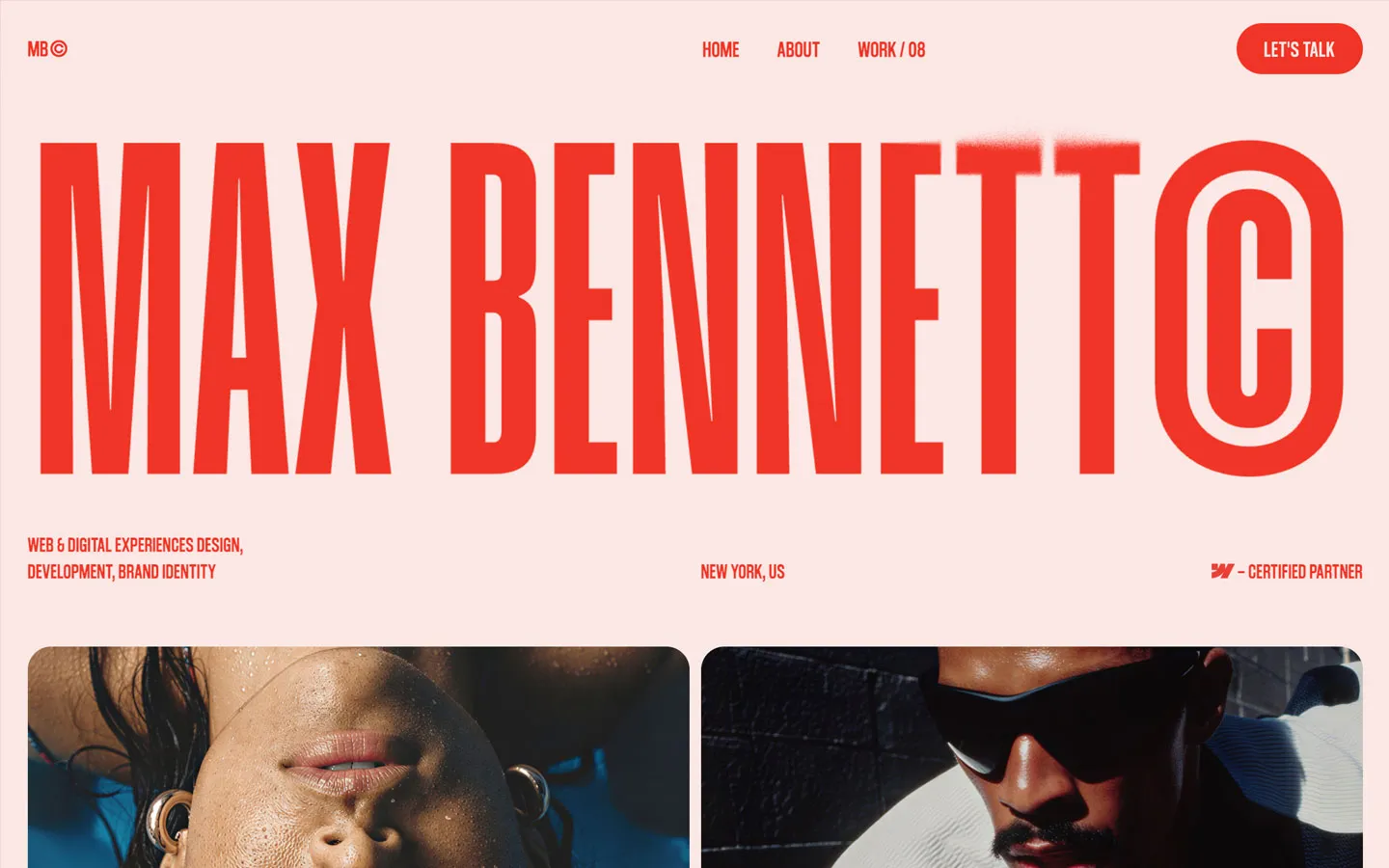


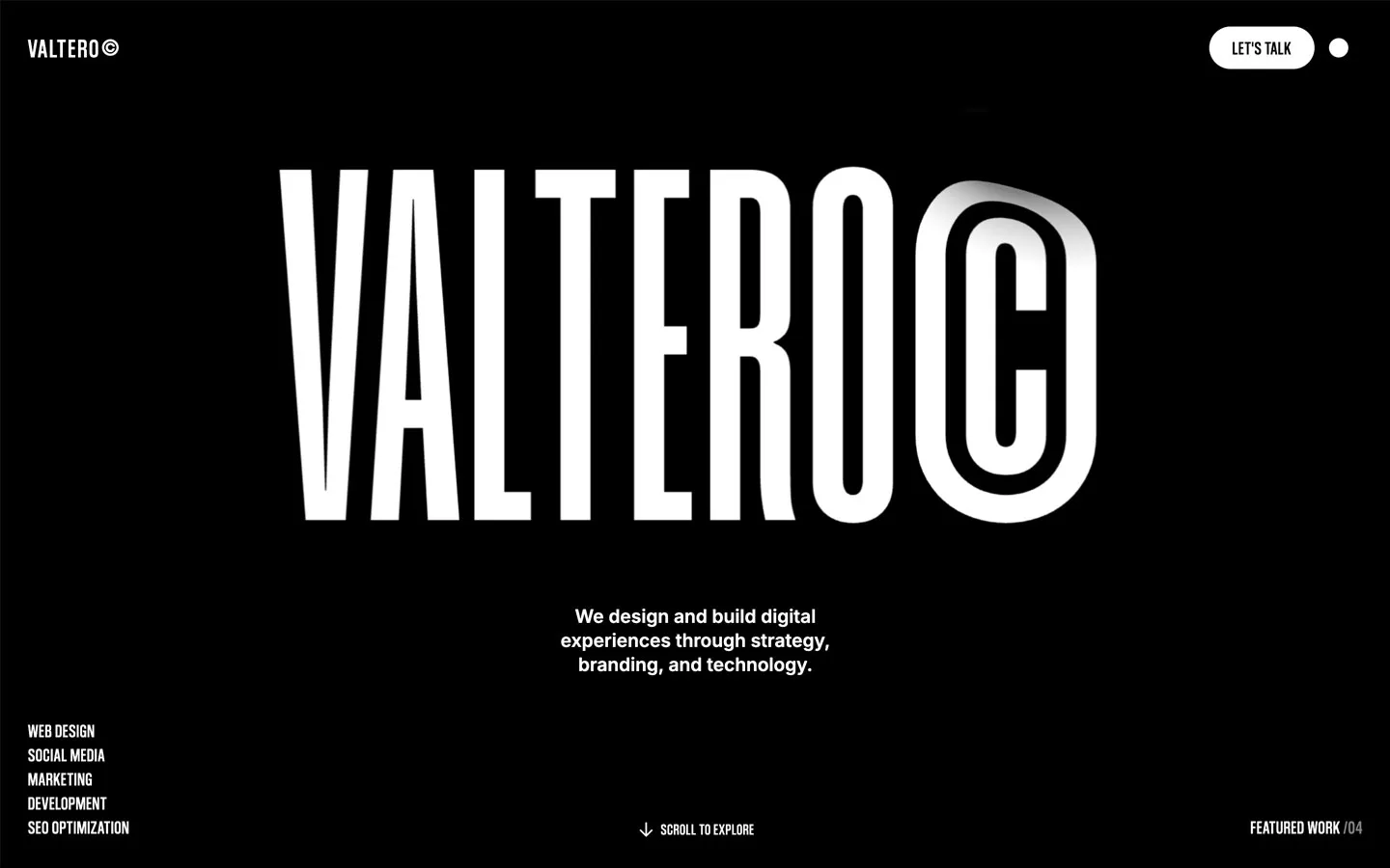



Don’t miss out on our superb, customizable templates designed to enhance your web design experience. We constantly add new templates and components.

Explore stunning Webflow, Framer, HTML5, Next.js and Figma templates designed to spark your next big idea.


*Rest assured that your data is safe with us, and you'll only hear from us 1 time per month.