Customize a Webflow template in the right order: content, page hierarchy, typography, imagery, components, CMS, motion, responsive behavior, then production QA.
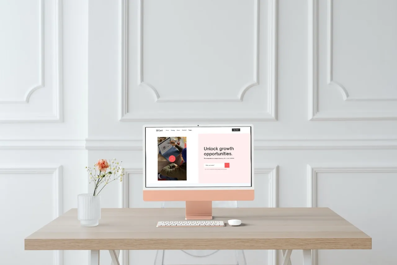
The order of customization matters. If you begin by polishing animation and colors before replacing the demo content, you often redo the same work later. Start with the decisions that change the layout most.
Add the real hero message, navigation labels, services, project titles, proof and CTA language. Real copy exposes layout problems immediately.
Remove demo sections the project does not need and reorder the remaining sections around the actual buyer or reader journey.
Set the typefaces, scale, line height, text widths and recurring labels as one system. Typography changes the personality and spacing of the whole website.
Replace demo photography, mockups and illustration with a coherent visual system. Check different aspect ratios before locking section heights.
Update navigation, buttons, cards, CTAs and other repeated UI consistently rather than restyling each instance separately.
Rename fields for editors, remove demo-only fields and test the templates with realistic long and short content.
Keep interactions that fit the new brand and remove the rest. Motion should support hierarchy or feedback rather than preserve the demo's personality.
Drag through intermediate widths and test real mobile devices. New typography, content and imagery can invalidate the original breakpoint assumptions.
Test forms, links, metadata, analytics, image alt text, performance and any custom code on the published site.
Customize from content and structure outward. When the underlying story is correct first, visual polish becomes faster and the finished site moves much further from the demo.


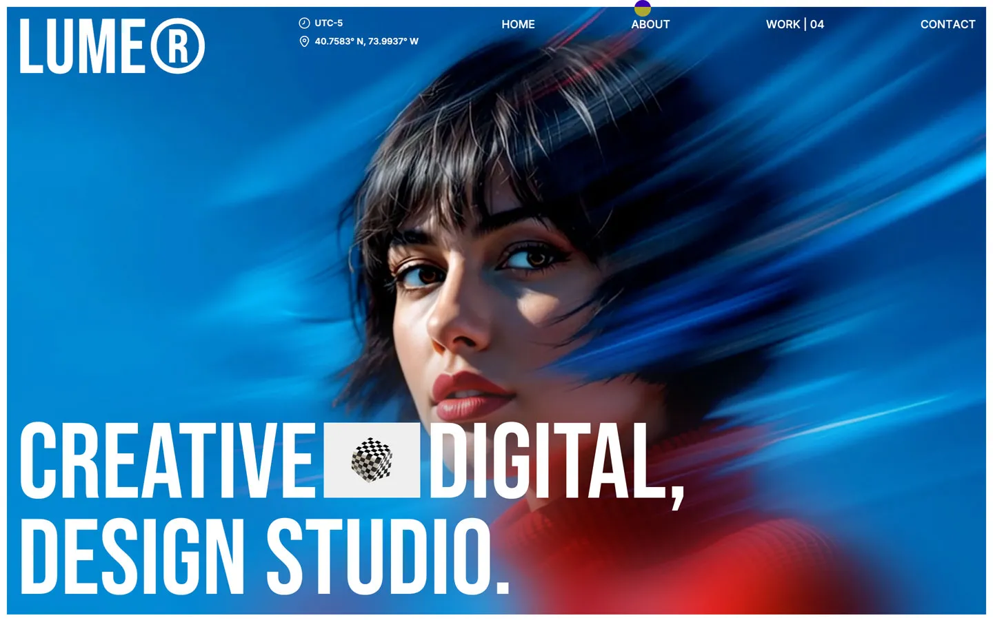
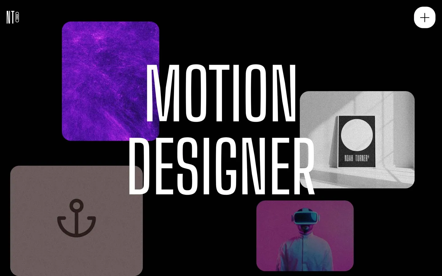
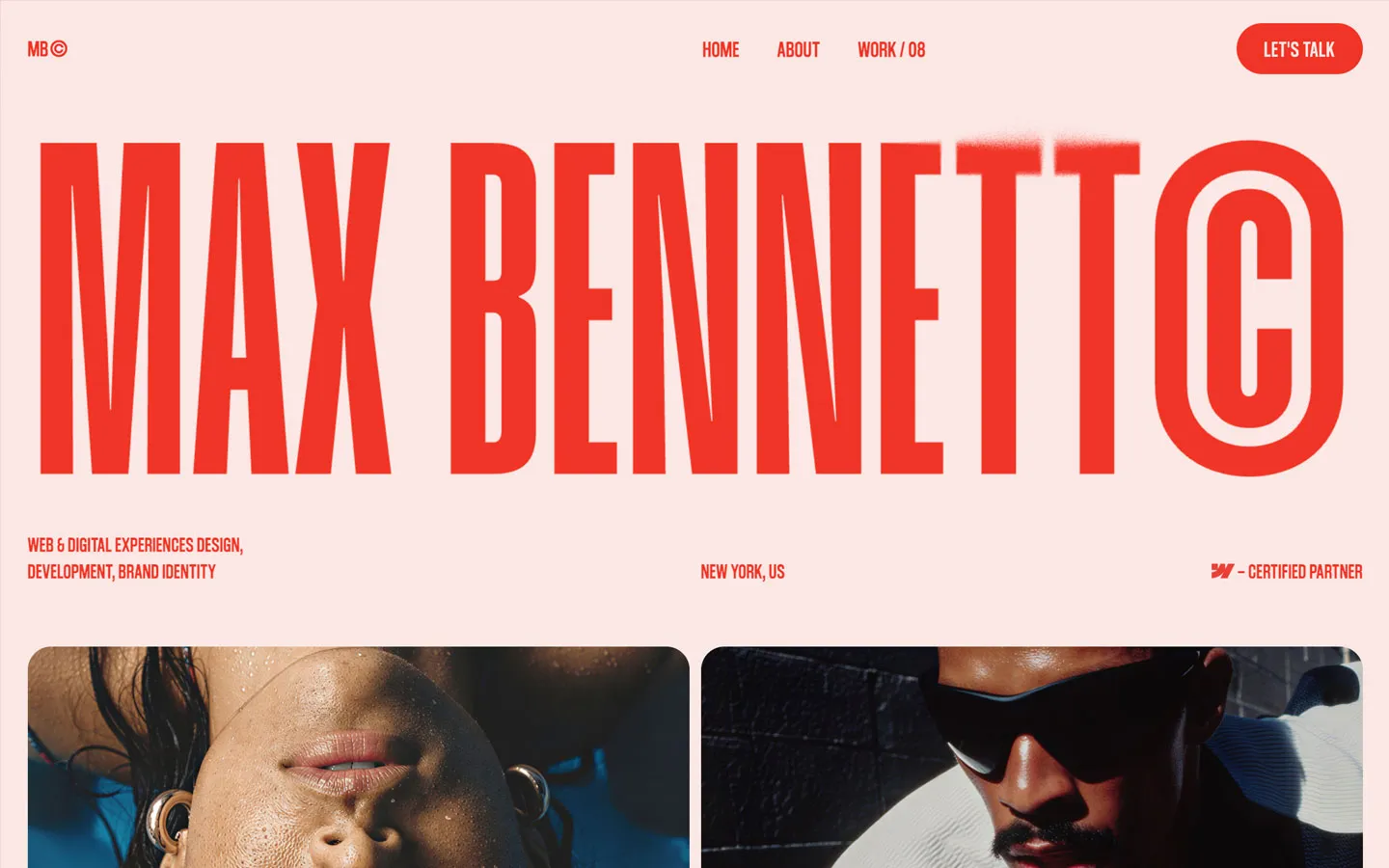


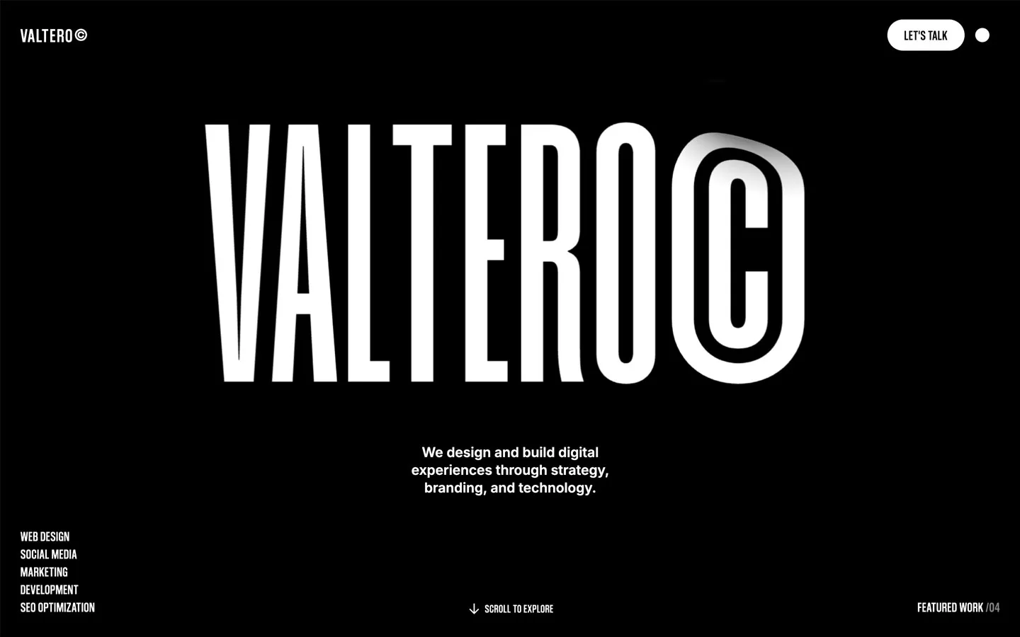
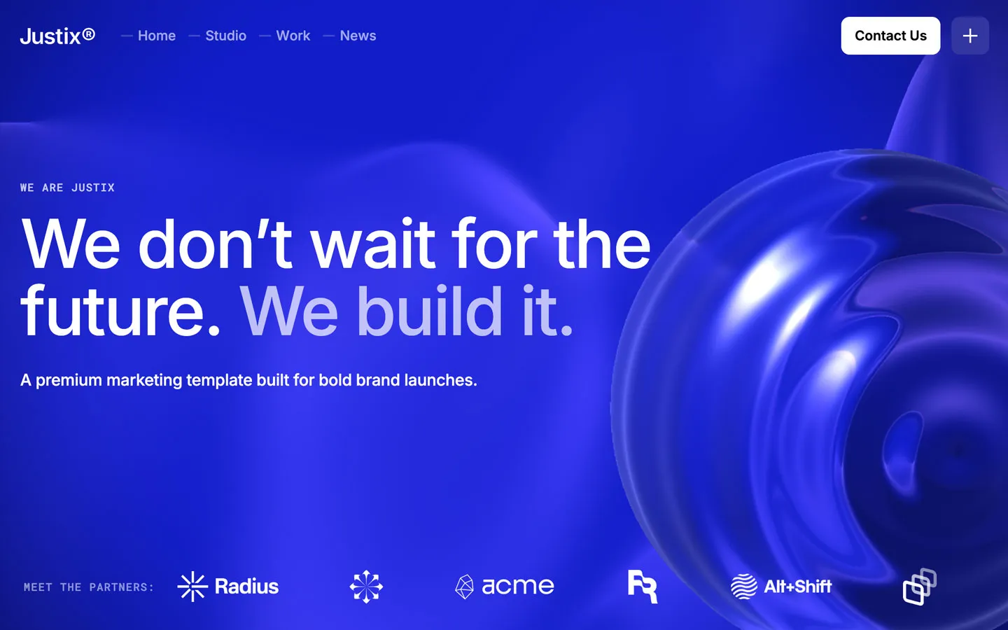


Don’t miss out on our superb, customizable templates designed to enhance your web design experience. We constantly add new templates and components.

Explore stunning Webflow, Framer, HTML5, Next.js and Figma templates designed to spark your next big idea.


*Rest assured that your data is safe with us, and you'll only hear from us 1 time per month.