A website style should match the brand's personality, content, audience, and product. Compare minimal, editorial, bold, corporate, brutalist, and image-led directions.
A website style should make the brand easier to understand, not simply make the homepage look fashionable. The right direction depends on what you sell, who needs to trust you, how much content you have, and how distinctive the brand is allowed to feel.
Before choosing a template or visual reference, decide what the website needs to communicate in the first few seconds.
Minimal design works well when the content, product, or imagery already has enough strength. It uses fewer visual devices, clearer spacing, and a controlled type system.
It is often a good fit for architecture, premium services, consulting, fashion, product design, and portfolios.
The risk is becoming anonymous. Minimal does not mean removing every distinctive choice. Strong typography, unusual pacing, a specific image direction, or thoughtful motion can give a restrained site plenty of personality.
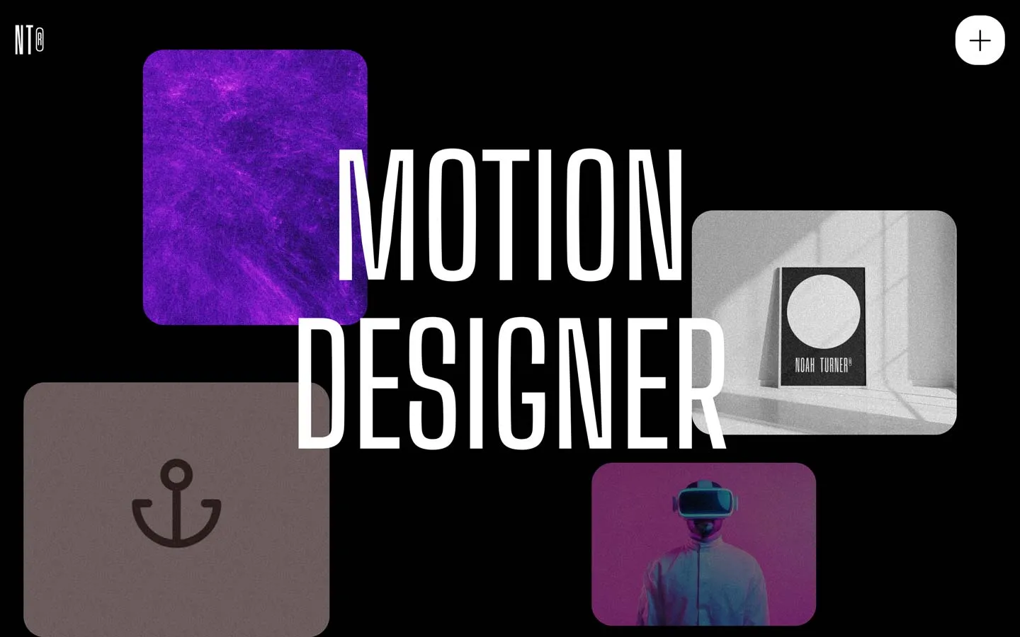
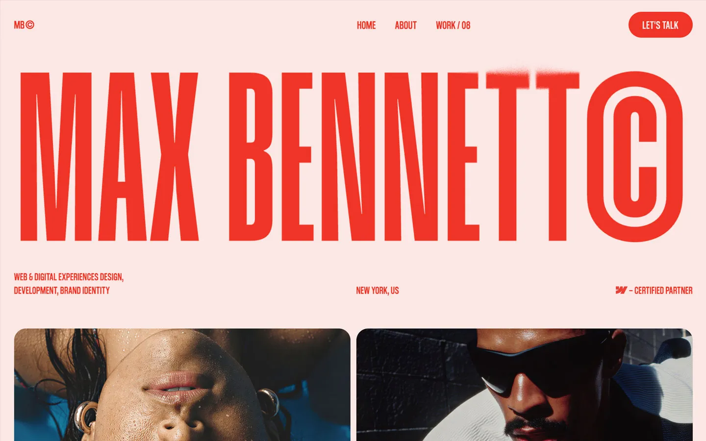
Editorial sites borrow from magazines, books, and publishing: expressive typography, layered grids, strong image crops, captions, columns, and deliberate reading rhythm.
This can work particularly well for creative studios, fashion, culture, architecture, personal portfolios, and brands with a lot of story to tell.
Editorial design needs discipline. If every section uses a new layout trick, the result can feel chaotic rather than curated.
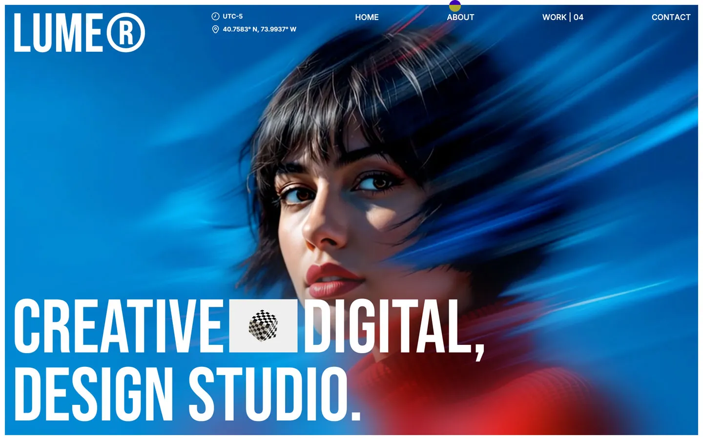
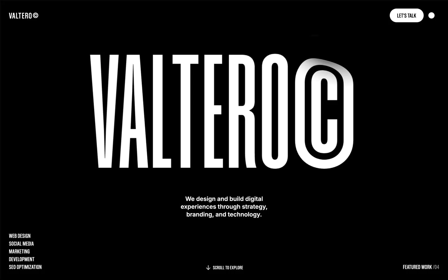
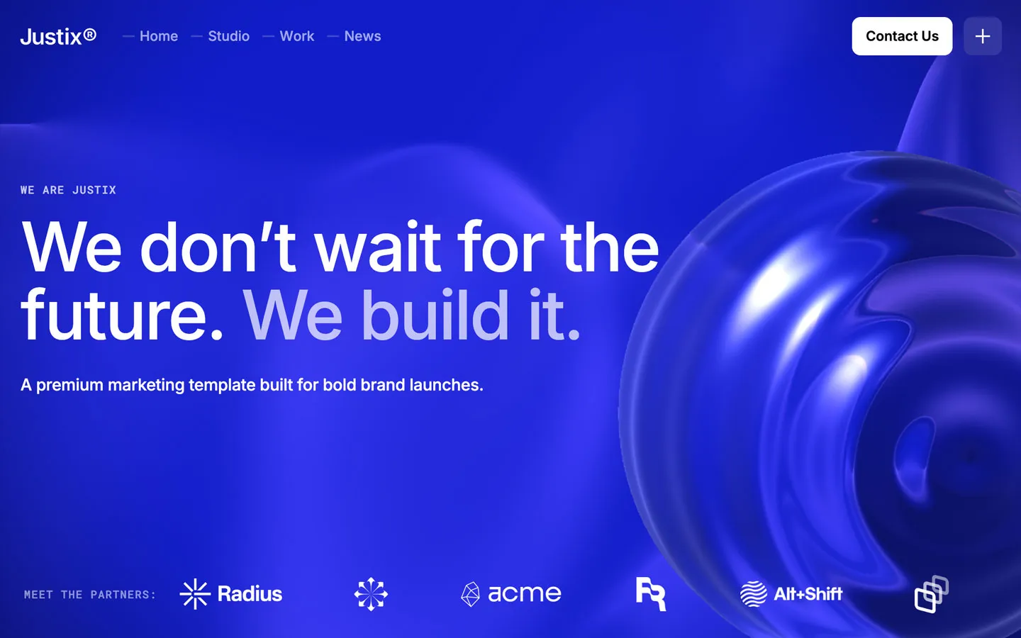
Large display type, unusual color, strong transitions, 3D, oversized images, and asymmetrical layouts can make a brand feel confident and contemporary.
This direction is common for creative agencies, launch campaigns, entertainment, design-led startups, and brands competing for attention.
It also has the highest risk of becoming tiring. Keep navigation, readability, and core actions simple even when the art direction is loud.
A structured business site prioritizes clarity, evidence, service hierarchy, trust signals, and predictable navigation. It does not need to be boring.
Consulting, finance, legal, B2B, and larger organizations often benefit from a system where visitors can understand the offer quickly and move into detailed information without learning an unusual interface.
Good typography, strong case studies, thoughtful motion, and high-quality imagery can make this style feel modern without reducing trust.
Brutalist-inspired web design often uses visible grids, stark typography, sharp contrast, raw interface elements, unconventional spacing, or intentionally unfinished visual cues.
It can be effective for art, fashion, music, culture, and experimental creative work where the brand benefits from challenging familiar conventions.
It is a poor choice when the audience needs maximum familiarity or when accessibility and information density are already difficult.
Photography and visual work can carry most of the interface when the images are genuinely strong. Portfolios, hospitality, real estate, fashion, travel, and architecture often benefit from this approach.
The design should give images room without making text an afterthought. Captions, project context, navigation, and mobile crops still matter.
SaaS and technology brands often use product UI, diagrams, feature demonstrations, and proof points as major visual elements.
The strongest versions show the product clearly without turning the whole marketing site into a dashboard. Use interface visuals to explain value, not simply to fill space.
Ask five questions:
You do not have to choose one label and follow it literally. A corporate site can use editorial typography. A minimal portfolio can include one highly expressive interaction. A SaaS site can use tactile photography instead of another wall of UI cards.
The mix works when there is still one dominant point of view.
Template categories can help narrow the search, but visual style often crosses industries. An “agency” template may suit an architecture studio; a “portfolio” template may work for a boutique consultancy.
Browse by the structure and visual language you need rather than assuming the category name decides the final use.
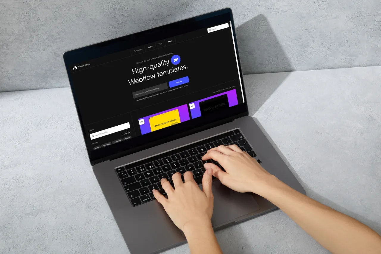
Flowmance's current Webflow and Framer libraries can be used as visual references across several styles and industries.






Don’t miss out on our superb, customizable templates designed to enhance your web design experience. We constantly add new templates and components.

Explore stunning Webflow, Framer, HTML5, Next.js and Figma templates designed to spark your next big idea.


*Rest assured that your data is safe with us, and you'll only hear from us 1 time per month.