November 18, 2024

Landing pages are critical tools for driving conversions. Whether your goal is to capture leads, promote a product, or encourage sign-ups, a well-designed landing page can make all the difference. Webflow, with its visual editor and advanced design capabilities, provides an ideal platform to create landing pages that are not only aesthetically pleasing but also conversion-focused.
In this article, we’ll explore five actionable tips to help you build high-converting landing pages on Webflow, ensuring your efforts translate into measurable results.
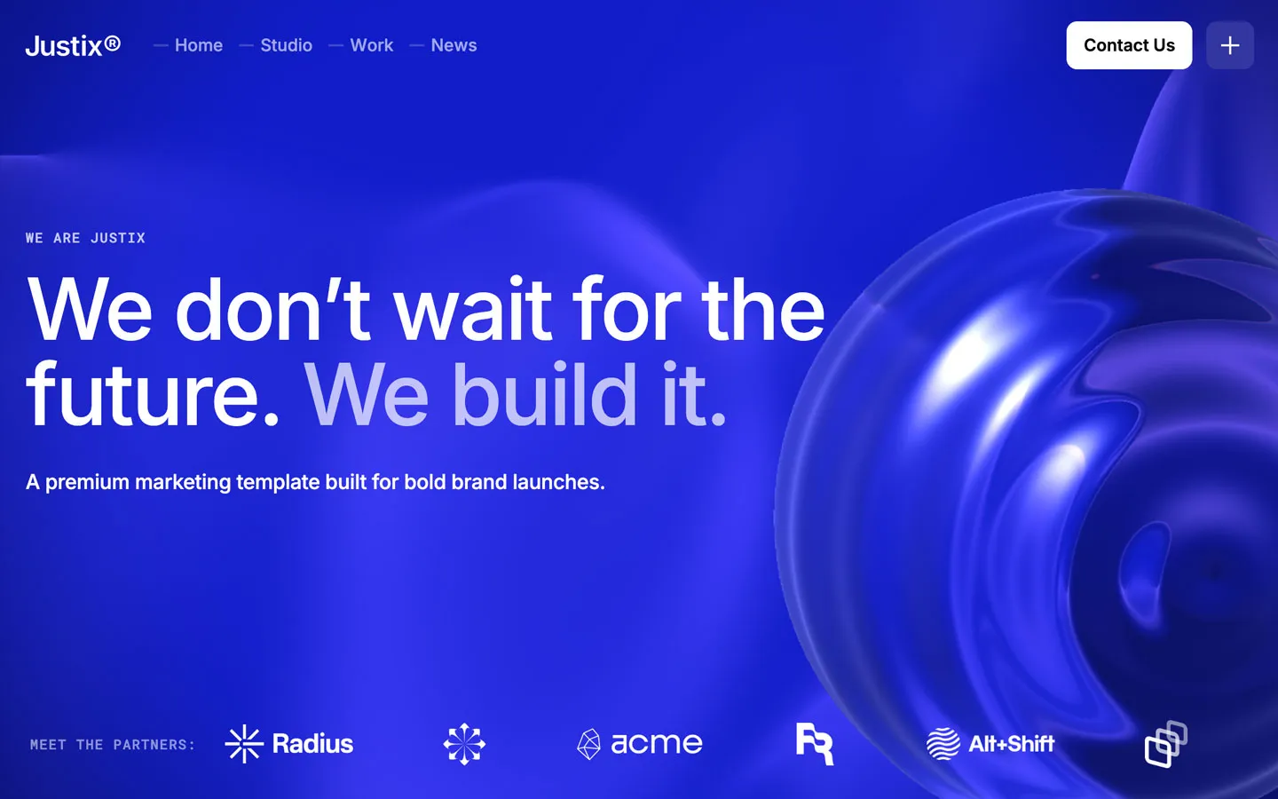
Your landing page must clearly communicate the value you’re offering. Visitors should immediately understand why they’re on the page and what they stand to gain. Use an eye-catching headline and a concise subheadline to deliver your message.
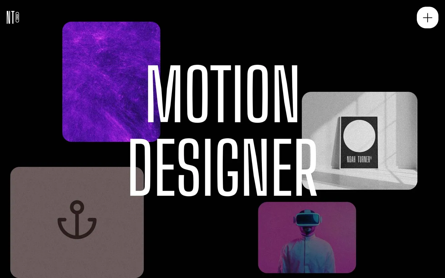
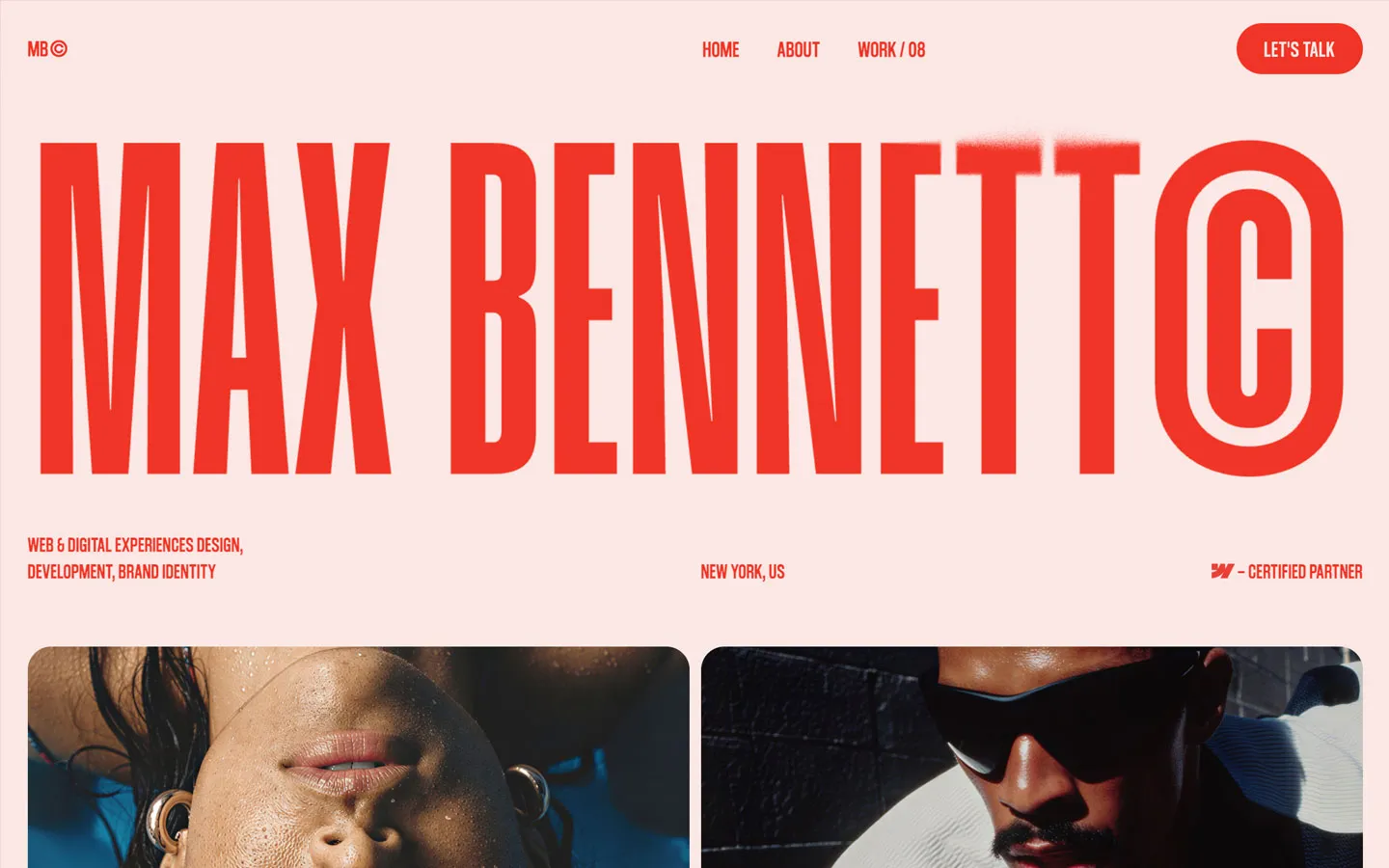
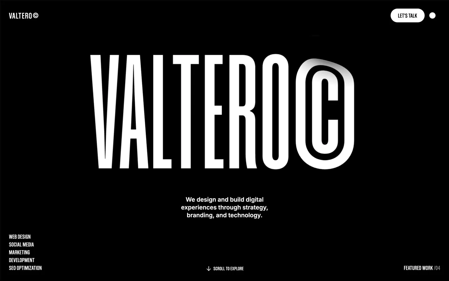
Webflow’s design flexibility allows you to experiment with typography, spacing, and layout to emphasize your value proposition. Ensure your text is scannable and aligned with your brand’s tone. Pair your headline with a high-quality image or illustration that complements your message, reinforcing the emotional appeal of your offering.
A cluttered landing page can overwhelm visitors and reduce conversions. Keep your design clean, with ample white space to guide the user’s attention to critical elements like your call-to-action (CTA).
Webflow’s drag-and-drop functionality makes it easy to create minimalist designs that prioritize usability. Stick to a clear hierarchy:
By maintaining a streamlined design, you can direct visitors’ focus where it matters most.
Social proof is a powerful psychological tool that helps establish credibility and trust. Include testimonials, reviews, or case studies from satisfied customers. Displaying recognizable logos of clients or partners can also enhance your brand’s legitimacy.
Webflow allows you to create dynamic content sections with its CMS, making it easy to update testimonials or case studies as you receive more feedback. Use visual elements like star ratings, video testimonials, or before-and-after images to make your social proof more impactful.
Your CTA is the most critical element of your landing page. It should stand out and clearly instruct visitors on what action to take. Use contrasting colors for your CTA buttons, ensuring they grab attention without being jarring.
For example, a SaaS landing page might use a CTA like “Start Your Free Trial” or “Book a Demo.” Webflow’s interactive design tools allow you to test different button styles, hover effects, and micro-interactions to find what works best for your audience.
Position your CTA strategically:
With more users browsing on mobile devices, it’s essential to design landing pages that look and function flawlessly across all screen sizes. Webflow automatically creates responsive designs, but you should manually check and tweak the mobile version of your landing page for optimal performance.
Pay special attention to:
Test your landing page on multiple devices to identify any issues and provide a seamless user experience, regardless of the platform.
Building high-converting landing pages on Webflow doesn’t require advanced coding skills, it requires a strategic approach to design, messaging, and user experience. By focusing on these five tips, you can create pages that captivate visitors and drive them to take action. Looking for a shortcut? Explore Flowmance, where you’ll find expertly crafted Webflow landing page templates designed for conversions. Whether you’re a SaaS company, a freelancer, or a creative agency, Flowmance templates provide the perfect starting point to launch high-performing campaigns with ease.


Don’t miss out on our superb, customizable templates designed to enhance your web design experience. We constantly add new templates and components.
Explore stunning Webflow, Framer, and Figma templates designed to spark your next big idea.
*Rest assured that your data is safe with us, and you'll only hear from us 1 time per month.